Software
Houzz Logo Print
kacee_blackwell

Color help

13 years ago
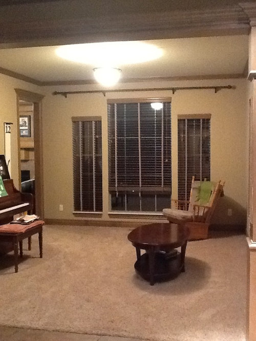
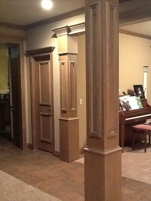
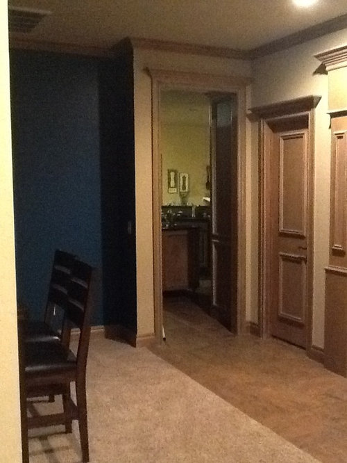
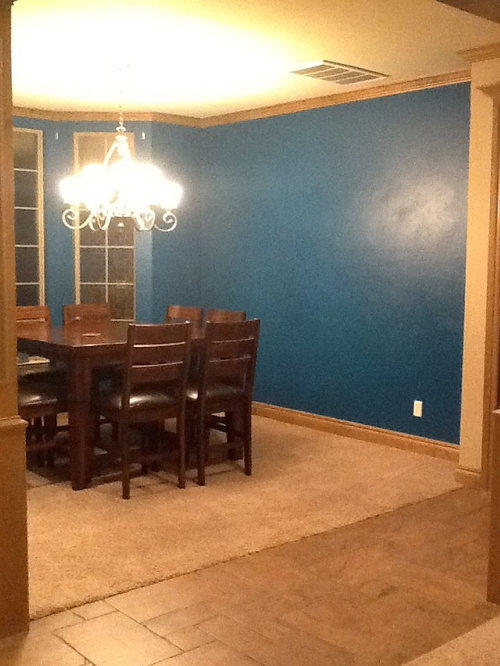
We are trying to decide what colors to use for our front "formal" living room. We want something bold and cheerful. We'll be starting from scratch with new furniture, curtains, and decor. The only thing staying is the piano. We need to complement the dining area, which we chose to do in Allen Roth "swizzle stick" which is a dark teal. Our dinnerware is cherry red, so I'd like to incorporate red in the dining window curtains. What do you suggest for the living room?

Comments (20)

  • 13 years ago
    Would orange walls be too overwhelming?
  • 13 years ago
    Look for the thread originated by Angela Pascoe called Paint Color. She's just done hers in orange and it's beautiful. Lots of comments that might be helpful to you.
  • 13 years ago
    last modified: 13 years ago
    I would pick a lighter version of the teal (on the same paint swatch) for the LR. It would flow nicely since it looks like the LR is across from the DR. I think the orange walls next to the teal walls is too much contrast so I would use the orange as an accent color.
  • 13 years ago
    last modified: 13 years ago
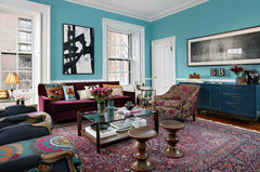
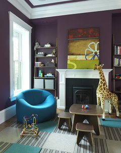
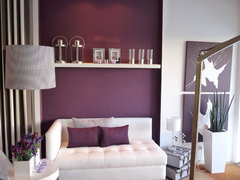
    For paint colors--my first thought was a silver-grey, but I'm not sure if that qualifies as bold and cheerful. What about a rich purple?
    Vanessa De Vargas for Teen Project · More Info

    Boston Townhouse Renovation · More Info

    http://www.colorcombos.com/teal-color-schemes.html
    Playroom · More Info

    workfolio · More Info
  • 13 years ago
    KB- I'm really considering your idea of the silver-grey. Do you think that would be okay with tan trim? I usually see gray walls with white trim.
  • PRO
    13 years ago
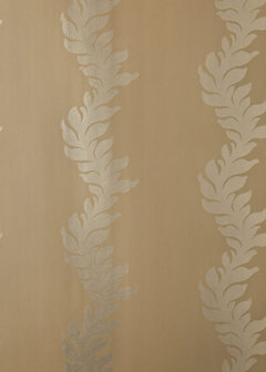
    Instead of going for a silver grey, I am more tempted to go for a pale gold... You have dark teal and need to counteract it with something that is light but that works with the wood panelling and the teal. I would rather work on the yellow (complementary) side of the colour wheel to balance the teal.

    I've attached a wallpaper that might give you an idea
  • 13 years ago
    The pale gold is actually not too far off from the current wall color. I'm attaching the artwork we have chosen to use on the wall on the right side. There are actually 2 very similar paintings. This is just one of them. We will put the other one in the dining room with the teal walls.

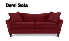
    I'm thinking of getting this red sofa to go under the painting on the right wall opposite the piano.

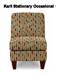
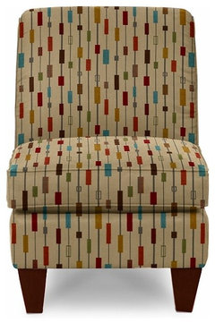
    Then I'm thinking about getting 2 of these multi-color chairs for in front of the window.

    Any ideas for curtains? Should I try to use the same fabric for the dining room and living room since they are connected space?
  • PRO
    13 years ago
    I think these are lovely colours and would work beautifully with a gold (but something that has some metallic sheen to give it a little twist of interest without being intrusive)...
    I like continuity in an open space - if you could find a pale gold thai silk curtain that again creates visual interest by the light it reflects (thus unobtrusive) it will blend in your living room and look great in your dining room.
  • 13 years ago
    last modified: 13 years ago
    My thoughts were orangy gold or eggplant too. Love the chair with the new retro print and colors!
    Note: I would NOT hang curtains in the dining with red in it. A light natural linen would look better, maybe a gold pattern or something.
  • 13 years ago
    thanks for the advice! do you think we should stick with the current wall color with gold curtains?
  • PRO
    13 years ago
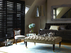
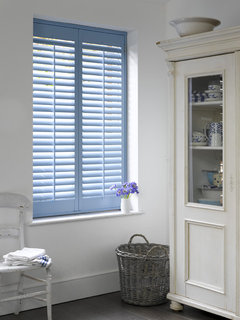
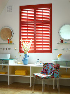
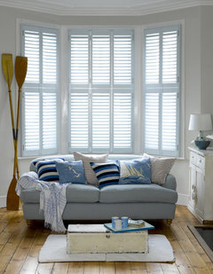
    Hi Kacee, Don't be afraid to add color through with shutters. Everyone always thinks they need to white or wood grain. I have added some of our images for inspiration! Good Luck.
  • 13 years ago
    Those are pretty, but I think we will keep our blinds on the living room for now. However, the dining room windows don't have anything, and I have considered shutters. What color would you recommend?
  • PRO
    13 years ago
    Hi Kacee, Ok so these colours might seem outrageous....but they look great once they are on the wall. People put full colored drapes on the wall....so you can do the exact same things with shutters. I have kept in mind your outside wall colors and the red of your dining set. My favorite is the softer red. It would be a OUTSTANDING!
  • PRO
    13 years ago
    But maybe the taupes would be softer on the eye!!! ha ha ha ha ha.
  • 13 years ago
    Keeping the blinds ok, pale gold silksheers over the LR windows would soften the blinds & pale yellow walls would warm up the perimeter of the walls. This be a pleasing background to compliment the furniture you have in mind. Cushions on the sofa could pick up the gold, teal, red colors in the LR & DR.
  • 13 years ago
    Nice crisp rug with geometric design hightlighting the teal color, white woodwork, & white plantation shutters ...suggestions for the DR
  • PRO
    13 years ago
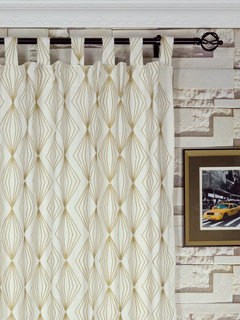
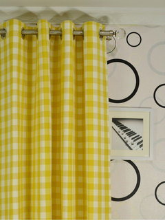
    some ideas on the curtains
  • 13 years ago
    last modified: 13 years ago
    In a house with character in the architectural trim, you need to use contrast and you've begun in the dining room - the perfect place for a deep tone. This blue shade is a tealish cobalt in the light of the camera. I bet you've already tried to hang this art with all shades on it and it works- it works great with slipper chair you found too. The art as inspiration is great, but since it is going to be the colorful star, I think you get more with neutral palette.

    Must must advise against a red couch - something neutral so you can add a pop of red or a print pillow will give you best result - best advice I can give when you want to use strong art & color. Long term the red couch or loveseat / settee is hard to work with - here, if you want another big strong color statement, do the sofa in a slipcover repeating the blues - maybe a hue lighter - a mid-tone. I'd repeat either the linen tone or fall towards the pale gold / cornstraw tone as noted above. I went to find some fabrics to see what you really resonate with -

    If you do want red and teal, the best fabric combos I found for pillows and upholstery are this family - the star for pillows against a linen sofa http://beautifulfabric.com/asccustompages/products.asp?fpage=1&productid=8578&storeid=39
    this blue could be a sofa slipcover / make upholstery if you want to be colorful on the sofa http://beautifulfabric.com/asccustompages/products.asp?fpage=1&productid=7216&storeid=39
    the one fabric that would coordinate well for curtains following your original palette http://beautifulfabric.com/asccustompages/products.asp?fav=0&fpage=1&page=1&categoryID=17&productID=8583&pStart=200&recNum=261 that could work in both rooms

    In the living room, I like leaving the trim color, but taking the wall color up a couple of tonal notches. One approach is to the straw tones / a bit gold like the lines in the curtains above left. For the walls - SW ivoire or blonde might be a good wall tone here http://www.sherwin-williams.com/homeowners/color/find-and-explore-colors/paint-colors-by-family/SW6127-ivoire/ at this level, it works with the existing trim but if you go down to blonde or restrained gold you will likely need to adjust trim shade away from tan. I think Ivoire is a good choice of contrast against the deep teal since your living space is bungalow sized.

    With the neutral wall / more gold based color scheme, red might just happen in the art and dishes and a few accents, then the teal blue and gold could rule. Using the cream and gold wire graphic curtains above left could be a great print choice for both room to both quiet and tie the dining and living room together. Then you can find one great print fabric to echo the blue and gold - an accent pillow - this is the best I found to match these tones http://www.calicocorners.com/product/designer+fabrics+for+the+home/shop+fabrics+by+color/aqua+and+teal+fabric/el+convento+-+nate+berkus+fabric+-+pacifica.do
    and this as an accent pillow might inform your upholstery selection.

    Hope these ideas help give you some clarity on what you love and where you want to go - great architecture in this house - how fun! Glad you are celebrating your love of color - I find that one fabric with the major elements, just like one piece of art with the major elements, helps to "tell" your color story and help the eye make sense of it. Finding one print to work with your inspiration art will tell you how to proceed.
  • 13 years ago
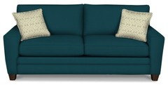
    Considering the advice of libradesigneye above, I am going back and forth on whether to get the red sofa I posted earlier or this teal sofa. What do you think?