

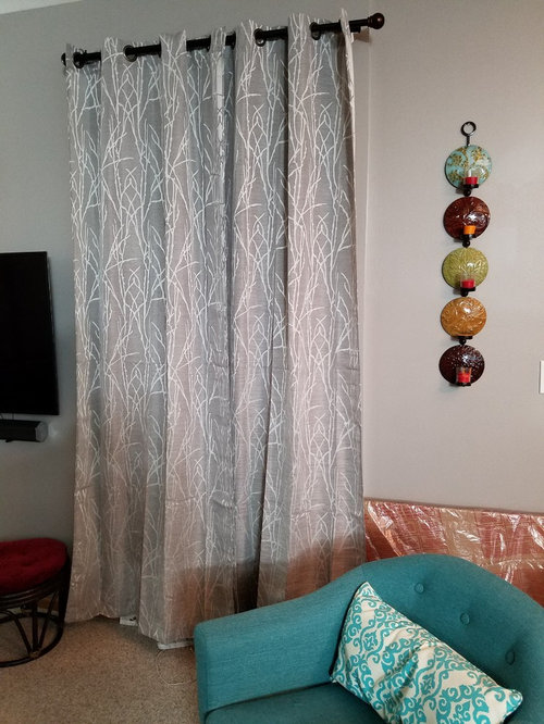
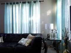
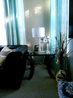
gray curtain color on gray wall
9 years ago
Featured Answer
Sort by:Oldest
Comments (14)
 9 years ago
- 9 years ago
Related Professionals
Valdosta Interior Designers & Decorators · Cherry Hill Interior Designers & Decorators · Waco Interior Designers & Decorators · Enfield Interior Designers & Decorators · Dubuque Interior Designers & Decorators · Worcester Interior Designers & Decorators · Brainerd Interior Designers & Decorators · Middletown Interior Designers & Decorators · South Bend Architects & Building Designers · Poughkeepsie Architects & Building Designers · Chula Vista Architects & Building Designers · Denver Architects & Building Designers · Magog Architects & Building Designers · Vidalia Kitchen & Bathroom Designers · Tupelo Kitchen & Bathroom Designers 9 years ago
 PRO9 years ago
- 9 years ago
 PRO9 years agolast modified: 9 years ago
- 9 years ago
- 9 years ago
- 9 years ago
- PRO9 years ago
- 9 years ago
- PRO9 years ago
 9 years ago

Related Stories
DECORATING GUIDESColor of the Week: Decorating With Warm Gray
Tired of tan? Getting gloomy from cool gray? Make warm gray your new go-to neutral
Full Story
DECORATING GUIDESColor Guide: How to Work With Charcoal Gray
The most modern neutral, charcoal gray looks great in dining rooms, living rooms and even nurseries. Here's how to use it best
Full Story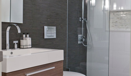
COLORBathed in Color: When to Use Gray in the Bath
Go for elegance and sophistication without going overboard on coolness, using these gray bathroom paint picks and inspirational photos
Full Story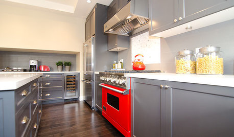
COLORCooking With Color: When to Use Gray in the Kitchen
Try out Trout or shake up some Martini Shaker gray for a neutral-based kitchen that whispers of sophistication
Full Story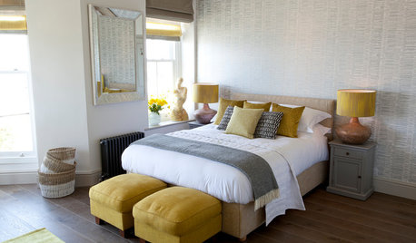
COLOR10 Pretty Ways to Refresh a Gray Palette
Energize your favorite gray shades with pick-me-up accents as fresh as a spring day
Full Story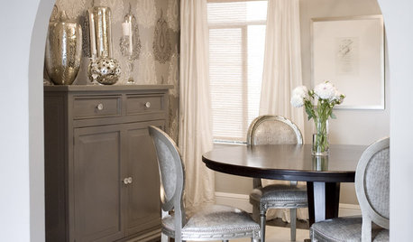
GRAYChoosing Color: Give Me More Gray Days
Layer On the Grays for a Sophisticated Look in Any Room
Full Story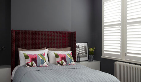
COLORDreaming in Color: 8 Gorgeous Gray Bedrooms
With this versatile hue, you can go dark and bold or slip into something more soothing
Full Story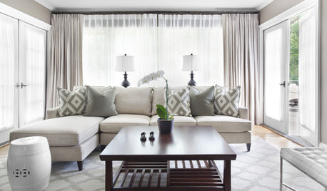
GRAYChoosing Paint: How To Pick the Right Gray
Which Version of Today's 'It' Neutral Is For You?
Full Story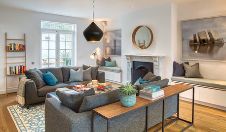
FURNITURE11 Reasons to Love a Gray Sofa
See how a sofa in this neutral shade can take on anything you mix with it, from soft to sharp and everything in between
Full Story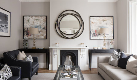
MOST POPULARWhat’s Your Neutral: Beige or Gray?
A designer shares 10 tips for using the neutral shade that works best for you
Full Story




Home Interiors with Ease