Software
Houzz Logo Print
paraveina

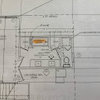
Critique this plan

9 years ago
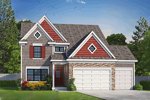
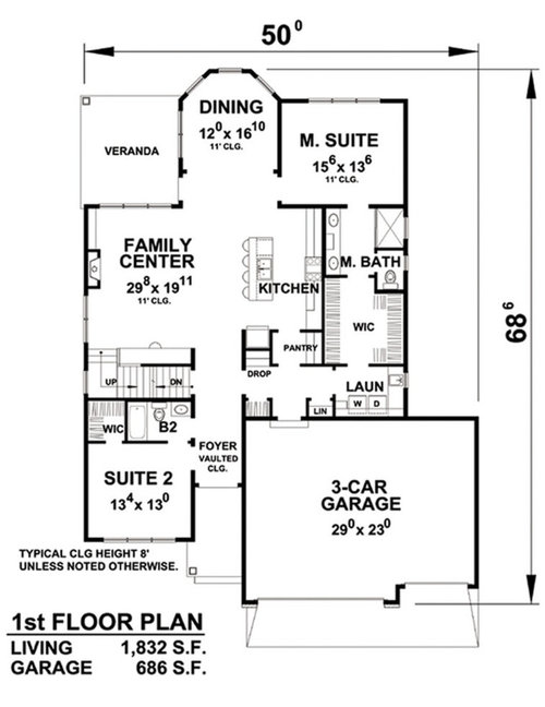
I'm not building right now (had been planning to, but the cards have changed for at least a couple years), however I love looking at online plans and reading everyone's critique when people post their plans here. I saw this one this morning and wondered what people would like and dislike about it. I think it's pretty cute, but I think that about a lot of plans and then after I read all the comments I think "oh, I didn't notice that, or that either".

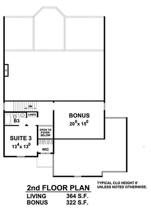
I'm a little confused by this second floor though - it looks to me like the area above the "family center" is being shown as vaulted, however the notation on the first floor is 11' ceiling for this area.

Comments (14)

  • 9 years ago

    Cute house, but the garage could be less obvious, lose the stone just there or wrap it around the front door, too, and maybe the 3rd garage could be pushed back further, and if used for bikes and mowers could have windows on the front and a door on the back.

    The shaft created by the "open to foyer below" might be better used to open up the upstairs a bit.

    I am happy, myself, with lower ceiling heights, 8-9' is just fine by me. If the FR ceiling were less than 11', they could have a step-up to a usable space upstairs. That would allow an additional bedroom up there. (I would not want a bedroom right next to the foyer; though in my current house the guest room is right off the foyer, it also makes a good study ) In the plan, I'd use the front bedroom as a study, but I'd have to keep it looking nice all the time since it's right there by the door.

    The stairs landing in the family room disrupts the furniture placement. If someone lives upstairs, they have to skirt FR furniture every time they go up and down. On the other hand, I like interesting stairs, and if the front bedroom were a study, I'd lose it's closets and let the stairs split at the bottom and drop in both the FR and the study. I like to be able to circle through the main floor,

    i like the entry area, that the garage and foyer spaces meet. They are a little tight and I'd like a skosh more room, though.

    On the Laundry, I'd do a straight run of sink-washer-dryer. And personally, I don't need a door from closet to laundry. I want wall storage! But a passthru might be nice.

    Master suites that open right into living space are not my cup of tea, but at least you don't walk right into the kitchen/laundry/mudroom as I've seen before.

    It looks like it's designed for a narrow in-town lot, and for that it's pretty efficient I think. I wish it could be a bit wider for a nicer entry/foyer, which would give the garage a slightly-less percentage of the front.


    paraveina thanked bpath
  • 9 years ago

    There isn't a lot of wasted space, but that's at the expense of weird room entrances. The doors to suite 2 and the only public bathroom on the 1st floor are in the foyer, which seems pretty awkward to me. The entrance to the master is in the dining room - unless the bedroom door is always closed, you see right into it from most of the public areas.

    While there are a lot of windows in the family and dining rooms, the kitchen will be dark, and none of the bathrooms allow for natural light near the vanities (or at all, in the case of 2 bathrooms out of 3). I would also want more windows in all three bedrooms, and either a bigger window or a skylight in the bonus room.

    I like the door from master closet to laundry room, but the laundry area itself seems crowded.

    paraveina thanked AnnKH
  • PRO
    9 years ago

    Snout garage, wider than the house itself. Only worth considering for a very narrow lot. Lot of gymnastics for a 3-BR house.

    paraveina thanked Virgil Carter Fine Art
  • 9 years ago
    last modified: 9 years ago

    The shaft created by the "open to foyer below" might be better used to open up the upstairs a bit.

    Good point! I hadn't tried to picture that spot but now that you mention it, it does seem like it would look strange & be useless. Shaft is definitely the word for it.

    I am happy, myself, with lower ceiling heights, 8-9' is just fine by me.

    I'm not sure that I even know what 11' ceilings look like. I'll have to measure when I'm home to see what I have now.

    The stairs landing in the family room disrupts the furniture placement. If someone lives upstairs, they have to skirt FR furniture every time they go up and down.

    That's a good point; you lose quite a bit of space for circulation. They probably should have depicted the fireplace even further up, to be more centered on where furniture could be placed.

    On the other hand, I like interesting stairs, and if the front bedroom were a study, I'd lose it's closets and let the stairs split at the bottom and drop in both the FR and the study. I like to be able to circle through the main floor,

    I LOVE that. When I was a kid one of my friends had a staircase that split like that and it was my favourite part of their house.

    On the Laundry, I'd do a straight run of sink-washer-dryer. And personally, I don't need a door from closet to laundry. I want wall storage! But a passthru might be nice.

    I must admit, one of the things that made me like this plan was how you could walk from the closet to the laundry. It just seems so convenient.

    Master suites that open right into living space are not my cup of tea, but at least you don't walk right into the kitchen/laundry/mudroom as I've seen before.

    That was one of the negatives that I had noticed, and I don't think I like it either.

    There isn't a lot of wasted space, but that's at the expense of weird room entrances. The doors to suite 2 and the only public bathroom on the 1st floor are in the foyer, which seems pretty awkward to me.

    I have had a powder room off a foyer before and that was fine, but I agree it's weird to think of having a shower there. I like BP's suggestion of using that room for a study instead.

    While there are a lot of windows in the family and dining rooms, the kitchen will be dark, and none of the bathrooms allow for natural light near the vanities (or at all, in the case of 2 bathrooms out of 3).

    I hadn't considered that - I've only been so lucky to have natural light in a bathroom once so it wasn't something that occurred to me. I also hadn't noticed how far the kitchen is from the windows until you mentioned it.

    I like the door from master closet to laundry room, but the laundry area itself seems crowded.

    It does seem crowded, especially considering there's a lot of wasted space behind a washer & dryer for the hookups.

    Snout garage, wider than the house itself.

    I thought snout garages stuck out in front more than this one.

    Lot of gymnastics for a 3-BR house.

    What do you mean by gymnastics?

  • 9 years ago

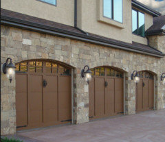
    It bothers me if the thing I notice first about a house is the garage doors.

    Yes, I know that's a concern for quite a few people on this forum.

  • 9 years ago
    last modified: 9 years ago

    It's a cute little house, though I do find myself asking, "Where did more than 2500 sf go?". It's not overdone like so many we see here, and I think its greatest strength is good circulation. The walls are "stacked", which will make it economical to build. Specific thoughts:

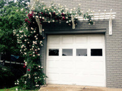
    - I agree that the garage is front-and-center prominent. Perhaps if it had nicer doors and a pergola with some flowers, it could be a feature instead of a liability:


    Still on the subject of the garage, 29' wide is NOT a three car garage. It'll be like my friend's garage: So narrow that she has to let her family out in the driveway, while she scoots the car up to the side-side-side and inches her way out of the driver's door. 12' is generally considered a comfortable width for one car ... I'll leave you to extrapolate from that point.

    - I agree that for a family the bedroom-to-the-front is odd. Perhaps as a guest suite it'd be nice. Note that while this bedroom is a nice size, the WIC is small, and the bathroom is downright minimal ... and a minimal bathroom is never comfortable. This slightly-remote location could be an excellent office or den ... and if that's the plan, I'd be tempted to leave out the tub and go with a more generous sink vanity ... or enlarge the closet; a closet in a den isn't a bad thing at all. If you're not doing a basement, you should include the under-stair space as short closet space; it'd work for Christmas items or similar things that you need to store but don't need on a regular basis.

    - I really like the circulation in the family entrance: Though the area is small, you have immediate access to a drop spot, a closet, the pantry, the laundry, and even a scoot-through to the master without going through the family area. Nicely done. This is my favorite part of the plan.

    - The master suite looks good; the only thing I'd add would be another window on the side wall. I would want a tub in the master bath, yet I see no way to get it.

    - With just a straight run of cabinets and an island, this is an economical-to-build kitchen. Lacking in light though.

    - Note that they're being deceptive with the "family center" dimensions. The room is clearly the same width as the 13x13 bedroom suite. Holding up a post-it note and estimating, I'm thinking the space you have available for living room furniture placement is about 15x15 ... that leaves walkways to the dining room and to the staircase. I think it's a decent amount of space, in keeping with the house.

    - This might work well with a corner fireplace.

    -The dining room is a bit further from the kitchen than I'd prefer, but I note that they've included a reasonable door to the veranda ... something that often doesn't happen.

    -The upstairs looks nice. You could clearly have two bedrooms upstairs simply by adding a closet to the bonus room.

    - As for 11' ceilings, I'm in my classroom right now -- huge room, using ceiling tiles as an estimate, I'd say 38' x 30' ish -- and my ceiling is 10' ... so I suspect these rooms'd feel like elevator shafts. They'd also be hard to heat. The space is modest, so I suspect they're trying to make it appear larger with high ceilings and big windows.

    paraveina thanked mrspete
  • 9 years ago

    Perhaps if it had nicer doors and a pergola with some flowers, it could be a feature instead of a liability

    Those are definitely an improvement over the original.

    Still on the subject of the garage, 29' wide is NOT a three car garage.

    I agree, it seems more like a two car garage with some room for a snowblower.

    This slightly-remote location could be an excellent office or den ... and if that's the plan, I'd be tempted to leave out the tub and go with a more generous sink vanity

    The upstairs looks nice. You could clearly have two bedrooms upstairs simply by adding a closet to the bonus room.

    I agree, that makes more sense given it's so close to the foyer. The designer probably just wanted to make sure they ticked the boxes for both 3 bedroom and a bonus room.

    I really like the circulation in the family entrance: Though the area is small, you have immediate access to a drop spot, a closet, the pantry, the laundry, and even a scoot-through to the master without going through the family area. Nicely done. This is my favorite part of the plan.

    This was the aspect of the plan that drew me to it. It feels quite efficient to me.

    The master suite looks good; the only thing I'd add would be another window on the side wall. I would want a tub in the master bath, yet I see no way to get it.

    Agreed on the additional window. The tub aspect is one I go back and forth on. I do like the tub I have now, but I think I'd like my bathroom even more if I just had a really fancy shower.

    With just a straight run of cabinets and an island, this is an economical-to-build kitchen.

    And no corners! I detest corner cabinets.

    Note that they're being deceptive with the "family center" dimensions.

    Good point!

    I suspect these rooms'd feel like elevator shafts.

    I agree, and I wonder if they've made them that high because of the window placement in the upstairs closet?

  • PRO
    9 years ago

    It's scary. Plop it on 99% of the sites in this country and it becomes scarier.

    paraveina thanked Mark Bischak, Architect
  • 9 years ago

    Oh, look at that cute garage! Oh! And it has an attached house!

    paraveina thanked littlebug zone 5 Missouri
  • 9 years ago

    It's scary. Plop it on 99% of the sites in this country and it becomes scarier.

    Boo!

    Oh, look at that cute garage! Oh! And it has an attached house!

    Yes, the garage is very prominent.

  • 9 years ago

    Welll, Mark is right. It looks like a lot of developments, infill, and teardown replacement housing in my area.

    paraveina thanked bpath
  • 9 years ago
    last modified: 9 years ago

    Welll, Mark is right. It looks like a lot of developments, infill, and teardown replacement housing in my area.

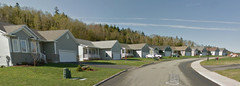
    We have an uncanny valley two streets over from where I live now, where one developer has allowed people to pick between three similar house plans, and then the only choice that appears to be allowed is siding colour (even the trim is all the same colour). I imagine people go to the wrong house all the time.

    Edited to add picture:

  • 9 years ago

    Although to be fair, this isn't exactly a new phenomenon for where I live: