Software
Houzz Logo Print
kimmie7803

What do you think?

13 years ago
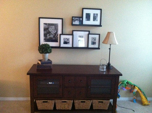
Are the picture ledges hung at the correct height above console? Too high or too low? Thanks!

Comments (36)

  • PRO
    13 years ago
    The heights look great.
  • 13 years ago
    I must have missed that memo about "correct" heights and console surfaces.........Kimberly, I think it looks great, but then I'm not an Interior Designer and will defer the correctness to their expertise.........as an artist though, I personally like my pieces to be hung so that the focal point of my work is about the average eye height of an adult. These are usually stand alone displays...........with your console, I think the massing has to be consider in its entirety. This looks quite balanced and harmonious..........I think it looks just right. The big question is how do you feel about it? If you're happy with it, I think you have your answer.
  • 13 years ago
    Nice shots BTW...... did you take these photos? I love good B&W photos.......a big Ansel Adams fans and have a number of reproductions of his work in my studio.
  • 13 years ago
    In my opinion it's to low. I know it is hard to get it in the correct position. You don't want to go to high or to low. I think you could move the shelves up a bit. That way if you want to place a decorative piece on the console it won't interfere with the pictures.
  • 13 years ago
    Somehow it doesn't feel right. I like the arrangement of your photos, but I think the shelves are too 'flimsy' compared to the console table and a bit too low perhaps. If you take the entire shelf arrangement as one piece, the center should be about 60" above the floor. Don't really like the lamp, that table could do with a much bulkier one.

    Having said all that, it's just because you asked for our opinion. If I were to come into your home and see your shelves, I'd be very impressed with your stylish photo arrangement. But when I look with my critical eye...

    I'm thinking a lamp that's similar to this:
    http://www.potterybarn.com/products/celia-ribbed-mercury-glass-table-lamp-base/?pkey=ctable-floor-lamps&
  • PRO
    13 years ago
    Shelf arrangements were one of my hardest exercises at school.
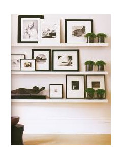
    This shelf arrangement can give you an idea (by one of my teachers)
  • 13 years ago
    last modified: 13 years ago
    I think the ledge height is very good, and the vignette is pretty. There are two changes I would make however.

    First, on the lower shelf, overlap the 3 pictures on the right, but leave a bit of space between that grouping and the one large picture. To me that would be more pleasing to the eye.

    Second, I think you could use a bit of a more substantial lamp.
  • 13 years ago
    I like the height, but what about hanging one or two of them on the wall instead of resting them all on the ledges? Like maybe the small one on the top and the largest one on the bottom. They could be hung just a few inches above the ledge to more dimension. Some empty space on the ledge isn't a bad thing.
  • 13 years ago
    I like your idea of a grouping of B + W pictures but I would like to see you remove the shelves. Just use the frames and don't line them up straight on the top or bottom. Notice how much more interesting the tops of your pictures are compared to the bottoms all in a line. Place them on the floor and play around. Anytime you're using pictures over a piece of furniture, whether it's a sofa or a table, the art is relation to the furniture--not to the wall. So some of your pictures could actually be a little lower. Your lamp needs to be quite a bit bigger to balance with the table.
  • 13 years ago
    I think maybe center the console and change the stuff on the console, or just add more. The shelves should look okay then.
  • 13 years ago
    last modified: 13 years ago
    The lamp should be bigger and then the whole arrangement would seem better. It is too narrow, and should be slightly taller. It is out of proportion which is why the shelf looks off.
  • 13 years ago
    I think if you take away one of the books it will be great. The pics need to be above the plant I think.
  • 13 years ago
    oh, and I agree about the lamp needs to be bigger too. Nice grouping though
  • 13 years ago
    I would hang them directly on the wall
  • 13 years ago
    They are too tightly hung together. The tops of each frame should be even and the bottoms of the bottom row should be even. Also the sides. Then place the others anywhere inside that perimeter. I am an artist teaching 30 years. Frames (either photos , prints or paintings) should always be hung at EYE level! People put them way too high. The height here is fine, it's the placement.
  • 13 years ago
    Pretty idea. Take the small photo off of the top shelf. For the big photo on top shelf, use the medium sized one from bottom shelf that holds just one image. Remove the baskets from under the buffet. Add a pop of some color by placing a pink or purple orchid instead of the topiary.... or a basket of hydrangea. Do you have two lamps by chance?
  • 13 years ago
    Lower the bottom shelf just about 2", wall mount the large photo on the left off the bottom shelf by 3", consider wall mounting two of the small square pics under the top shelf, add in the topiary if it will fit, get a much larger lamp and much, much larger books stacked with something sitting on top if you move the topiary. Wall mount some of the trendy stars or maybe add an ampersand "&" to the mix. Add some small nick nacks scattered throughout the pics, layer the pics on top of each other.
  • 13 years ago
    last modified: 13 years ago
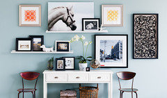
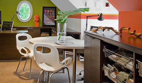
    I saw this ad for Home Sense and it reminded me of your question re composition of pics on your wall Mix it up a bit so that it doesn't appear flat. I think this composition would work in yr space quite nice. see the chairs.
  • 13 years ago
    I think you need a different lamp. The height is just fine. Love the table though! Where did you get it?
  • 13 years ago
    The lamp needs more heft to it and I would set a couple more of your photos on the console itself to fill the gap between the shelf and the surface.
  • PRO
    13 years ago
    The height is fine, I would move the topiary which is 'heavy' to the other side next to the lamp. This will help balance the grouping what is happening at the moment is that all the 'weight' is on the left hand side.
    Otherwise I thing it looks great good job. Adding a goup of three bright coloured vases, bottles or bowl of orbs on the left will add visual interest too.
  • 13 years ago
    The topiary is too high, try removing one book under it, also the lamp and topiary look like soldiers standing guard on each side. Try adding a long low bowl or something to the middle of the console. I like the overall look though.
  • 13 years ago
    Gosh... aren't you glad you asked? :-D
  • 13 years ago
    As a professional interior designer who loves to accessories and create picture groupings the finished shape above the console does not look right to me. I would stand back an look at the bigger picture including the topiary and plant on the books. The larger picture would anchor the center of the grouping about 5' off of the floor. I would then arrange the other photos asymmetrically around the larger photo. The picture grouping would be approximately 9" above the console. Also, the picture grouping in total needs to NOT be as wide as the console. If you add more pictures then take them out wide and down low.
  • 13 years ago
    I love your photo's. I think the large photo is amazing and would like to see it hung as the focal piece and at the highest visual position in your grouping with the ledges still staggered but extending beyond the edges of the console.
  • 13 years ago
    I like the idea of B&W photos. However, I think you have too many on one shelf. One or two and a grouping of other small items would work better. Also, the wooden furniture piece below is substantial and can handle a larger lamp and accessories. Just MHO - hope it helps.
  • 13 years ago
    last modified: 13 years ago
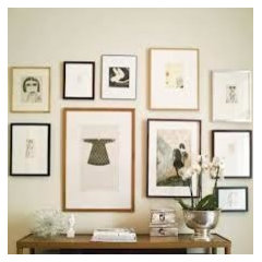
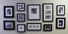
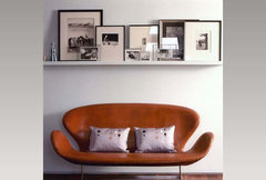
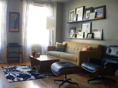
    A couple of my favourite displays of photos:
    CrystalTech - [ Roger Hirsch Architect ] · More Info


    Eclectic Living Room · More Info
  • 13 years ago
    Odd numbers of items may make it a little more pleasing. Frames with a variety of widths might be something to try.
  • 13 years ago
    I like the level of the shelves but don't like the little pom pom tree and other items on the left size of the table . Also, someone mentioned 3s on the lower shelf. I think if you either move the left lower picture (largest one) on the shelf but to the right a bit, it will look much better. You could try adding back the smallest one to the left of the big one, layered on top, but you just have to try it. Also, someone mentioned hanging the large one as part of the grouping and I like that idea too. Still, it looks good right now. These are just subtle changes.
  • 13 years ago
    You must feel something is off given your question. It could look much more interesting. Some ideas for ya ... For something different I'd try hanging them over the left half of the table, making the arrangement more vertical than horizontal then shift the decorative objects on the table to the right. The tall lamp may balance the photos (may need one with a bit thicker base) but you may have to add a few heavier objects so that the weight distribution makes sense. This is what I do to play with wall placement: take some brown wrapping paper (you can get at an office supply store cheap, cut them to the sizes of each photo and arrange them on the floor in front of where you want to hang them. When you're happy, tape them to the wall and then move things around on the table to see what floats your boat. I'd leave about 6-8 inches from the table to the bottom of whichever photos you liked best and placed on the bottom. You can take the paper and put dots for the locations of where the hangers should go, then punch through with a pencil to mark the wall. This makes things go quickly once you're happy with it. Also you might try wrapping the photos around the lamp so that the lamp becomes a part of your display rather than to the side of it. You can lay the lamp down on the floor amidst the brown cut-outs to see how you feel about doing something like this. It creates allot of interest.
  • PRO
    13 years ago
    last modified: 13 years ago
    I'm not one for filling void spaces for the sake of, well,.. filling space - no tchotckes in my home!, but my first thought is that the hutch/table is so bare so the eye is drawn to the blank space between table and shelf-begging for something to be placed there! What'cha got that you can group together and make a little vignette with that lamp? (no photos or framed things); a plant; vases; urns... create a focal point and use one of your fav colours!
  • 13 years ago
    The lamp needs to be more chunky. It's not to scale. And throws table off.
  • 13 years ago
    I'd also remove one of the two books and I love the idea of the Pottery Barn lamp Carolins suggested. The shade would work great with all those baskets on the bottom shelf. I think you did a nice job with the shelves and the height is good. I did like the idea of moving the one photo (3rd from left) to the table.
  • 13 years ago
    I would prefer the frames w/o the shelves. Would you consider a color to bring the area alive?
  • 13 years ago
    Looks like the height is ok for the shelves photos good but Lamp is way to small
    Needs to be taller and larger