Software
Houzz Logo Print
rajagopj

Need advice, wall paint for contemporary kitchen

13 years ago

Light Greige tiles, black granite counter, Brazilian cherry floor. Please help, I'm stumped!

Comments (26)

  • 13 years ago
    Whatever you like! These are so neutral you can choose anything!
  • PRO
    13 years ago
    any photos showing what the wall looks like against all the materials currently being used ?
  • PRO
    13 years ago
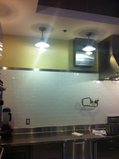
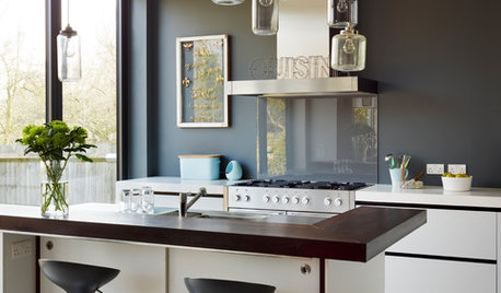
    It's a little hard to say without a picture of the room. The amount of wall space will make a difference. I've attached a picture from an industrial kitchen with a shade of yellow that might look great. Probably works best on smaller walls. On larger walls, I might suggest a deep taupe/ gray color. I agree with bonnielynn that you would have a hard time finding something that doesn't look good. The biggest mistake I think you could make is going to light. Use a deep, rich color to make everything pop. -Michael
  • 13 years ago
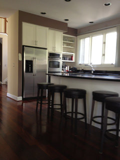
    Here is a picture. The light paint you see in the hallway is sw believable buff. That just got painted. The dark paint in the kitchen has to be done over and that is what is keeping me awake . The painter suggested aw ivoire and I had her paint a couple of swathes but it looks wrong for the space. Michael, I think you are right about going dark, but the other side has a fireplace and tv (ie, more wall space) so maybe two shades? Darker here and lighter there? Will taupe work, and which ones can you suggest? Thank you!
  • 13 years ago
    now that's a space you can have some fun painting. contemporary style with neutral basics is a license to go bold with wall color. how about granny smith apple green? turquoise? periwinkle? berry?
    gray,taupe or beige or any pale color would be safe but is safe really what you're going for?
    orange may be halloweeny. red seems dated. deep cocoa or charcoal is rich but again somewhat safe. i could go on with metallics etc but you get the idea.
    it looks like a beautiful kitchen with potential to WOW. the buff hall paint is unexciting and more traditional IMHO.
  • 13 years ago
    Thanks everyone. I went for really dark - sw Turkish coffee- and it looks wonderful & makes everything pop. Painting is still in progress, will post a pic when done.
  • 13 years ago
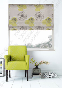
    I have white cabs with black granite counters in my laundry room .... went with a soft, chartreuse green color and added chartruese/white/black modern balloon shades.
  • 13 years ago
    Fab kitchen can not wait to see pics
  • PRO
    13 years ago
    Odd looking backsplash with a granite and tile backsplash?
  • 13 years ago
    Very nice kitchen - I'm also looking forward to pictures with new paint.
  • 13 years ago
    I would consider an aqua blue to lift and freshen up the space. Add some black framed white mounted contemporary prints with splashes of deeper aqua/turquoise and red to pick up the other colours in the kitchen and I think you will have a cheerful, modern effect. Don't stress too much; it's only paint and can easily be re-done if you honestly can't stand it. Just remember to get sample pots first and paint a piece of board a decent size that you can move around and see how the colour changes with the light in the room.
  • 13 years ago
    The red is striking but for a modern look I would consider a mocha color, weimariner - Benjamin Moore. With white cabinets and the dark counter top it is a subtle but very modern, warm and sophisticated look.
  • PRO
    13 years ago
    Add color...what colors do you like and use in other areas of the house? Continuity and flow throughout the house is important.
  • 13 years ago
    What colours have you used in the rest of the home? A continual flow of possibly 3 colours. Some rooms may use one colour prodominantly and that same colour be the accent in another room. Your Brazilian CHERRY floors would be one of the colours. Be very selective when using any red colours in combination with this. Decide which colour schemes appeal to you. i.e. Do you like the complementary contrast...so greens with your red floors. I personally like cabinets that go to the ceiling, so I would paint the wall above the same colour as the cabinets, to prevent a choppy feel. It's a lovely space and no doubt look lovely with any number of colours. All the best and I look forward to pictures.
  • 13 years ago
    I would paint it the exact color as your back splash. If there is a any wall space hang art work that compliments the style and colors of your first floor. Example: your main accent pieces are red in your other rooms. Incorporate the red in the artwork. Add accessories in that color. Example: dishes, counter top canisters, coffeemaker, fresh flowers, etc. This will give you the pop. Keeping it neutral is great because when you tire of the red, you can just change out your accessories. Much cheaper then repainting.
  • 13 years ago
    Love Benjamin Moore Athena or Collingwood... atmospheric...I find them perfect with most rooms.
  • 13 years ago
    I have kind of the same issue, however my kitchen will be more traditional with cup pulls and a couple of glass fronts. My kitchen is also pretty small. Won't need much painting except around the kitchen window and around door to gararge and maybe trim. I love the look of your floor..What is it ? Engineered or not? Love it!
  • 13 years ago
    I bet the sw Turkish Coffee looks great can't wait to see the pics
  • 13 years ago
    A light sage green would look real nice
  • PRO
    13 years ago
    I agree with many of the other comments. You have an opportunity to inject a bold color of your choice and connect that color with you table settings- place-mats, plates, accessories, etc.
  • 13 years ago
    My kitchen looks just like that; we went with a yellow the color of real butter and love it.
  • 13 years ago
    last modified: 13 years ago
    I tend to keep colors in a somewhat neutral pallet for the basic room, because it is easier to change the accessories than the fixed part of the room. Depending on the rest of your design, I have a fewe suggestions. If your house has a modern feel, grey subway tiles might work well, a light gray. If you are on the traditional side, I would recommend a light tile with a cinnamon and or tan to bring in the color of the flooring, but very subtlety. Not a lot of colr depth,because it gives you many more altermatives to changing the accessories in the future. I tend to like a neutral base to have more options for the decorating. Hope this is helpful.
  • PRO
    13 years ago
    Using two different shades to complement each other and act as an accent wall can help separate spaces and draw the eye to a particular area. Always go with colors that you love!
  • 13 years ago
    How did the sw Turkish coffee turn out? Would love to see the finish.