

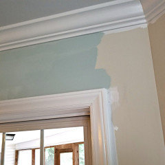
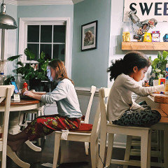
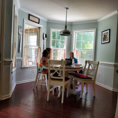
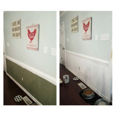
Palladian Blue - at 75% or 50%? Did you use these/have a pic?
9 years ago

Featured Answer
Sort by:Oldest
Comments (9)
 9 years ago
 9 years agolast modified: 9 years ago
Related Professionals
Gainesville Interior Designers & Decorators · Asheville Interior Designers & Decorators · South Sioux City Interior Designers & Decorators · Nashua Interior Designers & Decorators · Chico Interior Designers & Decorators · Clearlake Interior Designers & Decorators · Mission Viejo Interior Designers & Decorators · Farmington Interior Designers & Decorators · Tuscaloosa Architects & Building Designers · Oxford Architects & Building Designers · York Architects & Building Designers · Webster Architects & Building Designers · Salt Lake City Architects & Building Designers · Hot Springs Kitchen & Bathroom Designers · Grand Rapids Kitchen & Bathroom Designers 9 years agolast modified: 9 years ago
- 9 years ago
- 9 years ago
 8 years ago
- last year
- 7 months ago

Related Stories

PETS50 Dog Photos Worth a Wag
Design hounds: Share in the pet love with Houzzers' snapshots of their beloved dogs at home, in the workshop and at play
Full Story
FEEL-GOOD HOME9 Ways to Boost Your Home’s Appeal for Less Than $75
Whether you’re selling your home or just looking to freshen it up, check out these inexpensive ways to transform it
Full Story
DECORATING GUIDESCool Color Palettes: Enviable Green and Blue Spaces
Freshen up tired interiors with dewy to inky hues that harmonize even as they help each other stand out
Full Story
MOST POPULAR50 Shades of Gray
Gray is hotter than ever, thanks to a hit novel full of risks and dark secrets. Tell us: Which paint shade possesses you?
Full Story
REMODELING GUIDESHouzz Tour: Turning a ’50s Ranch Into a Craftsman Bungalow
With a new second story and remodeled rooms, this Maryland home has plenty of space for family and friends
Full Story
PETS50 Cats Soak Up the Last Days of Summer
As the days get shorter, felines find the best ways — and places — to lounge in the sun
Full Story
MODERN HOMESHouzz Tour: ’50s Ranch Redo Could Be a Keeper
An experienced house flipper puts his creative talents to work on an L.A. remodel designed for his own family
Full Story
KITCHEN DESIGNPersonal Style: 50 Clever Real-Life Kitchen Design Details
Get ideas from savvy homeowners who have a knack for creating kitchens celebrating personal style
Full Story
VALENTINE’S DAY50 Valentines to Home
Houzz users reveal how they knew their home was "the one"
Full Story



Jonathan Jay