Software
Houzz Logo Print
bonitapplebum

Backsplash help

9 years ago
last modified: 9 years ago
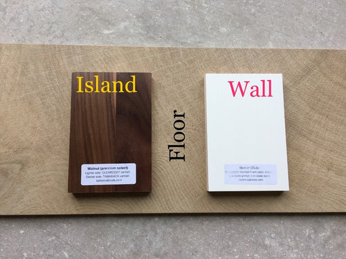
I'm considering doing a bold backsplash in my kitchen.

Here are my materials so far - creamy white wall cabinets and clear walnut island:

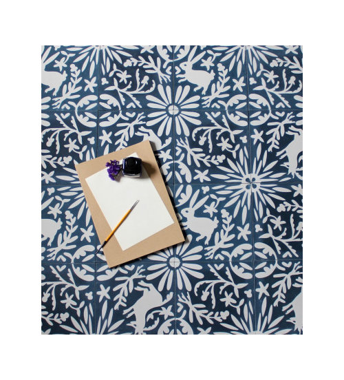
And I'm thinking of doing this backsplash:

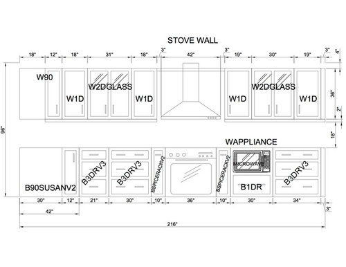
On my stove wall and side sink (kitchen is not installed but backsplash has a lead time of 6 weeks so I need to make a decision as cabinets will be installed in 5 weeks, so I can have backsplash in time):


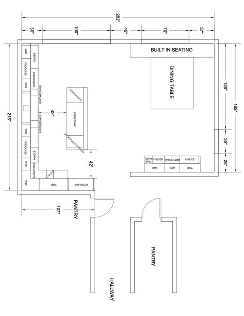
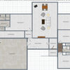
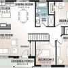
Here is the floor plan:

The other walls will painted Benjamin Moore's Van Dusen blue:

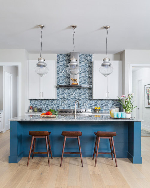
I've also seen 1 photo of the backsplash installed on Houzz and it's this one:

Modern Farmhouse · More Info

Countertops: I will either go with a light grey quartz on wall and white quartz on island, or white quartz on both wall and island.

What do you guys think? I know having an actual pictures would be more helpful, but with the lead time on this backsplash, I'm trying to figure this way in advance. Is it too much? Should I only put this on the stove wall and not on the side sink (I can have the counter material be installed as backsplash)? Pick a different backsplash?

Comments (24)

  • 9 years ago

    I think it's beautiful! If you're in love with it, do it!

    However, I am one that cannot commit to something for long, so I would love it for maybe a year and then be sick of it, which is why I tend to go more classic, like perhaps a Heath subway tile or similar in a lovely blue.

  • 9 years ago

    I LOVE that tile and think it would look great as a back splash buuuut you will want to go with a plain plain plain counter top. I'd think if you got anything with any type of movement at all, it would just be too busy. So I think I would do the white quartz on all surfaces. That way the eye would just take in that beautiful tile.

    The blue paint, where is that going? In the kitchen somewhere? I'm not sure if I would put it in the kitchen, it would just make the tile blend in. If I had that tile I'd want it to be front and center so I'd use a plain old white paint of some tone that works with your cabinets.


  • PRO
    9 years ago

    Okay so if you know you would be over it by the end of next year than the Heath tile might be the best option. The home in the above image is a work of art but living in art is not for everyone.

    bonitapplebum thanked WW Love Your Home
  • 9 years ago

    she didn't say she would be sick of it in a year, that was a comment from someone else

    I think it's a fun tile. I JUST noticed there are rabbits in it! lol. I still think it would be an awesome back splash

  • 9 years ago

    I LOVE the tile. Good choices all around. ;)

    bonitapplebum thanked Sammy
  • 9 years ago
    last modified: 9 years ago
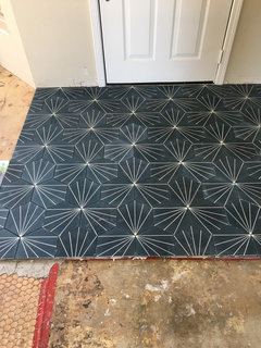
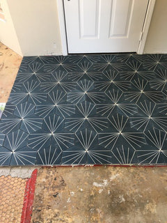
    We gravitate towards blue so much in this house that it is essentially a neutral for us now. Here is the home entrance tile that just went in yesterday:

    The blue color in the entrance tile is the same blue in the backsplash i'm considering.

  • 9 years ago
    last modified: 9 years ago
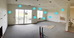
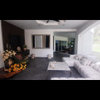
    Melissa R So here are two panorama photos (sorry they look a little stretched out and wonky) of our kitchen space. The blue dots are the walls that I was thinking of painting Van Dusen blue to match the tile. The rest of the house will be Sherwin Williams Agreeable Grey so that's also an option here.
    The second photo shows the backsplash walls - side sink and stove walls.

  • 9 years ago

    ski4life Heath ceramic looks intriguing! They have some colorful options. I will take a look at their showroom later this week as they're only 20 minutes away. Have you used their backsplash tile?

  • 9 years ago
    your selections will look fabulous in your kitchen. However, maybe you hold off on the paint until it's all finished and then decide how that paint color will compliment your room.
    bonitapplebum thanked Sandy R
  • 9 years ago
    Since you already have 2 cabinet colors, and an amazing backsplash, I would keep the quartz all one color. I love white counters and am on my second kitchen with white quartz. Little kids are a bit rougher on it than when I was single... but not sure gray would be any better. good luck, it is gorgeous.
    bonitapplebum thanked Stacy Oakey
  • 9 years ago

    LOVE This backsplash, I can't wait to see it finished.

    Ditto what other commenters said, i woud do the same countertops on all surfaces, the different island is enough change and you want that backsplash to be the focus.

    Personally I would keep the walls grey/white and do blue window treatments or blue cushions for the built in seating, but the space is large enough that the blue paint could also work if your eating area isn't too busy. All focus on the backsplash wall because that tile is just amazing!

  • 9 years ago

    So I went to the Grow House Grow website--because I just HAD to check out their stuff!--and either their website isn't optimized for iPad or my iPad is being wonky. If any of you is using an iPad, could you see if you have issues when you try to scroll down? Here's the link: http://growhousegrow.com/shop/otomi/

    bonitapplebum thanked Sammy
  • 9 years ago

    I would only do that tile on the stove wall just like the inspiration. I think it will be overkill all around the kitchen.

    bonitapplebum thanked jck910
  • PRO
    9 years ago

    akaur007, your kitchen palette is great! can I ask if you could share the specs on the floor tile in the photo? it's amazing!

    bonitapplebum thanked MOVAdesign
  • 9 years ago

    jck910 Do you think I can just put the counter material on the side sink as the backsplash or should I be thinking of a matching white subway or such?

  • PRO
    9 years ago

    My apologies for the confusion but I wanted the spec from this image:

    Thank you in advance. Btw, the Crosscut tile is incredibly interesting!

  • 9 years ago

    Beautiful choices! I don't think you'll be tired of it in 1 year, but in 3-5 yes, probably. It's just what usually happens with a bold unique backsplash, but that said, if you love it then own it and dive in with both eyes open. I agree with one person about using white countertops everywhere, but disagree another about going with white walls. I think the Van Dusen Blue (yummy color btw!) on all the other walls will pull the backsplash on your stove wall and on your side sink wall together. The design is super bold and will always be a "stand out", but surrounding it with all that additional blue on your walls will soften it. In other words it will still make a BOLD strong statement but it won't be a punch you in the face and give you a black eye strong statement, LOL!

    And yes, I do see the backsplash on your side sink wall. Consider the alternatives:

    1. 18" x 80" of white above a white counter top with white cabinets above and below... Granted there's glass in the upper cabinets but Yikes, TOO MUCH WHITE!

    2. 4" of white countertop extended up as backsplash on your side sink wall and Van Dusen Blue paint above that. A doable compromise, and it does break up all that white, but somehow I think it might feel like the plain country cousin ( just an expression, I watched the CMA's from start to finish and know there aren't really any plain country girls any more...) compared to the dressed for success city cousin a few feet away...

    So I guess I'm saying go BIG AND BOLD in both areas!

    Question: What are the finishes for your built in seating and dining table? If there's room for a pillow or 2 consider Mexican Otomi embroidered fabric. CasaOtomi on Etsy is a good source with pricey but quality products. There are many cheaper ones as well. Just mentioning because your backsplash immediately reminded me of this fabric and they do have an occasional bunny... :-)

    bonitapplebum thanked Deb Burdi
  • 9 years ago

    movadesign Oh that's okay. The entrance tile is Hex Navy from www.cementtileshop.com. Another very fun tile!

  • 9 years ago
    last modified: 9 years ago
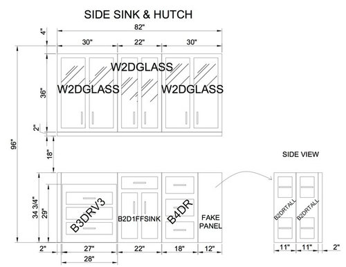
    Deb Burdi Thank you! That's exactly why I went looking for a matching blue paint. On the side sink wall, the white wall cabinets are centered and leave about 20" of space on either side. I started thinking of a blue paint so that white and blue on that wall would look balanced.

    I like the idea of adding otomi fabric pillows. I haven't even gotten around to upholstery or even shopping for a dining table yet, but I'll add this fabric to my list. Thank you for that excellent tip!

  • 9 years ago

    Hah! I stopped reading to write and fix dinner after the first entrance tile pic above. (Which btw, is also a spectacular tile choice). After seeing Sammy's post just now I realize why your tile reminded me of Otomi...it IS Otomi! Sheesh!

    bonitapplebum thanked Deb Burdi
  • 9 years ago

    Deb Burdi Thank you for that link. Having a pillow in the same design is really going to tie everything together.

    I've had my eye on otomi for a while now, and was so happy to find this tile. Even if I get tired of it in 4-5 years, it'll still be worth enjoying for that long. Our home is California Mission/90s Modern on its exterior (spanish tile roof, half moon windows), so I think the tile will add to the home, should we sell.

  • 8 years ago

    kingqueen007 what did you decide to do? are you happy with your decision? I'm struggling with decision re: a bold backsplash myself right now!

Sponsored
Wannemacher Interiors
Average rating: 5 out of 5 stars26 Reviews
Customized Award-Winning Interior Design Solutions in Franklin Cnty OH