Software
Houzz Logo Print
mrcotton73

need backsplash help for alaksa white granite & maple cabinets

9 years ago
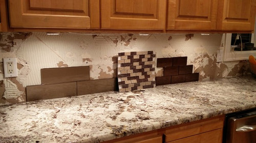
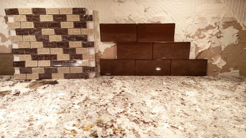
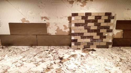
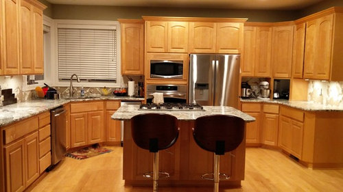
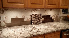
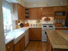
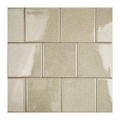
We just had Alaska White granite installed for our kitchen counters. Out cabinets (and hardwood floor) are light maple. We need some help with backsplash choices - I have attached a picture with two glass tiles (one is more of a coffee color and the other more brown) - both have metallic look.. Which one would go well with the counters and cabinets? We are planning to make the island espresso (using the rust-oleum cabinet transformations kit). We are also planning to add a mosaic accent- 4" wide in the middle of the backsplash . Any help / suggestions would be appreciated.


Thanks


Sam

Comments (35)

  • 9 years ago

    I like the medium brown colour of the three you are showing. Maybe you could look for a similar tile but in an even lighter colour of brown. I feel like it is still a bit on the dark side.

    The dark brown is too dark and the multi-colour mini brick is too busy against a busy granite pattern. I think you should consider skipping the mosaic stripe. I find that look to be dated now and 4" wide is a pretty overwhelming stripe. I really like the granite.

    Would you consider replacing your blinds with fabric shades or blinds? They aren't adding anything to your overall look, although I know you may need them for their functionality more than their fashion sense.


  • 9 years ago
    For me, the problem with a busy patterned countertop is that any pattern in the backsplash, be it color, shape, or layout, then competes with the countertop, and both lose. A cream subway tile, glossy finish, will not compete with the granite. A glass mosaic as you've shown will definitely draw attention from the countertop, and not in a good way.
  • 9 years ago

    I agree completely with MV...the lighter solid colour is the best of the three, but I'd go even lighter. Are you committed to the taupe paint colour visible above your cabinets? It could be the lighting, but it looks quite green in comparison to the other colours you have in your kitchen. (Bet you're excited about that countertop!)

  • PRO
    9 years ago

    I would pick the glass one on the left. I looked at the whole picture. I think the one on the left will help your cabinets pop, if you go lighter then that your tone will be competing with the cabinets and start to get muddy looking. If you look how your dark stool backs look you will get an idea of how the darker tile would look as your black splash which is a bit too much pop. I agree with the others that a sold one will be best. I think some pendants over the island would make the whole project look complete

  • 9 years ago

    Your counters are beautiful and dramatic. Don't add more drama in the form of a busy or dark backsplash. All "technically" match but you'll hate any of them once installed. Brand new Design Dilemma--Help, my backsplash was just installed and I hate it!

    Neutral is the way to go.


    Fireclay Birch


  • 9 years ago

    Check out Fireclay on line and if you call they'll send up to 5 free samples. These are lovely tiles and they won't overwhelm your counters or make your kitchen too dark.

  • 9 years ago
    Lighter and solid for sure.
  • 9 years ago
    The lighter brown of the three choices.
  • 9 years ago


    First, let me say that I love your granite selection. So pretty!! Alaskan white was one of our top choices too but we went with Giallo Ornamental White. I wanted the lightest granite I could afford because of the darker cabinets and that turned out to be it. While I like the lighter tan subway tile that many others liked, I would also go even lighter on the backsplash as many have indicated if you go with that. My top choice though: I really, really love the glass mosaic tile back splash option that you have - but I would consider a lighter toned option. If you are worried about what is trending - don't go with it because I think the mosaics are unfortunately on their way out design wise but I don't care because I just love ours (see pics). The one we chose has cracked glass and ceramic pieces. The cracked glass catches the light and I'm a magpie - love anything sparkly, even this subtle tile. Good luck!! I think if you go a shade or 2 lighter than what you have, either the glass subway or mosaic will be fabulous.

  • 9 years ago

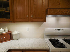
    I used ordinary cream subway tile and I love the simplicity of the look. There is a lot going on in a kitchen in real life and a busy backsplash just adds to the visual confusion and distracts from the pretty countertop.


    My pics -work in progress: · More Info


    My pics -work in progress: · More Info

  • 9 years ago
    What about going lighter with the tile and a brown grout? This is mine paired with Bianca Antico granite.
  • 9 years ago

    Solid lighter brown is definitely the best.

  • 9 years ago

    Thanks everyone for the comments. Really helps. My wife was leaning towards the lighter brown - turns out wife is always right ;)..

    Couple of comments - the bar stools appear way too dark in the picture - they are a warmer brown tone - not espresso; the cabinets appear slightly more darker in the picture too - they are a shade lighter. The tiles themselves are also slightly lighter - the dark brown glass tile isn't quite as dark - but still very dark - especially at an angle. Looks like we will pick the lighter brown - I hesitate to go too light because everything will start looking the same shade (floors, cabinets, etc..).

    Pendants are a great suggestion and we will add them. Someone asked about the paint color - yes it's a taupe with greenish hue, runs thru' the entry hallway and all the way into the kitchen, family room and nook and we hate it (was there when we moved here) - it's on the list after the tile is done. We will go with a light / bright neutral shade for the family room and entry hall - for the little bit of wall in the kitchen we were thinking a bright red or crimson - too much pop?

    Thanks again.

    Sam


  • 9 years ago

    Sam, it's going to be a great kitchen. And yes, of course your wife was right! ;)

    I was the taupe commenter, probably because we also bought a house with taupe walls EVERYWHERE and we don't love them. I would worry a bit about red or crimson on that small bit of wall, as I feel it would take focus away from your other beautiful elements. I would probably stick with a neutral that works in family room, entry and kitchen, and add some fun red elements elsewhere...a KitchenAid stand mixer on your beautiful new counter, for example.


  • PRO
    9 years ago

    Far left, lighter brown - for sure!!

  • PRO
    9 years ago

    much better choices above from Beth.. Stay lighter

  • 9 years ago

    Thanks again for recommendations. I hesitate with very light choices because everything is light in our kitchen - floors, cabinets ..


    Beth H - I like the 2nd and 3rd pictures you have in your post - can you tell me what the names are? We saw a similar tile today - manhattan sand by pental - which looks very similar..

    Thanks

    Sam


  • 9 years ago

    Actually, you have a lot of mid tone surfaces, but few if any "light" surfaces. White kitchens with light counters and backsplash have a lot of light surfaces - and they are very popular.

    Many who come here for a recommendation on how to brighten their wood kitchen have an overly dark backsplash. Get a sample jar of paint the same color as the backsplash you are considering. Paint the backsplash area that color and live with it a week - on sunny days and cloudy days. Everyone has different taste. I like a light and airy kitchen. Others may prefer darker, but a handful of tiles will not give you the big picture.

  • 9 years ago
    last modified: 9 years ago

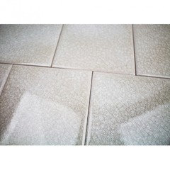
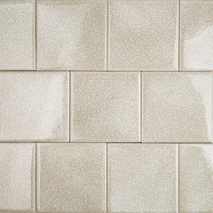
    2nd pic is Nabi by http://tilebar.com/shop-by-colors-now/brown-biege.html

    they also have

    I actually have a sample of this 4x4 (Roman) and it's very nice til

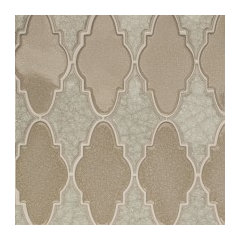
    and the 3rd pic you asked about is crackle glass in Flax from Floor and Decor (cutting those tiles needs an experienced tile setter with a very good blade). Although I would be careful w/buying their tile. It isn't known for it's quality.

    S R thanked Beth H. :
  • 9 years ago
    last modified: 9 years ago

    actually, I really like this color better. it will go w/the whiter tones in your stone.

    and they have it in a few different shapes too just look up Frosty Morning in their search bar . they will send you 5 samples for 5 bucks. get a few and see how they look next to your stone.

    http://tilebar.com/roman-collection-frosty-morning-4x4-glass-tile.html

    S R thanked Beth H. :
  • 9 years ago

    I'm interested to see what back splash you decided on, please post a picture!

  • 9 years ago
    Great choices! I would go much lighter.
  • 9 years ago
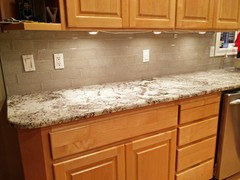
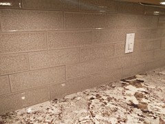
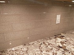
    Thanks everyone for the interest and suggestions. Here are the final two contenders - we went with the one on the right (lighter color - Taupe Crackle glass tile from Floor & Decor). I really liked the look of the other one - Spanish olive from tilebar.com - but ultimately we picked the lighter one. It's getting installed next week so I will post a picture when it's done.
  • 9 years ago

    SR, make sure your tile guy has a very good diamond blade for glass tile. I've heard some complaints about F&D quality. These tiles have a tendency to chip badly when cut.

  • 8 years ago
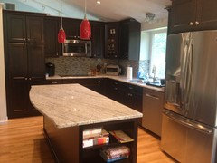
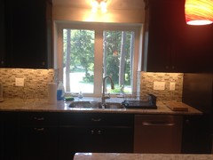
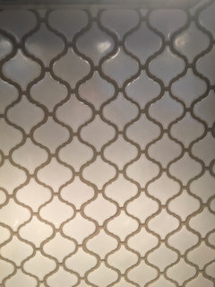
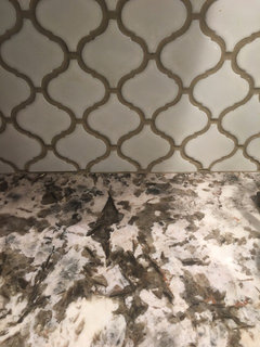
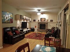
    Thanks to everyone that replied with suggestions and sorry for the long delay in getting pics posted, but here they are. The F&D times actually cut surprisingly well - no rough or chipped edges. The tilebar arabesque tile that we used in the powder bath wasn't too great however. Now on to the next step which is to decide wall color in the kitchen / family room. We keep waffling between a light / bright color for the whole area ( BN Chatsworth cream?) or doing the small kitchen wall area in a darker color (dark earthy brown or red - BN moroccan spice) and keeping the rest of the space light.. Any suggestions will be appreciated..

    Thanks
  • 8 years ago

    I don’t like the busy pattern but the other two are nice!

  • 8 years ago
    Great choice loving it
  • PRO
    8 years ago

    The darker of the three is best. The varied one is too busy and the lighter one looks good with the granite, but not the cabinetry. Show us after photos!

  • 8 years ago

    Pacific Dream,,,it's already done. ( you should read the dates before commenting!) scroll up 3 comments for the after pics

  • 8 years ago
    Of the three possibilities, the darkest one is less likely to be problematic. A clean white would compliment the cabinets and the countertop.
  • 8 years ago
    Of the three possibilities, the darkest one is less likely to be problematic. A clean white would compliment the cabinets and the countertop.
  • 8 years ago
    Of the three possibilities, the darkest one is less likely to be problematic. A clean white would compliment the cabinets and the countertop.
  • 8 years ago

    you guys commenting,,,,she's already done! post is a year old!

    This is the after shot. scroll up a few comments before you post something.

  • PRO
    8 years ago

    somehow ended up in my feed- maybe because of the two recent posts. I do not read others posts before posting - I have my own opinions and don't really want to see the photos and suggestions by others first! I love the tile with the counter!