Software
Houzz Logo Print
moggala

too much color?

9 years ago
Hi all,

I'm so incredibly impressed by the folks here who have a great eye for design and an important sense of the practical. I would be grateful for any advice you might give.

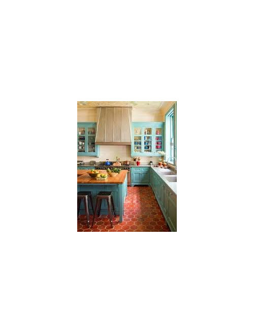
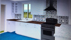
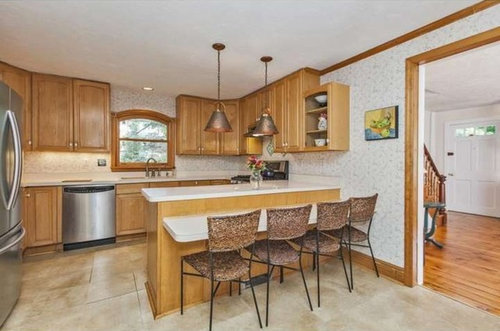
Last year we moved into an old farm house (probably circa 1870) in central Jersey. The kitchen and sunroom (the latter an addition on a slab) desperately need redoing but we are completely unhandy and have to pay for all the work to be done. We are educators so there is not a huge amount of money for this so what is done needs to be done well and last. This is our home at least until the kids hit college; the younger of the two is 8. I think there is little to discuss with the layout, my concern is whether we will go too far in wanting a fun, colorful, homey feeling kitchen and end up with something that looks like Caillou's house in the kids cartoon. Since the house is so old, none of the floors are remotely level and so we have been told our best bet is to lay a sheet material in the kitchen (though some people claim we could put down wood, or engineered hard wood -- I hear conflicting reports on which of these will hold up better on a sloping floor). My inspiration pic has light turquoise cabs and a terra cotta tile floor. I have talked with my husband about putting down red marmoleum or some combination of red and orange (sorry, I seem to have accidentally posted a picture of the kitchen in the middle of this paragraph and can't figure out how to remove it)

but we are afraid that the red is too much red and we find the sort of terra cotta color that they have off putting (with too much of a tendency towards pink). Anyone have other ideas about the floor? And what kind of counters would you put with that? We like the butcher block but also wondered about soapstone, if it were affordable. Also, would you put the same floor in the sunroom?And if not, what on earth would you do? (it bothers me to see three different floors as you look through from the living room to the sunroom but perhaps that is silly.)

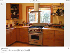
Here is the inspiration pic:

Comments (28)

  • 9 years ago
    last modified: 9 years ago
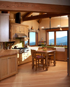
    I still love sandyponder's colorful kitchen


    I personally would want the same floor in the sunroom.

    moggala thanked cluelessincolorado
  • 9 years ago

    I wouldn't do a colorful floor with turquoise cabinets. And I would put the same flooring in both the kitchen and sunroom -- perhaps a natural cork?

    moggala thanked my_four_sons
  • 9 years ago
    last modified: 9 years ago

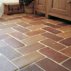
    Not too much color, but possibly the wrong colors. Terra-cotta comes in a variety of shades from red to brown. I'd go browner, like these tiles from Fired Earth.

    I understand funds are limited, but if your floors aren't level, the answer is not to use sheet vinyl, but to level the floors. If that means lifting off several levels of material and laying a new subfloor and floor, then that's what you do. It will never be perfect in a house that old, but it can definitely be improved. You can do some of this yourselves. Then feel free to use marmoleum or whatever else you like.

    moggala thanked eam44
  • 9 years ago
    last modified: 9 years ago

    I like the brick look, even if it's not actual brick. I think other styles of terra cotta tile will look too Mediterranean or south western. And red marmoleum with blue cabinets will be very Caillou-ish.

    moggala thanked reesepbuttercup
  • 9 years ago

    Nothing to contribute except to say I love your inspiration photo!

    moggala thanked sheepla
  • 9 years ago

    Specs on sheet marmoleum call for a pretty much perfect subfloor. Forbo-approved installers are pretty much the only ones in the game, since real linoleum has been almost absent from the market for 50 years and is much different from installing vinyl. There's a good chance those installers wouldn't want to do a floor that's out of spec. It's a big part of the reason we went with click Marmoleum instead of sheet.

    As long as your foundation is stable, I don't see why you couldn't do tile on a slanted subfloor if your budget won't allow its repair. Terra cotta is an imperfect product and seems to me like it would camouflage any underlying cosmetic issues. If your house still shifts, or there is weakness in the subfloor, repair it.

    moggala thanked townlakecakes
  • 9 years ago

    That Asian Tiger is what drew me to Marmoleum in the first place. DH vetoed all the warm colors for our floor.

  • 9 years ago

  • 9 years ago

    In our roughly 12 x 12 kitchen we have a 1/2" drop in the floor. We have bamboo flooring and there is no problem. I would suggest that for you except that you have hardwood out in the entry and, I assume, the rest of the lower level. A mismatch starting at the kitchen would be odd.

    Have you considered Marmoleum Click using 2 colors on point? That might be a really good look in an old farmhouse with turquoise cabinetry.

    moggala thanked suzanne_sl
  • 9 years ago
    last modified: 9 years ago

    I think this is an excellent place for luxury vinyl plank tiles (peel and stick) . They are much more forgiving than real tile and are similar to marmoleum. It being an old house one of the barn wood looks might be a good candidate. And definitely same floor in the sunroom. I love blue kitchen cabinets so I like the inspiration.

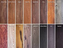
    It comes in colors

    moggala thanked ravencajun Zone 8b TX
  • 9 years ago

    Thank you all so much for your advice! What I've been told is that we can get the floor more level but to get it close to perfect would be nearly our whole budget. And the people we spoke to said we couldn't use the click but had to use the sheet. Do you think they are wrong, townlakecakes? It is frustrating if the professional that you speak to has the wrong information! We are pretty clueless ourselves. I agree that it needs to be the same color in the sunroom and the kitchen. And I'm partial to cork but my husband thinks it is not a good idea in a highly traveled, liable to get wet area. If we can do click, Cawaps, I wonder if all three of the colors you posted would work together on the floor? Maybe it would end up giving that varied, terra cotta feel.

  • 9 years ago

    Ravencajun, I am somewhat tempted by the luxury vinyl because we could get something that looks like terra-cotta but we prefer to put natural materials in the house if possible.


  • 9 years ago

    Suzanne_sl, yes, the floors in the living room are the original pine floors and we did struggle with what we could put adjacent to it that wouldn't look weird. My husband would just like to put wood in the kitchen but I know we would never be able to match 150 year old pine so I was stymied by what to do next (plus everyone keeps telling us wood wouldn't last on the uneven floor). What does on point mean? I like the idea of two tones on the floor.


  • 9 years ago

    Reesep-buttercup, I suspect you are right about the red and blue being too Caillou! :) Would you try and put wood down? My husband also says he doesn't want real tile/terra cotta even though he loves it because it is too cold (and he is really OCD about letting the kids walk around barefoot if someone breaks a glass -- he is convinced that the shards of glass linger for years waiting to stab someone in the foot).

  • 9 years ago

    We don't have ours in yet, but I've done a lot of reading, including the install specs on both products. The sheet product will show every imperfection in your floor. We accidentally found a pretty new install of sheet in the bathroom at our bank. Lots of bumps. Marmoleum is a lot softer than vinyl, so I guess it kind of molds around those bumps and up they come. Ditto small holes.

    With an underlayment, click will probably go over very small imperfections. It will not, however, tolerate changes in slope because unlike most wood floors these days, it has square edges with no bevel at all. The bevel On wood floors is there to disguise small differences in the height of the lip. If your floor is wavy, click won't do, if it's flat but just leans a bit, it might, but sounds like your floor guy doesn't think so

    Sheet vinyl probably won't care as much what your subfloor looks like. Plank cork will have the same issue as any plank floor. Glue down cork tiles, site finished, might be an option. From what I've read, I think they are less prone to water damage

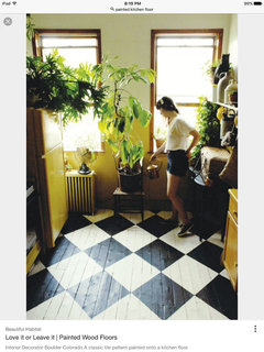
    heres another idea...painted solid pine. It would be suitable for the style and age of your home and now worries about matching existing

    We were hoping for a more level floor than we got in the aftermath of our foundation repair, but it's uneven enough that we're using self leveling concrete so we can get the best possible result with the click. And since we got the click for $4.50/sqft instead of the $6 we were planning on, and we're laying it ourselves, the super expensive concrete won't break the bank.

  • 9 years ago

    Townlakecakes, would love to see a picture of your floor that showed more of the Asian Tiger...do the swirls stand out less or more once you have a large amount of it on the floor?

  • 9 years ago

    Oh, sorry, I see you haven't put yours in yet! :)Painted pine is an EXCELLENT idea!


  • 9 years ago

    With really old wood floors elsewhere in the house I wouldn't try to match, or even attempt anything "wood look". Personally I'd probably go with tile/brick or possibly marmoleum maybe with a boarder or check to give a vintage feel. Your home sounds lovely by the way, I love the old farmhouses out there.

  • 9 years ago
    last modified: 9 years ago

    We didn't go with Asian tiger ... that's just a pic I found online with the right sort of color scheme. I was open to any non-neutral but DH pretty much just wanted blue. No warm colors, no green, and neither of us wanted purple. We've got lapis lazuli going in.

  • 9 years ago
    last modified: 9 years ago

    American Clay Earth Plaster · More Info

    I'd like to throw out an idea for you after seeing your inspiration photo. The kitchen above has a product on the walls called American Clay Earth Plaster. They're on Houzz and have a website. I used American Clay on all our walls, including in our kitchen. Your wall paper is comjng down, I assume, and this stuff totally fits a farmhouse. I thought of them as soon as I saw your photo.

    It's is really easy to apply as a do it yourself project. You mix it until it's about the consistency of soft serve ice cream, trowel it on, and scrape it down with your trowel. It needs to have taped drywall seams but unlike painted drywall, the seams don't have to be perfectly smooth. Part of its beauty is the imperfect, hand applied look. I saved a fortune by mudding our drywall and Claying our walls. If it gets marred, you just slap on some more, or trowel off the mark.

    I'm not an American Clay sales bot, but I am a huge fan. Take a look at the website. I really think it could be so fun for your kitchen.

    I mostly used white, but here's a terra cotta I used in a mini bath.

    moggala thanked barncatz
  • 9 years ago

    You mentioned doing multiple colors in Marmoleum Click. I just wanted to say that they can do amazing things with multiple colors of sheet Marmoleum, too. If you Google "marmoleum pattern floor" it will turn up lots. Some of them might be Click, but many of them obviously are not, with curves and odd angles.

  • 9 years ago
    last modified: 9 years ago

    Hi Moggala --

    Big fan of lino weighing in, here.

    First -- If you haven't already make sure you take a look at Armstrong's lino line too. It may just be under their commercial line, can't recall/too lazy to check. But worth a look at their colors.

    Second -- I don't know if you've hit up the commercial flooring places yet (vs more boutique ones that cater to homeowners). Often they have remnants that are PLENTY big for home spaces, at a nice discount. Given the width restrictions of lino sheet you often end up having to pay for more material than needed, so it's nice to save where possible.

    Third -- If you're dealing with experienced lino installers, trust what they tell you re Click vs sheet. There's out of level and then there's WAY out of level, and that may make a difference.

    You need the *luan underlayment* they will put in over your subfloor to be perfect for a good sheet lino install, but my old-house floors have not been level. Since we were doing kitchens and bath we did sheet in all 3 for minimum seams. You might be able to do the sheet in the kitchen and DIY Click in the same color in the sunroom.

    In my area labor + luan was more than material so be prepared. It's definitely not a cheap solution.

    Four -- Don't fall in love with borders/inlays etc in sheet lino if budget is a concern. Just don't. ;) However, if you end up using the squares or Click then go for it! A two-tone look in the sunroom using your main/only kitchen color could be fun and create a nice dialogue between the rooms.

    Ok, now: color talk!

    Can't discourage you from blue + red or orange as I love bold shades and vintage-inspired kitchens can really take a lot of color!

    However, while I know you're considering several Forbo Vivace color-colors -- have you seen the more neutral Donkey Island and Granada in person yet?

    Both have rust marbling that make them beautiful next to old-growth fir so your OG pine should really be set off. Personally I'm a fan of having flooring seen from room to room be tonal -- it just seems to keep the flow going. The Donkey Island or Asian Tiger will do a better job with that.

    You can't really tell from the online detail, but the Donkey Island also has a slate-y blue in it that will provide a subtle echo of turquoise or blue cabs. [I used it with dark and sky blue tile]

    DO try to get the largest samples you can, but even small ones will help. Good luck, keep us updated!

    moggala thanked House Vixen
  • 9 years ago

    On-point means set like the black and white painted ones in townlakecakes's photo.


    moggala thanked suzanne_sl
  • 9 years ago

    Cawaps, I think we have similar design minds! I have spent days drawing patterns for different possible floors with the sheet lino when I ought to be grading essays. I love so many of the possibilities but I keep coming to the conclusion that those patterns end up looking very modern and I'm trying to maintain something of the old farmhouse feel. (Although the previous owner put two huge, hideous windows at the front of the house that seriously mess with that look.)


  • 9 years ago
    last modified: 9 years ago

    House Vixen, thank you for all your advice! I think we will probably end up going for one color with a border in the kitchen (but your point about that increasing the price considerably is well noted). And I think you are right that carrying it on into the sunroom would be wise. We are cutting out a large section of the wall between the tiny, useless eating area in the kitchen and the sunroom so more of the floor might be visible. And also there will be some natural light in the kitchen. Hurray! It is funny you mention the donkey island and the grenada, those were the first two that we brought home. I thought the donkey island read pinkish in the wrong light so I nixed and my husband didn't like how busy the grenada was. So they both went back. But I wonder if we should revisit them -- that was before we had settled on turquoise cabinets as our starting point. And I keep telling him that we won't notice the swirls as much once a lot of it is on the floor but he doesn't believe me And I'm just saying it. For all I know the opposite is true :)

  • 9 years ago
    last modified: 9 years ago

    barncatz, thank you! I didn't know that something like that could be done by a relative novice. I will definitely show that to my husband and see what he thinks! (And yes, can't wait to get rid of the hideous wall paper!)

  • 9 years ago
    last modified: 9 years ago

    Hi again Moggala --

    You may want to revisit the samples as I'm sure your current kitchen finishes are reflecting light. Possibly take a look at them in the LR, too. I wouldn't have said DI skewed pink, but geographic setting plus overhead lighting can certainly make or break!

    [In my area it's a slightly warm sand color.]

    And welllll -- Marmoleum Vivace is definitely one of the busier subsets of lino!

    So your husband's concerns aren't totally unfounded. TBH I was a little concerned myself but my space was small (bath) and the DI is such a neutral despite the swirls. Plus what can I say -- it was just a clear winner, even if sometimes it does look like a carpet pad to me.

    Have you looked at their more sedate options?

    The Real and Fresco are much quieter. The Armstrong Marmorette options are pretty sedate in terms of marbling, too.

    To me the pro/con of the Vivace is that you *do* see that lino patterning pop out. My particular Real and Marmorette floors really read more solid unless one's staring down (or scrubbing!) them.