Software
Houzz Logo Print
brandy_brenner

Advice for next steps

9 years ago
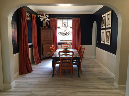
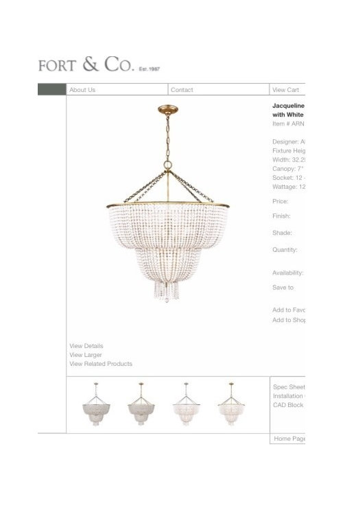
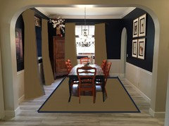
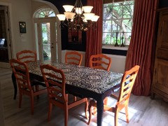
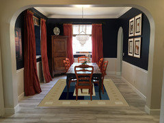
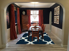
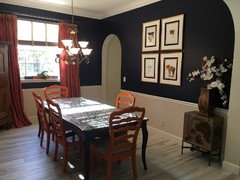
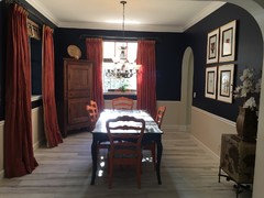
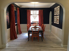
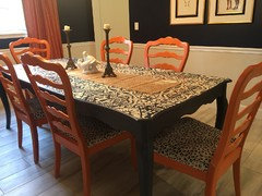
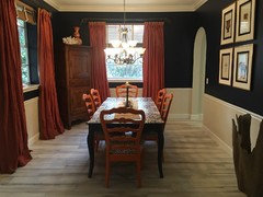
I'm in the middle of a dining room redo and I've changed just about everything in this room. I changed the floor, painted the walls, and painted and reupholstered the dining room table and chairs. I recently ordered a new chandelier and I'll include a photo of it. My questions are about the finishing touches.

Do I need another piece of furniture in the room? Does it seem empty?

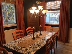
What should I put on the table?

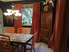
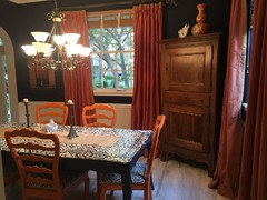
Is the arrangement on the armoire nice or should I try something else?

Is it ok without a rug?

Comments (36)

  • 9 years ago

    ^^ totally agree.

    Beautiful room!

  • 9 years ago

    I'm not digging the two-toned walls. I would suggest removing or painting the chair rail and the wall below black, but I don't think that would work with the flooring.

  • 9 years ago
    Rug suggestions?

    The wall looks darker in this photo, it's actually navy. The two tone took some getting used to, but I think it keeps the room light and ties into the rest of the house.
  • PRO
    9 years ago
    last modified: 9 years ago

    Patterned draperies wouldn't be bad for the windows either.

    Nice room, and I like the blue with the white wainscot, but the orange/rust was a bad call IMO. Looks like Chicago Bears dining room.

    I would change out the drapery panels to white, flax or camel or patterned, and add a natural fiber rug with blue border under the table.

  • 9 years ago
    Lol! Beverly you are from Florida, you should have said gators!!! (We live in Florida too).

    I love the drapes. More than the wall color actually... but I'm keeping the color scheme. I do like your rug suggestion though. Thank you!!!!!!!!

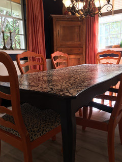
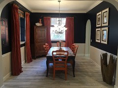
    I added more pictures. The room isn't as large as it looks in the first photo.
  • 9 years ago
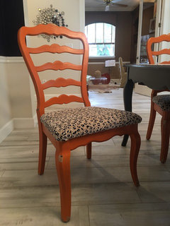
    And the chairs aren't finished. I'm going to darken the finish with wax.
  • 9 years ago

    the room looks good, a rug under the table would anchor everything. i don't think the fixtures you have pictured will work however, too much bling for what you have done. the style of the table, color of the chairs, rail, wall color, corner hutch dictate more casual than a full crystal fixture. the rug should be oriental in design with a dark border to anchor- colors should include dark wall/chair color. right now everything is floating with light color at the base and darker above. the fixture style is critical- & i like bling! perhaps a drum shade with crystals peaking from the bottom? it needs mass to stand out against the window behind it. good choices!- whats for dinner?- lol.

  • 9 years ago
    Funny you say that. The chandelier is made of white beads, so more bohemian than bling. I agree that that many crystals would be over kill. An oriental rug sounds good too, but more expensive than beige with a navy border...
  • 9 years ago
    I like what you've done and (unfortunately) agree that a rug would help anchor everything. I just hope you don't eat in there too often / don't have little kids - rugs under tables sound like a lot more clean up work than I would like. I wonder if anyone has any other ideas to tie it all together
  • 9 years ago
    You don't need to go for an oriental, and there many options between that and a bla beige with a navy border! The room seems to allow for a patterned rug.
  • PRO
    9 years ago

    Love your room and all the bold personality you have introduced!

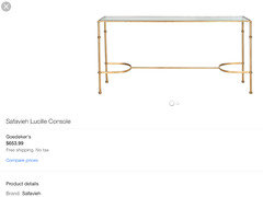
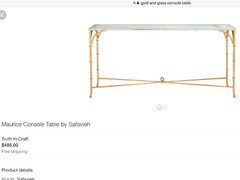
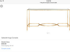
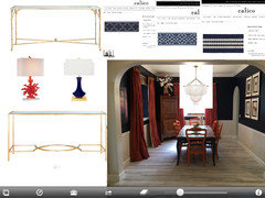
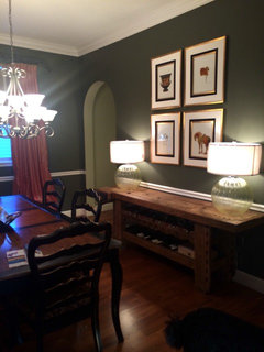
    I would suggest removing the Corner cabinet and adding a gold and glass console table to really pull in the the gold and glass lighting you posted.

    I would add a navy blue trim tape to the lead edge of your drapes..it will push them to another level in your design.

    I love no rug it is not necessary and your floors are so pretty!

    Add lamps and accessory onto console.:)

  • PRO
    9 years ago
    last modified: 9 years ago

  • 9 years ago
    Nice dining room. I thought perhaps painting a darker color below the chair rail and perhaps adding a Greek key navy border to the drapes to pull it together.
  • 9 years ago

    I would remove the vase of flowers from the top of the armoire. Agree the room could use a rug.

  • 9 years ago
    I *love* your luscious, intense colors! And I'm glad to read that the chandelier is made of beads; that photo certainly looks (to my eyes) like blinginess, which would've been too much. Please don't go beige! There are a billion gorgeous rugs... find one that makes your heart sing. It'll be perfect!
  • 9 years ago


  • PRO
    9 years ago

    No rug necessary....it is fabulous without!

  • 9 years ago
    I too don't think the room needs a rug, so impractical under tables. I love the cupboard but something about its position spoils the symmetry.
  • 9 years ago

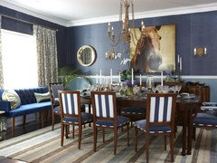
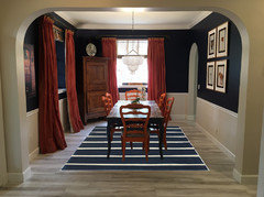
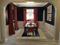
    Look at groveraxle's picture with the striped rug. It finishes the room off perfectly and repeats the wall color again. The strip is simple which goes good w/ the table top. (I have a wool rug in my dining which is easy to clean and i just vacuum it. No biggy for the amount we use it.)

    What fabric will you use for your chairs?

    I agree that the flowers on the antique cabinet are too tall. White is a good contrast there but only as tall as the vase. LOVE the chandelier.

    I keep thinking the room needs something in the front right corner but can only think of a 5' yucca-which WoULd fit in w/ your bohemian vibe! Very cool look you have going on here.


  • 9 years ago

    Brandy Brenner - I appreciate your creativity and the work you've accomplished in your beautiful dining room! The left side of the room does feel heavier with the drapes and corner cabinet appearing similar in height and color. Groveraxle's image with the stripped rug definitely provides the needed balance. Looking forward to seeing photos when the new chandelier arrives!

  • 9 years ago
    last modified: 9 years ago

    I also don't think a rug is called for here. You have managed an airy effect in the room, and a rug makes it feel static.....takes you from Boho to boo hoo. I like the idea of the trim tape, though, and also think you could use a very slight, vertical sumpin sumpin on the wall just to the right of the window, to balance off the casegood. Love that table!

  • 9 years ago
    Wow! I love the glass table and lamps you suggested!!! Adds weight to that side of the room, but the glass keeps it from feeling crowded. That may be my next purchase.

    My chairs will have a Navy and white cheetah print velvet fabric. Squeal! I just finished the second one yesterday and I have to say, I love them.

    I'll attach a before photo of the room. It was dark and formal before. I actually loved it for years until one day I didn't and decided to go for a whole new look. I kept the drapes because I LOVE them. They are silk and iridescent and change colors in the light from a deep coral to a light yellow.
  • 9 years ago
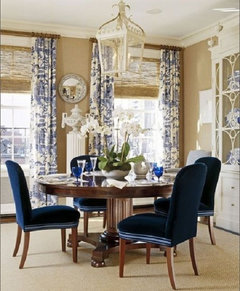
    What about this?
  • PRO
    9 years ago

    That floral just doesn't match your new edgy style.....I still think the heavy Corner cabinet needs to go and glass and gold console table to match your new chandelier is what will really finish off your beautiful space...and balance out the room...:) fabric on the chairs is Great!

  • 9 years ago
    I love the table suggestion that home interiors suggested. Removing the corner cabinet will really lighten up the space and keep the mood of the rest of the room. The glass table will keep the light feeling and tie into the chandelier. I also think the corner cabinet's angle is what is making the table float and introduce the need for a rug. By eliminating this piece you also eliminate the need for a rug (which could counteract the light and airy feeling of the room as is)
  • 9 years ago
    last modified: 9 years ago

    That is a beautiful cabinet in the corner but it is so crowded there. It throws off the balance of the room and the look of the drapes.

    Please find another spot to highlight it.

    I like your style!

  • PRO
    9 years ago

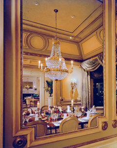
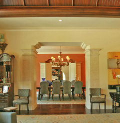
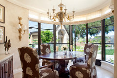
    Looks like you have some great suggestions so far. We just wanted to add a few photos of a dining room designs we've done to provide you with more inspiration.

    Bay Area Estate · More Info

    California Mission Style Eclectic · More Info

    Old Hewlett Estate · More Info

  • 9 years ago

    With the cabinet removed, I think you really need a rug.


  • 9 years ago
    I understand about the cabinet not being optimal, but it's a forever piece of furniture. We brought it back from Paris when we lived there as a young couple. I don't have another place in the house for it. I guess my love for it blinds me to the awkwardness.

    I'll lose the floral because I agree it was a stretch to reuse an old piece.

    My next purchase will be the glass table or something like it, but in the meantime does he small table help the imbalance or no?

    I could paint it navy maybe?
  • 9 years ago

    The smaller table isn't really effective there, blue or not. Pretty piece, though.

  • 9 years ago
    Yes. It was the last shot for that table. It may be heading to the goodwill
  • 9 years ago
    I toned down the decorations on top of the cabinet, added neutral pieces to the table top, and tied in the brown with a piece of cypress trunk on the right side of the room. I'm going to wait on the chandelier before I buy anything else. I really like how it's turning out. Thank you for all of your help
  • 9 years ago
    I love the drapes and the paint. I don't love the corner piece. It crowds the corner, when the rest of the room is borderline sparsely furnished. I think you should put the corner cabinet in a different room and put a not too deep buffet or console on the wall under the multiple prints.


    Replacing the two end chairs with host / hostess chairs that have solid backs might be nice.


    Overall, the room looked good when your started, and even better now.
  • 9 years ago

    The cabinet is in the corner but it's not actually a "corner cabinet" is it? It would look better if it was on a flat wall. Surely there's a place where it can shine. It is too wonderful to not give it more room.

  • 9 years ago
    It is made for a flat wall. Unfortunately I don't have a place for it other than here. I slid it over a bit. It helped somewhat. It seems more awkward in photos than in real life (at least that's what I'm telling myself)