Software
Houzz Logo Print
pensivern

Help me pick a BM off white for my bathroom!

9 years ago
last modified: 9 years ago
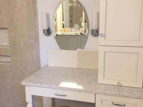

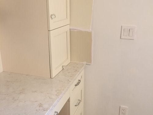
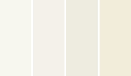
I know its tough to judge colors on monitors, but I could use some direction on wall color choice for my master bathroom. My cabinets are on the creamy side (wish I went with Dove white but too late.) My counters are Viaterra Clarino quartz and my shower walls and floor tiles are Florida Tile Botticino Classico. I like a monochromactic look but can't seem to find the 'right white" that doesn't make the cabinetry look any yellower than it already does. I want a light airy feel -so far have tried White Sand -a bit too dark, and white down-still a little too yellow for me. I keep bouncing back and forth between wanted some contrast and wanting little contrast. Any suggestions? I'm starting to think something like Ballet white with greyish undertones might give me the lighter look I seek but still allow the cabinets to pop a little. Thoughts before I spend a small fortune on more paint samples?

Comments (25)

  • PRO
    9 years ago

    The darker sample looks much more exciting against the cabinetry; although it is difficult to really gauge the color of the cabinets from the photos. The darker sample also looks like it matches your floor too closely. Have you looked at BM Classic Grey? OC-23, or BM Intense White OC-51?

  • 9 years ago
    No, I haven't tried those two. My cabinets are A creamy white- so much that they look a pale yellow next to primer white. Would I be able to put a wall color with greyish undertones with a room with all those warm colors? The background of my counters is really the only element with a greyish tone amidst the white.
  • PRO
    9 years ago

    The great thing about gray-whites are they can either be cool (blue tinted) or warm (yellow or orange tinted.) So if you stick with the warmer gray tones, it should compliment the cabinets. You can order larger color sample sheets from Benjamin Moore on their website. That way it is an inexpensive way to get a larger sample area that you can see against the cabinets. Here is the website: https://www.benjaminmoore.com/en-us/order-color-sheets 

  • 9 years ago
    In my world BM and bathroom in the same heading means something altogether different from Benjamin Moore. You had me a bit worried there for a minute!
  • 9 years ago

    I prefer the lighter swatch colour actually. It makes the cabinets stand out and goes better with the airy look you are going for.

  • 9 years ago

    I would stick with a very light warm white. You will keep the nice contrast that you have now on your walls with the primer. If you know what color your cabinets were painted you could use a smaller strength of that on your walls.

  • 9 years ago
    I had a shelf color matched at a Ben Moore distributer today- AF 45 came up- similar colors were Navaho white, white linen. I never thought about altering their strength- they all looked too yellow for me.
  • 9 years ago
    I'm not sure why everything looks SO yellow in that room with either artificial or natural light. Even Simply White looks pale yellow. I was thinking of trying Cloud White- it's the only warm white that hasn't read yellow yet ( at least in a paint chip).
  • 9 years ago

    The colors may just look "off" to you since you have them up against the grayish primer. Once that is gone you won't see that yellowish contrast. Choose a color based on how it looks against just the cabinets.

  • 9 years ago

    I used a cream shade of off white in a my kitchen that was called Seashell by BM. It went well with the darker cream tones in my granite and the bisque porcelein sink, you should take a look at it, it may work well in your bathroom.

  • 9 years ago

    Light--the dark swatch is going to look too yellow.

  • PRO
    9 years ago

    Perfect - love it. Glad you are going in a monochromatic choice. your bath is wonderful. See you found a stool for your make up area. Is that working for you? Looks cute.

  • 9 years ago
    Thanks Flo- yes, love the tufted skirted stool. It'll be great as soon as my husband attaches the 2" casters he ordered- It'll be more functional when it rolls and the perfect height!
  • PRO
    9 years ago

    Sounds like a plan! Glad that worked out. You could also make a slip cover for it in maybe a leopard print! Need some fun in this bathroom! haha! Or might need a bit of tassle trim on bottom edge of skirt to hide wheels. Or maybe you could make a "TuTu skirt of purple toule. Just something unexpected and fun. Right now, kind of "buttoned-down"! But lovely. No offense, just thinking of little punches of interest.

  • 9 years ago
    Yes, Would like to add some pop of interest to the bathroom after its painted......not so sure about purple tulle (lol) but hopefully a cute window treatment and a pic or 2 (?)
  • PRO
    9 years ago

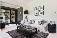
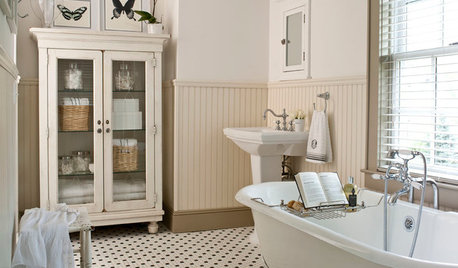
    A black and cream print would look classy and keep your theme going.

    Beechwood Manor · More Info
    Black always adds drama and sophistication. I like these simple prints on the wall here. There are also some nice painted metal pieces that might work. Just depends on what look you want.

  • 5 years ago

    Any one know what the final choice was? have similar situation except darker floor.

  • 5 years ago

    Yes, I’m the original poster and had decided on Glacier white as posted above.

  • 5 years ago

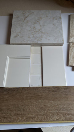
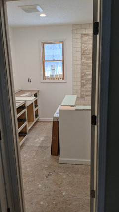
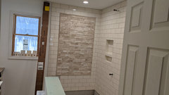
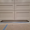
    Thank you! We have similar color tones except for our flooring is a darker luxury vinyl. I attached a few pictures. the first shows all of our material colors and the Benjamin Moore color samples for Glacier White. Glacier White is the last color tone at the bottom of the sample. the other two pictures just giving an idea of the installed tile.

    I am terrible with picking out colors. Given the darker flooring, any thoughts if Glacier White could work for us also? Or do we need to work with something with deeper color tone?

  • 5 years ago

    I just think Glacier white would look great- it blends nicely with your cabinets and your darker floors pick up the veining in your counters.

  • 5 years ago

    Pensivern,

    Thank you, thank you, thank you.

    We did three or four colors on paint boards. because we are trying to blend between the beiges and the cream-colored cabinets, glacier white was the standout winner. Heading to the paint store to go pick up paint. just out of curiosity what paint sheen did you choose?

  • 5 years ago

    One last question......I promise.

    On the color white you chose for your trim work, is there a BM color you used or did you tint it in any way so as not to stand out too much?

  • 5 years ago

    I painted my bathroom BM Paper White, I absolutely love it! Everything and anything goes with it!

  • 5 years ago

    Dewitt, no problem! I think I used an eggshell sheen and we went with BM Chantilly Lace for the trim as it’s a clean white and went well with the white toilet and sink.