Software
Houzz Logo Print
buy1soon

Not home deco..but work.. paint thoughts

9 years ago
last modified: 9 years ago

Good Morning,

I recognize many of the people here and am hoping to get some advice on paint color(s) for my work.

I am rehabbing two spaces. I am the principal's secretary at our middle school and we are re-configuring our enrollment grades and using up every inch of space in the building next year. It will be crowded!

I have ordered new furniture for our staff lounge. I have walnut wood round tables, chairs and chocolate brown "leather" high back seating going in. The space has 2 4' windows, so there is a fair amount of natural light in there, but it's east facing so by lunches you've got 8-10 banks of LED fluorescent to rely on.

The space currently is the same wall color as the rest of the walls and classrooms in the building. I want this space to not feel institutional. I want it inviting and friendly. I am going to put up "photo" art work of our scenic area we live in.

I need a color. I had settled on a warm as in brown side of mauve. But I was staring out my window at home and looking at the glorious sunsets we get and thinking that blue the sky gets would be awesome as well.

None of the schools in our district have really made an effort to make the staff lounge a different space. I want that for my staff. We have 14 new staff members joining us, most of them are from other buildings, some are from other states.

The colors must be Sherwin Williams, that is where the district gets their paint from.

I have the current fan deck sitting at my desk. Please, give me some suggestions.

I can do an accent wall as well, but whatever color that is will also be my office color likely. :) I'm finally getting my own office too.

My office is tiny, but does have an east facing window as well.

Start the suggestions.

Comments (9)

  • 9 years ago

    Apricot and aqua!

    Terri_PacNW thanked Sylvia Gordon
  • 9 years ago

    Aqua and cool taupe, like chocolate ice cream. And maybe an aqua and white stencil pattern!

    Terri_PacNW thanked melle_sacto is hot and dry in CA Zone 9/
  • 9 years ago

    I also love that part of sunsets..

    Apricot and aqua...or chocolate ice ceeam... Great direction.

  • 9 years ago
    last modified: 9 years ago

    Once I worked in a school that was designed by a prominent architect.

    It was totally amazing(it was a pre-school), each classroom was a tad different..with different windows at different heights so even the smallest kids could peek out, and stages in the classes for older kids so they can perform there.

    So the walls in each classroom were painted in two colors-very pleasant blue..not baby blue..and bluer then aqua..I don't know how to call it. Maybe deep sky blue? And yellow. Each classroom had some blue walls and some yellow walls. It looked very cool. It didn't look busy at all..but true, it was designed in advance to handle such contrast very well-lots of light, everything's highly considered, architecturally speaking.

    Several years later(I wasn't working already), I read that yellow contributes to intellectual stimulation, while blue is good for quiet, and thus helps creativity..:)

    Obviously the prominent lady who designed the building knew that and much more.

    So..think how you want to feel there, and what are your main activities there will be. And if you think you could benefit from different colored walls-there might be a wisdom in that too

    I highly recommend a wonderful book by Janice Lindsay, "All About Colour". Besides it just being an amazing source of knowledge on how and why we perceive colors and how it manifested itself throughout human history and influenced art, etc-she also writes about several projects where she was invited to paint schools..how she went about it, why, and what influence it had on teachers and students.

    Terri_PacNW thanked aprilneverends
  • 9 years ago

    Wythe blue is gorgeous.

    Terri_PacNW thanked Yayagal
  • 9 years ago
    last modified: 9 years ago

    Hi Terri!

    Waving at you from the PNW. You must be in a drier part if you seen colors other than grey in your sunsets. ;)

    What an awesome project to take on. And congrats on your upcoming door, too!

    • If you really share my long overcast winters, I'd look for shades with some warmth to them...complex neutrals with red or green undertones; brighter shades that skew green; warm ivories or yellows.
    • If there are a lot of trees out your window bank, keep in mind your natural light will have a greenish tint (amount will vary seasonally depending on evergreen vs leafing).

    I know it's harder to answer with a lot of new staff coming in, but in general do your folks need more of a place to destress (so, spa-esque colors) or to revitalize (so, high-energy shades)?

    ** CALMING **

    I think a lot of the usual green-grey-blue suspects you see on the GW forums would be a good place to start. I'd just make sure they didn't skew too blue in your space (test test test...no pun intended!).

    So: Sea Salt; Rainwashed

    I'm going to put in a plug for an oldie but oft-goodie that's having a resurgence:

    Halycon Green (column 1, row 2 below). Looks great with walnut shades, great backdrop for photos and art, underused as a LR/DR color. Basically if you test lighter greenish grey and think, "I mean it's pretty, but kind of meh...." you may love the medium depth of this one.

    Paint Landing · More Info

    ** VIBRANT **

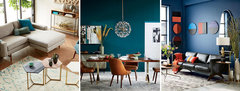
    I have to say if a room can handle it, I love a deep teal to revive without the overstimulation that orange, bright leaf greens, and bright yellows can bring about. Also awesome with browns.

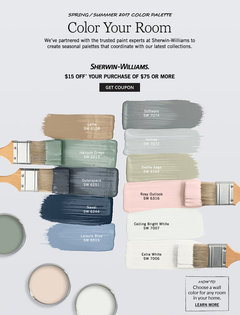
    SW has a ton of turquoise/teal colors but take a look at Oceanside (center image) and then nose around your fan deck. Here's the SW link to these SW/West Elm collab images

    Your Sherwin-Williams · More Info

    ** WARMING **

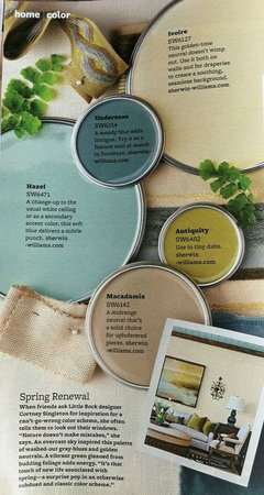
    Lastly for now, I wanted to put a spotlight on one of my favorite creamy yellows, Ivoire (top right). Inviting Ivory is similar.[The deeper "Blonde" is a great mellow old-gold shade, too.]

    At least in my part of the PNW, people LOVE those 2 shades. Even the non-yellow-lovers, ha.

    They're pretty flexible, so you could likely use either of them as your accent wall/office shade.

    Or you could consider making them/something similar your main shade and accent with the aquas, teals, etc as they've shown below with Hazel and the muted teal, Underseas

    Explore Interior Color Schemes, Interior Colors, and more! · More Info


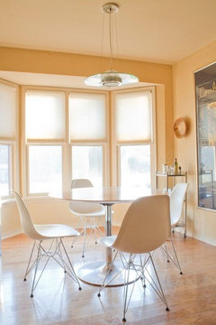
    ETA: Here is Blonde throughout a home that's very inviting (and has lots of dark brown accents)

    One shot:


    Jean & Don's Mix of Modern Classics · More Info

    Terri_PacNW thanked House Vixen
  • 9 years ago

    Thank you for the very detailed post. Lots to toss around.

    Funny, I put Hazel on the list today. Together with macadamia...hmmm...I'll look at that one too.

    There is a tree outside my office. It's dark burgandy leaved.

    I'm not sure what the staff's use is beyond lunch times.

    I leave campus and go home usually. I get no rest if they can find me.

    So I don't really use the lounge, except for setting up potlucks. :) which we have 2x a month.

    I think spa like is where I was heading. But not to "quiet".

    Yesterdays sunset standing on my front steps. Past the tree line is the Strait and just a hint of the Northern tip of the Olympics.

  • 9 years ago

    No ideas, but wanted to say hello!! Haven't "seen" you for a long time, but I am still using some of your candles in my wax melter :^)

    I am of the green school for restfulness...a very calming sage with a bit of décor in bright pink!

    Blessings,

    J