Software
Houzz Logo Print
mpheisner

Help picking white paint!!!!

9 years ago
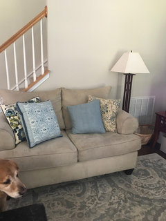
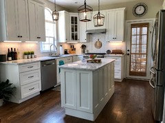
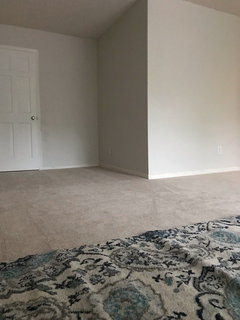
Please help me pick a white paint!!! We have accessible beige throughout our house. We want to paint the kitchen cabinets white. What white goes best with accessible beige? I don't want extra bright white, something more traditional but not yellow. Our downstairs is an open concept where our kitchen, eating area, den are pretty much the same room. Do I take the white throughout the whole house on the trim, moldings and doors, or just on the kitchen cabinets? All of the doors/trim in the house is white and I have no idea what color it is, but it's a fairly bright white.

Comments (49)

  • PRO
    9 years ago

    Hello CLTmomof4!

    White & beige typically work well together, if they have the same base undertones. Best practice when choosing paint colors is to get a paper fan deck from a high-quality brand (such as Benjamin Moore or Sherwin Williams). You can then order large, paper samples online, directly from the company. Tape them up so that you can see them in different times of day & in different types of light.
    Do NOT paint color samples on walls or cabinets (this is actually the worst way to choose a color & design pros never do this).
    Since your downstairs is an open concept, you should be able to get a very clear idea of the white paint color that works best with your existing beige.

    Then, prepare the cabinets properly by either sanding them or priming them (or both) and choose a paint finish that is easy to wipe clean such as gloss or semi-gloss.

    The best of luck to you
    LM Masiello, CKBD, CAPS
    LM Designs
    http://lmdesignsllc.com/

  • 9 years ago
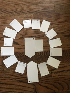
    Thank you! I went to Sherwin Williams and Ben Moore yesterday and picked up a "few" samples :)
  • 9 years ago

    Kitchen cabinets sometimes look weird if the don't match, or at least coordinate with, the trim

  • 9 years ago

    White tones can be very difficult unless tried in your own home in your own light. SW Eider White is a very pretty color... I wanted to use it desperately, got it on a sample board and in my space I was intending to use it... PINK undertone... you might try some samples on poster board of some of your favorites.

  • 9 years ago

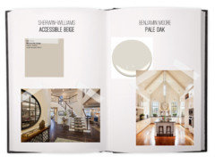
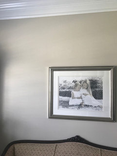
    aesthetic white by SW paired with accessible beige

  • 9 years ago
    Porter, thanks! Eider white is actually one of the samples I picked up because I've heard it's so nice, but it looked a little pinkish in my house too. Our den has a north facing window and we've got the windows along of the back of the house facing east (along with a lot of trees) and then a south facing glass door in the kitchen, so paint colors tend to look a little cooler and green in our light. I think I really like SW Alabaster, but not sure if it would look too heavy throughout the house on the trim, moldings and doors.
  • 9 years ago

    Yes, Eider turned pink every place in my home.. I was shocked when I was how much pink was in it so I moved the board around and it was pink no matter :(

    I'm sure you have gone crazy looking for the right color...

    Did you try white dove by BM? I have no doubt you have a sample!

  • 9 years ago

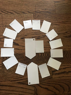
    if you can see the arrows... what are these colors with the arrows?

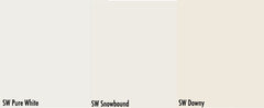
    Did you try, "snowbound".

    I am unable to read your samples :(

  • 9 years ago

    I'm sure you have a sample!!

    Consider if you are doing SW.. they sell larger sample cans.. if you select a white you like and it's a bit dark, they can reduce by 25% in their sample size cans. Where as say, the big box stores sell tiny samples so if it's cut by 25% it won't replicate by the gallon and be the same.

  • 9 years ago
    The sample on the very top is either glacier ice or dove wing. The one to its left is pearly white, and then the next arrow is snowbound :) I can either go with a Ben Moore paint or Sherwin Williams.
  • 9 years ago

    Yes, Eider white was full on PINK in my master... it has two larger windows and with the test board I did I was shocked Lori... It was a true light pink in my room that is.

    Every room is different. After testing it did some reading and it has a lot of magenta in it so... there I had it and nixed it :)

  • 9 years ago
    Lori, that is pretty amazing... thank you! Would say these whites also go with agreeable gray?
  • PRO
    9 years ago
    last modified: 9 years ago

    Agreeable Gray's hue family notation is 2.33 Y. If you locate it on the color wheel, it's at the top between Snowfall and Snowbound.

    The rules for partnering whites with near neutrals, like Agreeable Gray, is they both need to be from the same, immediate hue family neighborhood - OR - you need a white that lives in a hue family neighborhood that's farther away BUT not too far. Too far away and there's no hue family relationship and it looks weird (technically called discordant).

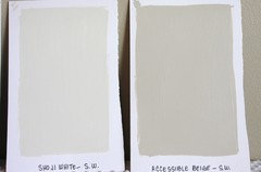
    In the case of Agreeable Gray, good options for white from its same hue family neighborhood would be Snowbound and Alabaster. Result is a lower contrast color relationship between white trim color and the wall color.

    Far enough away but not too far would be Simply White and Pure White. Result is a higher contrast color relationship and ya get more "pop" (as they say).

    Chroma also matters. Chroma answers the question 'how gray is a paint color'. Like LRV, there is a chroma scale that you can use to compare the grayness of colors. The lower the chroma number, the more grayness.

    When it comes to pairing whites with near neutrals, you have to get the chromaticity contrast right as well. If you don't, the result is either discordant or each color will make the other look sad and muddy.

    For example, I don't like Cotton Balls or Cloud White with Agreeable Gray. CB and CW have too much chroma, they're too colorful, not gray enough to harmonize well with Agreeable Gray.

    They're "ok" but in comparison Pure White or Snowbound are better options because they're more gray, they have less chroma (colorfulness).

    So, that's it. You just have to get the hue family right and the degree of chromaticity right.

    In terms of how they look in situ, the light is always boss. But odds are if you get the color relationship technically correct using spectral data, that harmony transfers to the 3-dimensional built environment and holds true.

    (and you're welcome :D)

  • 9 years ago

    I love hearing colors explained like this! What useful information :)

  • 9 years ago
    FWIW, Agreeable Gray and Alabaster are crisp and beautiful in my house.
  • PRO
    9 years ago

    @simstress, yeah, they work nicely together. Perfect pitch of chroma, nice hue family relationship.

  • 9 years ago

    We have weird light in our house. The back of the house faces east where my family room, breakfast area and kitchen are. I think because we get a lot of sun in the backyard, but also have a lot of trees, paint tends to look a bit green. We actually have accessible beige with a drop of black in it to grey it up a bit. Oddly enough, I desperately wanted to paint my house when we moved in last year Revere Pewter, but it had a purply look to it. And agreeable gray trended towards blue on my family room wall. But that room also has a north facing window with a white house next door, so I think it made it look too cool. The accessible beige still looks a little green in my family room, but looks beautiful in the front part of my house. Lighting is so weird. Oh,... and I have a sample for chantilly lace and it trended a bit blue.

  • 9 years ago
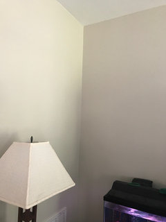
    I have the same color through out my house except for bedrooms and bathrooms. Here is the same color on different walls taken within a minute of each other. It's the damnedest thing!
  • PRO
    9 years ago
    last modified: 9 years ago

    If you look on the infographic and compare chroma numbers you'll see that Chantilly Lace is super low in terms of chromaticity.

    It doesn't have enough color oomph to stand up to the weird light. In other words, it's too neutral, too close to a true neutral gray, And being so far away from Agreeable Gray (even with an additional drop of black), the two colors don't support each other in a Wonder Twins unite! kinda way to push back the bossy light you have to work with. So, no surprise it looked blue.

    Color shifts and changes all day every day. It's a good thing really because believe it or not, it's more supportive from a color psychological point of view. A static color environment is not a good thing.

  • 9 years ago
    @Lori - I can't take credit for the Agreeable Gray/Alabaster pairing, but it's nice to get validation from a pro! Thx. :)

    @CLTmomof4 - I think I would paint the cabinets and trim the same. If you're not wanting to paint trim, I guess the challenge is to find a white that works with your current white trim and Accessible Beige. Good luck!
  • 9 years ago

    I used BM Decorator White on my cabs trim and doors. Lower walls are BM Snowfall White. I love it.

  • 9 years ago

    Simstress... our trim/doors/etc throughout the house definitely need painting... so I would like to pick a white that will look nice throughout :)

  • 9 years ago

    I had a fit with painting my master... it has a 15 foot ceiling... I had so many samples of light grays and taupey whites.... I finally went with Agreeable cut at 25% and half the day the top half portion of my wall is light blue!!! There are two medium windows one on each side of the corner of the room. That may play in to the problem... I was going to paint it again with a different color, but my husband said, "you want to go ahead, but I'm not cutting it in for you at the ceiling again". So, I live with the blue half the day... I just don't look up :)

    Glad it worked for you Simstress!!

    I think Snowbound or White Dove would be great CLTmom, Decorator White by BM as mentioned above you might give a try...

  • 9 years ago

    Ok. Reading this is post is putting me into a state of panick and making my heart race!!! I was reading this because I'm researching whites...I have a similar issue where I'll most likely be painting my kitchen cabinets white. I have a celadon greenish-blueish counter and pink floors!!!!! I'm starting painting this Thursday and am now worried what I pick out might be completely thrown off due to my counter color. The walls will be painted later but the counter is here to stay. Can any of you who commented on this maybe offer some suggestions to my post?

    https://www.houzz.com/discussions/kitchen-cabinet-painting-color-advice-dsvw-vd~4741889?n=0

    @CLTmomof4 Are you doing the work yourself or having a painter do it? If so, Good Luck!!!

    @Lori Your whites comparison chart is awesome.

  • PRO
    9 years ago

    The walls will be painted later but the counter is here to stay.

    That's easy. Let the counter inform the paint color choices. Assuming I know what you mean by celadon greenish-blueish, a good option for you would be Chantilly Lace.

  • 8 years ago
    last modified: 8 years ago

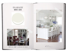
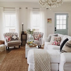
    Hello, can someone help me with a white color choice? This picture is my inspiration pic (I can not find the source). I am looking for a white on the wall that is not too cold, too yellow, or too gray. This picture seems to have the perfect color... but what is it?? I thought Dove Wing (the next color to White Dove) , but reading this forum has me seriously questioning that. I also considered SW Pearly White because I would describe this picture as a pearly color, but can't find much info on that color. Also, what paint for the cabinets and trim? I would like that to coordinate while being a bright and clean white (however less blue than out of the can white). I thought Simply White but read that doesn't pair well with gold accents, and then F and B All White but read that reads modern... Going for a traditional French Farmhouse feel with a cool smokey blue/grey accent (similar to as shown in this picture)... But what is this pearly color on the walls??

  • 8 years ago

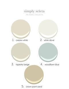
    Laurel Bern Interiors recommends these six whites for trim that covers all the basics......Benjamin Moore Paints Simply White OC 117, White Dove OC 17, Cotton Balls OC 122, Linen White OC 912, Cloud White OC 967, Ivory White OC 925.

    Try these SIX sample colors and I think one will be perfect. Her Blog goes into greater detail and has pictures of rooms painted in these colors. Good luck. It really does get easier!

    Let us know what you think.

  • 8 years ago
    What do you do when no white works in your house? I'm looking for a bright clean white. I have a south facing window in my kitchen and a north facing window in a dining room and no windows in my living room. Everything looks dingy or yellow. I have watery color backsplash, gray counters, and I have snowfall BM cabinets- but snowfall looked yellow on the walls. I tried chantilly lace, which looked great on the window wall, and gray on the other wall and living room.

    I've been through so many paint colors and nothing works! Currently I have collingwood as my general color on the halls and LR. But I'm switching to silverplate
  • 8 years ago
    last modified: 8 years ago

    BM Snowfall is a slightly warm white. I have it on my lower wall, in kitchen and dining room, beneath Decorator White chair rail. All my cabs and trim are also DW. I like the way they work together. But I have a dark kitchen with only a small north facing window. The Snowfall does not look yellow at all, in my home.

  • 7 years ago

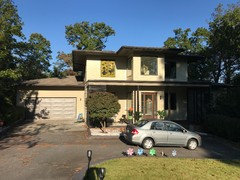
    Hi Lori, can you give me some advice please? I am about to paint the exterior of our contemporary prairie house white. Debating between Alabaster and Snowbound. Fascia and porch screens are in SW Tricorn Black gloss sheen. Front faces mainly south (a little east) and back faces mainly north...I want the modern look but do not want it to be too stark. Yet I also don’t want anythinh ivory / yellow because it would emphasize the “traditional“ look of the house instead of putting a modern spin on it (a lot of people are confused by the style of our house and what to make of it, so I feel like the right shade of color can really make or break it). Would really love your input! Thank you!


  • 7 years ago
    I’ve had a lot of luck using Pure White. It’s a slightly off white that looks good with many different colors. It’s not cream and it’s not bright white. Currently, I have Accessible Beige in several rooms and Agreeable Gray in the other rooms, both with Pure White and they look great. Perfect contrast, not too white. I had pure white in my last home, paired with yellows and greens and it looked great with those too.
  • PRO
    7 years ago

    @Nancy,


    Test Eider White, Shoji White, and BenM's Ballet White.

  • 7 years ago

    BM White Dove would be my suggestion. it goes with everything. I have it on all my doors, casing, moldings, baseboards, and has no yellow or pink undertones. Love it!

  • 7 years ago
    I started this discussion a year ago and never posted what I did. I didn’t want to have a custom cabinet done, so I searched and searched until I found a white cabinet close to alabaster and I LOVE it! It’s a slightly warm white and looks great with our accessible beige paint. Thanks to all that helped me!
  • 7 years ago
    It DOES look great! Thanks for the update. I didn’t see that the post was so old.
  • 7 years ago
    @Nancy... and I am by no means an expert... but my dad and I just renovated a small investment condo and I picked origami white for the walls. It was tiny and only had two windows and a sliding glass door in the whole place. The origami white has a slight grey tint to it. It was a nice, modern white.
  • 6 years ago

    What about SW Origami White walls with BM White Dove cabinets? Would this work? Our whole house is Origami White, and we love it! We're after a tuxedo kitchen cabinet look with SW 7076 / Cyberspace lower cabinets on a white upper cabinet ( White Dove?) - against SW Origami White rest of house interior.

  • 6 years ago

    I would think SW has a color catalogue of what works the best is your wall color. Google it?

  • 6 years ago

    Google brought me here to this discussion thread, Susan - so it's full circle for me.

  • 5 years ago

    Mary, did you get a response to your question? I’m considering the same thing.

  • 5 years ago

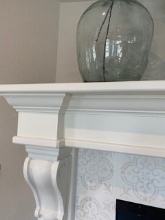
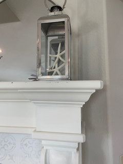
    In case it is helpful to visualize the colors....
    Here are the two sides of my mantle. The mantle is Alabaster and the walls are Accessible Beige. The stenciled tile is Alabaster in the background with the dark part in Accessible Beige with a wash of Alabaster on top.

  • 5 years ago

    The post is one year old.

  • 5 years ago

    I wanted a warm white for my office and chose White Dove. It looks yellow! What’s a less yellow alternative?

  • 5 years ago

    If you wanted a warm white - that is exactly what you got. Did you not try a sample in your room first? Without repainting, I would suggest you change your lighting. Try a 4000k or 5000k bulb.

  • 5 years ago

    It turns out this is just the primer - relief! But, I think I need an alternative to white dove to put up because it shows up yellow - even in natural light.

  • 5 years ago

    Check the whites on the color wheel several posts up. Lots of cooler whites there.

  • 5 years ago

    Google brought me here too! Has anyone painted their home aesthetic white (Sherwin Williams) with BM white dove trim? . The aesthetic white samples look wonderful, but our other white (trim, cabinets, etc) is white dove.

  • 3 years ago

    I have Snowbound walls going up. have white dove trim and ceiling. Do I need to change ceiling to brighter color?