Software
Houzz Logo Print
mary_roycroft12

My Dining Room Needs Help!

9 years ago

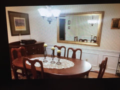
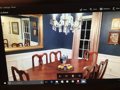
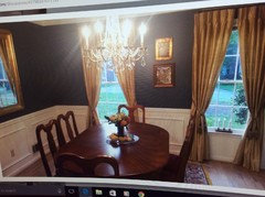
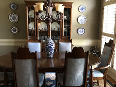
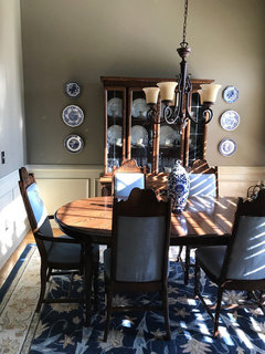
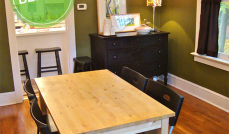
Help! I hate my dining room. We just moved into this house a year ago. The wall color, a green-gray is painted throughout all of the rooms that open to each other and the trim color is the color of a milkshake. So, to change wall colors, I'd have to have all trim and shutters repainted-expensive! I'm trying to decorate with what I have, but I feel as though the chairs, rug, walls, paintings, and plain table look horrible. What can I do? ANY suggestions would be terrific. Oh, in the photo below, the two paintings (dark) that I added to each side of the cabinet are not up yet.


Comments (55)

  • 9 years ago

    Agree with above... the chandelier needs a major upgrade and the iron piece above the hutch should be moved.

    M GR thanked Porter Edun
  • 9 years ago
    last modified: 9 years ago

    Agree with painting out the panels below the chair rail. Some of my favorite dark blues are BM Newsburyport Blue. Others are van Deusen Blue, Gentleman's Gray, and New York State of Mind. I'm not posting pics because you really need to look at the samples in your place.

  • PRO
    9 years ago

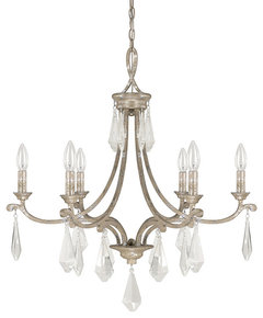
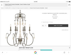
    Beautiful area rug! Here are two more chandeliers to consider:


    Kendra Mottled Silver Five-Light Chandelier · More Info

    Capital Lighting Harlow 6-Light Chandelier, Standard · More Info

    M GR thanked Seldens Furniture
  • 9 years ago
    Thank you so much for the suggestions on the chandelier, paint, etc. Thank you, too, for the compliments on the area rug. My son picked it out to go with the fabric in the chairs. I had the set restained and recovered after my mom passed away as it had all been lovingly used for years. He will be proud of himself for suggesting it! We had an R monogrammed on the end seats in honor of her first name!
  • PRO
    9 years ago
    It looks like a silver band on your China, so I like the Champagne finish for your chandelier. You could do silver, but that is a more traditional look and the champagne is a more updated touch. I think the two pictures are lovely, but had more dark weight to your room. Long tall mirrors one on each side would reflect light and even possibly outside into the room. Could you post a photo taken from China cabinet wall to the other side? Also what is view into dining room from adjoining space.
  • PRO
    9 years ago
    I love BM Van Deusen Blue. Would look wonderful.
  • 9 years ago
    last modified: 9 years ago

    The

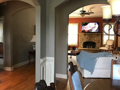
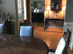
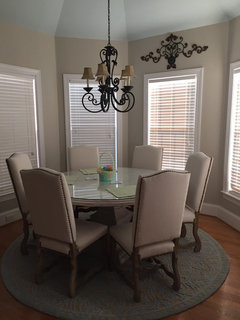
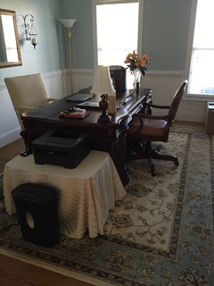
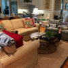
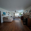
    Sure! Just excuse the mess. The first photo is looking out from the dining room in one direction and the second is from another viewpoint.

  • 9 years ago

    I have a BM fan deck, I don't know if the color is in there, but I'll check it out!

  • 9 years ago
    last modified: 9 years ago

    I'm sorry, but the art doesn't have enough "weight" for this beautiful room. They look as though they may be prints rather than oils, and a gilt frame would stand out better against the wall color than the partially dark framing. I would choose more interesting art, something more unexpected, and perhaps pieces that take some of the blue from the rug, although art doesn't have to match the decor. At any rate, it should be worth looking at and have an element of surprise in it. ebay has a lot of artists that sell their own work but even if you buy from a dealer there make sure it's genuine and has some punch to it. There is another recent thread here that lists a lot of venue for original art. To me that wall looks almost better without art now that I'm looking at it again, but perhaps you can put something on the wall to the left of it. I agree about the chandelier and the iron piece above the hutch.

  • PRO
    9 years ago
    You have cut off points so you can easily paint walls above wainscoting the dark blue.
  • 9 years ago

    Thank you. I plan on digging out the ladder after supper to take down the iron scrollwork. By gilt, do you mean a gold frame?

  • 9 years ago

    I'm sorry, but I don't know what cut off points are. Are those the chair rails?

  • 9 years ago

    By the way, you all are the best. I really appreciate your help. I have been desperately stuck!

  • PRO
    9 years ago
    No I mean the walls have edges where you can stop the navy blue and contain it to the dining area. The navy also would work with adjoining spaces as well as far as I can see.
  • 9 years ago

    Oh, okay!

  • PRO
    9 years ago

    Your room needs more texture and proper lighting to make it more interesting. Select a bronze chandelier with shades. You current chandelier focuses the light up to the ceiling, and that renders your roof a bit 'flat' in appearance. Add blue white plates to the sides of the hutch and add drapery panels at the windows. All additional items will make the room more interesting Also I have taken your white paint and filled in the panels on the lower part of the wall. Or you could do them in a coordinating blue.

  • 9 years ago

    Oh, wow! What a difference! I love the plates and drapery panels. I am getting so excited now. I have found a swatch of the blue paint called Van Deeusen Blue. It would bring out the rug tremendously. Would it be a little dark for my small space, though?

  • 9 years ago

    Would you put anything above the hutch where all of that dead space is, or just leave it alone?

  • 9 years ago

    *i just took down the scrollwork :)

  • PRO
    9 years ago

    Nothing above the china cabinet. I noticed the chairs and the monogram and it is such a wonderful touch, I love it. If you don't mind, I am working on another thread here and this poster would love to see your dining room and chairs especially. I want to share it with her. You will be amazed at how a dark wall color can actually make a room feel larger! Let me show you a before and after of a dining room I helped with here on Houzz a couple of months ago, and she used BM Van Deusen Blue above white wainscoting similar to your. Her space is even smaller than yours!

  • 9 years ago
    Sure. I feel honored! I would love to see the before and afters. Houzz is so lucky to have you. I wish you were near me!
  • PRO
    9 years ago


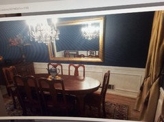
    cristinas dining BEFORE · More Info
    Before shot of dining room.

  • PRO
    9 years ago


    cristina dining SEMI complete · More Info
    We didn't have the new drapery up at this stage. I have a photo of the finished room, but have to hunt more for that one. I think you can see the room doesn't look smaller! Dark colors actually recede visually so that actually visually moves walls that are dark further back. She was given the mirror and otherwise we would have done art on that wall, but hope you can see the difference, even though this isn't a complete picture. I'll see if I can find the thread and you can take a walk down her experience!

  • 9 years ago

    Oh my gosh. I love the photo you sent of the blue dining room. If I did something like that (as it's beautiful!!!), should I get slipcovers for some of the chairs or keep them the way they are? Also, where do I find plates like that? I can't wait to see your client's after photos. How exciting!

  • 9 years ago

    Thank you for the after photo. I love it! You did an amazing job. You are so talented!

  • 9 years ago

    I like Beverly's mock up. With the addition of the blue and white plates, I don't think you need to paint the room.......just the wainscoting.

  • PRO
    9 years ago
    The chairs are beautiful. Don't need to do anything with them. Lots of websites to pick up blue and white plates and platters if you need them. If you have any antique shops near you they have lots of blue and white items for bargain prices. We can help you find ones. There are also new plate hangers that don't mess up plates like the metal ones. Hobby Lobby carries them.
  • 9 years ago

    My laptop is terrible for rendering colors (it makes everything in your dining room look fine--the rose-colored glasses solution to your problem). But...

    Is the trim color terrible, or could you find a wall color that looks better with your stuff but still works with the trim? Painting walls is easier than painting trim, and painting just the walls would reduce the cost of the project (or effort, if you do it yourself). It seems worth it not to deal with a color that doesn't really work for you.

    It looks like their are arches between the dining room and the other rooms, which provides a good place to change paint color (without trim, the transition is tricky at the corner but do-able). Just keep in mind sight lines when you choose a color. How will the navy look when viewed from the other room, framed by the other wall color.

  • 9 years ago
    Thank you, Flo and k9arlene! I will get the hangers from Hobby Lobby. We do have a couple of antique stores near me, so I'll start that in the next day or so. I may need help, though, Flo . I am very excited!
  • 9 years ago
    Cawaps,

    The trim color is indescribable. If you can imagine a light colored tan milkshake, then you have it. The previous owners had all of the walls and trim painted with custom colors. They are not even named colors. I have tried to Google the codes, but nothing compares. They also painted all of the shutters in the house to match the trim which would normally be great, but this color is really a tan. It's darker than any off white and light colors make it look brown. The strong blue color suggested would still help the trim still look off white. While I had much lighter colors in my other house (Revere Pewter with white trim throughout), I now have to try to make this trim work. When sitting in the family room, you can see into the dining room. I think the dark blue would be okay because I have blue sprinkled throughout the other rooms-although it's a lighter blue. Q
  • 9 years ago
    The only wall I am concerned about is the one with the stone fireplace. They painted that Egyptian Pyramid. I still think it will all work, though, as I have some throw pillows from Pottery Barn with terra-cotta, blue and tan in them (my former color scheme). Oh, in my other house, I had a raised ceiling in the kitchen breakfast nook and had it painted Woodlawn Blue. My study was white (wainscoting) and a Sherwin Williams blu (trade winds?) above it. Very different from what I have now. I'll post a picture.
  • PRO
    9 years ago
    Found it. Here is finished after photos. Just had to hunt art for wall opposite mirror. Cristina was traveling this month to Europe and hoped to find something in her families treasures there.
    M GR thanked Flo Mangan
  • 9 years ago

    Beautiful! I love her drapes. They look so elegant. Thank you for finding the photo. What a wonderful transformation. I know she must be pleased!

  • PRO
    9 years ago

    She is thrilled and has had several family meals in the room and received many compliments. Yes, we struggled getting the right color for the drapery and getting them done and hung properly, so it is always a challenge! I wouldn't do the gold in your room however. Maybe a linen-like color depending on that trim color which seems to be quite mysterious!

  • 9 years ago

    I am so glad and thank you! Yes, I will go with a linen or cream colored drape as I think it will blend in with the trim (enough) and will make the room look more elegant!

  • 9 years ago
    last modified: 9 years ago

    Flo,, here is the picture I mentioned to you regarding the ceiling height/drapery rod issue. Oh, I hope you can see I am on my way to collecting the blue/white pieces!

  • 9 years ago

    Flo, everything about the blue room you posted is BEEEE autiful!!!

    Love the lamps, pops of yellow in the table decor.................

  • 9 years ago

    Following...

  • 9 years ago

    Okay. I have the plates up. Still a work in progress, but it's exciting!

  • 9 years ago

    The photo is a little distorted. I'm not sure why!

  • PRO
    9 years ago

    Very nice and I like the large vase on the table as well. In looking closer at this photo, I think you do need to put the drapery rod above the palladium to keep the look of the high ceiling. Are you thinking of painting the walls? If you are not sure of the darker color, you can do an off white as well which would look very nice. It might work better with the other colors in your home too since they all "see into" each other. We can give you some paint colors. In fact, one that immediately comes to mind is SW Westhighland White. Of course, with your trim color, you will need to do some paint sample boards (do not paint samples on the wall itself because it will bleed through because the "sample" paints have a eggshell finish so avoid that.) You might have to go to more color because of the trim. Otherwise it might look like you "missed" matching.

  • 9 years ago
    last modified: 9 years ago

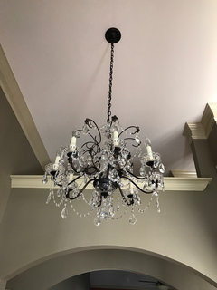
    Putting some blue on those walls really punched up your space! When I see the combo photo of the dining room and foyer, I think you could easily switch chandeliers for even more pizazz in your dining room and would not look bad to have something plainer in the foyer. I love your monogrammed chairs, btw!

  • PRO
    9 years ago

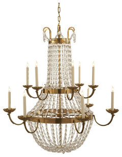
    Of course, you know I would love dark blue walls for your room, but it's your house. I would also go for more crystal on the chandelier with your furniture. Again, personal choice. Not dripping crystal but some.

    Visual Comfort Lighting E.F. Chapman Paris Flea Market 12 Light Chandelier · More Info
    With your high ceilings, you could do a 2 tier chandelier. This is beads not faceted crystals.

  • PRO
    9 years ago

    That is pricey one, but you can find ones similar for much less money. Let me look around some more.

  • PRO
    9 years ago


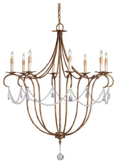
    Large Crystal Lights Chandelier · More Info

  • PRO
    9 years ago


    About $418. 30x30 · More Info
    about 30 x 30 so it has some height and the white antiqued parts would look great with your plates and a dark blue wall but blend with the wainscoting as well. Might be a nice choice.

  • 9 years ago

    Could we see a closeup photo of the chandelier you have in the entry.

  • 9 years ago

    Wow, it's amazing what a difference the blue-white plates make. Great suggestion!How do you like it?

  • 9 years ago
    Thank you all for the nice comments. The plates do make such a big difference! Thank you, too, for all of the additional chandelier pictures! I will take a photo of what the room looks like now with the lower half of the wall painted as well as the entryway chandelier. Yes, I could move it to the dining room and find a different entryway light. Lots of options! :)