Software
Houzz Logo Print
carrienations

Updating "dated" bathroom / contractor pressure

9 years ago
::sigh::

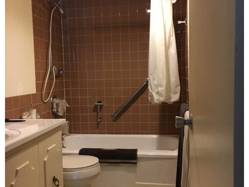
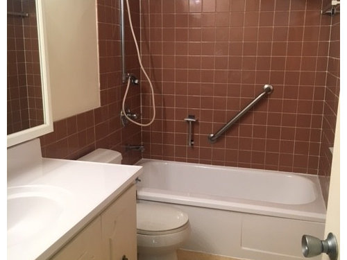
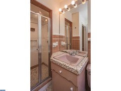
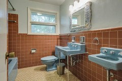
I'm in the process of fixing up a 1957 condo that came with many of the original finishes, including built-in cabinets, cute accordion closet doors, light fixtures, and some lovely cinnamon-colored wall tile in the master bath. I say "lovely" facetiously, as I had every intention of ripping it out and replacing it when I first bought the place. Now, after 3 or so years, it's kind of grown on me, and I'm looking for ways to decorate around it with new flooring, paint and perhaps some accent wallpaper (I use it for the bathtub only, not the shower. While the brown tile is not a contemporary look in the least, I feel it matches the personality of the apartment, and it's in near-mint condition. Also, I don't want to spend $10,000. Heh.

Every realtor and contractor I've talked to has pressured me to scrap it all and start over. "No one will want this," they say. My feeling: what a shame to tear out perfectly good, original tile just to make way for the trends of the moment--the stark, white-on-white look that Pinterest loves (hello white subway tile and white or black hex floors), or the "stone finish" (travertine and its ilk) look that is more at home in a suburban McMansion or mountain lodge than a mid-century modern apartment in the middle of the city. Nothing against those looks, it just doesn't suit my home.

Just today, a contractor came in to give me an estimate to retile the floor He lamented my choice as "drab and dated," and proceeded to show me a catalog filled with 12x12 natural stone tile. DO. NOT. WANT.

So, part one of this post--anyone else ever get frustrated by these design professionals steering their choices in a generic direction and discouraging personal style? How do you handle this situation?

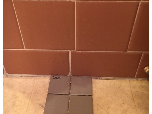
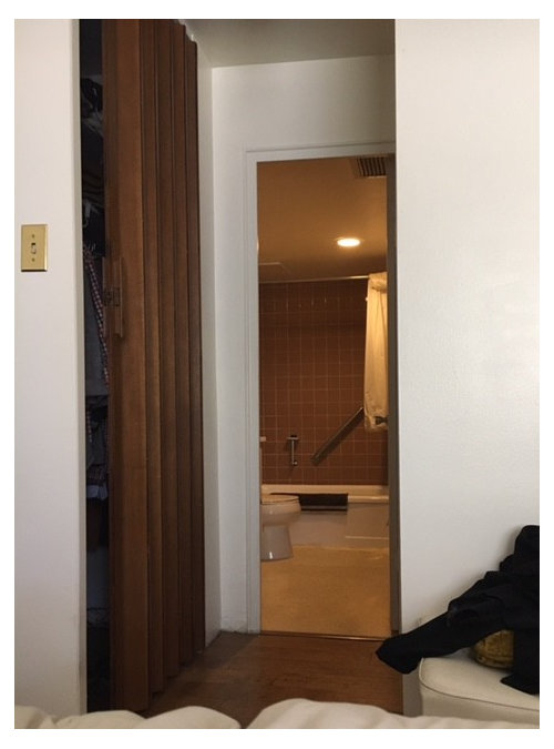
And part two: pics! Here's how it stands right now, with putrid linoleum that will be coming up ASAP. I will paint the walls and vanity, get a new shower curtain and change up a few fixtures to make it look a bit more polished. The bathtub, formerly harvest yellow, was recently reglazed white.

View from bedroom:


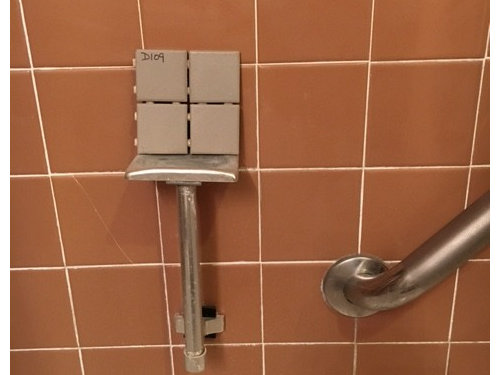
So to achieve a classic, understated mid-century modern look, what do you think about this 2" mosaic tile from Daltile? I think the warm gray complements the brown/tan tile.

Would I be better off going with white? Some other color? I want to stay in the neutral realm, so no blues or greens or anything like that. I'm also considering this same color in 1" mosaic or 2x1 rectangular stack bond pattern. For reference, these are Daltile Keystones.

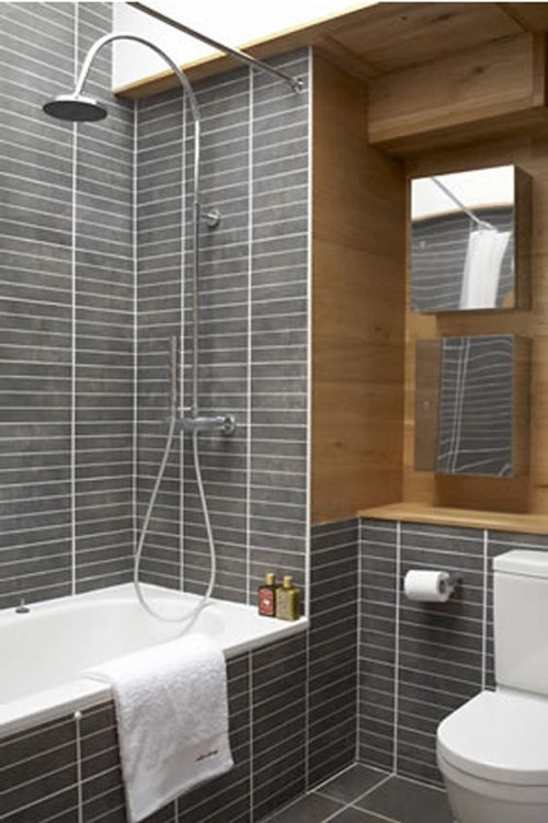
In my mind, it'll look something like this:

Or like this (smaller tile, same pattern):


Thoughts? Watch-outs? Tile size/shape preferences or concerns? Should I truly let the original tile go and start from scratch (NOT preferred!). This bathroom has been a real design conundrum from day one, but I'm determined to make it look good, "dated" brown tile and all.

Thanks for listening and I appreciate your advice!


Comments (15)

  • 9 years ago
    last modified: 9 years ago

    I would not use any shade of brown floor tiles unless you can match the brown exactly. The daltile looks dead grey against the reddish cocoa color. Plain white would be better.

    A crisp white and chocolate color scheme with accents of pink or teal would look cheery.

    Pinstripes in chocolate and white?

    Chocolate toile print wallpaper?

    Chocolate, white and Kelly green also work well together

    Chocolate, white and mint green or a clean baby blue look good.

  • 9 years ago

    Thanks lazy_gardens, I'm definitely not trying to match the floor tile at all, just wanted a nice neutral warm gray to complement the brown of the wall. *Hopefully* that gray goes okay with the brown! I'm also very open to the idea of plain white! And I am in fact looking at a cactus-print wallpaper with various green shades that I think will bring a lot of life to the space. Thanks for your suggestions!

  • 9 years ago
    last modified: 9 years ago

    I have used Daltile Keystones in three bathrooms, Waterfall, Artic White, Desert Gray and Suede Gray, in 2 x 2 and in 2" Hex. I am a big fan of this particular line of tile

    That said, I don't think the Architectural Gray, which is what you have there, I think, is quite right.

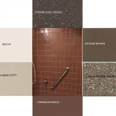
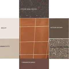
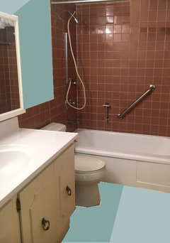
    I would try Artic White, Biscuit, Almond, and the following other colors. I used two of your photos and you can see that you will have to try samples out in real life to see how they look because they look quite different in each set, but Possibly one of these could work in real life. Maybe a border of one and a field of another. You will have to try these out, and also decide what kind of lighting you are going to use. Some of these look terrible with one of your photos, some with the other. You would have to sample them in real life.

    The tile looks Orange on my monitor in this picture.

  • 9 years ago
    last modified: 9 years ago

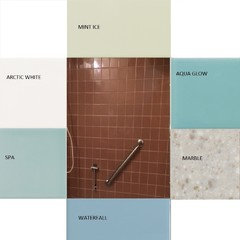
    I know you are also looking at neutrals, but honestly the Cinnamon Tile is not a neutral even though it is "brown" so I would be tempted to try actual colors with it. Marble and Arctic white are in this set for good measure, but I think any of these colors would create a pretty cheerful looking bathroom compared to all brown and honestly it's what they often did in the 1950s anyway. Too bad there isn't a really pale pink.

  • 9 years ago

    Palimpsest, you have outdone yourself with these moodboards! In RE: your first post, I actually brought home Desert Gray and Suede Gray in addition to the Architectural Gray! I thought both of those would work okay with the brown tile, too. I really love this range and hope I can use it in some shape or color.

    But wow, the Spa and Mint Ice look fantastic! I'd definitely consider one of those, particularly the mint. And you're right, those colors have the added bonus of being period appropriate. The marble actually looks better than I thought it would too; I had considered it but ruled it out, for whatever reason.

    I also really like the Biscuit next to the tile, but my only hesitation is that the bathtub and countertop are STARK white...do you think that would clash?

    Thanks!!

  • 9 years ago
    last modified: 9 years ago

    Mint Ice

    Spa

    carrienations thanked palimpsest
  • 9 years ago

    Also the Arctic White is already not strictly stark white and has some variation in color so it will already not "match" your plumbing fixtures. It will blend with them. So if it is too bright with the Cinnamon compared to biscuit or almond or an off white, they will probably look like a "color" not like they are trying to be white.

  • 9 years ago

    I love Pal's last two groupings. He really hit the nail on the head with them. Don't be afraid of the color. I think it will really make your bath unique and wonderful.

  • 9 years ago

    I am not a design expert or construction expert. However, I believe you have a mud-set tile job in excellent condition. Your bathroom is wonderful and I would remind anybody who insisted you remove it, that it is your home and you like it, Period! I wish more people would appreciate the older work. I wonder is it possible that under the vinyl flooring original tile is still in place?

  • 9 years ago

    From my archives...

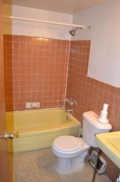
    This may be what you originally had, which admittedly, is pretty horrible. I am not sure why anyone would pick this combination. Don't worry, they get better as they go along.

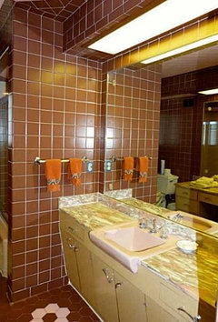
    And here's another one, which may have a pink sink, the lighting is bad

    This one mixes it with pink or lavender

    And finally this one is a nice combination of brown and blue (and also has a rare "toothbrushing sink"

  • 9 years ago

    Palimpsest, that's the stuff!!! That first picture is almost EXACTLY what the bathroom looked like when we moved in, with the yellow tub (blech). I actually think the tile looks pretty cool in picture #2! Thanks for digging those up...any idea what that tile/color is actually called?

  • 9 years ago

    The closest current Daltiles (In Natural Hues) are Cinnamon, Chocolate, or Latte. These do not come in 4-1/4", they are 4" (and many other sizes). It's hard to say because the same tile will look different in different photos and monitors, to say which one is closest in real life. At B and W it's just called "Brown".

  • 9 years ago
    last modified: 9 years ago

    love the cinnamon walls with the brown and pink flower hex tiled floor!

  • 9 years ago

    I assume you're improving or upgrading your bathroom lighting? Be sure to use the same bulbs the new fixtures will take - maybe by bringing in a table lamp or torchiere if you're doing uplights - to check your new color possibilities before making a final decision.

    There is nothing worse than spending hours picking just the right colors, only to find that everything looks quite different when the lighting is changed. Don't ask me how I know this, LOL......