Software
Houzz Logo Print
maries1120

Feedback on Ben Moore Sonnet

9 years ago

Has anyone used this paint color?

Any info on the hue, undertone etc that could help me?

When I look at the color chip and my test board I think it looks a tiny bit pink but when I compare it to Peau de Soie, (which looks really pink to me) it doesn't look pink. I have a big patch on the wall and so far the best I have found. I have tried many off whites, beiges, greiges, and taupes..... Sonnet is maybe a teensy bit lighter than I would like but very close. I might try it with the formula increased by 25-50% but could live with it as is.

This is for a room that seems to add a green cast to whatever I have on the wall but just going with green is not an option. I want something that doesn't clash with the greyish beige carpet but looks soft - like the color of oatmeal (very, very light brown/dark off white with just a hint of gray). This will be the 4th time the room is painted so this is it and I am at the point where I will live with a green overcast if I need to - as long as I like the color and it doesn't clash with the carpet or wood trim. Right now it is Brandy Cream which looks peach. I thought about going darker but that really isn't the look I want. The journey started with Behr Hazelnut Cream which I love and worked in 2 other rooms! Sonnet is just about the same depth as that.

Comments (12)

  • 9 years ago

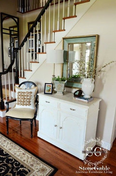
    Here's a pic of it in a room and it looks pinkish to me. Sonnet

    maries1120 thanked Yayagal
  • 9 years ago

    I can't believe they would use that photo on their website for Sonnet. I don't see pink on my wall and painted some fairly big patches on 2 different walls. I haven't seen these in all types of lighting situations yet. When I look at the chip of Sonnet alone it does seem a little pink but just ever so slightly - however, not at all pink when compared with Peau de Soie which screams pink to me. Who would ever imagine that picking a paint color could be this hard!

  • 9 years ago
    last modified: 9 years ago

    My opinion it looks like a lovely warm color that might read a little taupe/peach depending on your lighting? Can you tolerate some peach in your life? Maybe the greenish cast will cancel out the peachiness.

    maries1120 thanked robo (z6a)
  • 9 years ago

    Lori - thank you for all of that info. Why such a big difference in the hue for Sonnet? Any other suggestions on colors that might be similar to Sonnet? When I go too much into gray or greiges, I run into green unless the color looks like a pink gray. Muslin is very close to Brandy Cream - just looked more red than the peach fest I see now. I think my husband might have me committed if I go back to my original Behr Hazelnut Cream after having it painted twice after that! At least I know what I am getting. Or settle with Sonnet. Others I have on the possible list - White Sand (looks too yellow), Creamy White (maybe - I haven't tried this on the wall yet), Maritime White (even lighter than Sonnet) but looks like a soft not too bright white. Elmira white went green. I brought home a bunch of chips and 3 samples from Sherwin Williams and nothing seemed any better.

  • PRO
    9 years ago

    Lori - thank you for all of that info. Why such a big difference in the hue for Sonnet?

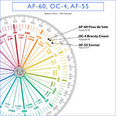
    It's actually not a big difference. Brandy Cream and PDS are at the end of the YR (yellow-red) or orange hue family. Sonnet is at the very beginning of the yellow hue family. Which explains all the peach, blush overtones.

    maries1120 thanked Lori A. Sawaya
  • PRO
    9 years ago

    What color is the closest to what you want and how would you change it to make it the "perfect" color?

    maries1120 thanked Lori A. Sawaya
  • 9 years ago

    Perhaps the greenish cast that is bothering you is comes through the windows? Rooms where there is a lot of greenery to be seen through the windows tend to reflect that.

    maries1120 thanked carolb_w_fl_coastal_9/10
  • 9 years ago

    Thanks, Lori. Sonnet seems very close. I wish it had a bit more depth but not by much which is why I could probably live with this. I haven't had it on the wall enough to see if I will still see green in varying lighting situations. I can see where Sonnet ends against the Brandy Cream and it looks much more "neutral" next to it so I don't think the peach will come out. This is a step up from most where I instantly pick up green. I have even had my vision checked to be sure it wasn't just me - even though my husband sees it too with our "misses". Brandy Crème doesn't go green but in some lighting situations seem to pick up more yellow on top of the peach so I pretty much hate this all the time. Perfect for me would be like the color of oatmeal. To me that is soft and serene. When I googled that though, I see some really orangey paint colors. Valspar has a warm oatmeal color that looks a bit too yellow. I want the paint to be the backdrop and not the focal point. The bedspread is dark brown and art, etc is autumn colors. I tested Muslin on the wall and it didn't look much different than the Brandy Cream - a bit less peachy but still there. Manchester Tan looks great in our basement but went green in the bedroom. I tried Edgecomb Gray and some other popular colors. I considered going dark (Ben Moore Truffle, Bradstreet Beige...) but I would rather live with green shadows than paint that fights the carpet and doesn't give me that feeling of serenity.

  • 9 years ago

    The room has a south and a west window. We see green even with the drapes closed so at times green could come through the windows but we even see this in artificial lights - not as much with the drapes open and a cloudy day. I changed lamps to ones with whiter shades and changed to LED bulbs from halogen or incandescents.

  • PRO
    9 years ago

    Try Sherwin Williams SW7516 Kestrel White and BenM 1023 Cocoa Butter.

    maries1120 thanked Lori A. Sawaya
  • 9 years ago

    Thanks, Lori. I will check those out.