

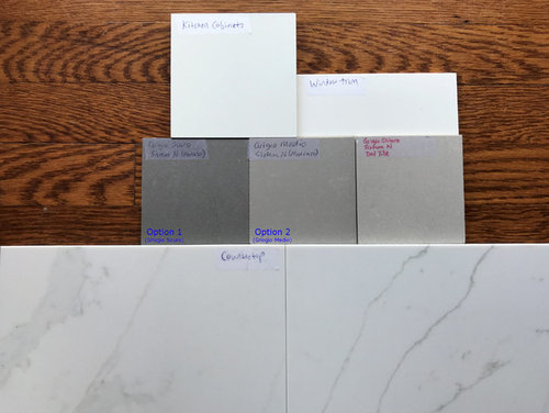
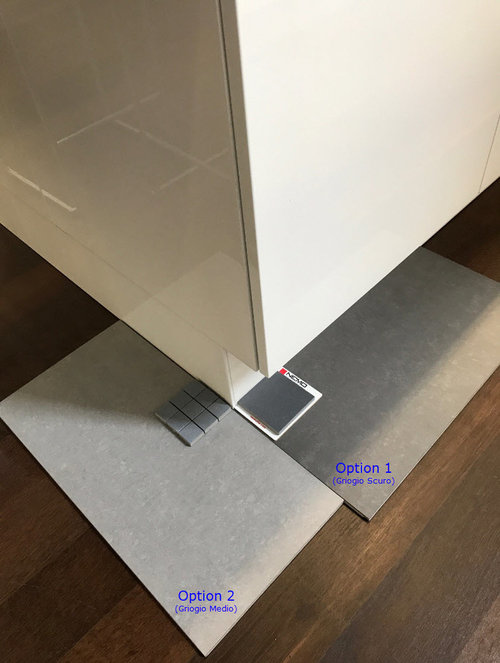
Another Tile Color choice type post! Please help!
9 years ago
last modified: 9 years ago
Featured Answer
Sort by:Oldest
Comments (10)
Related Professionals
Columbia Architects & Building Designers · Asheville Architects & Building Designers · Sugar Land Architects & Building Designers · Tyler Architects & Building Designers · New Bedford Architects & Building Designers · Albany Architects & Building Designers · Elgin Design-Build Firms · Kankakee Design-Build Firms · Toledo Design-Build Firms · Napa Design-Build Firms · Tuscaloosa Home Builders · Morgan City Home Builders · Jacksonville Home Builders · Newport News Home Builders · Scottsbluff Home Builders- 9 years agolast modified: 9 years ago
 9 years ago
 9 years ago
- 9 years ago
 PRO9 years ago




Related Stories

COLORPick-a-Paint Help: How to Quit Procrastinating on Color Choice
If you're up to your ears in paint chips but no further to pinning down a hue, our new 3-part series is for you
Full Story
KITCHEN COUNTERTOPSKitchen Counters: Tile, the Choice for Affordable Durability
DIYers and budget-minded remodelers often look to this countertop material, which can last for decades with the right maintenance
Full Story
LIFE12 House-Hunting Tips to Help You Make the Right Choice
Stay organized and focused on your quest for a new home, to make the search easier and avoid surprises later
Full Story
TILEMoor Tile, Please!
Add an exotic touch with Moroccan tiles in everything from intricate patterns and rich colors to subtle, luminous neutrals
Full Story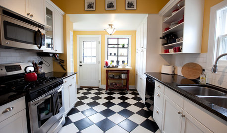
FLOORSChecks, Please! 13 Choices for Checkered Floors
Checkerboard Patterns Go From Casual to Ritzy, From Marble to Grass
Full Story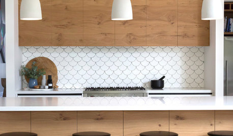
TILELet’s Talk Tile: An Alphabetical Guide to Tile Terminology
Get set for a tile project with this handy glossary of shapes, materials, finishes and more
Full Story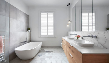
BATHROOM DESIGNFloor Tile Options for a Stylish Bathroom
From the countless choices of bathroom tile available, we focus on some of the best looks for the floor
Full Story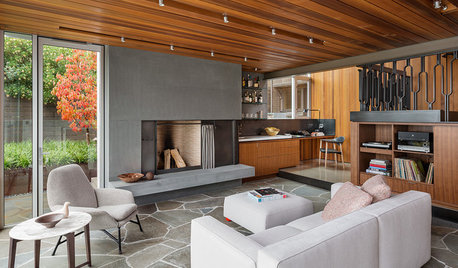
FLOORSHow to Get a Tile Floor Installed
Inventive options and durability make tile a good choice for floors. Here’s what to expect
Full Story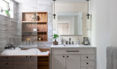
BATHROOM OF THE WEEKBathroom of the Week: Wavy Tile and a Japanese Soaking Tub
This spa-like basement bathroom includes lots of warm teak for a relaxing post-workout vibe
Full Story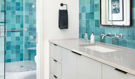
TILEPorcelain vs. Ceramic Tile: A Five-Scenario Showdown
Explore where and why one of these popular tile choices makes more sense than the other
Full StorySponsored

Columbus Design-Build, Kitchen & Bath Remodeling, Historic Renovations




cpartist