Software
Houzz Logo Print
ssstukel

Bought a carwash - needs a makeover.

8 years ago
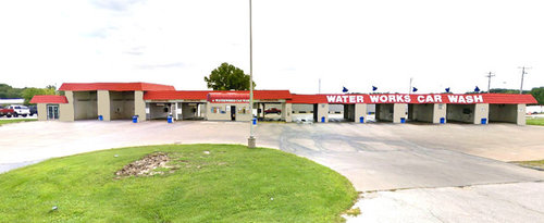
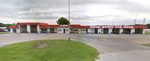
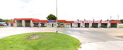
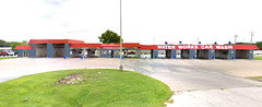
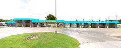
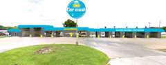
Hi - so, my husband and I just bought this car wash. It's 40 years old, but works great. Just needs a fresh look. We don't have a huge budget, but I know a coat of paint will do wonders. Below are pics of the car wash "painted" in BM Crisp Khaki with an added awning and lights above the lettering. (The red roofline has to stay, as does the white lettering). The picture below is what it looks like now. Thoughts/suggestions please!

Also, since I just painted this on the computer, will the color actually look a lot lighter in "real life" on such a large expanse?


Comments (43)

  • 8 years ago
    last modified: 8 years ago
    Interesting.

    I would want it to stand out. But the red roof might be an issue.

    There's a storage facility near me that's done in Seahawks colors - blue and green. It really stands out. Good call, imo.

    I think you want something like that.

    Sheri Stukel thanked User
  • 8 years ago

    Since its called Water Works maybe it should be blue?

    Sheri Stukel thanked suzyq53
  • PRO
    8 years ago

    Ask Ben Moore. They probably have had that question before and may be able to give you some guidance. I knew a guy who sold BM paint for 20 years and he could answer a question like that in an instant. He understood color and light and how they effected his product.

    Sheri Stukel thanked Carolina Kitchen & Bath
  • PRO
    8 years ago
    last modified: 8 years ago
    Also, since I just painted this on the computer, will the color actually look a lot lighter in "real life" on such a large expanse?

    Did you try to match the rendering to a in-real-life paint chip? Or did you just select the color from the digital chip rack in the paint program?

    Either way, color on your monitor never matches color in-real-life. If you tried to match it to a chip you were holding in your hand, then it may look somewhat similar.

    If you picked a digital chip from the online chip rack, it will look totally different.

    Your smartphone, monitor, laptop, tablet, all use a VERY small color space called sRGB to display colors. What that means is the number of colors a device is physically able to display is a SUPER tiny fraction of the number of colors we can see in real life.

    Plus, colors on your device is light beaming to your eyeballs. Colors from in real life paint color is light reflecting to your eyeballs. Two different visual experiences and the reason why color on your device never matches the color as you see it in real life.

    Sheri Stukel thanked Lori A. Sawaya
  • 8 years ago
    last modified: 8 years ago
    Some landscaping would be lovely on that patch of grass. Rocks/tall grasses/hostas would help to give it some curb appeal and stand out. Maybe even a small fountain to go with the water theme!

    Sheri Stukel thanked Cara Lewis-Watts
  • PRO
    8 years ago

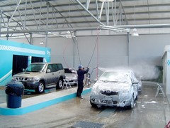
    You know, you could always buy a quart, which will do 80-100 sf, and paint one of the wall sections with it. That might give you a better idea.

    Sheri Stukel thanked Carolina Kitchen & Bath
  • 8 years ago

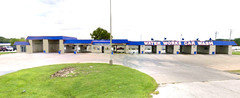
    Was thinking about what Suzyq53 mentioned about the blue and about what jn3344 said about making it stand out. Not sure if I can figure out how to make it unoffensive by painting it all blue, but here is the awning changed to blue. Thoughts?

  • 8 years ago

    By the way, our logo has this color of blue in it and the team wear blue shirts that color.

  • 8 years ago

    No, I'd rather see the whole roof done in blue rather than red.

    Sheri Stukel thanked Cara Lewis-Watts
  • PRO
    8 years ago

    A blue roof would look better with the paint color than red.

    Sheri Stukel thanked Carolina Kitchen & Bath
  • 8 years ago

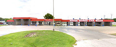
    Here is that idea:

  • 8 years ago

    I don't think the khaki is a huge improvement. I actually prefer the white if I had to chose between the two. What about adding a stripe of blue? I don't think a whole blue façade is the way to go.

    Sheri Stukel thanked erica051176
  • 8 years ago

    Carolina Kitchen & Bath, is there a paint color you think would look good with the red? Husband says the material we have that's red is very difficult to paint over.

  • 8 years ago

    Paint the stucco blue gray, get a blue and red striped awning, leave the red.

    Sheri Stukel thanked suzyq53
  • 8 years ago

    super idea Becky. Let`s find a Mascot.

    Sheri Stukel thanked Angel 18432
  • 8 years ago

    I think we need to know what city state it`s in to find something appropriate.

    Sheri Stukel thanked Angel 18432
  • 8 years ago

    You guys are awesome! It's in Central Illinois. We have thought about some sort of retro theme. I'm also experimenting with painting it some sort of charcoal/black. Might work... I'll put a pic up when I'm done.

  • 8 years ago

    For some inexplicable reason here in Atlanta we used to have Cactus carwash. They had these awesome giant cactus signs out front. I guess with the alliteration it rolled off the tongue better than Magnolia Carwash, though there was no desert instead!

    Sheri Stukel thanked Becky Harris
  • 8 years ago

    Okay, here it is in a charcoal color. For some reason, the combination reminds

    me of race cars - which wouldn't be a bad thing. Hideous, Fabulous or meh?


  • 8 years ago

    Could you try painting it blue instead of charcoal.

    Sheri Stukel thanked Angel 18432
  • 8 years ago

    Sure - here's a blue

  • 8 years ago

    needs to be more like the garbage cans, then you have r w and b - very patriotic - for all the presidents that have lived in Illinois, including one that was born there.

    Sheri Stukel thanked Angel 18432
  • PRO
    8 years ago
    last modified: 8 years ago
    Why do you have to do just one color.

    Do the sign in a red-orange like Glidden's Flaming Sword and then three colors of varying widths (or fat equal widths) on the body. Like start with BM Iron Mountain for the first stripe under the sign, BM Whale Gray for the second stripe and end at the pavement with BM Gull Wing Gray.

    Just make sure the sign is a definite red-orange and is not too close to orange - looks like it might already be a red-orange color. Which is a good thing because if you use a range of gray/gray blues, the red-orange will keep you comfortably away from any black/orange Halloween associations.

    Sheri Stukel thanked Lori A. Sawaya
  • 8 years ago
    last modified: 8 years ago
    Congratulations!

    I would not do gray or beige or anything like that....Blue makes it too dark.

    Like it or not, there is a psychology to color. White is clean. Blue is clean (glass cleaners, for example, are blue)

    I would do white (or white-ish)...and leave the red, since you can't change that color.

    Get the center as neat as you can and get the entrance sparkly-power-wash clean.

    Sheri Stukel thanked User
  • 8 years ago
    last modified: 8 years ago
    ^^^Yes, colors for a business are entirely different than for your home. You want a great contrast that 'speaks' to the consumer. There are marketing companies that will give you the best colors for your type of business - with your roof color constraints. In your specific case, you are looking for consumers to think "clean" when they look at your place as mentioned by pennydesign. You do want to attract attention though..and not fade into the background. One of the most successful car washes in my area has a bevy of huge pink umbrellas in front of it - colors are white, pink and blue - they grab your attention in a good way (much better than I describe).

    Sheri Stukel thanked Denita
  • 8 years ago
    last modified: 8 years ago
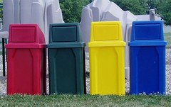
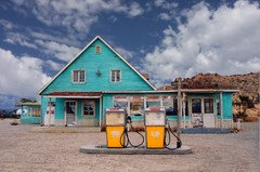
    Have you considered using Turqouise/Teal for the roof and then get Yellow bins.

    For the logo you could try a dark gray on the Teal to give it some class...

    Sheri Stukel thanked Bryan Lip
  • 8 years ago
    last modified: 8 years ago

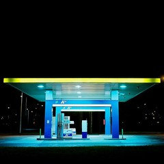
    Some more inspiration- you want to stand out from the road. Too many businesses already have red or blue. The Teal on white text or dark gray text for your name. And then yellow accent bins can help.

    The Teal also matches the color of water which I think is more on brand with what it is.

    Love to see the final result!

    Sheri Stukel thanked Bryan Lip
  • 8 years ago

    This is such an interesting post. Everyone is so creative. So this is not the kind of carwash where people decide to use it because of the come ons or snappy decor? They just need to wash their car and this place is close or convenient? It would be regulars probably, hopefully. Neat and clean. Bathrooms. Fully stocked. Loyalty rewards. On-site assistance. Food truck - BBQ. Picnic tables. If you make it a snacktivity they will come; the families will make a carwash into a weekly outing. I see it! Petting zoo? Pumpkin patch?

    Sheri Stukel thanked suzyq53
  • 8 years ago

    Wow! Thanks everyone! This is really giving us some great ideas!


  • 8 years ago

    That little lawn is just begging for a big sculpture that will turn it from a carwash into a local landmark. Something like these: http://www.prescottstudio.com/

  • 8 years ago

    Flying an American flag on that flag pole? Then do red, white and blue. Alternate the colors. I realize some people are offended by our flag, but if you are proud of it that is what we would do.

  • 8 years ago

    Don't people read the postings and see these last 2 suggestions have already been suggested.

  • 8 years ago
    last modified: 8 years ago

    Here are some rough mockups of the color concepts I've created so it's easier to visualize Sheri!

    Version 1:

    Version 2 (slightly darker turqouise):


    Any news on your final decision Sheri? Would love to also see after photos of what you ended up deciding..!

    Attached is my mock-up using the turqoise, yellow and the mid-gray walls. The yellow trash bins, the turquoise roof with "water works" logo and the yellow awning with the gray text and a matching yellow office door. Simple and inexpensive, stands out from the Road.

    You can buy the trash bins on houzz.

    Sheri Stukel thanked Bryan Lip
  • 8 years ago

    Wow! Thanks so much everyone! I kind of love that turquoise color! How can you ever go wrong with turquoise? :). Another thing I was thinking about was how a lot of vintage cars go through our wash because they don't want to risk brushes (we're a no touch automatic & self-serve). What do you guys think about a vintage car on the roof? Have no idea how to do that - haha! But would be fun to figure it out!


  • 8 years ago

    Ooh, I like the turquoise!

  • 8 years ago

    Another vote for turquoise. Its evocative of water (swimming pool color) and gives instant retro vibe. I know you said the red has to stay, but I wonder what exists for just adhering some sort of new surface over it. Not sure about car on the roof= would it be large enough or visible enough from the street to make an impact.? I pose that as a question not a statement. I think that front lawn area next to road is where the attraction (whatever it is) should go

  • 8 years ago
    last modified: 8 years ago

    Bryan Lip Version 2 (slightly darker turquoise) The darker gray body will also help hide day to day scuffs, splashes and dirt. I like the idea of yellow accents but not for the trash cans, light colored cans will look like crap in no time.

  • 8 years ago

    At first glance, the blue color made it look like an Ikea store to me. I like the red and would leave it alone, personally.

    Agree with the landscaping and vintage car on the roof! Kids love seeing that, along with self serve car washes, they will bug their parents to go.

    Congrats on your purchase, can't wait to see what you decide!


  • 8 years ago

    Sept 2017 Post. - Glad Olivia dug up this old post as I'm curious as to

    what you did.

  • 8 years ago
    last modified: 8 years ago

    Olivia is a scammer, so don't bother thanking "her".