Software
Houzz Logo Print
heather_hughes7374

Question about decorative stripe...

13 years ago
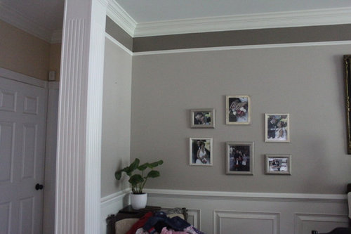
Hi everyone! I'm wondering if it would look OK to paint the top stripe a shade lighter of gray than the base color (instead of two shades darker) I feel like this top stripe takes away from the soft feel that I had hoped to achieve.

Comments (71)

  • PRO
    13 years ago
    Yeah I love it has it is too...! You can always calculate a visual impression ine by using Phi. Its a great guild.!
  • 13 years ago
    I dislike the stripe, it is too dark. It looks very commercial and pulls the height of the ceiling down. I would either paint it a much lighter shade closer to the wall color, or just paint it white.
  • 13 years ago
    Paint the ceiling the darker color….striking.
    living room · More Info
  • PRO
    13 years ago
    agree all white!
  • 13 years ago
    If you are emotionally attached to the stripe, put it above the chair rail. (I would say below, but you have the beautiful raised panels. ) Move the thin molding directly under the crown molding. Keep the the top of the upper wall clean, and don't interrupt the crown.
  • 13 years ago
    As a more is more person, I like lots of detail, but the stripe iMO is way too dark. Perhaps double the color of the wall or a beautiful paper of a similar color to the wall like decoenthusiaste suggested. That would add detail without choppiness.
  • 13 years ago
    There is a beautiful place you have! But for me it is too many horizontal details. May be it is something on the other side of the room to balance it, but I do not see on the picture what justifies so many horizontal lines. The
    quickest way to improve it - lower molding and stripe paint gloss the same color as wall. Gloss will make it look lighter. Also, picture display does not have focus, and yes wandering back and force. The reason for it might be too close in size and colors, and some negative space in between. If you redo picture display, room will look even more gorgeous!!!
  • 13 years ago
    I am another vote for liking it the way it is now as well. I like the colors and I think it is different and that can be a good thing!
  • 13 years ago
    Going with judyg, she is exactly right that a dark ceiling will be striking. Consider "Dark Olive" by Benjamin Moore:

    http://www.benjaminmoore.com/en-us/paint-color/darkolive

    and carry the stripe color to the upper and lower trim. Yes please!
  • 13 years ago
    Agree with others, paint it all white and anchor with larger print or larger display of family pictures in various sizes but ALL frames in black and if possible photos all in black/white. Nice room.
  • 13 years ago
    Agree with most who like the "all white" from stripe to crown molding. Beautiful color wall and trim. May I ask what color is it and trim? Also, what color is adjoining room? You have a lovely home with beautiful color choices.
  • 13 years ago
    I like it just the way it is. It's not cookie cutter.
  • 13 years ago
    This photo and the colors are absolutely beautiful! Great Job! Great Idea!
  • 13 years ago
    Change it! What other color is in the room? I'm thinking a very, very light blue would look good, but only if you have blue in the room. Otherwise, make it white.
  • PRO
    13 years ago
    last modified: 13 years ago
    Detracts from everything on the wall. Its not interesting or unique. Its someone else's half baked 80's design idea that didn't pan out. Voting the stripe out!
  • 13 years ago
    OMG, I just love love what you did with the molding and color. i would not change a thing...
  • 13 years ago
    I love it so much, i would like to do in my living room. What color of grey are you using?
  • 13 years ago
    last modified: 13 years ago
    I haven't read the other entries but I'd paint the darker stripe white like the ceiling. It would give the effect of a deeper molding and since you have tall ceilings it would look great. The dark stripe reminds me of the days when people used to put up a wall paper border even if they had no wallpaper on the walls

    You need to find a better place to display your wedding pics. A hallway is perfect so you can add to them. Yours seem to be stuck in a corner and they're in competition with the larger picture next to them. Do you have a hall leading to the powder room or bedrooms?
  • 13 years ago
    I would leave the millwork and simply paint the dark tone over with the wall paint - would look crisp and soft at the same time! Just my opinion though!
  • 13 years ago
    This sort of stripe is an old-fashioned design detail and typically contained stenciling in the Victorian to Craftsman era. The proportions look a bit different than traditional, but hard to tell in one photo. The color is maybe a bit dark and a lighter version with perhaps some restrained tone on tone stenciling could look great. Depends on what you are going for.

    Bradbury and Bradbury explains the relationship between chair rail, crown, dado etc... They do period reproductions that are rather fussy for modern tastes, but looking through might give you some ideas. The more restrained Neo-classical examples might work for you. Near the beginning of each online catalogue, you will find a page called "What is a Roomset?" that explains the traditional way to break up the surface of a wall.

    Old House Journal had an article on this recently http://www.oldhouseonline.com/the-right-way-to-use-trim-in-old-houses/
    http://www.oldhousejournal.com/magazine/2001/march_april/ways/index.shtml

    This is a really good article on the subject. http://www.thisiscarpentry.com/2012/11/23/the-magical-entablature/

    Proportion and color are everything. Modern design emphasizes contrast, traditional design tended to be more subtle and frequently used low contrast color schemes, even if a variety of colors were used. Toning down the stripe so that it is just a little darker than the wall (just add white to the left-over paint until you get what you want--it should dry a bit darker--try a patch and work your way down) and a subtle color tint, such as just a bit of burnt umber, could warm it up a bit. But any added color would have to be either very subtle or definitely different.
  • 13 years ago
    Paint the dark area the same color as the trim, it will give you the look of expensive crown molding!
  • PRO
    13 years ago
    Use the lighter color of the walls to paint a stenciled pattern over the dark grey you already painted. You can get really cool and sophisticated stencils from Cutting Edge Stencils, order them online. Good luck.
  • 13 years ago
    last modified: 13 years ago
    Paint all white. Use a matte finish for area that is currently the lighter gray and a semi gloss finish for the wainscoting, the molding and area that is currently two shades darker.

    If that is a TV screen at the right of the picture, then remove the existing photos on the wall altogether, or put them on the smaller wall.

    If that is a larger picture to the right, decide which is more important to you. The larger picture or the grouping of smaller pictures. Pick one or the other. If you use the smaller pictures, reframe them utilizing white matting and larger simple black frames to correct the scale.
  • 13 years ago
    I happen to luv!!! this.. Leave it alone. It's very striking.
  • 13 years ago
    I think the strip is a great and original idea. I would have choose white frames and put them closer (I agree with all what "toronto designer have said).
  • 13 years ago
    Heather, since you said ideas are welcome ... I like the greenery you have in this room but I would have it bigger. Maybe a small tree.
  • 13 years ago
    I would recommend the same light grey tone as painted below. Painting white, while classic, would amplify the crown moulding effect and reduce the aesthetically effective height. I see the Victorian frame to the right, which leads me to think this space is calling for classic. I've also found a muted warm grey-clementine/terracotta tone pairs well with grey if you prefer a classic palate.
  • 13 years ago
    *The latter color suggested for the foyer, not this space.
  • 13 years ago
    Paint the ceiling the dark color and fill the stripe space in with the trim color- it would look stunning- extra large molding and a bold 5th wall. The ceiling color can be done in an eggshell or a satin to help the light reflect back into the room. I would also re-group the photos so that they are closer together and they are level at the top= which give the eye a more soothing view. Great room!
  • 13 years ago
    It's a nice detail, but with the wainscoting and the doorframe and the crown molding, you don't need it--it tends to distract from them. I'd remove the thin molding strip and paint the same color up to the crown molding.
  • 13 years ago
    Strip is a different idea, and would look completely different if your pictures were framed in larger chunkier frames, grouped more closely. That would bring the eye to the middle of the wall, using the stripe as accent. With the smaller frames, the eye goes directly to the stripe. I would suggest a lesser contrasting color in the stripe, and larger picture frames to anchor. It seems most don't like the molding, but I think its a unique way to give character and I would keep it, but adjust your colors a bit.
  • 13 years ago
    gloss white or a subtle metallic wash over the wall shade
  • 13 years ago
    Keep in mind that the dark line does draw your eye upward and make the ceiling look taller. A lighter color won't do that.
  • 13 years ago
    I would paint wall color higher on the wall, perhaps within 3-4 inches of the crown molding. Then paint the gap between the molding and wall color the same shade as molding, but in a satin or eggshell paint. This would make your ceiling look higher and exaggerate your molding. I also like the idea of painting the ceiling darker, but not quite as dark as your stripe-- maybe same color at 125% as your wall color. Your paint store can use the same formula as your wall color and make the new color for you. What color is the 'greige'? Pretty!
  • 13 years ago
    Since you wanted a soft look, you are right to get rid of the stripe. I like the idea of a lighter shade of the wall color as it will give a subtle gradation upwards, allowing the wall to reach the ceiling. If you make the stripe white you will end up with a white block which could result in the ceiling being brought down. I would try them both out...it is only a narrow stripe and won't take you long to paint it and see which you prefer. Agree that the pictures seem to hang rather uncomfortably, they should be a little higher, and I think symmetry would work well so put the two smaller ones either side of the central picture and the third one (seem to be 3 with the same frame) above the central image. It will give a loving sense of embrace which seems appropriate for the subject matter :)
  • 13 years ago
    two smaller ones either side at the bottom, three larger ones above...hmmm or add another larger one?
  • 13 years ago
    What paint colors did you use? I LOVE both of them!!!
  • 13 years ago
    May we see the rest of your wall that has the pictures on it?
  • 13 years ago
    Since the thin stripe is so low, painting everything white over it would make a really thick crown moulding and it would be top heavy, not in proportion. I believe the stripe was to add interest. I would reduce it's starkness by what you said, a lighter shade of the base color. It would stop the eye from moving up to the ceiling but still show off the architectural detail which would be softer than it is now. I love your colours. I am a fan of lots of heavy moulding but it has to be proportional. For example if your base boards are thin, the thick crown would not go well with it. But the lower thin stripe and different color would be fine because it isn't part of the crown moulding as it would be if painted all white.
  • 13 years ago
    I agree with the comments that the pictures look a bit lost and could use heavier frames and/or a different grouping and placement.

    This pic reminded me of your home.
  • PRO
    13 years ago
    last modified: 13 years ago
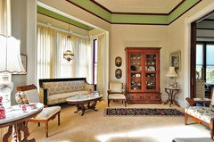
    Consider leaving the molding as it is. Add the median grey you asked about to the ceiling. See pic, attached. In this case, we added metallic wallcovering to the ceiling instead of paint, but the effect will still read.
  • 13 years ago
    I love it. Add a big tree in that corner instead of what's there. Not really feeling the family pictures. Would put in bedroom. Let a palm cover area.
  • 13 years ago
    Love your work Daniel. Where are you?
  • 13 years ago
    If you need something to fill in wall space tall candle scones would be nice.
  • PRO
    13 years ago
    Thanks travisinteriors. You are kind. I am based in Atlanta.
  • 13 years ago
    I like it! I would leave it but if you don't like it then I would paint it white to match the molding.
  • 13 years ago
    I love Atlanta . I'm in Orange county in So Cal.
  • 13 years ago
    A shade lighter in the gray stripe might be a better choice. The two pictures on the right side, to me, need to be moved up a little bit; with the top of the picture on the left being level with the top one on the right, and the bottom picture on the right should be level with the bottom picture on the left. Another idea would be to put a really nice mirror right in the center with the pictures all around the mirror displayed as I suggested above. But, if you like the area as it is, enjoy it, and don't change it! :)
  • 12 years ago
    it looks nice the way it is now just the frames should be larger
  • 12 years ago
    I'd like to know the brand of paint and the names of the grayish colors. I'm getting ready to paint my bedroom and these colors would look great.
Sponsored
Hope Restoration & General Contracting
Average rating: 4.7 out of 5 stars35 Reviews
Columbus Design-Build, Kitchen & Bath Remodeling, Historic Renovations