Software
Houzz Logo Print
mark_rachel

Top Granite pick... about to pull the trigger

9 years ago
last modified: 9 years ago

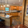
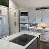
Our current kitchen. The paint has been changed to Clay Beige that reads much lighter...
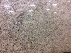
Here is my top pick. It's Giallo Verona. Nothing over the top, but it seems like it will fit our kitchen well. Right now we have dark brown Corian on dark oak cabinets. The original owners pick... WHY?!?! We have light hickory floors & this is our cabinets. Thoughts?

Clay Beige BM. Reads a lot lighter in our house. Not the color that is on the wall in the above pic of our kitchen.

Crackle glaze subway.

Comments (22)

  • 9 years ago

    I think of hickory as a busy floor, a "wow". I think your cabinet and granite look really nice together in the picture, just be sure you want the busy floor with the somewhat busy counters also. It will probably look great! What I like about your granite is that it has warm tones and also cool grays--makes choosing other colors easier.

  • 9 years ago

    Mrs. S makes a great point about the counter and floor..... As far as the cabs and counter go, they're fine.

  • 9 years ago

    Yes our floor does have a bit of a "wow" factor to it. It's beautiful, but a bit busy. The granite it a tad busy, but it doesn't have a lot of movement, so I'm thinking it will work. I'm still open to suggestions. I would LOVE Taj Mahal, but the budget isn't going there.... :)

  • 9 years ago

    I think with the kiddo stirring the cookies being so cute, it's hard to notice the colors.

    mark_rachel thanked Mrs. S
  • 9 years ago

    Agree about the hickory floors and a busy counter. Think about it.

  • 9 years ago

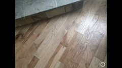
    Do you have a pic of the floors?

  • 9 years ago

    We have a kitchen in our lower level with speckled granite, (Santa Cecilia) and I have a hard time telling when it is dirty or clean. After I clean the counters I have to wipe my hand over them to make sure that I didn't miss anything, especially crumbs. If I had to do it over again I would choose something different.

  • 9 years ago


    Here is the flooring. @Wilson853 I don't mind the dirty/clean factor. With 2 young kids & a very busy life I need everything to LOOK clean even if it's not. That I don't mind at all & actually prefer.

  • 9 years ago

    Here is the entire slab. I would need at least 2. As you can see it doesn't have movement. hmmm....


  • 9 years ago
    last modified: 9 years ago
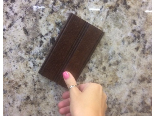
    Movement doesn't always mean busy. I have white countertops with lots of directional veining, but they are anything but busy. Your granite is simply a busy pattern. It's just a rather common thing with most granite. Your floors are beautiful - hickory is my favorite wood. Personally I would just rather have a quieter counter with the hickory.

    But the reality is, you are the one that needs to like it - not us. :-)

  • 9 years ago

    Too busy for my taste.

  • 9 years ago

    I think they would work together. The countertop isn't terribly busy; the pattern is kind of small and they're not right next to each other. If it were me, I'd go for it.

  • 9 years ago

    I think I like your granite better than I would a granite with a lot of large movement across it--that would really compete with the floors imho. But the speckled-ness makes it read simpler, especially from the photo of the whole slab you posted, and in a way, not too different from the current corian photo. it is a neutral in terms of color. I think it blends/complements the floor coloring. I think if you choose a plain/simple backsplash, it will all come together.

  • 9 years ago

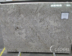
    @Mrs. S please don't tell me that it looks like my Corian!! haha I despise that countertop!!! haha Just for fun here is one that I'm IN LOVE with, but I'm thinking is definitely too busy. I do love it though... I'm not sure if it's warm enough for my space. So hard finding things you love, but know they aren't right for your house. Ugh.


  • 9 years ago

    To me, the last slab you posted is beautiful ....maybe same level of busy but somehow more monochromatic and uniform than your giallo.

    I could see the latter blending together to create a uniform grey/brown look when viewed from a distance. I think the higher contrast in the background color and the 'speckles' in the counter in your giallo make it busier to my eyes.

    Also, how much do you like the pattern in your current counter ? The giallo

    is a variation on that theme - lighter background but same overall effect. Do you really think its worthwhile to change your current slab for the giallo (asking earnestly).

    Have been counter obsessed myself lately and I think you could take a peak at Colonial Dream/Cream, if you search by my id (CurryUp) you should find pictures of the slab I posted. Its a cream colored granite with minimal specks,

    really pretty. Just my 2 cents.


  • 9 years ago
    last modified: 9 years ago
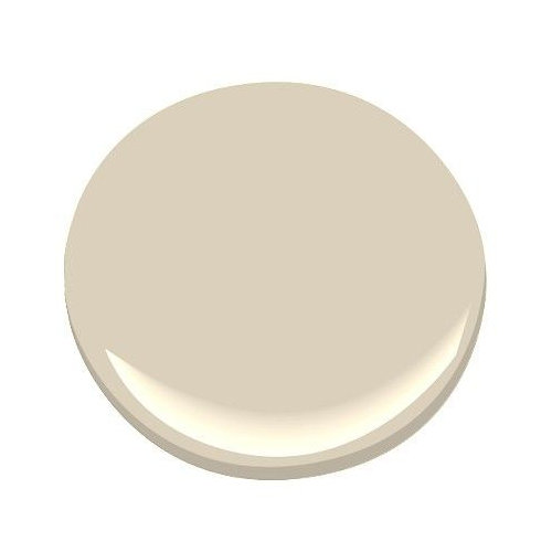

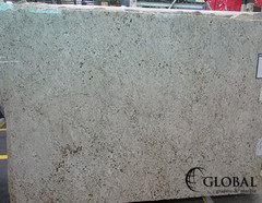
    They have a Colonial Breeze that I really like, but I'm concerned with how porous it is. Seems to have a bad rap. I've heard bad things about the "Colonial" family. Ugh. They colors are great though.

  • 9 years ago

    The granite is never going to look like Corian in person.Nor feel like it. Your granite is going to feel so wonderfully stone-like and luxe. It's hard to say whether those coolish-grays will look good. I don't trust my monitor, but I do feel those stones are beautiful!

  • 9 years ago
    last modified: 9 years ago
    Only addressing the 'bad rap' of " Colonial" granite, who knows if my 'Colonial White' granite is like the Colonial Breeze you like. But mine was sealed before install and is still bulletproof after 18 months. The fabricator told me to watch for when water stopped pooling on the surface and then reseal, and so far, it's still repelling everything. It's really easy care. Here's my slab photo.

    I like the last two slabs you posted very much, fwiw. Somehow I feel like the first one would work well with your elements. Your floor looks like it has some grey tones?

    Final Countertop and Backsplash · More Info

    mark_rachel thanked barncatz
  • 9 years ago

    It's one thing looking at a full slab hanging vertical and looking at a slab cut up on your countertop in a horizontal position. When it's horizontal, it won't look quite as busy. I say go with the one you love. It will be fine.

  • 9 years ago

    I think the color and the movement of Giallo Verona works well with your cabinets and floor. It will be a big improvement over that dull brown Corian.

  • 9 years ago

    Thank you everyone. I'm going to go back & take another look. They are getting a new shipment in this week.