

Is the penny tile too busy? White or blue?
9 years ago
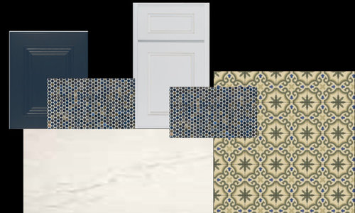
Featured Answer
Sort by:Oldest
Comments (10)
- 9 years agolast modified: 9 years ago
Related Professionals
Bloomington Kitchen & Bathroom Designers · Aiken Kitchen & Bathroom Designers · Beckley Kitchen & Bathroom Designers · Anniston Kitchen & Bathroom Designers · Riverton Kitchen & Bathroom Designers · Spartanburg Kitchen Remodelers · Auburn Kitchen Remodelers · Lawrence Kitchen Remodelers · Albany Kitchen Remodelers · Madison Kitchen Remodelers · Spanish Fork Kitchen Remodelers · Anchorage Kitchen Remodelers · Indianapolis Custom Countertops · Lincoln Custom Countertops · Ogden Custom Countertops 9 years ago
- 9 years ago





Related Stories
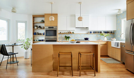
KITCHEN MAKEOVERSKitchen of the Week: A Modern Mix of White, Wood and Blue
A designer helps a San Francisco couple create a calm and clean-lined space with a touch of textured geometric pattern
Full Story
DECORATING GUIDESCreate a Classic Look With Beautiful Blue and White
These techniques and patterns from around the world never go out of style
Full Story
BATHROOM MAKEOVERSBathroom of the Week: Stylish Redo in Blue, White and Wood
Losing the bathtub makes room for a watery blue focal wall, a large shower stall and ample storage
Full Story
BATHROOM TILE13 Baths Tiled in Beautiful Sea Glass Blue
Let your cares slip away as you wade through these rooms of turquoise and blue
Full Story
MATERIALS6 Spot-on Places to Use Penny Tiles
You’ll flip for these coin-shaped wall and floor tiles in bright colors, subtle neutrals and even clear glass
Full Story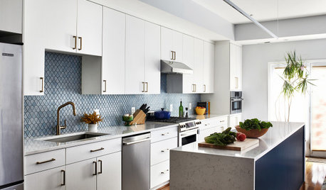
KITCHEN DESIGNKitchen of the Week: A Galley With White-and-Blue Style
A designer helps a D.C. couple create a bigger and brighter family kitchen with a new island and a fresh palette
Full Story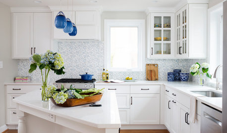
WHITE KITCHENSWhite Cabinets and Blue Accents Brighten a Kitchen
An empty-nester couple creates a light-filled open kitchen with improved storage, more workspace and better flow
Full Story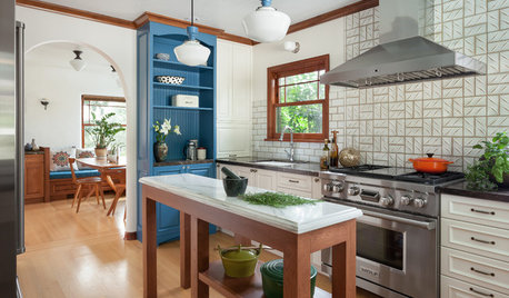
KITCHEN OF THE WEEKKitchen of the Week: White, Wood and Blue Perk Up Tudor Style
Design details that fit this Seattle home’s traditional look mix with modern upgrades and personalized storage solutions
Full Story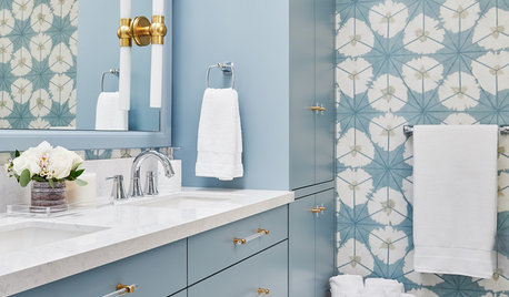
BATHROOM DESIGNPowerful Pattern in a Blue-and-White Bathroom
A designer packs function, light and style into 66 square feet
Full Story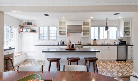
KITCHEN OF THE WEEKKitchen of the Week: Graphic Floor Tiles Accent a White Kitchen
Walls come down to open up the room and create better traffic flow
Full Story

eam44