

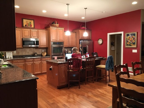
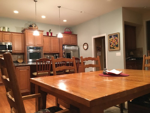
Right color for kitchen
8 years ago
Featured Answer
Sort by:Oldest
Comments (18)
 8 years ago
- 8 years agolast modified: 8 years ago
Related Professionals
El Dorado Interior Designers & Decorators · Palm Bay Interior Designers & Decorators · Jacksonville Interior Designers & Decorators · Charlottesville Interior Designers & Decorators · South Bend Interior Designers & Decorators · Pierre Interior Designers & Decorators · Gainesville Architects & Building Designers · Salina Architects & Building Designers · Virginia Beach Architects & Building Designers · North Adams Architects & Building Designers · Boise Architects & Building Designers · Twin Falls Architects & Building Designers · Little Rock Kitchen & Bathroom Designers · Greenfield Kitchen & Bathroom Designers · Middletown Kitchen & Bathroom Designers 8 years ago
- 8 years ago
 8 years ago
 8 years ago
 8 years agolast modified: 8 years ago
 PRO8 years ago
- 8 years ago
- PRO8 years ago
- 8 years ago
- 8 years ago
- 8 years ago
- 8 years ago
- 8 years ago
- 8 years ago
- 8 years ago
Related Stories
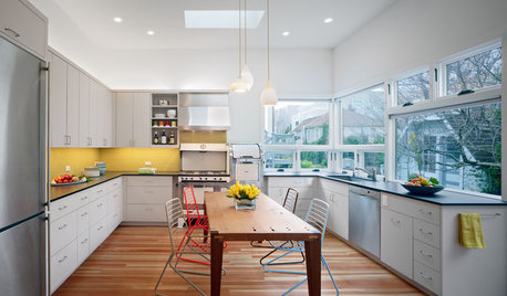
KITCHEN DESIGNThe Ecofriendly Kitchen: Light Your Kitchen Right
Harnessing the daylight is a terrific choice for earth-friendly kitchens, but it's not the only one
Full Story
BEFORE AND AFTERSKitchen of the Week: Bungalow Kitchen’s Historic Charm Preserved
A new design adds function and modern conveniences and fits right in with the home’s period style
Full Story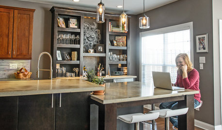
INSIDE HOUZZInside Houzz: The Right Kitchen Counters in Just a Few Clicks
Concrete kitchen countertops eluded this Pennsylvania homeowner until she turned to Houzz
Full Story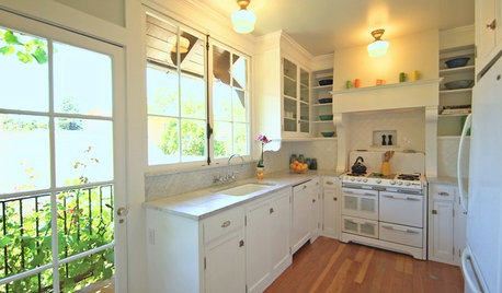
HOUZZ TVHouzz TV: A Just-Right Kitchen With Vintage Style
Video update: A 1920s kitchen gets a refined makeover but stays true to its original character and size
Full Story
MOST POPULARHow to Choose the Right Kitchen Sink
Learn about basin configurations, sink shapes, materials and even accessories and specialty sinks
Full Story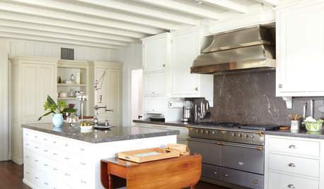
KITCHEN DESIGNHow to Find the Right Range for Your Kitchen
Range style is mostly a matter of personal taste. This full course of possibilities can help you find the right appliance to match yours
Full Story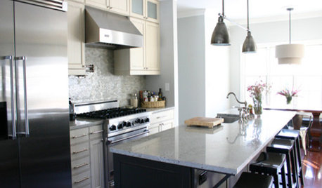
KITCHEN DESIGNKitchen Details: The Right Edge for Your Countertop
Square, Mitered, Waterfall or Bullnose? See What Counter-Edge Style Looks Best to You
Full Story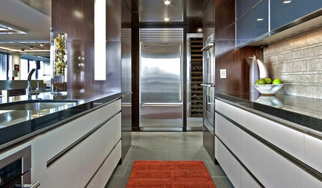
KITCHEN DESIGNThe Right Rug for a Kitchen
Add a Fun Runner for Color, Cushion and Warmth in the Kitchen
Full Story
LIGHTINGHow to Get Your Kitchen Island Lighting Right
Here are some bright ideas on when to use chandeliers, pendants, track lights and more
Full Story
KITCHEN DESIGNDetermine the Right Appliance Layout for Your Kitchen
Kitchen work triangle got you running around in circles? Boiling over about where to put the range? This guide is for you
Full Story




may_nancy61Original Author