Software
Houzz Logo Print
oomph18

Powder Room Help - just redone and doesn't look "right"

8 years ago
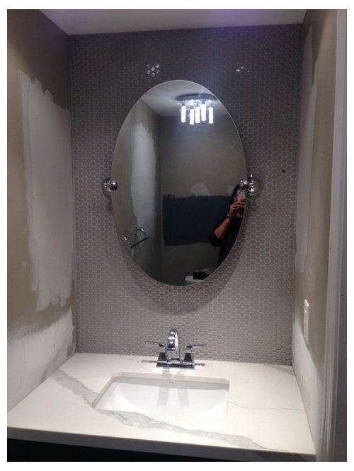


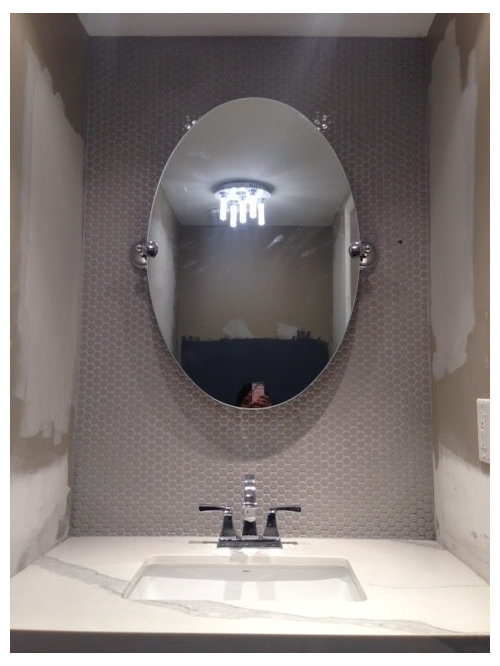
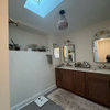
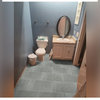
HELP! We just redid our powder room (reusing our existing vanity box
and sink). We got a new quartz counter top, applied grey penny tile to
the wall behind the vanity with light grey grout and we plan on
painting the side walls and ceiling a lighter grey (SW - Agreeable Grey)
+ the back wall where the toilet is will be darker grey (SW - Wall
Street). The bathroom is about 3' x 7' and 7' tall. Across the vanity
is the toilet (not visible in photos).

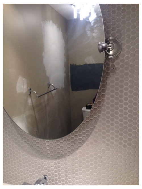
The mirror was hung too high. So we have to see if that can be
dropped and will have to live with a pair of holes drilled into the
tile. I"m not sure there is even enough room on the cover plate to hide
the holes if we drop it a few inches. To be determined.

What else is wrong here? Maybe the mirror itself just isn't the
right scale? Is the grout colour too light or too dark? Can that be
changed at this point? Maybe the install of the tiles is poor? Maybe
the room will look better once the paint job is done? Maybe a different
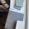
paint colour will suit the space better? You can see the sample of
Agreeable Grey to the left of the vanity.

It's just very disappointing after selecting all the finishings to end up here. It totally lacks interest and appeal.

Comments (20)

  • 8 years ago

    I'm not loving that mirror. I think once you get it all painted it will look better in there. I'm not loving the super dark gray sample behind you either. That is going to close that wall in & make it look even smaller in there.

    oomph18 thanked mark_rachel
  • 8 years ago

    For the mirror, see how confident your tile setter is in chiseling out the tiles around the holes and resetting them. Or, get a larger, rectangular mirror to hide the holes. Try to get it fixed, though.

    I don't care for the Agreeable Grey with the other tones. In the picture it looks very brown. I would choose a color for the walls, rather than the different greys.

    The tile color looks very similar to BM Ozark Shadows with a hint of purple. Is that true IRL? If you're going monochromatic, take a look at that color.

    oomph18 thanked alex9179
  • 8 years ago

    Would you consider an off white for the walls? You don't want grays to complete with your tile.

    oomph18 thanked mark_rachel
  • 8 years ago
    last modified: 8 years ago

    Tile the side walls too. Just the rear wall looks unfinished. Plus, you need some kind of splash there or you’re going to have water damage.

    Ditch that mirror. Add a dark framed mirror with an interesting frame. And a lot more lighting. A recessed and a couple of sconces.

    But a big offender is that 4” Center set chrome faucet. It needed to be an 8” widespread with some presence. Too late to redrill the top, so switch to a single post faucet with an escutcheon to cover the extra holes. You need something with character, and that will be a statement. That chrome is just a Homey Cheapo special and looks it.

    oomph18 thanked User
  • 8 years ago

    Drop the mirror, pick a better paint color, and I think you'll have a nice room. It is different, but that's what powder rooms are good for--being interesting.

    There is nothing wrong with the faucet.

    oomph18 thanked Fori
  • 8 years ago

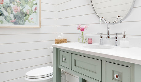
    What about something like this?

    oomph18 thanked mark_rachel
  • 8 years ago
    last modified: 8 years ago

    Where is your lighting? You need some cool sconces on either side of the mirror. Well, a different mirror. Not loving that faucet either. I like the suggestion of the blue green paint, but agree that you need sidesplashes.

    oomph18 thanked User
  • 8 years ago
    last modified: 8 years ago

    Thanks for all the feedback. Interesting how perspectives are all different. These are all great ideas and will try a few different things.

  • 8 years ago

    The mirror is too high and also too small. Either a bigger mirror or sconces will fill up the space. Bigger mirror will solve the holes in tile problem. It also is very old fashioned looking. The faucet is modern. So is the tile. Clash of styles.

    I wouldn't tile the side walls.

    oomph18 thanked Milly Rey
  • 8 years ago

    The mirror being dropped will change the whole perspective, now it is out of proportion so it seems unsettling. I like your tile so I do not like the idea of a larger mirror covering it up. You should be able to take the tile off under the holes, retile and regrout fairly easily. I like dark powder rooms a lot and find would find a spa blue to be less exciting than all walls being a dramatic dark color. Do not fret for it is still a work in progress and with minor fixes it will be lovely.

    oomph18 thanked roarah
  • 8 years ago
    last modified: 8 years ago

    I agree that lowering the mirror will be a good thing.

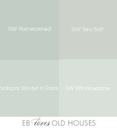
    Also, I like the idea of bringing in a bit of soft color -- I like that Rainwashed shade above.

    I'm confused by what looks like a fairly large towel bar in a half bath -- and shouldn't it be nearer the sink for the convenience of hand-washers? In a small half bath, it seems to stand out too far into the room /takes up too much space.
    Finally, you badly need your finishing touches -- they will make a world of difference. I mean linens, bath mats, artwork. Right now it looks empty, but I'm sure you have a pretty soap dish, etc. waiting.

    oomph18 thanked Mrs Pete
  • 8 years ago

    A towel ring closer to the sink would work better. Also maybe some wood floating shelves above the toilet.

    oomph18 thanked mark_rachel
  • 8 years ago

    I agree with a rectangular mirror (The current one reminds me too much of make-up/shaving because it's tiltable) and sconces.

    Personally, I like the faucet. And while I'm a huge fan of Agreeable Gray, I'd probably go with something that's more like the tile color, perhaps slightly darker. or even purpler.


    oomph18 thanked nosoccermom
  • 8 years ago

    I think mayflower has the perfect solution!

  • 8 years ago

    Where is your lighting ? The paint can change if you don’t like the outcome. But the hard finishes need settled initially to avoid disappointments. @mayflowers mirror pic is lovely. Use a good bathroom paint, and keep that counter dry and you should be ok without a side splash, if counter top is well caulked all around. If it was a kids room I’d want everything tiled :)

    so many great comments made above.

  • 8 years ago

    Instead of removing the mirror, why not add a glass shelf with similar chrome brackets a few inches below it. My neighbor has a similar set up and it looks really nice.

  • 8 years ago

    As a short person, I hate it when I can't check for untucks/hang-ons/general dishevelment because the mirror is too high for me to be reflected. Don't ask what I've been doing, you just never know. A shelf could help with proportion but the fact remains that it's not at a functional height.

    I agree OP. The pic Mayflowers posted is a great blueprint. Notice how the paint is the same shade as one of the colors in the tile?

    Enduring brought up an excellent point. Anyone using the PR won't have Lightroom to be able to see themselves. Look into lighting that can be dimmed. It's easy to install and great to have a choice between adequate and "what's on my face?!?"

  • 8 years ago

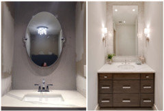
    Comparing ... I definitely prefer the one on the right ... but why? I see four things that make a difference:

    - As hard as I'm trying, it's hard to look past the unfinished aspects. I'm not convinced that it won't look just fine once everything's done /accessories are added.

    - Lighting. The right photograph has lovely light, whereas the left photograph has shadows at the top of the mirror /the mirror casts a shadow. I see a ceiling light in the left photograph -- you definitely need lighting by the sink as well. Without lighting near the mirror, your head will cast a shadow over the sink as you use it.

    - The colors on the right are warmer. I'm not into the current grey trend, which feels cold to me. I think this is why I advocate bringing in a soft color on the walls.

    - I agree with the above posters that the rectangular mirror /attached to the wall is a better choice.


  • 8 years ago

    your tile does look lavender. what is your vanity color? My sister has done a lighter lavender gray in her kitchen, with white cabinets. The tile is a soft grayish limestone look-a-like luxury vinyl. The whole room is so well put together, color wise. She had a kitchen designer help her. I don't know who chose the whites and gray. She probably chose the lavender gray, and the team chose the white for the cabinets and case work. The point I'm making, is get a color that goes with the tile, while in the room.

    The lighting will make a huge difference with color. And our own personal preferences. Type of lighting will change the color of paint throughout the day. Maybe you know all this. Paint color can be tricky because of the lighting.

    When I was choosing my paint for my second bathroom, I wanted something different than the typical greens/blues that I've used throughout the house. So I tried a tan. The room has tan and browns in it. Out of 4 samples I selected a good candidate. I painted the whole room and about puked when I was done. My neighbor loved it. To me it went pink, like antique pepto-bismol. I got another paint and redid the whole room lickity split, in a greenish blue gray, almost white. I love the color. It goes with my tiles, as did the other paint, but I just couldn't stand the pink that I saw. And I like pink.

    Anyway, I'd go with the color of the tile, matched with paint, darker or lighter, when you have the correct lighting you want in the room. I would then use accessories as complementary or analogous colors for interest.