Software
Houzz Logo Print
michelle_shepherd1083312

Backsplash Advice- lots of pics!

8 years ago
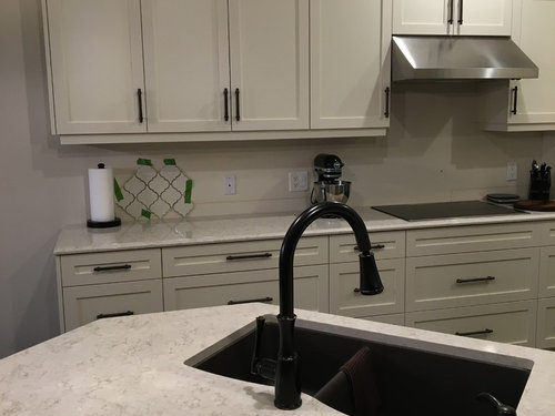
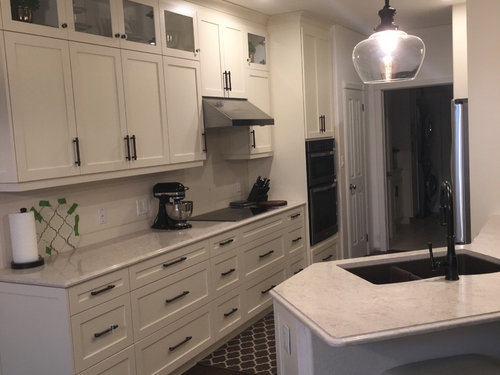
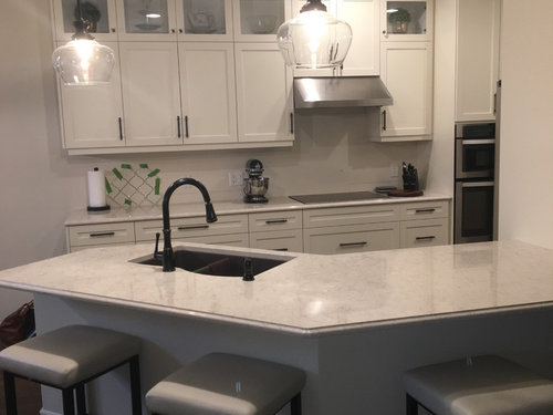
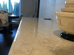
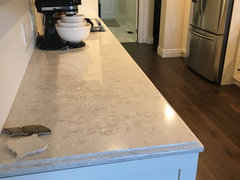
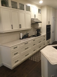
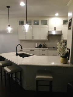
Our new kitchen is almost complete aside from paint and backsplash. Cabinets are antique white with bronze hardware. Quartz is Zodiaq Venetia Cream, a creamy off white with a hint of bronze veining. I do not want a busy backsplash but also think the kitchen needs a pop.


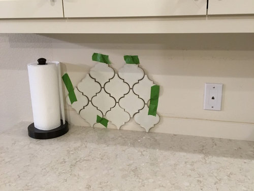
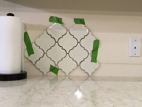
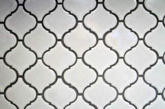
I found this arabesque tile at Home Depot (only in US of course ), and I was wondering what everyone thought of this tile with a darker grout for some contrast? Sometimes I think it's too matchy-matchy but then I remember I LIKE matchy-matchy!!


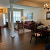
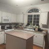
Here's some pictures so you can see the quartz up close with the tile and one further back so you can see a bit more of the overall space. Keep in mind we have not painted yet. Thanks!


Comments (34)

  • 8 years ago

    You are right that it is very matchy-matchy, but I also enjoy that look sometimes. I completely understand how you feel! I think it is a gorgeous look, but knowing what color paint you are thinking about would make a huge difference. Do you have an idea in mind? That might help people provide a better recommendation. You can play around with some of the color visualizers online, such as on Sherwin William's or Behr's website. You might be able to break up some of the matchiness with some pops of color on your top glass shelves. Are the stools staying? I like them, but if they aren't that is another option to bring in your color. The good thing about having a neutral palate in the cabinets and backsplash is that you can easily swap out colors in your paint and accessories.

    M Sheps thanked User
  • 8 years ago

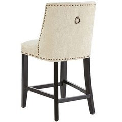
    K Fritz thank you. I definitely want a fairly light paint but want to install the tile first then decide on paint. Barstools stay for now but am thinking of something like this.


  • 8 years ago
    last modified: 8 years ago

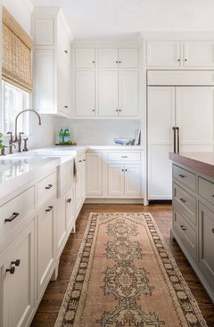
    The tile is perfect I think and when completed with the dark grout, it will have impact, but not too much. I especially like the idea of the darker grout which will really compliment all of the darker components. Your choices were lovely and I wouldn't be second guessing if you love it - it's a timeless and classic look, like your kitchen. If you want to inject color/contrast, consider a classic oriental runner and select based on the wall color and I think soft grey would be complimentary.

    M Sheps thanked Maureen
  • PRO
    8 years ago
    I agree, the tile and grout colour is perfect. And the diagonal pattern makes it appear larger than if it was horizontal. Can’t wait to see the finished kitchen!
    M Sheps thanked Chez Pluie
  • 8 years ago

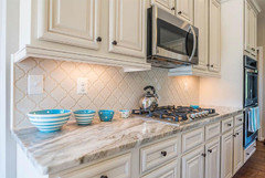
    I love all of your choices, including the backsplash with a dark grout. I just saw this at Home depot recently and took a picture to remember it.

    I'm curious with the antique white cabinets if the true white trim other places is bothering you? Or did you paint trim an off white as well? I ask because this is a look we're considering for our upcoming remodel and I go back and forth about whether it will bother me.

    M Sheps thanked Jennifer Paul
  • 8 years ago

    Thanks jackiep9. Let me tell you I have stressed over my white trim and antique white cabinets. I have read every post on GW and Houzz on the subject. Now that the kitchen is almost done, I have to say that with the exception of the pantry door in the kitchen, I'm not bothered at all with the white trim. The first photo is a bit misleading because the walls above the door frames have primer on them, so it appears really white. Once painted it shouldn't stick out as much. The kitchen overlooks the family room that leads into the bedrooms. All white doors and trim. If I paint some I have to paint it all..and I just don't want to paint it all (it's in perfect shape). So for now I'll keep it and do what Maria Killam says and add some white here and there to keep the flow.

    Seems like a consensus on the tile .. anyone have thoughts on a paint colour?

  • 8 years ago
    M Sheps it all depends what your taste is. You can go matchy matchy or go for a contrast. Personally going with matching grout you will not get the visual effect of the tiles shapes which is the beauty of the tile. For grout color you can go with a shade of bronze that will match the hardware and it will bring out the bronze veining on the quartz as well that is the beauty of using a darker grout.
  • 8 years ago
    Let me know the final outcome. If you pick a few colors and repost and houzzers can help decide.
  • 8 years ago

    yes it's fine.

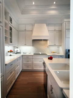
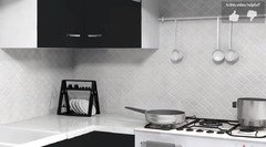
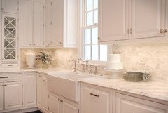
    do it w/a darker grout for some contrast, otherwise it will look like this

    or this

    a darker grout along these lines or a tad lighter

  • 8 years ago

    Love the tile, love the stool!

  • 8 years ago

    If you look on HomeDepot's website and check out the video for this tile, it shows what this tile backsplash will look like with white grout. Beautiful either way but it will definitely stand out with darker grout, which is probably what attracted you to it in the first place. :)

  • 8 years ago

    By the way, gorgeous Venetia Cream quartz! It was pretty cool when we had narrowed down our search for quartz to the exact same two you were looking at (oak cabinets though). We decided on Zodiaq Venetia Cream as well because the LG Viatera Aria had a repetitiveness about it that really stood out that we didn't care for after seeing it in the full slab...just too busy for our grainy oak cabinets but still gorgeous quartz.

  • PRO
    8 years ago

    I don't care for the all-white look, I'd encourage you to look for a tile that's mostly white but has an accent color you can take off from and do your accessories in. However, if you have to do white, do go with a darker grout, as suggested above.

  • 8 years ago

    Because I like a soft look, I would go with a grout that was close to the darker color in the counters, but not much darker. I don't like to draw attention to the grout myself.

  • 8 years ago

    I love your kitchen! Thanks for posting photos. I like a soft, monochromatic look and am ready to order off white cabinets for my kitchen. I'm debating between Venetian Cream and U Quartz Vista Blanco - just slightly greyer/darker. I have fairly new bisque appliances in very good shape so I'm keeping them. When bisque is no longer available, and I have to replace them, I will go with white or black, so I'm trying to decide if I should have an undermount sink in SS or a porcelain bisque. What do you all think? My walls will be cream on the bottom and darker greige on the top. This photo is my inspiration - I saw it online.


    I won't be using a farm sink.

  • 8 years ago

    I like everything in your new kitchen but would not put a dark grout. Pop it with colourful gadgets, jars or ornaments. You can always change the accent colour when you like too

  • 8 years ago

    I vote for dark grout. Otherwise, the shape of the tile will be lost.

  • 8 years ago
    last modified: 8 years ago

    Dark grout and a tile with a complicated shape and a long run of backsplash are going make a very strong pattern and design statement in your kitchen. The backsplash is going to take the focus away from your marble, your lights and your other carefully chosen design elements.

    If you want the focus of the kitchen to be the backsplash, then definitely pick the dark grout. If you like the current look of your kitchen choose a grout that matches the tile. You can add more color and pattern to your kitchen with more easily changeable paint, rugs, art and accessories.

    The shape and texture of the tile is going to be much more apparent in person than it appears in the photos.

  • 8 years ago
    I would match the grout to the color you like in the counter top.........for the simple reason that this would make the backsplash and the counter work together for a stronger but subtler impact ........rather than the two parts fighting each other..
  • 8 years ago
    last modified: 8 years ago

    Contrasting grout demands--demands--an A++ job by your tile installer. Every single flaw will be highlighted with a contrasting grout and you'll be back here (like so many others) crying about the bad tile job.

    IMHO, that tile is waaaay too busy for the style of your kitchen, and it will draw attention to itself. If your kitchen were Mediterranean, maybe. But for a kitchen with so many simple, clean lines that tile looks out of place. It's just a backsplash, not a focal point.

  • 8 years ago

    In regards to paint color, choose something that flows with the other rooms. That is a trick I learned from our painter. It makes everything look a lot more cohesive with an open floor plan. I love the choices you've made so far!

  • 8 years ago

    Thanks so much for all the comments. I've still not made any decisions .... I take procrastination to a whole new level. Hopefully after the holidays, but I'm thinking of calling a designer to help me choose the tile and paint colour.

  • 8 years ago

    Another vote for not too dark grout - for some reason dark grout looks dirty to me even if I know it isn’t. I know a lot of people like it, but it doesn’t work for me.

  • 8 years ago

    Thank you for posting. It is very difficult to find pictures of this new countertop colour. I would love to see this with natural light if you have any pictures you can post. Your pictures have convinced us to seriously consider this colour. The sample I saw is very yellow, yet this does not look yellow at all!

    M Sheps thanked A S
  • 8 years ago

    Hi masteveson ... here’s a few pictures I look this morning. It is very hard to photograph and pictures don’t do it justice. It’s definitely not yellow. I still don’t have paint or backsplash ... hopefully soon and I’ll post a completed photo.

  • 8 years ago

    M Sheps - Can you tell me the thickness of your quartz? I know it's available in both 2 and 3 cm. The fabricator in our area is calling this same quartz Venetian Stone. It looks identical but hope it's the exact thing. We are just a few days away from ordering it.

  • 8 years ago

    I believe it is 3 cm.

  • 8 years ago
    Thank you SO MUCH for posting your pics of Venetia Cream. We’ve been agonizing over whether this is the best choice for our island and I’ve found no pictures anywhere until I stumbled upon your posts here. We are going for it - thanks again!
  • 8 years ago
    Thanks for the additional pictures. We are going to go for it. Debating between the darker sink or stainless. Our cabinets are Cloud White too. Looks like you are considering adding some darker tile to mix up the backsplash. I will post pictures too when done. We are about three weeks from install. So many decisions....
  • 8 years ago
    A quick update.. we didn’t end up going with the arabesque tile. I found this Olympia tile and liked the shape and the match to the quartz. It’s all very matchy matchy, but I like it.
  • 8 years ago
    Very nice..
  • 8 years ago

    Your kitchen looks great! I have been looking for a white on white kitchen with dark floors for inspo. Great job.

  • 7 years ago

    M Sheps your kitchen is so pretty! I have been looking at LG Aria but I love your new quartz how have you liked it?