Software
Houzz Logo Print
emcsq

Picking Colonial White for counter replacement

8 years ago
last modified: 8 years ago

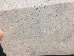
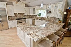
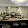
We are replacing the counters in our kitchen. We have picked out Colonial White slabs. We are looking for a lighter, less busy granite than our current Giallo Ornamental (which are very gold/yellow/brown). We had a sample of SF Real (or Light Ornamental?) in our kitchen before we went to granite yard, but although the colors seemed to work, the pattern on the sample was too busy. Colonial White seems to check the boxes in terms of color and minimal busyness.

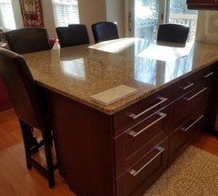
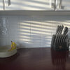
So I would love opinions on how Colonial White granite will look with our existing kitchen finishes. The cabinets are Ikea Ramsjo (the closest stain color is Red Mahogany), the floors are butterscotch oak (which read orange-ish, but they are in the rest of the house and we have tried to tone them down with beige and white kitchen rugs). The appliances are SS. If you zoom in close on the picture, there is a paint chip above the drawer front for SW Accessible Beige. This is the paint color in the kitchen and the family room that is open to the kitchen.

We have a lot of south facing light from the kitchen window, the slider, and two windows in the family room. The basic kitchen plan can be seen at http://ths.gardenweb.com/discussions/2700513/advice-on-our-kitchen-remodel-round-2?n=12

Backsplash suggestions are also welcome!

Thanks!

Comments (29)

  • 8 years ago

    Really porous and will stain quite easily. Even if you apply sealer.

  • 8 years ago
    last modified: 8 years ago

    Gorgeous slab!

    Our experience with Colonial White has been totally different than Sophie's allegation. We installed it in May, 2016 and it's been bulletproof. The fabricators sealed it before install and told us to seal it again when water stopped pooling up on it. We haven't resealed it yet and everything wipes up without any stains. It looks like new. We use plain hot water to clean and a spray cleaner Joseph Corlett recommended, Stonetech Cleaner and Protector,

    I will post later about your design questions!

    emcsq thanked barncatz
  • 8 years ago

    wow , with the large eating peninsula in your kitchen this piece seems too utilitarian . I would move to the quartz family for a less cold surface and look for what you said-lighter-less busy- but also seek more of a statement with either some tones/a subtle pattern . Or keep looking at all the granites...this one is just ho hum....the black flecks aren't really special enough for that eating area.

    emcsq thanked herbflavor
  • 8 years ago
    last modified: 8 years ago

    Thanks for the feedback so far.

    We have tried to find a quartz that we like, but the whites seem too bright (contemporary), and we don't care for the uniformity of quartz. It also seems to be more expensive than granite, and we are concerned about heat. Is there a particular quartz that you would recommend, herbflavor?

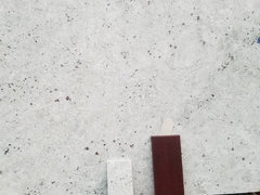
    This is first post is not our actual slab, but we picked two others from the same lot. The one in the first post happened to be the one that we got a picture of with the cabinet and paint and floor sample. The two actual slabs are shown below. They probably have more black/gray, but honestly, neither of us has much dramatic flair. We have a small kitchen space and hectic lives, so we really want our home to feel serene (even boring!). We have no intention of changing the granite again any time soon, so we would rather err on the side of caution than end up with something too dramatic or busy or visually strong. My thought is that we can add interest with smaller pieces.


    and


  • 8 years ago
    last modified: 8 years ago

    what I agree about is the colors in your current counter: gold brown yellow need to go. I don't believe the current counter is too busy.I don't care for black flecks --they stand out and are "flat" . Your space can use some more active/organic/pattern to the counter surface.... the eating area is a feature/a bit of a statement , and needs the right selection ....think dynamic/alive ....not busy. I think bringing in various granite samples is what I would do. Good Luck.

    emcsq thanked herbflavor
  • 8 years ago
    last modified: 8 years ago

    That granite will read light gray. Can the rest of the space handle such a cool tone? I see your paint is Accessible Beige. I have warm tones in my adjoining DR and LR and when I put a white or gray countertop sample on my peninsula and looked across to get the big picture, it didn't work. I went with a cream colored quartz.

    emcsq thanked User
  • 8 years ago

    We used Colonial White in a rental property and never had an issue. It held up really well.

    emcsq thanked Caroline Hamilton
  • 8 years ago
    last modified: 8 years ago

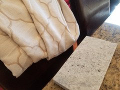
    I am worried that it might be too gray or cool, but I want to avoid yellow tones. Here are some pics in the actual space of a sample. The last one is next to a curtain that is ivory and beige.

    I don't know if it's a valid design principle, but what I think I am trying to do is balance warm and cool colors. For a long time, nearly all of my home has been on warm "overload," to the point that I sometimes felt like the walls were closing in on me. While we still have the warm floors (and I do like them in the FR and LR where we have large area rugs), I've been cooling things down by painting coastal colors (Accessible Beige, SW Watery, and SW Sea Salt). So far, it seems to be turning out well. I'm ok with a cooler granite if I can balance it and integrate it in the room, but I guess what I (think I) want is a neutral granite.

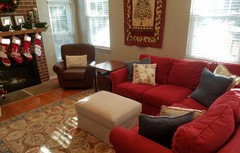
    Here is a view of the FR that next to the kitchen (open design)...In real life, I think the red tones in the sectional, stockings, and wall quilt do not clash the way they seem to on my monitor.


  • 8 years ago
    last modified: 8 years ago

    the Typhoon Bordeaux would match perfectly w/your cabs. it has bits of the burgundy in the stone. Each slab is different, but this gives you an idea of coloring

    they also have typhoon bordeaux cream.

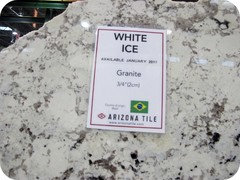
    look at White Princess, or White Ice granite as well.

    white giallo ornamental..

    emcsq thanked Beth H. :
  • 8 years ago

    Thank you, Beth. We did look at the White Giallo Ornamental and SF Real, and while the color seems very consistent with what we are going for (and are also similar to Colonial White), there is too much pattern (busyness) for us.

    I'm not sure about Typhoon Bordeaux...seems dramatic for our small space.

    I think there was White Princess at the stone yard, but it didn't make us stop to consider it as a serious contender.

    I was also thinking that our peninsula is frequently laden with school papers, a fruit bowl, groceries to be put away, etc. I think that is part of why we think we need a very plain and non-busy granite. For me, the dense pattern in our Giallo Ornamental is too visually stimulating and stressful. Does that make sense?

    We still lean toward the Colonial White, but I am starting to stress that we might be making a bad choice. Given our desire for a predominately ivory/light beige/light greige granite that is calming and not busy, is there something else we should consider? I've seen lots of online pictures of Colonial White with a color scheme similar to ours (at least in terms of cabinet and wall color), and it seems to work.

    Thanks!

  • 8 years ago
    last modified: 8 years ago

    I think the Colonial White would look nice. It does read a bit cold in your space though with your other elements. We selected Fiore Bianco which would look nice in your kitchen. I'll link you to my thread that might have some options for you. I'll also attach one of the slabs of my Fiore Bianco.


    [https://www.houzz.com/discussions/found-another-granite-choice-help-dsvw-vd~4890884?n=65[(https://www.houzz.com/discussions/found-another-granite-choice-help-dsvw-vd~4890884?n=65)

    emcsq thanked mark_rachel
  • 8 years ago

    Thank you mark_rachel. I just checked and my stone yard does not have a product by that name, but it might be worth pursuing more. It really looks beautiful in your picture. Do you have an installed picture in your kitchen that you could post?

  • 8 years ago

    My install date is Jan 15/16 so I'm very anxious! My advise would be to keep looking if you are not 100% sold on the Colonial White. When you find the perfect stone you will know. I went back & forth for months. When I found this Fiore Bianco slab I knew it was the one. It married the warm/cool tones I was looking for.

  • 8 years ago

    So we are still moving along with Colonial White. We didn't find any other options, and after looking at it again, we both like it. I'm still nervous, but we think it's the best choice. I thought I would post some more pictures:

    In shade:

    In sunlight:


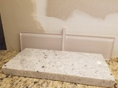
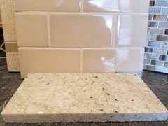
    Sample with possible glass tile backsplash with undercabinet lights:


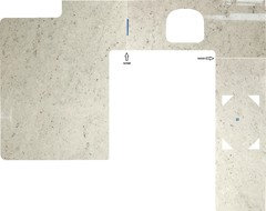
    Slab layout:


  • 8 years ago

    It's going to look great. I don't think I would do the glass backsplash though. I love that layout. Did your fabricator provide that? Very cool.

  • 8 years ago

    Thanks! Yes, the fabricator did the layout. They are pretty great. We called to ask about the T shape on the peninsula, and the CAD designer went to make sure that it was a camera flash. He would have re-worked the layout if it was actually an oddball marking in the granite. He also verified that the gradient of dark-to-light is a camera artifact.

    Yeah, we're not sure about the backsplash yet. I will probably post a new thread once the granite is in. I thought I wanted an ivory ceramic tile, but I haven't found one that works. A designer picked out the glass tile, and it is a great match to the color with a slight reddish undertone to pull in our red mahogany cabinet color. Here is the other one that she recommended, but it is $$. It's called Bossy Gray by Sonoma Tile, and it is very similar to the SW Accessible Beige paint color.

  • 8 years ago

    I like the look at that one better, but it looks pink on my computer. I would stick with something similar, but the lightest color in your stone. A creamy white or even a crackle tile. Since the rest of your house is so warm you don't want your kitchen to look completely out of place. The stone is a bit cold (which is totally fine), but I think keeping the backsplash a little on the warm side will keep everything tied together. The glass is too cold.

  • 8 years ago

    Yes, I agree! I've only been to the one shop, but the ivories and creams looked yellowish next to the counter sample. Thanks! I will post more pics when it's installed!

  • 8 years ago

    emcsq - Have you finished the remodel and would you kindly share some photos? We have also chosen Colonial White to go with our dark cherry cabinets with a red undertone. Curious to see your results and the backsplash you chose. Thanks much!

  • 7 years ago

    I'd love to see the counters too. Your dilemma sounds just like mine.

  • 7 years ago

    Me too!

  • 7 years ago

    It looks really good. Nice contrast with your cabinets. Thanks for posting.

  • 5 years ago

    What is the name of the tile backsplash you went with? Looks very nice!

  • 5 years ago

    @emcsq @emcsq Can you please post pictures of your White Colonial installed. I'm trying to decided with that and SF Real and Ornamental White with a whitewashed brick backsplash.

  • 5 years ago

    @Rhonda F. - seriously, 2 posts above yours.

  • 5 years ago
    last modified: 5 years ago

    @Shannon_WI YIKES! How did I miss those? :-D Thank you!

  • 5 years ago

    Would edgecomb gray by Benjamin Moore go with colonial white granite?

  • 5 years ago

    We chose Linen White Benjamin Moore. Natural Cherry cabinets. Colonial White granite going in today and paint to be finished next week. I can post pictures when done if that helps you?

Sponsored
Hope Restoration & General Contracting
Average rating: 4.7 out of 5 stars35 Reviews
Columbus Design-Build, Kitchen & Bath Remodeling, Historic Renovations