

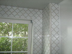
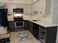
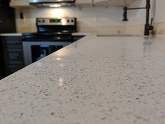
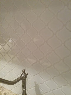
Lantern tile with modern accent?
8 years ago
last modified: 8 years ago

Featured Answer
Sort by:Oldest
Comments (26)
 8 years ago
Related Professionals
Texarkana Interior Designers & Decorators · Potsdam Interior Designers & Decorators · Lima Interior Designers & Decorators · Huron Interior Designers & Decorators · Springfield Architects & Building Designers · London Architects & Building Designers · Great Bend Kitchen & Bathroom Designers · Middlesboro Kitchen & Bathroom Designers · Wichita Custom Closet Designers · Brunswick Kitchen Remodelers · Richmond Kitchen Remodelers · Elizabethtown Custom Countertops · Rock Hill Custom Countertops · Mansfield Custom Countertops · Tacoma Custom Countertops 8 years ago
 PRO8 years ago
 8 years ago
- 8 years ago
 PRO8 years ago
- 8 years ago
- 8 years ago
- 8 years agolast modified: 8 years ago
- 8 years ago
- PRO8 years ago
- 8 years agolast modified: 8 years ago
- 8 years ago
- 8 years ago
 8 years ago
 PRO8 years ago
- 8 years ago
- 8 years ago
- 8 years ago
 8 years ago
 8 years ago
- 8 years ago
- 8 years ago
- 8 years ago
- 8 years ago

Related Stories
KITCHEN OF THE WEEKKitchen of the Week: Graphic Floor Tiles Accent a White Kitchen
Walls come down to open up the room and create better traffic flow
Full Story
KITCHEN DESIGNKitchen of the Week: Tile Sets the Tone in a Modern Farmhouse Kitchen
A boldly graphic wall and soft blue cabinets create a colorful focal point in this spacious new Washington, D.C.-area kitchen
Full Story
WALL TREATMENTSIdea of the Day: Tin Tiles Create a Striking Accent Wall
A bachelor's bedroom has the industrial style he loves but also is warm and comfortable
Full Story
KITCHEN DESIGNA Modern Farmhouse Kitchen, With an Emphasis on ‘Modern’
Clean lines and sculptural pendants combine with shiplap and wide-plank oak floors in this Northern California kitchen
Full Story
MIDCENTURY HOMESHouzz Tour: Making Midcentury Modern Work for Modern Times
A dynamic new entryway and other interior updates open an Atlanta home for better light and flow
Full Story
TILELet’s Talk Tile: An Alphabetical Guide to Tile Terminology
Get set for a tile project with this handy glossary of shapes, materials, finishes and more
Full Story
KITCHEN DESIGNKitchen of the Week: Modern Minnesota Walk-Up
Red accents against glossy white tile and walnut cabinets provide bold touches amid subtle style
Full Story
MY HOUZZMy Houzz: 1955 Texas Ranch Moves On Up With a Modern Addition
Graphic tiles, wood accents, modern furnishings and a new second story help elevate a dated interior and layout
Full Story
PATIOSLandscape Paving 101: Tiles Bring Bold Color and Pattern
This versatile garden material can blanket an entire patio or liven up the scenery with striking accents
Full Story
VINTAGE STYLEKitchen of the Week: Preservation Instincts Create Vintage Modern Style
Original features in this 1908 kitchen join new custom accents for a look that bridges the years
Full Story
lovliny