Software
Houzz Logo Print
piefairy

Kitchen backsplash height conundrum

8 years ago
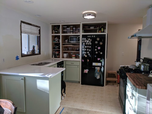
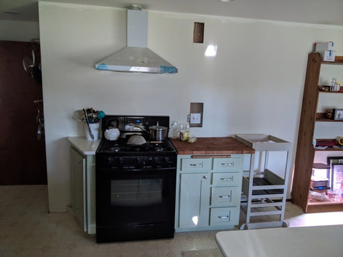
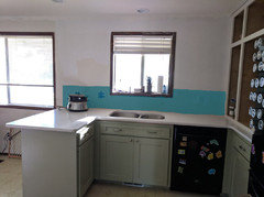
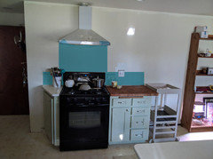
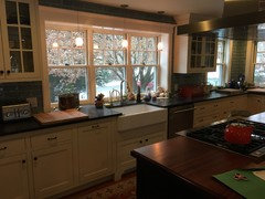
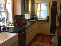
We're in the homestretch on a DIY kitchen renovation, and getting stuck on the backsplash. Specifically, the backsplash height.


There are no shelves or cabinets above the backsplash, so no obvious places to stop it. It will be on two walls, over the sink and over the range.


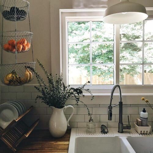
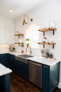
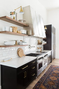
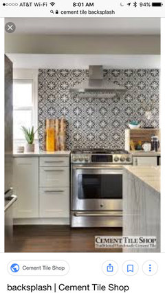
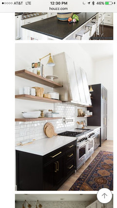
I had nominally thought to take it all the way to the ceiling, but I am afraid that will look too cold and shiny (we've got an urban homestead thing going on in the PNW), and I am finding that I like a shorter height in some inspiration images (one attached). Should it be the same height on both walls? Lower on the window wall, up to the bottom of the range hood on the other? Help, please!


FYI, tiles will be white or cream, likely a combination of subway and large-scale (6") hexagons (a nod to our honeybees). The pantry will have doors (Shaker, like the base cabinets, in off-white) and there will be a wood-toned floor.


Thank you for your input!


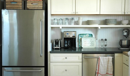
^^ inspiration photo

Comments (23)

  • 8 years ago
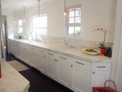
    You're lucky on the sink wall and could follow your inspiration photo all the way from the pantry to the window. Things aren't so good on the range wall. That section doesn't appear to be finished at the same level to me. A slide-in range and counter material and cabinetry to match the other side would create a more coherent look, imo. As it is I wouldn't put up a back splash on that side until I got things sorted.

  • 8 years ago

    I would use the height from your inspiration photo. The same on stove side but all the way up to your at hood or ceiling directly above stove.

  • 8 years ago
    last modified: 8 years ago

    take it all the way up. that window wall is the perfect focal point for it. stopping it short would look unfinished, to me. agree w/phun on the stove wall. would be a great place to showcase your hex tile. pick a cool color!

    consider some shelving near the window or by the stove

  • 8 years ago

    Happy sunny cold days we are having in the PNW. I love seeing the mountains out.

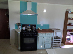
    Here are a couple of pics to help you visualize it a little better. I think your kitchen is awesome looking, I love the butcher block top next to the range, nice job!

    As Dan1888 said the window/sink wall is easy:


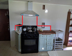
    Here are 2 options for the range wall:


  • 8 years ago

    Rawket Grl did a good job with the colors to show you your options. I think the sink wall mock up is a good design and her first range wall option looks the best.

    I would put the back splashes up to about 18" so if you decide to add upper cabinets, you can without difficulty.

    Remember, a back splash is to protect the walls from splashes. When it is out of place from the intended job, I think it can look funny.

  • 8 years ago
    last modified: 8 years ago

    Kathi, if that's the case, then perhaps going w/just the 4" piece that matches the countertop would be a better bet. If all someone wants is a 'splash guard', then do the cheapest option that still looks good.

    Totally acceptable.

    here is one with your 16" or so splash. while it looks good, to me it would look even better if it went all the way up.

    I like to think of tile as a decorative, as well as utilitarian option. why can't both be had?

    or, meet in the middle and do halfway!

    In this case, I think her sink wall is rather open and just 'there'. doing a little visual interest by taking the tile up to the ceiling would do a bit more for that area. Since there really are no upper cabinets on that wall, I think stopping short will look a little on the blah side. Just my opinion. Neither is wrong.


  • 8 years ago

    Especially the 1st window-wall photo showed a clean line for the whole wall, just like the shelving next to it....

  • 8 years ago

    I think the proportion might look a bit off if small-ish amount is above stove's counter. Why not a large rectangle to the bottom of hood.... ?

  • 8 years ago
    last modified: 8 years ago

    How wide are your tiles? It might look busy with visual breaks of backsplash, black, softer green.... ? A medium -sized, imo.

  • 8 years ago
    @everdebz, we don't have tiles picked out yet -- needing to determine how much square footage we're working with so we know how the budget has to stretch. They'll be in the 4"-8" range, and a similar tone as the wall paint, which is a creamy-green-off-white color.
  • 8 years ago

    If you just do the short height you don’t have a lot of room for mixing shapes. Going all the way up on the window wall gives more room for design options with the tile.

  • 8 years ago
    last modified: 8 years ago

    Consider stopping the back splash at just under the window frame -- perhaps a single row of black tile above a single row of white tile.

    Do add shallow shelving/cabinet from above that back splash left of the kitchen sink to the ceiling -- deep enough for one large can, usable for spices, glasses and other item, too. Put doors on the upper shelves and leave the bottom shelf open for your napkin holder and S&P shakers and sugar bowl -- stuff you might need at the "bar" part of the counter.

    Keep the space above the back splash right of the window for hanging colorful trivets or other decorative and useful kitchen items on that wall.

    Put a stainless steel panel behind the stove from counter top height to the bottom of the hood.

    Vertical blinds could cover the window area from the bottom of the window frame to the ceiling (no bare wall to decorate) and they would open more conveniently for the kind of window you have if you ever want that window to be a pass-thru to a deck outside the kitchen.

    Also, vertical blinds offer two ways of controlling light and privacy rather than the one way of the roll up blinds. They are available in wood, faux wood, fabric and a myriad of colors of vinyl -- very easy to clean vinyl. I have a similar kitchen window and have used blue vinyl verticals for over a decade and still like them. There is a tan vinyl that would go well with your flooring -- had them on a patio door in a dining room in a prior residence.

  • 8 years ago
    I would carry the backsplash to the bottom of the hood/vent and follow that height for the rest of the kitchen. Then paint above that whatever color you choose. That will look the best here I think.
  • 8 years ago

    A back splash, especially one other than white, all the way to the hood vent will "crowd" the kitchen and, if overhead cabinets are to be put beside the stove hood, which you should do, you'll still end up with a "where to stop" issue. Do at least decide on what other cabinets you're going to add overhead before you settle the back splash issue.

  • 8 years ago
    last modified: 8 years ago

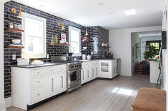
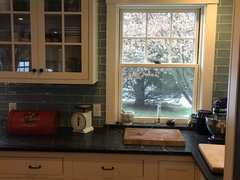
    I agree completely with Beth: your kitchen will look choppy with anything but tile to the ceiling (and better yet on the whole wall to the right of the butcher block/stove) OR just do a backsplash to match the counter (a challenge w that is the butcher block). I am so glad I went to the ceiling with mine, it adds color and interest.

    Note the grey day :)

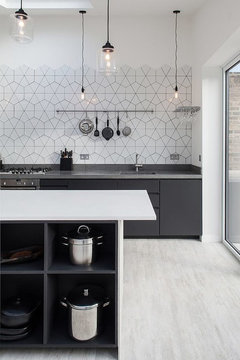
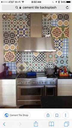
    also to the shiny issue, along with what I think is an artisan vibe you are going for. Check out www.cementtileshop.com for hand-made in the US cement tiles, using a hundreds-year-old process. They went for around 10$/sf when I bought mine 2 years ago, for what will be one of the most interesting things in your house. Someone posted a photo above with some, here are some more:

    ^^see the whole wall Iver the door

    ^^Or just a statement over your stove and adjacent cabinets. Can buy them in random mix is, which is what I did for my powder room

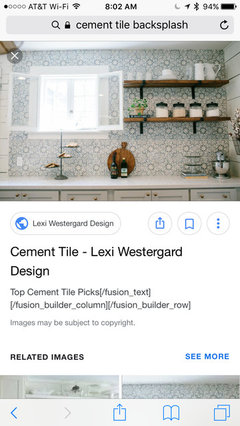
    ^^very similar to your window wall. They come in large and small patterns

  • 8 years ago
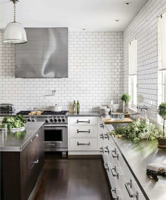
    It a stainless panel between the stove and the fan hood. On the window wall, take tile to the ceiling.
  • 8 years ago

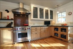
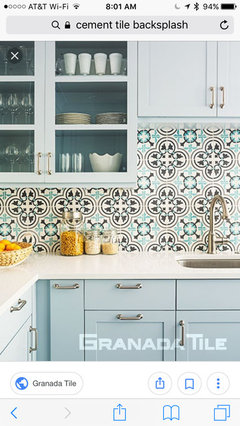
    One like this picks up the blue in the cabs: you could do the same with your green

  • 8 years ago
    Thanks for your input, everyone! There won't be any additional cabinets in here -- this is a fairly small room, the working park of the kitchen is about 9' x 10', heavily shaded and the first room you walk into from the front door (weird, I know), and with the double-depth pantry we built there is ample storage. It sounds like there lot and high backsplashes both have support. Is there anything that *wouldn't* work, that we should specifically stay away from?
  • 8 years ago

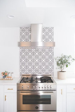
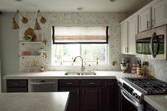
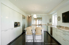
    Well I think a traditional "cabinet height" backsplash won't work, for one thing because you don't have cabinets. It just will look like an arbitrary height that you chose. You may not need more storage, but would you consider trading what looks like a bookshelf and a cart for wall-mounted shelves? You have such a nice, open kitchen with very clean lines, It would reduce the clutter and create a natural stopping point for a tile backsplash of any height as in this picture

  • 8 years ago

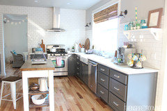
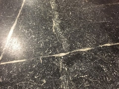
    Greenfish,,,yes! thank you for not going w/white subway and actually picking a color. lol. beautiful space. Soapstone? I'm considering it for my redo. and good call going above the window. To me, it just looks 'finished'. stopping part way appears like one ran out of tile!

  • 8 years ago

    Thanks Beth! We went a year without tile and the color transformed the room. I love the soapstone, but you have to like a patina, or at least be a little more careful than I am if you don't. My bread making area in particular is pretty nicked up from the dough scraper but I guess you can refresh it with a light sanding. I oil it every couple of months.

  • 8 years ago

    oh wow. yes it does. just adds to the charm. and yes, you can certainly sand it and make it look like new again.