Software
Houzz Logo Print
kynsmama

Exterior Elevation...

8 years ago
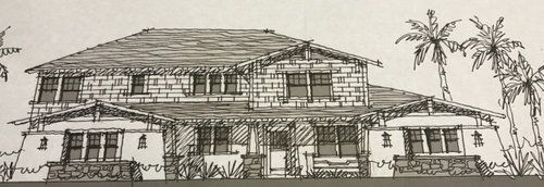
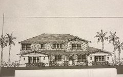
Got the sketch back from the architect. Thoughts?


I have a hard time seeing things in 2D...

Comments (25)

  • PRO
    8 years ago

    Looks pretty good. It would bother me that there aren't posts framing the front door, having just one near there looks odd to me, but I'm a huge fan of symmetry. I would also make sure that the overhang for the porch isn't too low because that could prevent light from entering those windows and hide your entrance.

  • 8 years ago

    Is there a way to make the entry more defined? It actually took me a minute to find the front door in the photo. My eyes go straight to the left gable section of the home..

  • 8 years ago

    Not sure why your image is so stretched horizontally, so I have brought the scale back to something more realistic.

    Sorry but to me what you drew looks off for a craftsman style home. Too tall.

    And quite frankly, the home sketched by the OP's architect looks nothing like those homes at Babcock Ranch. The only thing craftsman on those Babcock Ranch homes are the applied decoration the builder added to call it craftsman as opposed to the overall correct version the OP is showing.

    Well done. I might remove all the columns in front if not needed as I don't think they are needed for the overall feel. My craftsman style home is foundation is stone, first floor stucco and second floor is 4" wide siding.

    Will this be built in CA or FL? If CA I would consider changing the roof line to a gable roof overall.

    kynsmama thanked cpartist
  • PRO
    8 years ago

    I think the entry is weak and the front door should be redesigned into something more appropriate for a front door which says, "welcome--enter here!" As it is, the door looks like it belongs on the side of a garage...

    When we turn the left corner of the house, how does the cement plaster of the first floor and the shingle siding of the second floor interact?

    Hopefully, all four sides of the exterior of the house are treated and detailed in similar fashion, and we're not looking at a design which only works with the front elevation...

    kynsmama thanked Virgil Carter Fine Art
  • 8 years ago

    With the sketch I'm not entirely sure of everything I'm looking at, but some thoughts:

    - Repeat the column on the right side of the door, so the door is framed by the two columns.

    - I'm not sure what the treatment is where I have the 2 blue Xs below, but it looks like the same kind of stone that's at the base of the column, only on a corner. Try removing those so the focus goes to the door.

    - It would be nice if all the first floor windows started at the same height (red line.)

    Congrats on using an architect and it looks like it will be very attractive! I'm sure we'd all love to see the floor plan as well.

    kynsmama thanked chicagoans
  • 8 years ago
    last modified: 8 years ago

    I agree about adding more emphasis to the front door but other than that I think it looks fantastic. I think it looks completely different than the ones that Beverly posted - and that's a good thing.

  • 8 years ago
    last modified: 8 years ago

    @cpartist - we are in FL

    Thank you all for the thoughts. I am looking so forward to a front porch, and agree that the entrance gets kinda lost. Will discuss those things with him.

    @Beverly - I don't think its stretched. The house is very wide. The porch is 35 feet long

  • 8 years ago

    I'm building a craftsman style house in Fl too. Message me.

  • 8 years ago

    @chicagoans - Its hard for me to see as well, but I believe the things you highlighted in blue are also columns. And thank you for mentioning the windows. I will bring that up as well.

  • PRO
    8 years ago
    last modified: 8 years ago

    It appears you may have taken this photo with your smart phone camera, but it wasn't completely perpendicular to the picture plane. As a result there are walls which appear to be vertical, and there are walls which appear to be "battered", or at an angle. Is this what we are actually seeing?

    In addition, the "sketchy" nature of this elevation makes it a very expressive sketch (which I always like), but from an architectural point of view it makes it very difficult to truly see and understand what is proposed. For example, the two areas highlighted in blue...are those really 4X4 or 6X6 posts on stone bases in the plane of the porch...or are they appendages to the two wings on either extreme of the elevation...or something else entirely?

    It's always important when posting here to provide full information (you'll be shocked at how many posters do not), as well as posting understandable photos which aren't confusing...

    So...is the overhanging roof in front supported by two "craftsman-like" columns or four columns (the two craftsman-like plus the two simple posts)...?

    It's very difficult to properly assess this photo...

    kynsmama thanked Virgil Carter Fine Art
  • 8 years ago
    last modified: 8 years ago

    Virgil,

    I agree. Yes, I took the picture with my phone. I can try to take another one. And, yes, there are four columns all the same style. But I do not know if they are 4x4 or 6x6.

    I also have a bit of a hard time assessing the photo and didn't ask all the questions when I was reviewing it with him yesterday. I will get some clearer answers from him.

    And Im sure it will help when I can see a 3D rendering.

  • 8 years ago

    not sure if this pic is better or worse :p

  • 8 years ago

    Yep the hipped roof wins out in FL because of wind loads. :) I had the same thing with my house.

    Are you planning on the interior being craftsman too?

    I'm now quite curious to see more!

  • 8 years ago

    Thank you everyone. And yes, we will have craftsman elements inside as well. We have some time to ponder this elevation for a while. Won't be doing anything with the house build between now and new years..

  • 8 years ago

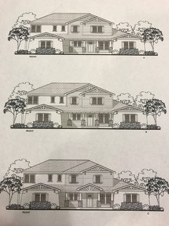
    so, round two.

    Am I crazy or are we heading in the wrong direction???? Help!

  • 8 years ago
    last modified: 8 years ago

    Am I crazy [...]

    No.

    [...] or are we heading in the wrong direction????

    Yes.

    The original design was MUCH better; these details are kinda... awful.... :-(

    I'd go back to the original elevation, making the suggested changes to emphasize the entry (posts/columns/what have you, lol). The house looked so cute before!

    PS -- And please remove the shutters, they aren't big enough to even pretend to cover the windows! ;-)

    kynsmama thanked One Devoted Dame
  • 8 years ago
    last modified: 8 years ago

    100% in the WRONG direction. Your original design was appealing. These ones looks like something a builder might design for someone asking for a craftsman style house.

    What's with all the nested gables?

    And the 3 different kinds of siding?

    And the shutters that don't even cover the windows?

    And the clunky porch gable in the third version?

    And the builders special gable detail that every builder feels he needs to add to "make it a craftsman house"?

    And why are there now pork chop returns on the eaves? A true craftsman house would have open rafters and open eaves.

    Even the window placements now are wrong with double windows instead of the combo of triples and doubles. And it looks like the windows are factory ganged now instead of inset singly.

    It looks like even the vertical proportions of the floors is off now.

    I'm sorry but the more I look at the three versions on the bottom, the worse they look.

    WHAT HAPPENED?

    kynsmama thanked cpartist
  • 8 years ago

    Were famous "clouds" so 2017 and 2016? Are trees in for 2018?

  • 8 years ago

    Agree....way in the wrong direction. It's all in the details. Siding, eaves, windows were all better in the first round. Now it just looks like a builder's special.

    kynsmama thanked gthigpen
  • 8 years ago

    Are you SURE he is an Architect?

  • 8 years ago
    last modified: 8 years ago

    ^This. Sounds like a builder's draftsman rather than an Architect with the last go round.

  • 8 years ago
    last modified: 8 years ago

    Cpartist,

    Thanks for verbalizing all the things I was thinking. Im not sure how we got to here. It is definitely an architect. But, somehow miscommunication or something happened to get us here.

    ugh. I could just cry. Im exhausted and we haven't even broken ground.

  • 8 years ago

    I can't believe your architect gave you that fabulous first drawing and then turned it into the horror of those three renderings. I'm thinking he/she turned it over to a junior flunky (or the draftsman) in the office and this is the sh, um stuff they came up with.

    Thought. Are you working with a builder's architect?

    kynsmama thanked cpartist
  • 8 years ago

    Oh and even the columns are wrong. In the original the columns rightfully go to the ground. In the three new versions they stop on the porch? That screams builders special.

    The eaves in the new drawings are not deep enough. Look at the deep overhangs on the eaves in the original drawing versus the builder grade hack in the second set of drawings.

    kynsmama thanked cpartist