Software
Houzz Logo Print
miayaniw

Help! Ugly ORANGE living room - keep color or change?

13 years ago
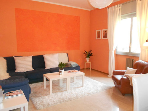
Dear Houzz readers,
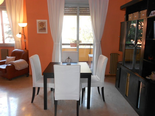
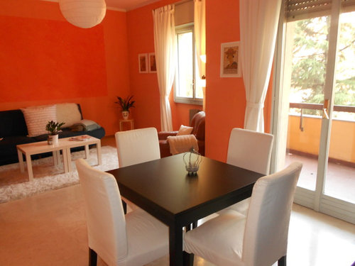
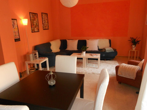
my living room is an ugly orange with a dark orange rectangle! After living in this rental for about 8 months something needs to change. I've tried to balance the orange and blue with whites but nothing is working. The paint job was badly done by the people before we moved in and it is blochy and uneven.

My question: Should I go white or choose a new color?

Maybe a light mushroom brown or grey?
I love the warmth the color brings and am afraid white might be too cold in this big room. I like both French Provincial and Hamptons as a style. Could I make these styles work?

The floor is a cream marble stone with light brown veins through it.
The couch is dark blue.

Thanks to everyone who comments - it is greatly appreciated!!!
Mia :)

Comments (29)

  • 13 years ago
    I think white will wash out the room. It looks like a lot of light comes into that room. You have dark furniture. You could do a lovely cream, tones everything down, then your furniture will stand out as the focal points instead of your walls. Then add wall decor like large photos or several small ones in whatever shape you prefer. Actually, I think even a pale yellow could be nice too.
    Mia thanked Rebekah P
  • 13 years ago
    You have a lot of nice contrast going on with your dining table, chairs, and wall unit behind the table. Maybe a warm beige or gray on the walls would look nice. Then change the draperies to a pattern that includes the "blue" color. That would spread the blue color into your dining area, making more of a connection there. You could also add a different area rug under the coffee table that would add more contrast there. Again, something with "blue" to tie it all together. I think if you leave the white coffee table it would help balance out the white dining chairs, but would be set off more with a different rug underneath. You could also add some more color with artwork over the sofa and new pillows.
    Mia thanked watcher1
  • 13 years ago
    what are you committed to living with? You write you've been in the space 8 months living wiht a paint color you hate...but have you slapped anything on the walls to see how the light plays with the colors you think you want?Will your landloard let you repaint the walls? You write the previous renter painted the walls so I'm guessing you can paint. If you can't paint are you able to recover the sofa and or chairs?

    If you can't paint and can recover the sofa and chairs I'd look for gray fabric for both same color tone but different pattern or texture. I'd look for something in a bold gray (not dark) but boldly textured to compete with the bold color in the walls. Keep your beautiful rug and one or two throws. Three throws in that small space seems like clutter. I might suggest bringing in the right purple as a pop of color as an accent that will draw the eye away from the walls. Paint one of your side tables add another pillow or two (once you've removed a throw). If you can't paint (even if you can) add a taller design element in the corner where you currently have the plant stand.

    If you can paint the world of gray is a wild and wonderful world. You have great light which is crucial because gray absorbs light, gray is like black it is the absense of light so it absorbs light unlike white which will reflect light. But with a navy sofa gray walls wil be beautiful.
    Mia thanked jerimcclure
  • 13 years ago
    Well I like so much everything else about the room, that I'm kind of even liking the orange! :)) But really, I think a light beige, light yellow, or gray would look great...it would contrast with the dark cabinets and couch and add lots of light. I really love this space...post after pics please!
    Mia thanked Elisabeth
  • PRO
    13 years ago
    Hi Mia. I am currently working on a project that we used ICI/Dulux - Mushroom Cap in several areas in an open concept house. This colour is what I like to call a cammillion. It changes up slightly from room to room depending on the light it receives. As a landlord myself, I would be happy to have my tenant paint this colour as it's neutral yet with some style to it. Not your typical neutral beige. Then get out there a pick up some amazing artwork that goes with your style and goes with you when you move on. PS Your current art pieces are hung too high. Lower them to no more than 6" over the back of the couch/chair in seating areas and in standing areas keep the centres of the art at about 5'. That will help cozy up the space. Go with you gut that told you "mushroom".
    Mia thanked Lorelei Interiors
  • 13 years ago
    I do like orange on a living room, ..maybe if it was a slightly darker shade? Or keep the colour you have but as an accent wall, and change the others
    Mia thanked eleri
  • 13 years ago
    It appears you are a little more on the modern side so I would switch the color of the wall to a pale gray with a VERY hint of blue but really more gray. Then I would switch the area rug and throw pillows to tie everthing together and add a color. The white is the "White Elephant" in the room - it stands out too much without a purpose - as well as the area rug - blends to much with your flooring. Also, I believe your art is too small for the room. You have a lot of small items in a larger space ie: a couple of little tables, little art, small lamp, small plant. You need some height and volumn to the room. Good luck and please send some pics when you complete the space.
    Mia thanked scbeachgirl45
  • 13 years ago
    In my opinion, a pure white wall color is too dead. I would say go with cream since the floor has cream in it, but if you're going to keep the white furniture, cream won't work. I think a very light warm taupy grey (mushroom?) would blend with the floor and work with the furniture. Warm is the operational word here, especially since you have a cold marble floor. The important thing is to test colors and make sure they blend with the floor because a disjuncture there could ruin the whole thing.
    Mia thanked gwen47
  • PRO
    13 years ago
    I would re paint for sure. This color is blocking all lighting and should be used as an enhancement only
  • 13 years ago
    Nope, I agree with you. Paint the walls white like Benjamin Moore Chantilly Lace. Then put the color in your accents. I LOVE orange so I would find a throw with the orange, recover your pillows in a print with orange and other colors in it, have orange placemats on the table to tie it all in or an orange vase. It would be bright, fresh and modern looking. And you can take the accents with you when you move.!!
    Mia thanked somerspastimes
  • 13 years ago
    be careful of colors that won't work with your sofa and chair - taupe and mushroom are nice colors but might make the room look drab when pairing it with the darker furniture.
    Mia thanked scbeachgirl45
  • 13 years ago
    I actually really like the orange! That being said, maybe a pale yellow would work?
    Mia thanked Sarah M
  • 13 years ago
    I read everthing posted but when I got to Genevieve I thought: she is right. I saw an absolutely gorgeous orange room on HGTV - the Design Star Meg's own home. Maybe you can find it as a rerun. What made it work was artwork, large print drapes (which would work for you in grey/, brown/, or greyed blue/white), and other decor that toned it down by breaking it up. One of the colors she used with it was yellow green which might sound awful (she covered dining chairs in a yellow green and white print) but because she also had a lot of white and either browns or greys as a neutral, it worked. Agree that you have hung your art too high (a common error, I think) and that they should be grouped. You CAN go higher if you have a vertical group that starts lower and then stacks up in twos or threes. Then I would add at least one large one - perhaps a modern impressionist style - that has a darker orange, white, grey, brown, and blue in it at minimum. I think you can find something like that online. The problem is that you are only trying to break up the orange at the lower level of the room, so it still dominates above. I also would find a different rug. If you go with a flat weave grey and white like a zebra or zigzag or another one that is more anchoring, predominantly grey or brown.
    Mia thanked janny3
  • 13 years ago
    PS - If you are at all artistic, or even if not, try painting a large canvas yourself with stripes (vertical or horizontal, wavy or straight) of the colors you like. You could use acrylics. It might even work with wall paint?? Use a soft, dry clean brush just once to blend each line. OR, stretch the perfect fabric (a scarf)? or a piece of wallpaper and frame it. Just make sure it is a good sized piece. It will be a focal point so you have to like the result!!
    Mia thanked janny3
  • 13 years ago
    Now that I keep revisiting these pictures, I would love this room completely if the walls were the same color orange just much lighter...and yes, artwork to break up the brightness would work too.
    Mia thanked Elisabeth
  • 13 years ago
    Just one more comment. I think the darker orange square on the wall doesn't look so great but before painting everything - a big job - try using it as a "frame" for the large art piece(s) or vertical mirrors. (I like mirror-framed mirrors or weathered wood). Center your couch under it. Also I like the blue grey best as a neutral. Works with your couch, it's modern, and is a complement to orange.
    Mia thanked janny3
  • PRO
    13 years ago
    Wow - thanks to everyone for the comments. They are really helpful and have got me thinking in a new way! I'll post pictures when I finish.
    Rebekah Pope - I hadn't thought of pale yellow but I'll look into it!
    watcher1 - if we don't cover the couch I'll definitely be bringing the blues out in the room.
    jerimcclure - yes I'm able to paint the walls. I heard it was good to just live in a space first before redesigning, but maybe 8 months was too long! The color was great during the European winter (i live in Italy) as it always felt warm. I like your comments about the throws - one is gone! And I'm buying a large fiddle leaf fig plant for the corner. I'll try out a few grays for the wall too - do you have a recommendation? At this point I don't think I'll cover the sofa.
    pdomingos - Thanks, I'll see if they sell this paint in Italy or find an equivalent to try! I need to address the artwork work too. What size canvas, or series of 3, do you think for would work in this space?
    Genevieve - thanks for the vote for orange - my friends are split too as it does grow on you - especially during winter!
    scbeachgirl45 - great point about all the 'small' items in the room! It does feel unbalanced. And good point to consider that some colors could look drab next to the couch and chair. I think I'll need to test a few colors before committing. I'll be sure to post pictures when I finish.
    janny3 - thanks, I'll see if I can find that episode online. I think whether I keep the orange or change it, I need to balance the room with some good size artwork (hung correctly!) and some texture without adding clutter. Thanks also for your artwork and mirror suggestions.
  • PRO
    13 years ago
    Hi Mia
    I have a 2/3 rule that I like to use. Over the couch you should occupy that much space for a truly balanced look. Some will disagree but I am a balance freak. As you have a sectional couch look for artwork that works together and one will be slightly longerr than the other as your sectional is longer on one side than the other. Try to keep height demension the same. I love that you are putting a large plant in the corner. If it doesn't come higher than the art work you end up with get some height by putting it on a plant riser. Didn't realize you were in Italy. My husband and I have a second home in Portugal that we will be finishing up remodeling in September. European styling is diferent than here in Canada but I'm loving the challenge. Your space is off to a great start as you've found good starting peices.
    Mia thanked Lorelei Interiors
  • 11 years ago

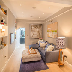
    Although, I love orange can be overwhelming to some. Since you mention the two colors here are some photos:


    Notting Hill House · More Info


    Lone Mountain · More Info


    Mia thanked onestawr
  • 11 years ago
    I would paint the dark orange a lighter then the main orange. Inside the lighter square I would put several pictures. The color scheme is a warm and happy color. Several peach pillows would make everything a complete picture. Good luck
    Mia thanked lsimon6631
  • PRO
    10 years ago

    Maybe just paint one wall white to give a visual break. Otherwise, I love the orange. So thankfully NOT taupe.

  • 10 years ago
    last modified: 10 years ago

    3 year old post, but 2013 was a good year;)

  • 10 years ago

    This Orange is way overpowering. Not calming whatsoever. I would suggest a muted brown with no obvious red tones. This would bring everything together and offer a bit of tranquility instead of screaming ORANGE IS THE NEW BLACK! lol


    Mia thanked Merita Blanchet
  • PRO
    10 years ago

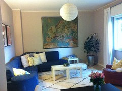
    A HUGE thank you to everyone who took the time to comment and share your creativity & style. I'm sorry for taking SO long to post the 'after' photos! But finally here they are. And after the last patch of orange was painted I felt instantly calmer. The space is now a peaceful sanctuary. We used Farrow & Ball 'Elephants Breath' paint. I love how it changes in different lights...

    Antique Italian map of Europe. Found at the Navigli markets in Milan, Italy.

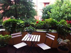
    This spring we found a little surprise on our balcony - a nest of blackbirds! So cute :)

  • 10 years ago
    Beautiful! You've done a wonderful job!
  • 10 years ago

    nice job!

  • 8 years ago

    Whew! So much better and calmer! Great job! (I know this is an old post...)

  • PRO
    8 years ago

    Love the balcony.