Software
Houzz Logo Print
lshack17

Suggestions for Art, Please

8 years ago
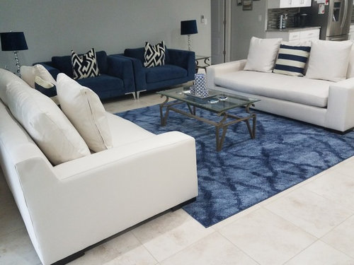
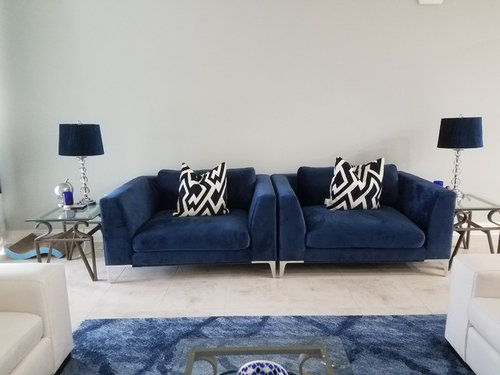
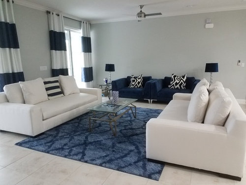
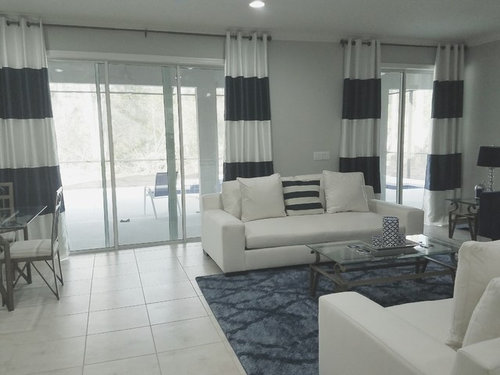
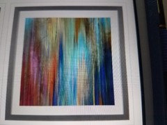
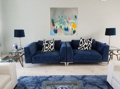
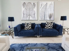
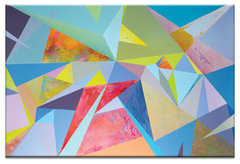
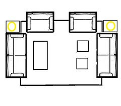
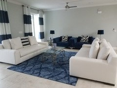
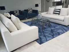
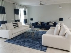
We just moved into a new home. This is a great room layout. Looking for suggestions for abstract art for over the blue chairs, a large statement piece. I would like to do something bold with orange and hot pink to break up all the blue and cream. Will include a pic of what I am considering. My husband prefers a calmer look, he likes grays, other shades of blue and silver. Here's the room. I am changing coffee and end tables soon. I also did not want blue lamps placed next to blue chairs but floor outlet for cream couches didn't work with layout. Backyard is a mess, in the middle of pool construction. Thanks!

Comments (34)

  • 8 years ago
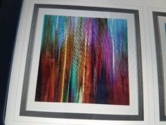
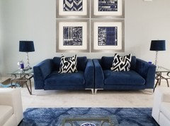
    I am considering these, two 35x35 prints from Z Gallerie. We have 10 ft ceilings.
  • 8 years ago

    If you don't have the funds for original artwork, try greatbigcanvas.com., art.com, etc. There are many online art vendors as well as Overstock, Wayfair, etc.

  • 8 years ago
    I agree art has to speak to you, that's why I am having a hard time choosing. From what I have read and learned from designers is art absolutely does not have to or should " match" decor. That's why I am waiting for a piece to really move me. Also, there's the theory that art can flow and become one with the design so it creates a more calming space. Which describes my husband's preference. The rug is actually much less intense than it photographs, it's more of a periwinkle blue. Sisal is not possible as we have cats who would see the entire rug as a huge scratching mat created especially for them. I am happy with the rug we have, but thanks for the input.
  • PRO
    8 years ago

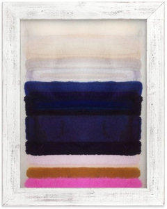
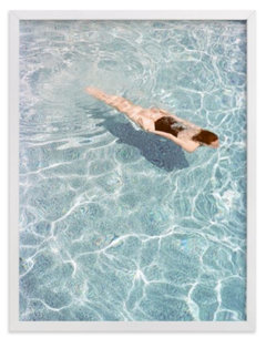
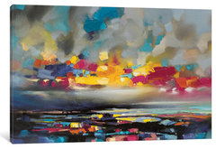
    Get some complementary colors in there, either via abstract art or photography. Try Minted.com or AllPosters.com. Some suggestions:

  • 8 years ago
    last modified: 8 years ago

    I love your room and think it's fabulous! I also like the art you are considering. Agree with art that has some pop colors to break up the blue. Might try pulling the couches forward just a bit to get more of the feet on the rug. Try Hobby Lobby, HomeGoods or At Home - lots of larger scale options at reasonable prices.

  • 8 years ago

    I would keep looking for one large piece since so much else is paired. My husband and I sometimes agree on a piece and sometimes we take turns choosing. This works better for us than compromising on art neither of us loves. Over the years I have come to appreciate his choices more and more...not too sure he would say the same;-)

  • 8 years ago

    Lola Donoghue sells prints of her work. She uses colors that I think you would like. http://loladonoghue.com/shop-prints/


  • 8 years ago

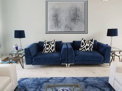
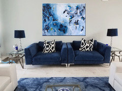
    Here's an example

  • 8 years ago

    I love your blue chairs, would you tell me where you got them. Thx.

  • 8 years ago
    Thanks Angela! hollybar, you are so right about things being in pairs. I will wait and get one large piece to break up the blue and all those pairings as well. That's why I appreciate constructive comments such as yours, and fresh eyes to a space are such a huge help. My husband had his way with the huge blue chairs so I do think the art will be my choice. I did colorful pop art in our laundry room/ mud room and he still doesn't get it, but probably typical with many couples.
  • 8 years ago
    shwshw, thanks for the mock up and the link. I went to that artist's website and I really do like many of the pieces. We lived in Europe for two years and there were so many amazing artists in Ireland where she is from. We got the chairs at American Signature Furniture. It's called the Aaron cuddler chair, also comes in gray and ivory. Super comfortable but very big. Thanks again for the suggestions!
  • PRO
    8 years ago
    last modified: 8 years ago

  • PRO
    8 years ago
    last modified: 8 years ago

    Check Etsy for wall art


  • 8 years ago
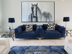
    celerygirl, thanks for all the suggestions! So you are thinking the opposite of a pop of color and going with black and white? Something I had not considered.
  • 8 years ago
    last modified: 8 years ago

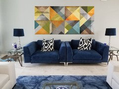
    I didn't think of striped art cause your curtains have that "covered"! I'd place contrast with bold stripes. .... ?

  • 8 years ago

    I'm liking the idea of more than two pieces above those chairs - 3 or even a gallery collection of art above the chairs.

  • PRO
    8 years ago
    last modified: 8 years ago

    Not sure the location of the blue chairs works for this room. Really pulls the seating away from the sofas. Maybe consider one chair on either side.


  • 8 years ago
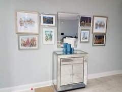
    Hi Carrie, thanks ! Gallery walls kind of make me crazy because as everyone can clearly see I like symmetry and hate clutter. Here's one I did in the entryway and am not sure how I feel about it. It's art from some of the places we have traveled. But that's a whole other thread...
  • 8 years ago
    Hi Beverly. Not sure what you mean that the blue chairs pull the seating away from the sofas? I tried to make a conversation area and still have a clear sight line for tv viewing. The blue chairs are only 2 1/2 ft from the sofas. The art suggestions are good, thanks.
  • PRO
    8 years ago

  • 8 years ago

    I like the idea of black and white photos or grayscale art, too. Sisal doesn’t seem right for the room, it would introduce a gimmicky kind of “nautical” feel. I like the rug that you have.

  • 8 years ago

    It almost doesn't matter as anything will go with the colors already in the room. What matters most is that it's something you love.

  • 8 years ago
    Thanks Lois, I agree about the sisal lending itself to nautical when paired with blue and white/cream. That's also why I tried to do more color block with the curtains and not many rows of thin horizontal stripes.
  • 8 years ago
    You are so right Annie!
  • 8 years ago

    It's kind of out of left field, but about that first picture of the pair you like: Aside from being problematic as a pair, the vertical lines don't seem right for the room so far.

    I don't see another wall for just one of them in your pictures, but I do notice that the top one could be hung sideways very nicely and suggest a landscape with horizontal lines. Just mention it in case you had a nice place elsewhere for it.

  • 8 years ago
    You have an attractive room. What could really improve the look significantly, in addition to finding art that speaks to you, is softening the look of the room. Right now, because of both the fairly rigid symmetry, and the fact that everything is blue and white, it has a rather hard look. I think you should try exchanging some of the pillows for ones that complement the colour scheme, but don't adhere to it so rigidly. Also mix it up a bit; for instance, mismatching pillows on the different sofas, and 1 pillow on one side , 2 on the other. There was a good article about pillows just yesterday. I'll post the link.
    Good luck.
  • 8 years ago
    last modified: 8 years ago

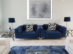
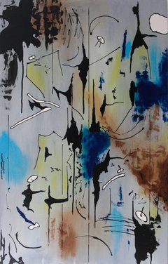
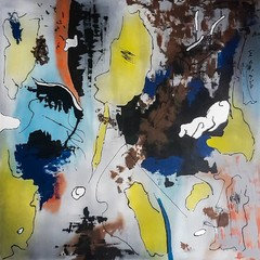
    I would save and buy some real art. Maybe something with the colors you like but with a bit of movement. However, if this is totally out of budget I would still look for movement and a light background in a mass produced piece.

    .........................................,.,..,..............

    Christain Van Hedel on Saatchiart.

    ..,.................,...............................,........

    --------------------------------------------------------

  • 8 years ago
    hamamelis, here's the wall opposite the blue chairs. I decided I won't go with the art I posted as a possibility because I think I do want one large piece above the chairs and one of those is only 35x35. Your comment isn't out of left field, I still like them and agree with you hung horizontal is better and I have lots of empty walls still to fill. That is just the biggest focal point in the house so that's why I was asking for feedback and ideas. Thanks so much!
  • 8 years ago
    last modified: 8 years ago

    Regarding the entryway, I really love that you hung pictures from your trips!! Personal, meaningful artwork is always SO much better than generic homegoods stuff. I don't love the whole look though. I think the problem is the mirrored chest with the mirror over it. Altogether way too much mirror and too hard looking (hmmm I'm detecting a theme here. Your home needs texture and softness to balance the hard and the shiny). Also the way there is all the mirror/shiny in the middle, with the artwork on either side looks strange. Do you have a different chest/table that could go there? Maybe something wood? I feel like the warmth of wood could be very helpful here. And maybe that whole gallery wall might work better elsewhere, or at least not flanking the mirror.

  • 8 years ago
    drdeb, I have a dark wood dining room table and China cabinet so no, not everything is bright and shiny. There's a good balance in other areas of the house. It's open concept so you see the dark wood from the living room too and it's not so one dimensional as one may perceive.