Software
Houzz Logo Print
jmgewinner

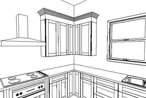
Corner cabinets look squished

8 years ago
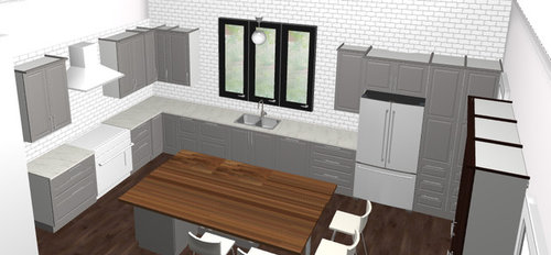
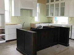
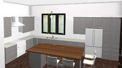
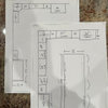
I am trying to decide if we should wrap the upper cabinets around the corner or end the cabinet run at the corner. If we do a easy reach in the corner, I am stuck with two 12" doors, in combination with the lower base cabinet having the same configuration. We would have 15-18" doors on both sides of the two 12" doors. I feel like the smaller doors in the corner are leading to a vortex (maybe it was just my KD print out?).

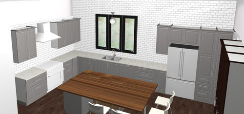
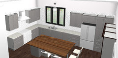
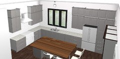
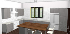
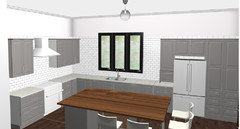
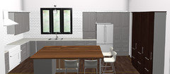
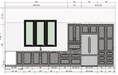
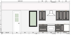
I am playing around myself with Ikea's planner (please ignore the technical challenges like the island) and came up with the 2 images... the first is the preferred but also the cabinet corner door width issue. Along with the KD image that is making me question this...

Other plan would be to end the uppers in the corner and have more open space around the window. I think its almost too much open space. Originally plan is to run the tile to the ceiling...do you think the more open space is just too much? And as much as I would like to do open shelves, I have had shelves in the kitchen before that I could never keep clean, so that is really not an option.

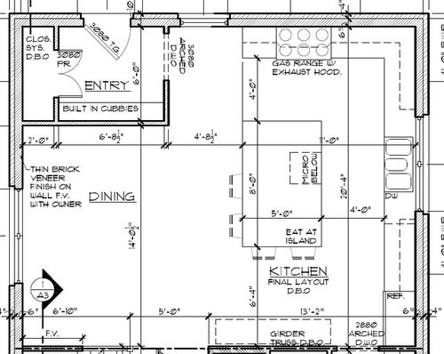
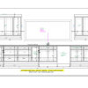
Here is floor plan for context (please note this the rear entrance) - the sink window can move, the size has to stay the same (6' wide) as they are already ordered. Pantry and bar is through the arched opening at the bottom of the image, furniture/china cabinet piece is the dotted lines at the bottom.


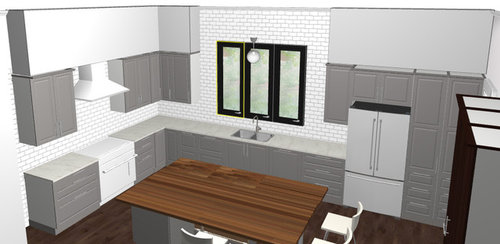
11' ceilings as we are in a historic district - If we do not take tile to the ceiling above the cabinets - i am trying to think about what a soffit would look like...42" uppers, 9" in riser/crown...budget tells us we can't do another upper cabinet run:( Soffit image below - This looks goofy? Granted our 7" crown at the ceiling would help and moldings that I cant put into the tool don't show below so it wont look as bad...but i'm not sure...

Thanks for your help and opinions!

Comments (34)

  • 8 years ago

    Can you use a corner cabinet that cuts diagonally instead of making the 45 degree turn? Does that make sense? I had one in my last house that had a lazy Susan spice rack in it that I loved.

  • 8 years ago

    The lazy susan base cabinet looks fine but the upper corner would look better with an angled door. You could also consider no door on the upper as seen in the link below.

    https://www.houzz.com/discussions/are-angled-cabinets-in-corner-out-what-do-do-with-corner-dsvw-vd~2932940

  • 8 years ago

    I like the cabinets "dying" into the wall at the corner. No corner cab, nothing on the wall with the sink. My own kitchen is like that, and it's easy to reach in. Clean look.

  • 8 years ago
    last modified: 8 years ago

    If you let it die into the corner, what is the distance between the cabinet and the window and then on the other side, the distance between the window and the cabinet by the fridge.?

    Another option is to let it die into the corner, remove the cabinet to the left of the fridge and just panel the fridge and then center the window.

    I like the idea of having it die into the corner instead of turning the corner.

    I wouldn't do a soffit.

  • 8 years ago

    I’m more concerned about the tile plan. What’s the point of tile going up that high? It’s really, really high above the upper cabs. Sorry, but it’s like crazy high to run the tile! Very weird, nothing I’ve ever seen done, and I would not do that. Or the soffit either. I’d end the tile at the normal height under the upper cabs. JMHO. I could go either way on the corner cab. Btw I have your exact layout and I love it. Good job. Also great job on making the Ikea planner work to show the island.

  • 8 years ago
    last modified: 8 years ago

    Your layout of appliances is the same as mine, although my overall kitchen is much smaller and a U.

    I’m ending mine at the wall. Like you, I’m still not 100% sure but that layout is my front runner.

    Since you have such high ceilings have you thought about stacking the 15” or 20” cabinets above?

    edit, just saw that you don’t want to do additional uppers due to budget. What about just doing additional uppers on the range wall? Just a thought, may look odd.

  • 8 years ago

    My first impression: it needs a regular double door cabinet left of fridge.....with a couple inches distance between window trim and such cabinet side. The gap that you show seems like something is missing and the super small cabinet left of fridge doesn't look right for usage left out, that you can benefit from and aesthetically the scale is off with too much void space there. Let the left side die into wall but consider a "void door" small cabinet with shelves at the last position....in the corner. Too much tile.

  • 8 years ago

    Completely not what you asked, but have you considered moving your fridge between the two pantries? I think it will look better to have it flanked. And then maybe even run that single upper by it all the way to the counter, for appliance storage?

  • 8 years ago

    I had 2 angled corner uppers in my old kitchen, and despised them. I find my new easy-reach to be SO much more useful!

    If you feel like you have plenty of storage space, perhaps a blind corner upper would work for you, allowing you to size the cabinets on each side of the corner in a pleasing way.

  • 8 years ago

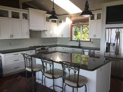
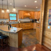
    Here's my cabinets dying into the wall. It's what I'd do with yours. (My kitchen isn't finished.)

    What bothers me more than the corner is your fridge and the one cabinet hanging on the left of the fridge. If anything I'd have that upper cabinet end down at the counter or do as someone else suggested and split your pantry with the fridge in the middle.

    To give you an idea, what I'm doing to the left of my fridge cabinet is putting in a "garage" below my upper so it feels more finished, (the cabinet with the solid doors to the right of the glass door cabinets) but then again, I have a row of cabinets and not a single cabinet just hanging there.

  • 8 years ago

    Okay - good stuff - here's where I am at:

    Not a fan of how the diagonal cabinet door in the corner look - that is what started me on this journey to find alternatives.

    Tile - I was going for a feature wall, I took down to height of window (software limits where i can end, ignore the row above the cabs). maybe that is better?

    herbflavor - I can not believe I didn't think about making a bigger cabinet next to the fridge...here is current mock up with that view. That allows me to dead end the one wall and balance the open space around the window. Puts the sink a little closer than I would like to that corner as that is MY zone when i am cooking - but i still have plenty of space. I can stage between sink and fridge, then land in my zone for cooking.

    The pantry cab is really just 1 cabinet, but ikea software I had to use two. My coffee zone is right next to the fridge and I want easy access to grab my milk from the fridge without a pantry in the way. Maybe what I changed above solves for that? I need to think more about a "garage"...could hide my coffee maker...but does that become too much with my daily usage to open and pull out??? And with it a double wide cabinet maybe doesn't work anymore?

    Does this look okay with the window closer to the corner? I feel like its better than the other 2 versions...

    AnnKH - good point, i do have plenty of storage - if i need to shift everything back, i could explore that option of the blind corner. But maybe I am on a roll with above???

    I haven't priced out the additional stack of cabinets...will ask, you never know (likely glass doors would kill it) and i have nothing i need to store here and a display is not really what i am going for... here is that view...does this look better?

    I really appreciate everyone's thoughts - its amazing what you get stuck on and can't see what is so clear to others. Yes, my designer questioned my tile to the ceiling as well...she's too nice to call me crazy, but i know she is thinking it.

  • 8 years ago
    last modified: 8 years ago

    I realize that this is Ikea's planner and not actual architectural elevation drawings but with the way the window wall is now drawn, by adding that extra cabinet to the left of the fridge you have thrown off the visual weight of the wall. It looks like the cabinets are going to tip to the left.

    You will get better visual weight if you just take that cabinet out and put the window back.

  • 8 years ago
    last modified: 8 years ago

    Have you purposely decided against any open shelves/ledges/etc? I like your last mock up. The microwave is in island?...across from sink? Do you have a busy household...is that a potential traffic jam spot? How much width is the pantry area right of fridge using up?....if you can shrink it by 3-6 inches that wall cabinet left of fridge could be more like 33-36 dbl door. It's really useful at that size, vs. 30 in. It is your main wall cabinet, in the best location....you will want it generous I think. Your kitchen looks nice.

  • 8 years ago

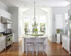
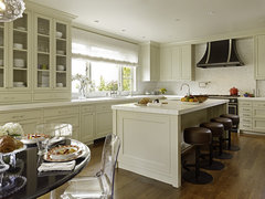
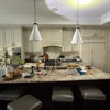
    Well I did remember this kitchen that has tile above the cabinets that I love!

    Your idea isn’t crazy! It is just that with your 11’ ceiling I though it might be total overkill. I couldn’t picture it and thought it might look odd, plus cost you a small fortune too.

    If you can price out the small stacked uppers and they would be in budget, that would look really great. I bet your historic home will look gorgeous when you are finished with the remoldel. Congrats and keep us posted on your progress.

  • 8 years ago

    I like how the crown on the cabinetry mimics that at the ceiling.

    http://www.scplaces.com/blog/a-kitchen-from-the-pages-of-a-magazine/


  • 8 years ago
    Yes I am against open shelves. I think they are beautiful but I’m not interested in the cleaning. And past experience tells me I’m not good at keeping them clean. Lol

    I agree I need a cabinet next to the fridge and the wider looks better, but blfenton makes a good point about the balance of that wall. Ugh. I’m stuck, I’d have to go back to the single door cabinet (must have a cabinet for coffee needs) to move window back down, but then I have too much space between dead corner and window.

    Cluelessincolorado, thanks for the image - looks like same height as what I will have. And we are leaving looking at a riser and crown, would look good to mirror, thanks.

    Waiting to hear back from KD to see about blind corner options...
  • 8 years ago

    I like the cabinets dying into the range wall. Aesthetically I prefer removing the upper next to the fridge, but if you need the storage I like Gennifer's idea of taking it down to the counter like an appliance garage.

  • 8 years ago

    Realized i never did view without that cabinet (that i still think i really need...more to think about) and one side dead end. I could put a panel but looks the cabs above the fridge are left hanging...

    Also tried view with tall cabinet there (improvised on software).

    Fell like i am close, but not yet there.

  • 8 years ago

    I like this. And although I'm not a fan of cabinets to the counter in this case it might be a good option. I agree, that I think you're almost there.

  • 8 years ago
    last modified: 8 years ago

    Looks good to me! I’d keep my coffee, coffee grinder, and toaster in that cab on the counter. Percolator or coffee maker on counter next to it. Can an outlet be inside the cab?

  • 8 years ago
    last modified: 8 years ago

    Here is what I did. I store all my canned food, pasta, etc, in the upper blind corner area. It is in the second glass cab passed the range hood to the corner. It’s not a problem for me at all to get to my stuff on the lowest shelf and even the second shelf on tip toe, but up high (glass upper) I need my step stool. I’d have loved to have your space around the window though, mine’s too tight. It seems that you would still have plenty space turning the corner I believe if you feel you need that cabinet space. I needed the cab passed the corner and wanted it to match with the cabinet on the other side of the window so I compromised with a blind corner. I don’t regret it, except the open space around the window. Way too tight. Biggest window possible plus space around it is always best! I couldn’t change window so dealt with it. Plus didn’t have GW advice when bought my cabs!

  • 8 years ago

    too much unused space around window...what are you trying to do here...showcase a window or have important storage in a kitchen?I would wrap the corner and bring cabinets in to a couple of inches either side of window as opposed to such a large window and voided wall space. The window itself is enough space you've removed from cabinet option....put up some cabinets!! Bad space for an appliance garage ...right elbow, arm, and so forth does not have freedom of movement with side of fridge....limited. If you want such a garage install it far left down from range....what is the purpose?

  • 8 years ago

    Going to disagree with herbflavor. Good size kitchens don’t need cabinets packed into every available square inch, and the breathing room around the window provides a nice open look to the kitchen. I don’t have upper cabinets on an entire wall, and I love the openness. I like your last option.


  • 8 years ago

    I like the last option too. I have an appliance garage between my sink and fridge; I put my cuisinart griddler and blender in there. Coffee maker lives on the counter for the reason you mentioned, don't want to pull it out every day.

    You could do a dish hutch to the counter rather than an appliance garage. Glass is gorgeous, but I think would look fine without glass if budget's an issue. The sole upper next to the fridge just seemed lonely, and taking the cabinet to the counter makes it more at home with the fridge/pantry section.

    If you need storage, yeah put in more cabinets. If you have enough storage without, I prefer fewer upper cabinets, especially around the window. Cabinets too close to the window block natural light. You can see in rebunky's picture how the cabinet blocks some of the light. It may be a small trade-off in a small kitchen where storage is very precious, but I'd make sure that's the case.

    Also I've found I prefer working with no uppers, more comfortable to not have the upper cabinet in your face. Your kitchen would be really pleasant working between the range and sink, where you'll have a lot of upper and lower storage in that area, but still some countertop space with no uppers.

    I'll say that rebunky's kitchen and the dish hutch example above are both beautiful, even though they have the cabinets up to the window that I'm encouraging you not to do :) So it's really a matter of personal preference and which trade-off is best for you.

  • 8 years ago
    last modified: 8 years ago

    Visually, I definitely like the look of the last mock-up you did, with the cabinet going down to the counter. If you haven’t ordered your cabinetry yet, though, what about switching to two smaller pantries, instead of one, and flanking the fridge?

    Or maybe go slightly smaller with it, and make the cabinet to the left bigger... Is the current pantry a 36”? If you bumped it down to a 24, and scooted everything to the right, and then had 24” cabinets down to the counter on the left of the fridge.

    I think the difference in storage would be negligible, and it would just feel more balanced.

  • 8 years ago

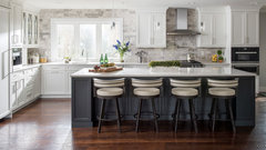
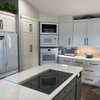
    Came across this image, how do you think this looks? The window is not centered on the room, but cabinets dead end, there is space around the window...

    Here is what my version would look like, that allows me to dead end the cabinet, have my coffee cabinet (and its not a lonely single door cabinet) and easy access to refrigerator.

    Gennifer B - That pantry is for small appliance storage, it's 36" and I don't want to make any smaller. The purpose of that pantry was also get keep my fridge closer to sink and cooking area (the fridge is already as far away from those items as i want them to be).

    So, here it is, maybe? Do you think the fridge side looks to heavy?

    Or no cabinet to counter, does it help lighten it up? Just calls out there is a long run of counter top there. I think i am down to these 2 options.

    I think this side is good.

  • 8 years ago

    It's just that it's ALMOST symmetrical, but not quite. Using a 30" to the counter, 36" fridge, 30" pantry would balance it. I think if the cabinets don't come to the counter and it's smaller than the pantry- it does look weighted to the left. I really like the example caligirl5 showed. Where did that photo come from?

  • 8 years ago

    It's from Houzz, I think I just did a search for dish hutches.

    I like the cabinet to the counter, but prefer the narrower cabinet that you posted on Saturday. It's hard to tell...is the sink in the same place in all the options?

  • 8 years ago
    last modified: 8 years ago

    Sorry if I missed it, but did you rule out the blind corner cab? Blind goes to corner, equal cabs flanking window (right one to countertop or not on fridge side), moving window over towards fridge, equal space, still allowing plenty open space surrounding the window? Not like mine! Haha!

    It gives you so much more prep space between sink and stove, yet still space for the cabinet on fridge side. Might looked more balanced? Dishes and glasses above DW and also dish drawer storage across DW in island drawers.

  • 8 years ago

    Oops, didn't see that you don't want the fridge any further away!

  • 8 years ago
    last modified: 8 years ago

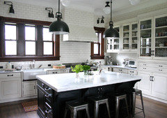
    This is a great discussion, and I have little useful to add, except to say I never liked tile to the ceiling until I saw this picture, which seems to come up on every Houzz search I do. Good luck with your project. It will be beautiful.

    San Jose Res 2 · More Info

    Jackie thanked MizLizzie
  • 8 years ago

    I think it will look fine. I prefer the one with the cabinet to the counter.

Sponsored
Franklin County's Heavy Timber Specialists | Best of Houzz 2020!