

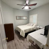
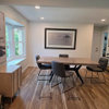
which picture? Poll
8 years ago
last modified: 8 years ago
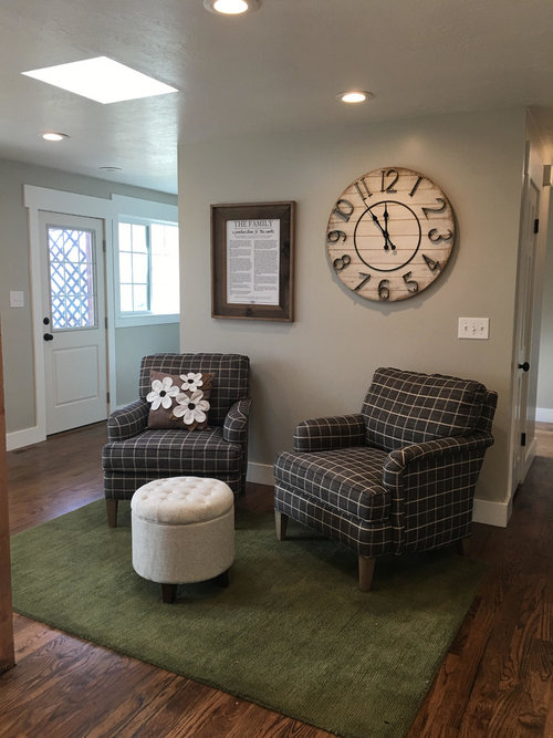
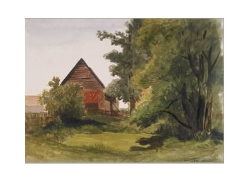
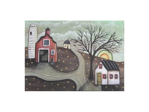
Featured Answer
Sort by:Oldest
Comments (32)
 8 years ago
 8 years ago
Related Professionals
Columbia Interior Designers & Decorators · Crestview Furniture & Accessories · Taunton Furniture & Accessories · Ardmore Architects & Building Designers · Liberal Architects & Building Designers · Pensacola Kitchen & Bathroom Designers · Valdosta Interior Designers & Decorators · Tupelo Interior Designers & Decorators · Vancouver Interior Designers & Decorators · Calgary Interior Designers & Decorators · Clarksdale Home Remodeling · Portsmouth Home Remodeling · Magog Home Remodeling · Aurora Flooring Contractors · Janesville Flooring Contractors- 8 years ago
- 8 years ago
 8 years ago
- 8 years ago
- 8 years ago
- PRO8 years agolast modified: 8 years ago
- 8 years ago
 8 years ago
- 8 years agolast modified: 8 years ago
- 8 years ago
- 8 years ago
- 8 years ago
 PRO8 years ago
- 8 years ago
 8 years ago
 8 years agoJanette Price thanked beckysharp Reinstate SW Unconditionally
- 8 years ago
- 8 years agolast modified: 8 years ago


Related Stories

LANDSCAPE DESIGNGarden Overhaul: Which Plants Should Stay, Which Should Go?
Learning how to inventory your plants is the first step in dealing with an overgrown landscape
Full Story
KITCHEN DESIGN12 Great Kitchen Styles — Which One’s for You?
Sometimes you can be surprised by the kitchen style that really calls to you. The proof is in the pictures
Full Story
DECORATING GUIDES11 Tips for Picture-Perfect Mantel Styling All Year
The garland is gone; the holly is history. But you can keep your mantel arrangements artful no matter which decorations you choose next
Full Story
COLORWhich Paint Color Should a Designer Pick for Her Entry?
Bright blue? Hot pink? Jennifer Ott invites you to vote on a bold new color for the entrance to her San Francisco home
Full Story
DESIGN DICTIONARYPicture Rail
This trim little design element can be used to do the heavy lifting of supporting artwork or simply be decorative
Full Story


WINDOWSExpand Your View with Picture Windows
Minimal, pane-free windows make a clear connection between indoors and out
Full Story
STUDIOS AND WORKSHOPSRoom of the Day: A New Art Studio Paints a Perfect Picture
After painting in spare bedrooms and garages for years, Elise Marshall finally has an art studio that inspires her
Full Story
EXTERIORSWhere Front Yards Collide: Property Lines in Pictures
Some could be twins; others channel the Odd Couple. You may never look at property boundaries the same way again
Full Story
picturebug