Software
Houzz Logo Print
birdkkk

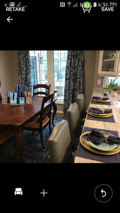
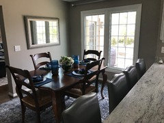
Are the rug and drapery too much?

8 years ago
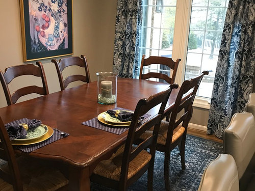
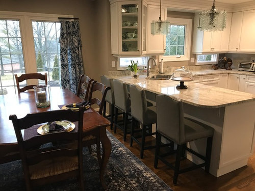
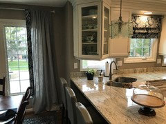
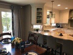
I need window treatment for the kitchen. Does this work or is it overwhelming? I have navy white and geeige throughout the house. I would do something on the other side of the kitchen too. The table isn’t always that big.


Comments (82)

  • 8 years ago

    Much better


  • 8 years ago

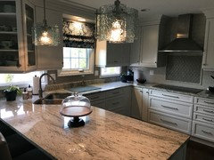
    I like the idea of a Roman shade in the kitchen with a similar blue/white fabric.

    I prefer the dining room with the framed print. It balances the color throughout the room.

  • 8 years ago
    The biggest things I see is the small curtain rods you used and the low placement. I think you should do a regular rod that is raised as high and wide as the ceiling and walls permit. This would make your ceiling appear taller and if by chance you would like to close the drapes then you could. This would mean buying longer drapes and possibly one or two additional panels for the correct fullness.
  • 8 years ago
    I looked closer and expanded screen, I guess those are not rods and just a hanger to see how they look? If that's the case disregard rod comment but I would still go for a longer drapes to hang higher.
  • 8 years ago

    Drapery and rug play well. Artwork, not so much. Contemporary artwork might work better.

  • 8 years ago

    Ishack, I clarified in a previous post, those are just hangers I have them suspended from. I intend to get a brushed nickel full rod for the dining area window, hanging them high. They are panels I purchased so I have the choice to put in grommets or hang them with a rod and clips. Not sure which I will do but I do like the idea of a Roman shade for the window on the kitchen side. It helps balance the room.

  • 8 years ago

    Bossyvossy and others...I would love a suggestion for something neutral on the dining side wall.


  • 8 years ago
    last modified: 8 years ago

    Please not grommets; they just look so utilitarian. As for art, that should be something you love. There are thousands of options, and only you can tell whether it's right for you. I would tape out the area and see what proportions look best first. I still think one large rectangular picture would be the most appropriate, or two smaller ones side by side that together make a rectangle. A genuine oil or acrylic painting would have much more impact than a print. e-bay has a huge variety of genuine pieces at good prices.

  • 8 years ago

    Thanks for the heads up on grommets! I will try and find some clips.


  • 8 years ago

    Bought more fabric for the other window. Now to decide balance or Roman shade or any other options.

  • 8 years ago

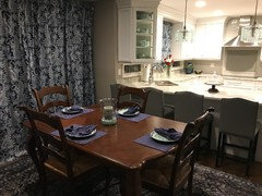
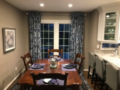
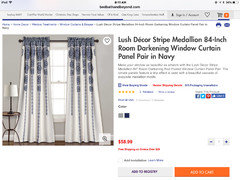
    Well I worked my a** off and I am just not loving it. The drapes overpower the room and look really overwhelming when closed. The faux Roman Shade is ok but all I see is printed fabric. I have an office I might move the drapes to and start all over. I am frustrated. The drapes are not hemmed yet and the roman shade is just hanging there! I will post photos soon.

  • 8 years ago

    Swapped out the picture. It is smaller but I like how the color picks up the light fixtures and tile by the cook top.

  • 8 years ago

  • 8 years ago

    Do you have the curtains closed and the kitchen shade down every evening?

    It is a very different look from your first picture, with daylight and curtain panels off to the side and shade up, but still very pretty. I'm sorry you're frustrated, especially with all the work involved.

  • 8 years ago

    I did hope to use them for some privacy at night. Not loving the look! Looks better during the day when they are open.


  • 8 years ago

    I have some neutral vertical blinds I used by the table before the reno. I could rehang and have them tucked behind the drapery panels during the day.

  • 8 years ago

    Following because I'm going to run in the same issue in our vacation home once the cabinets are in. What window treatment do you have in the rest of the house? I think if I had windows instead of sliders, I'd add white wooden blinds to the dining room and keep the roman shade in the kitchen.

    Did you try making the curtains a bit smaller in width and length? I think seeing some of the wall would help.

  • 8 years ago

    The comments here were to make them high and wide. I can bring them in a bit and I think it will look better! Avocado, I have no treatment in the family room as the windows are pretty and require no privacy. I have small bay windows in the formal rooms living room and dining room) which are undressed right now. My problem with with the kitchen is I can't mount anything inside the windows, there is no room. Thanks for your suggestions. I come from the ole valance era! I always liked how you could add color and interest simply!

  • 8 years ago
    last modified: 8 years ago

    Avacado making them smaller did improve the drapes. Thanks!

  • 8 years ago

  • 8 years ago

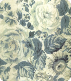
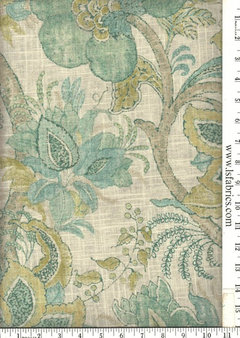
    I love the idea of mixing the rug with a floral/botanical but not loving this fabric. I think it could be much better with a light color fabric in muted floral. beautiful room tho!!

  • 8 years ago

    I think it looked fine with the first wall art and with the curtains opened so that they looked like an accent color. They are kind of too much when they are closed but if you only have them closed at night then can you live with that...I could. I like the look of the blind in the kitchen though, that's very nice in there.

  • 8 years ago

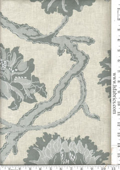
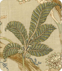
    here are a couple more. these are all from lewis and sheron textiles. lewis and sheron

  • 8 years ago
    I love both rooms, very pretty. Nothing on kitchen window and cream drapes in dining room. Pretty centerpiece is needed. Calm and relaxed.
  • 8 years ago

    I know Stacey, I'm stuck on that too! This decorating thing is hard work! I'll take any suggestions on centerpiece!


  • 8 years ago
    Your kitchen to me is very soft comforting and serene. On my iPad, it looks like it has a little green? I really think cream drapes would be really pretty . The rug has tones of gray? A simple pretty bowl of green apples. A large glass terrarium that is very easy to make with plants.
  • 8 years ago
    How about plantation shutters?
  • 8 years ago

    I love those two patterns from lewis and sheron.

  • 8 years ago
    I love your drapes, roman shade and rug. I will look around for a centre piece.
    birdkkk thanked Harper
  • 8 years ago

    Olychick, thanks for the encouragement. I entertained tonight and it felt very comfortable.


  • 8 years ago

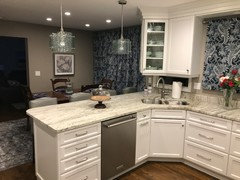
    Your kitchen is beautiful but I don’t think your table and chairs match it - they’re too dark. You have a light kitchen and then everything next to it is dark - table, chairs, rugs and drapes. I would paint the table and chairs the same color as your cabinets and the two spaces would blend beautifully.

  • 8 years ago
    Your dining room is lovely, but do you need the shade in the kitchen? I think that window would look better uncovered or with an unobtrusive shade.
  • 8 years ago
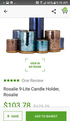
    Here's a pretty centre piece.
  • 8 years ago

    Thanks Tami, I like it!


  • 8 years ago
    last modified: 8 years ago

    I decided the pattern drapes were too much in the dining area. I will leave the Roman shade in the kitchen and put something lighter in the dining area. Any suggestions?

  • 8 years ago

    I would opt for white or off-white solid drapes in a fairly thick material or drapes with white and gray or white and blue stripes. The mirror looks great, by the way, in that location. You have a beautiful space and a great kitchen.

  • 8 years ago
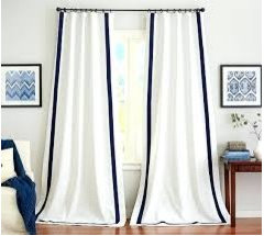
    I’ve seen solid curtain panels with a contrasting trim set in from the edges OR even tassels running down the leading edge that might add just a bit of zing to plain white panels — could be the answer :-)

    (I like the mirror! Size is super!)
  • 8 years ago

    Oh thank you so much! I like the suggestion of a white with trim for interest. Do you think sheers are out of the question?


  • 8 years ago
    last modified: 8 years ago

    Could you use that print fabric as a contrasting border on some light colored window panels? I think a print would work if it was in reverse..blue on white. I have been thinking lots about window treatments myself. Is that fantasy brown countertop?

  • 8 years ago

    Two sit for me, fantasy brown was our first love! We ended up going with white river granite and are pleased

  • 8 years ago
    I think it looks lovely. And I love the little windows under the kitchen cabinets - very cool!
  • 8 years ago
    last modified: 8 years ago

    I love the addition of the mirror! What about instead of curtains, adding sheer or solid color roman shades to the dining room windows?

    Like This:

    https://goo.gl/images/dckuNs

    https://goo.gl/images/3iVMtL


  • 8 years ago
    last modified: 8 years ago

    So here is what I am going with. Greige cotton drape which I will add tabs to for hanging rather than the gathered rod. It was suggested by 2sit4me to add a border. What do you all think? I’m not sure!

  • 8 years ago
    last modified: 8 years ago

    I figured it would look too busy...Never mind. Onward and upward!

    I wouldn't do that border. I would do a simple grosgrain ribbon inset a few inches.

    Also (but this is just me)...SO not a fan of the high rods...

    ETA: I would do off white drapes...

  • 8 years ago

    Thanks penny I tried the off white and it didn’t work! They looked dingy but the white looked too stark I do like the grosgrain ribbon idea. In navy? I did hesitate on the matching fabric detail. Thanks.

  • 8 years ago

    I like TwoSit's border, but I think edging like that looks better on fabric that's less sheer.

    But then I liked the original blue and white curtains : ) .

  • 8 years ago

    What if you did the border across the top? It would just provide a glimpse of color during the day but add interest at night without be overwhelming. It may work better with the lighter weight material.

  • 8 years ago

    I was wondering about that! I guess I would have to see it to envision. Thanks.

  • 8 years ago
    last modified: 8 years ago

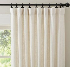
    Perhaps the white is too stark because you're not used to it? I would copy the color of your kitchen cabinets...This, maybe?


    This is stark white, but just showing for the visual...

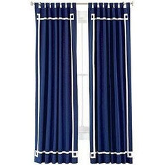
    Or, try my original suggestion of a plain indigo blue (these are annoying tab tops, but it's just for the visual...)

    birdkkk thanked User