Software
Houzz Logo Print
sam_goh18

Custom House - Kitchen Feedback Needed

8 years ago
last modified: 8 years ago
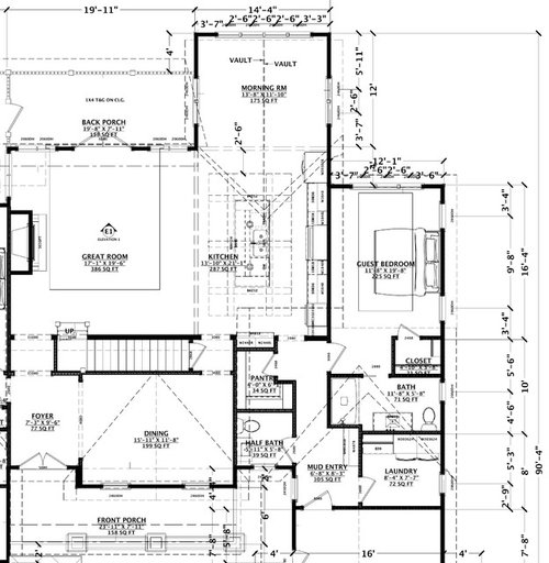


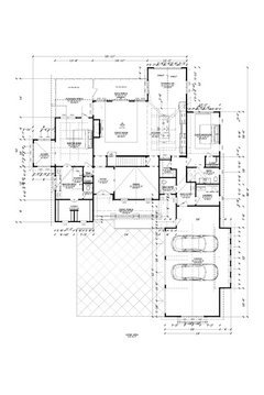
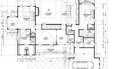
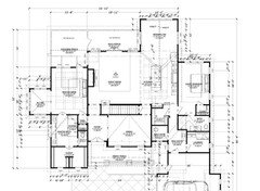
Here's the top down view. Entry from the south garage, passes by the pantry and then into the kitchen and greatroom and morning room. We eat primarily to the North and morning room, much less formal affairs in the dining room to the south.


Blank slate so literally lots of options.


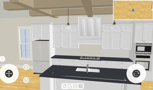
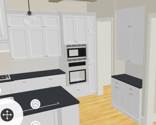
Kitchen area, fir down coffered ceilings stained cedar. 36" range. Wellborn select cabinets 36 x 36 (with some stackers) upgraded to soft close full extension. White shaker panels look fine to us. Vent with makeup air behind hood with valance.

Island is a bit larger + 6 inches each side from the next few pictures. 2 pendants due to the coffer.


Dishwasher left of sink. Trash pullout right of sink.


Ask away or flame away! I'll get a cold one from the bridge and listen to "feedback" :)


Comments (22)

  • PRO
    8 years ago
    last modified: 8 years ago
    I hope it's the tropics. You have almost no closet space. Where's the rest of the plan

  • PRO
    8 years ago

    I never like cabinets above my range only a nice hood. I would never put a guest room next to the kitchen . The foyer entry seems to narrow before actually entering the main part of the house which I find a bit odd . I do not like coffered ceilings in kitchens IMO they force the cabinets to not be up to the ceiling and just creats a big dust collector where you could have storage.I do not want to hike to the pantry to get stuff when preparing dinner I much prefer pullout pantries in the kitchen to a walk in outside the kitchen.The foyer really forces guests to actually stand in the DR if there are more than 2 , no closets for coats .A long walk to the laundry. The 1/2 bath in the mud entry is not exactly where I want my guests to go . All in all I would go back to the drawing board with your architect.You also need an actual KD.

  • 8 years ago

    Hi Sam, sounds like a fun project! It sounds like you said your makeup air is behind your hood which doesn't sound right. Could you clarify? Also, I would consider moving your sink out of the way where people cook. People are going to be running into each other and you'll be getting in your own way.

  • PRO
    8 years ago
    last modified: 8 years ago
    It’s pretty bland, but not terrible.

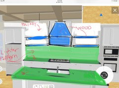
    Maybe try glass cabinets in the lower back band of cabinets flanking the hood.

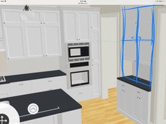
    OR for more interest...One alternate option might be to open up that wall a bit. I would eliminate the uppers flanking the hood. Change the hood to a wood finish with some hips- not straight. Repeat the wood finish with some decorative shelves. Change countertop to lighter tone marble looking quartz with pretty pattern - ie Cambria Ella or Brittanica or a natural quartzite. Wrap it up the wall 24” or so as your backsplash.. Extend uppers at side to sit on countertop to help offset storage lost.

    This would be a reduction in storage but addition of some character!

    Also not illustrated but it looks like you could enlarge your Island a bit in length and in depth to be more impactful in the space. Looks sorta dinky as is and you have a ton of space looking at the plan. I’d do 44” aisle from back counter to Island and 48” aside at side - keeping Island centerline same as hood. Enlarge depth of Island too by 8-10”.

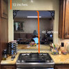
    Crude markups for your viewing pleasure!

  • 8 years ago

    I'm following, as a non-expert. But if I were building a house from scratch, I'd want kitchen cabinets that are tall and go all the way up to the ceiling. I'd put a coffered ceiling in the family room or living room. You can google pictures of both cabinet situations to choose what looks better to you (and provides enough storage). High kitchen cabinets in my house are used to store table decor/linens for Easter, Xmas, so don't have to be easily accessible.

  • 8 years ago

    @JAN MOYER House will be in Birmingham AL. Living in OH now, AL qualifies as the tropics I believe :) I'm attaching the full 1st floor layout. Coat storage is by the foyer for guests or 1 off's, for family it will be the mudroom cubbies.

    @Patricia Colwell Consulting There are some constraints for the floor plan. We don't have a preference for cabinets or hood over range. Designer suggested a built-in look and we didn't object. Is it just the look that you don't like? House is about as wide as setbacks allow. We'd like a 1st floor guest for in-law's. Views are all out the back, hence why it's next to kitchen. Both sets of in-laws are the earliest risers in the house, and go to bed after the latest meal time.

    Foyer entry is indeed narrow. Not my favorite feature. Different stair configurations, more of an L to open up that entry point, would take room out of either dining or greatroom. This was the compromise, if you have any thoughts here that'd be nice. We don't have many formal guests, the small closet in the hallway off the foyer should work for coats. One thought here is that we live in the back of the house essentially. Not being able to see through the foyer into the great room area gives us some privacy. You'll walk through the narrower entryway into the open area of the back of the house with vaulted ceilings, etc.

    Pantry and laundry are indeed a haul. 1/2 bath location we're agnostic. Again, constraints were all living areas in the back to maximize view. The wife understands the locations of the first two and is ok with them as a compromise. Not sure where else we could put these?

    @catinthehat I actually do not know where the makeup air part will be, sorry. Just know that it's spec'd. We have this exact kitchen layout at the moment and know what you mean about the space. We added about a half to 3/4 of a foot distance to compensate some. Any other suggestions for where sink might go for work triangle?

    @South Redwood Design Studio Thanks for the very helpful suggestions and illustrations! Right now, other than white shaker cabinets, we have not made any other selections. We were thinking - white subway tile for backsplash, picture frame herringbone over the range. Island base will be stained wood, darker hardwood floors at the moment. Not too unlike the ubiquitous "white kitchens" on Houzz.

    We will take a look at the cambria options you mentioned. Right now a simple quartz is priced. If you have other suggestions for what we were thinking about as well as more counter colors feel free to let us know!

    Hipped versus straight hood - we have been having that debate. Given that we need the space from the cabinets next to the hood, I've always been a little off put by the "empty" space between the cabinets and the hips. Some people paint, some people tile up, but it seems off to me. Going to have to look at more pictures to decide.

    The side counter was actually added for an area for small appliances (Keurig, rice cooker, toaster oven, etc) so we can't carry the cabinets all the way down there. Island I believe is 10'4 by 4' now (not pictured). You'd suggest even larger?

    @Mrs. S Thanks for following. We like the look of the cabinets all the way to the ceiling but it was a budget compromise along with we wouldn't use the extra storage space up that high. Right now it's a 36" upper with an 18" above. Add 4" of crown, the 6" fir down/coffer and it should be ok in a 10' ceiling. I don't know that it would stretch up high enough that we could incorporate that all into the ceiling though.

  • 8 years ago

    Since your layout is quite close to the one I'm planning, I like it! I think my island is longer, and my pantry is larger, but I live in a colder climate and we tend to stock up so we don't have to leave the house when it's booger-freezing cold. ;-)

    My side counter is a baking center.

    I think it's a functional layout, and while my fridge and wall over are flipped from yours, it works similarly.

    My cabinets aren't going to the ceiling, either - too $$ for space I can't reach. I'm doing a bit of a vintage look, so my choices for color, counters and hardware are going to be different. But I think what you've got looks pretty good, so far.

  • 8 years ago
    last modified: 8 years ago

    I'm going to comment on one of the pictures provided by South Redwood Design Studio. The last picture, I like what you already have. If you make the upper cabinet rest on the counter and it has doors, you will always have to sweep off the countertop to get the doors open. I made this mistake in my last kitchen. I was sorry I did it. But, I do like the idea of the range hood. No one ever uses the area above a cooktop for storage because ventilation often clobbers the interior of the cabinet.

    A lot of people don't like the sink in the island placed directly across from the cooktop. I don't have a problem with it as long as you have enough counter space on each side. But, it evidently bothers a lot of people. They seem to prefer it offset.

    I would rather have taller cabinets in a kitchen than the coffered ceiling. Trade one cost for the other.

    Have you thought of redesigning the guest quarters and having two doors to the bath? This would allow you to ditch the half-bath and have more room for pantry space. Just a thought to explore.

  • 8 years ago

    Sam, you really need an architect, not a "designer". Too many awkward flaws to list.

  • 8 years ago

    There is a bit of weirdness with the location of the half bath in the mudroom. Asking guests to go into your mudroom is definitely odd. Also having the main entry by the master bedroom is also weird and personally makes me uncomfortable.

    I would flip the dining and foyer and then open up the half bath to the foyer. When you have guests you can keep them contained in the great room/dining area which will generally keep them out of the rest of your house. You will need to find a way to re add a coat closet.

    Having to go through the foyer to get to the dining room from the kitchen is no big deal. I would consider closing the left dining room entrance to the great room so the great room is the only way to get to the master bedroom

  • 8 years ago

    with regards to your kitchen, that wide space between the pantry and guest room is wasted. Maybe something like this. The oven stack is moved to the bottom, the mudroom hall is straightened out which creates more room for the pantry. Change the swinging door to a pocket door.

    I like the sink to be offset from the stove because when Im cooking I like to turn around and pick up ingredients. It looks like your island might not be big enough to do this. But if possible expand your island by one cabinet to the top and one to the bottom. If you can add the one to the bottom you can shift your sink and dishwasher down

    As others have said I would remove the coffered ceiling and take the cabinets all the way to the ceiling. The coffered ceiling is a case of form getting in the way of function. You barely have enough cabinets as it is, so you need those uppers.


  • 8 years ago

    If it's possible, I'd put the sink on the exterior wall, not in the island. Maybe swap the stove and sink locations and then you can make the window that's now over the stove bigger so it comes down to counter level and you can see out while standing at the sink and also let more light in. This depends, obviously, on what the view is.

  • 8 years ago

    Hi Sam,

    Regarding sink placement, I'm not really sure where I'd put it in your setup. To be honest, if I could design a home from the ground up, I would not deprive the most expensive room in the house an exterior window. There are major design challenges with your layout that various folks here have pointed out to varying degrees of rudeness. There is a notion on this forum that you need a professional to help with everything which I find silly. In this case though, you really might want to consider working one on one with a licensed architect who has experience with custom residential homes.

  • 8 years ago
    last modified: 8 years ago

    You, of course, need a good lighting plan. But you've got an open floor plan with plenty of views out the many sightlines through windows around the perimeter. Your kitchen hasn't been deprived of anything. And to say it needs a window for your sink is stilted thinking from the days of yore before dishwashers.

    I'd increase the depth of the counter along the back wall to 30" by spacing out the lower cabinets. This dramatically increases the usability of your limited counter space. Nothing to the uppers except to mount them at 16.5" up from the countertop instead of 18". 4" led cans can be spaced between the front of an upper cabinet and the edge of the counter to avoid a shadow from your body when working.

  • 8 years ago
    last modified: 8 years ago

    @Holly Stockley - thank you for the feedback. Originally there was no cabinetry/counter space at all on the south wall with a larger pantry and door off the kitchen, instead of in the hallway. But my wife didn't think that would be enough counter space for our small appliances, hence why the layout is the way it is now. Our first thought was the extra space in the garage on the north wall, would be racks for canned goods as another pantry area. However, Anthony's tweaks, moving the oven to create a "baking center" like you have is a very interesting one that we are considering, if there is enough space for a doorway there.

    @homechef59 Wife also nix'd the extended cabinet idea, but appreciate the door clutter thought. We do primarily stir fries and ingredients are prepared and on a side counter ready to go. I agree there are strong opinions on the offset sink idea, I think I prefer the sink centered with the range for the look of the room.

    The consolidating of the half and guest bath has been proposed before too. I wanted to do it to save money, but my wife would prefer them apart. This is because if and when a set of in-law's moves in for good, she would like them to have their privacy. As much as they love their grandchildren, having kids in and out of their bathroom would not be optimal.

    @Anthony C - thank you for the detailed feedback, you have put a lot of thought into it and it has been thought provoking. For the entry situation, I agree and like your changes. I never did quite like the master being right off the foyer, and had thought about, regardless, moving the door where you have it at the moment. I also better like the half bath being off the foyer and on a different hallway than the mudroom area. We could likely put a coat closet on the dining room/foyer wall, taking some room out of the foyer.

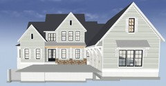
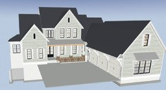
    The challenge here is marrying changes with the external elevations. This is how the current front looks. I like the symmetry of the exterior with the gable in the middle. Front doors are a simple but elegant set of stained double doors. I'm not sure what an entryway to the right as you have proposed would look as the front door would be buried a little in the nook and blocked by the garage. Bank of 3 windows above the current 3 would need to be changed too. If the porch entrance isn't changed, guests would walk up the stairs, past the windows looking into the dining room, and then to the front door. Any thoughts on the outside?

    We really like your thoughts on the kitchen layout. I agree that moving the oven stack might give a bigger pantry. Question will be how the empty space vacated will look from the greatroom area. The island has had two smaller cabinet (cookie sheet type) added to make the island wider (North south) 6 inches on both sides. We could do wider cabinets but at that point we'd be pushing the size of a jumbo quartz slab. My daughter loves to bake, so putting the oven on that wall would allow her to use the south side of the island as prep and keep her out of the range/sink area. Another question would be how wide we could get the doorway if we moved the oven stack there. Lots to think about here, thanks!

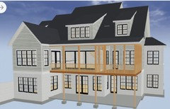
    @catinthehat, roar11, dan1888 - Thanks for your thoughts. Lots of people would like the kitchen on an outside wall. Due to the width, we could pick two out of three, great room, morning room, or kitchen. We decided the first two were what we'd like. To help with natural light, we have increased the number of windows in the great room and morning room. Also, swapped in sliders instead of windows in the great room and morning room (1 x 15' + 1 x 8') so that there is a nice view while standing at the sink.

    This is what the rear elevation looks like and this picture was taken at dusk, but should be right at the sink.


    We are meeting with an interior designer that we will run some of these ideas by, especially the lighting situation thanks for pointing it out Dan. BTW - I wouldn't put some of the perceived drawbacks on the house designer, the kitchen/great room/morning room layout was our request. It mirrors the house we have lived in the last 8 years and are very comfortable with the pros and cons. Could always be improved however, and that's the reason for this thread :)

  • 8 years ago

    Sorry. I didn't study the plan. I just looked at the pictures so I was not aware that the kitchen is in the middle of the house. I wouldn't do it that way, but you didn't ask our opinion on that.

  • 8 years ago

    Did a few follow-ups with the builder today. The Anthony C suggestions for first floor layout is a possibility but would require significant rework. Mainly reconfiguring main gable and the entrance might become a 1 door versus double door hidden a bit back into the cubby. Would have to reroute porch stairs and slow. Ultimately inside the house, the half bath faces the formal dining room. Anthony drew a wall there, but I'm not sure how much privacy there is either way.

    In the kitchen, moving the oven stack to the south seems like a good idea. However, it turns out the awkward area in between the pantry door and guest door was for a purpose. It's spread out to give space for a wheel chair to turn around and go left/right into the guest room, or into the kitchen. Moving the oven stack gives a corridor but not a turn around area. After this discussion, I feel like I need a wheel chair ;(

  • 8 years ago

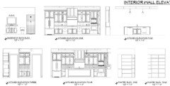
    Here's what the kitchen looks like at the moment. Not pictured - island has been expanded width wise to have vertical cookie sheet cabinets on both sides of the sink.

  • 8 years ago

    Don't fall in love symmetry. Kitchen elevation one and three, change those base cabinet doors to drawers. Three stack drawer units are better than four. Put as many drawers in as you can. They are just more efficient.

  • 8 years ago
    last modified: 8 years ago

    I think things are pretty good, honestly. I would flip the dishwasher to the other side, making it closer to your primary eating area (the morning room) and also moving it to the perimeter of your kitchen, so someone can be cleaning up while someone else is cooking. Definitely add more drawers, like homechef59 suggested.

    I would definitely leave the half bath entrance in the mudroom, vs the dining room. I can’t imagine anything worse when entertaining as having a guest uncomfortable with smells/sounds that close to where people are gathering to eat.

    The tight hallway from the foyer to the great room has the element of compress/expand that Frank Lloyd Wright promoted.

    Ultimately, every house has some things that are great, and some that are concessions. You can’t have it all!

  • 8 years ago
    last modified: 8 years ago

    The wider drawers you'll get by swapping out those lower doors are the most useful. By the time you subtract for the construction details that go into a drawer you're left with little usable storage from the two smaller width drawer stacks you show. All drawers should be dovetail undermount full extension Blum slides with soft close. I again suggest a deeper than 24" counter with 28-30" a more usable choice. If you want you can get deeper cabs to go with that and Blum makes deeper slide kits for more drawer space. Mock up a full scale cardboard layout so you can see for yourself.