Software
Houzz Logo Print
emily_nicholsgrossi

Desperately need kitchen wall color help

Hi All,

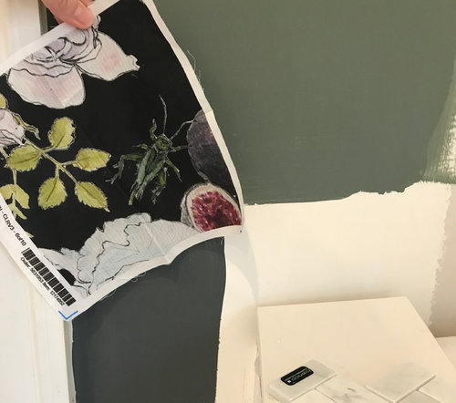
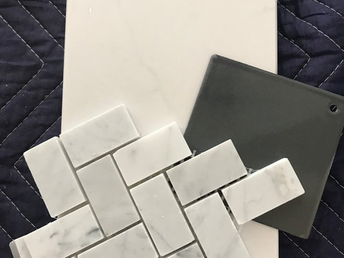
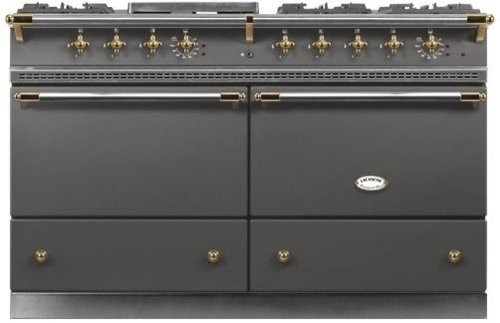
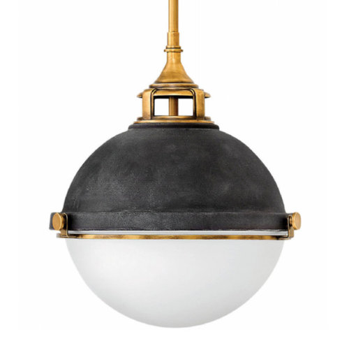
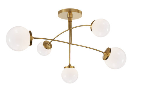
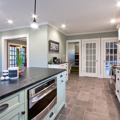
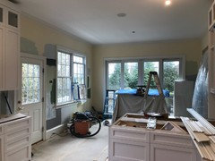
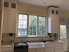
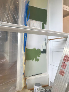
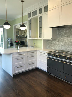
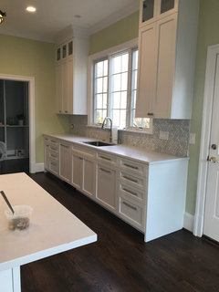
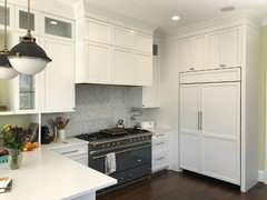
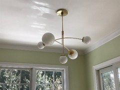
We are midway through our kitchen renovation, and I have tried nearly 20 paint colors for the walls. We have Silestone eternal statuario countertops, cabinets painted in Decorator's White, a honed carrara herringbone backsplash, a Lacanche Sully in Ardoise, many windows, and dark wooden floors. We have a fabulous fabric that will be used in a Roman shade above the tri-panel window above our sink. Also some brass/milk glass fixtures.

See pics to get a sense.


I loved BM Chimichurri but my husband thought it was way too dark a wall color. Otherwise I have tried:

BM Shoreline (too light), Stonington Gray (looked like cement), Wickham Gray (too light/bright), Coventry Gray, Sterling (too blue), Sterling Silver (cement), Cushing Green (muddy), Chimichurri, Glade Green (too minty),

and

Farrow & Ball Down Pipe (too similar to range), Green Smoke (muddy), Green Ground, Purbeck Stone (muddy), Elephant's Breath (elsewhere in our house and lovely but not a fit in kitchen), Churlish Green (utterly dreadful), Wevet...


What would you suggest in the gray and green families? I'm stumped and fried. Thank you!!!!!

Comments (59)

  • 8 years ago

    Thank you all SO much. Flo, wow!

    Traci, the pendants are from Hinkley and are the Fletcher in Aged Zinc.

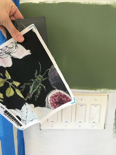
    Cor, I got the fabric from Spoonflower. https://www.spoonflower.com/fabric/6297100-wallpaperinsert-by-leilani-s_fleurs
    If you try Spoonflower fabrics (samples are unique and inexpensive), do get a variety of the fabric options. The basic ones look a bit cheap- like you took a computer and printed image on fabric. But others are lovely!!

    Flo, I will definitely try some more brighter greens. Most yellow greens give me hives but I do actually very much like Green Ground (F&B) and will try a few more today. And Irene, the SW grays you shared are beautiful. I will try one more gray today although I love the thought of color. My yard and gardens make me so happy so I'd like to bring some into the house. :)


    Thanks so much everyone. Will definitely share after pics. Emily

  • 8 years ago

    Try Gray Mirage.

  • 8 years ago

    If you tend to like one paint company's colors, buy their fan deck. It's worth the money when you are making a lot of decisions and you have been to the paint store 20 times in the last week. They run about $40 or so.

  • PRO
    8 years ago

    I love bringing outside inside, so stick with that vision. Keep us posted on your findings! That range is awesome. Which brand is it?

  • 8 years ago
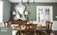
    Sw oyster bay with fabric or try the next one down from oyster bay. Sw retreat, much deeper colour, but nice
  • 8 years ago

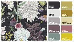
    Here's Sherwin Williams' read on the colors in your fabric.

  • 8 years ago

    That fabric!! I absolutely adore.

  • 8 years ago
    Thank you, Rebecca!! Me too! :)
    Flo, the range is a lacanche sully.
  • 8 years ago

    katinparadise - How did you get the SW read on the fabric? Thanks

  • 8 years ago

    Kat, that reading is very cool! Thank you!


  • 8 years ago

    Thank you, Irene!

  • 8 years ago

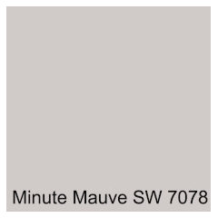
    You're welcome Emily. My eyes immediately went to the dusty purple gray in the fabric. If you want to stay with grays, perhaps you could find something in a light gray with a bit of purple undertone. Maybe something like Minute Mauve.

    Or the Mystical Shade shown in the color read.

    Cor, I uploaded a picture of the fabric into the Sherwin Williams website and used the Snap It button to get a read. You have to download the Snap It. It will give you the first five colors and you have to hit the Edit Colors button in green on the bottom right to get the second five.

  • 8 years ago
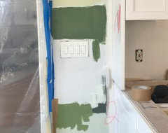
    Thoughts on this green??
  • 8 years ago

    I think it's beautiful although it is dark. If the kitchen does not have a lot of open wall space and has a lot of natural light, I think it could work. Your cabinets and countertops are light, so they would certainly stand out. If the kitchen is not finished, can you post 3D drawings showing the cabinet layout, etc?

  • 8 years ago
    Hi Kat, Thank you!!! Here are some photos - lots of light! And also a slightly lighter, more yellow green.
  • 8 years ago
    last modified: 8 years ago

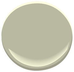
    more grey in Tree Moss -

    Tree Moss 508 Paint · More Info


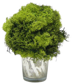
    Then real moss color, is actually the same just brighter..


    Mercury Glass Votive, Reindeer Moss Topiary Ball · More Info


    [https://www.houzz.com/products/tree-moss-508-paint-prvw-vr~1612078[(https://www.houzz.com/products/tree-moss-508-paint-prvw-vr~1612078)

  • 8 years ago

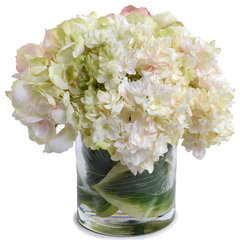
    Not saying you need hydrangeas, but the softer the paint, the more accessories of soft [from fabric?] would 'show well'...[instead of brighter green taking the attention]...

    Pink-green Hydrangea Bouquet · More Info
    https://www.houzz.com/products/pink-green-hydrangea-bouquet-prvw-vr~56739766

  • 8 years ago

    The shape of wall surfaces, the feel you want, matters. Do you want garden look? or the more soft look? The lighting needs space to 'be' also... is that sense.. :)

  • PRO
    8 years ago

    Top one. Great color!

  • PRO
    8 years ago

    What is the top color? Your kitchen is light enough you could get away with any of those IMO. Just a personal choice. The darker tends to drive your style to a more "traditional" look and the more edgy colors go more "transitional" modern. What table and chairs or banquette do you plan for the room? Will you be using the fabric in cushions or other elements? It is great fabric!! Love it.

  • 8 years ago

    Hi Flo, The top (with the poorly written red 1) is Calke Green (F&B) and the bottom, yellower one with the 2 is Yeabridge Green (also F&B). I actually like both. We have a Saarinen tulip table and knock-off Jacobsen Series 7 chairs. Great idea to bring the fabric in elsewhere!!

  • 8 years ago

    I love either green!


  • 8 years ago

    Thank you!!

  • PRO
    8 years ago

    Take a peek at Sherwin ancient marble 6162. Your selections are gorgeous. I worry about that heavy green overkilling things. Though I could see color like that in a powder bath or something smaller scale. Just thoughts...good luck!

  • PRO
    8 years ago
    With a contemporary table and chairs, you might go with the lightest green way up high in that photo. Then you could
    do some oval place mats out of the fabric for your table! Going to be gorgeous! Another client of mine has found some pendants that would look fantastic in your kitchen. I will post a photo for you. Bbl
  • 8 years ago
    last modified: 8 years ago

    Beautiful space! So much wonderful light. I like the Calke Green. I worry that all the light may fade out the 2nd. I think both are beautiful though. How do they feel to you?

  • PRO
    8 years ago
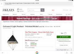
    Emily-take a look at this Hudson Valley pendant. It is stunning and could work beautifully in your kitchen. ;). Comes with silver or gold metallic.
    Emily Nichols Grossi thanked Flo Mangan
  • PRO
    8 years ago
    I like SW functional gray, BM stone harbor, BM revere pewter, and BM silver fox.
  • PRO
    8 years ago
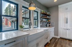
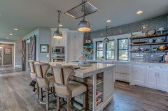
    Here is a kitchen with functional gray. It is more of a brown/gray than blue gray.
  • 8 years ago

    Thank you, Flo!! However, we have already purchased all our light fixtures. :) Thank you, Nest!!!

  • 8 years ago

    Kat, THANK YOU! I nearly cried today re: the (26 samples of) paint. :) I really like Calke and Yeabridge. Our whole house is gray and neutral so I do want something fun and colorful in our otherwise-white kitchen!

  • PRO
    8 years ago
    Ok, I didn’t realize you had purchased the pendants and they are great. No problem.
  • 8 years ago
    I like the yeabridge colour
  • 8 years ago

    You're welcome. I can understand your frustration. Although it wasn't quite that many, I went through 7 samples for my master bath and 5 for my master bedroom. Can't wait to see it finished!

  • 8 years ago

    More specifically - are you floors truly dark: espresso or dark walnut??

    If so, a more bright will to me, tip the balance over...

    to a contrast too much, even for many white cabinets.... ??

  • 8 years ago
    last modified: 8 years ago

    Ok, y'all, I think we have decided to go with Green Ground (F&B) and either Jacobean or Espresso for the floors. Fingers crossed and thank you!! The GG is a similar tone to Tree Moss, everdebz. Thank you!

  • 8 years ago

    You're welcome Cor! Emily, can't wait to see the finished space. Good luck!

  • 8 years ago

    I love the fabric and I am glad you are going lighter than in your initial post. The Tree Moss is nice, as is the Oyster Bay. I love picking up that soft light green in your fabric.

  • 8 years ago

    Thank you, enduring. I really appreciate this shot of confidence for our lighter color! :)

  • 8 years ago

    It sounds lovely--please come back and post a reveal when it's done!

  • 8 years ago
    Hi Everyone, Other than window treatments, our kitchen is done!! We adore it. Thank you for all your advice.
    Pics below!
  • 8 years ago
    Also missing art, so don’t worry, walls won’t stay bare. ;)
  • PRO
    8 years ago

    Beautiful, great job! Love that range! All your elements really comes together nicely.

  • PRO
    8 years ago

    btw, love the wall color! Great choice. Good call everdebz!

  • 8 years ago

    Gorgeous- I love it all! That range! Lovely fixtures! The bright paint works so well. And cant wait to see your gorgeous window treatments.

  • 8 years ago

    Looks great. The lighting is so nice too. Remind use where the fabric is going, on the windows?

  • 8 years ago

    Oh I love it! Please post more photos after the window treatments :)

  • 8 years ago

    GORGEOUS! Everything came out to perfection. I just love your hood. That was my dream to have a hood like that but my cabinet company doesn't make that one and it is not in my budget to go differently. And I love the final paint color. Super choice. What are your floors? They too look incredible. Enjoy your space!

  • 8 years ago
    I so appreciate all of you! Thank you for your enthusiasm and support! The floors are espresso (minwax) with duraseal max (commercial finish bc we have sons and a cat) on top. The fabric I shared will be used in a large Roman shade above the sink (that three-part window). Remaining windows will have a minimalist treatment TBD.