Software
Houzz Logo Print
cpatrie

15 years ago
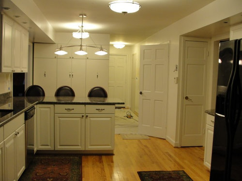
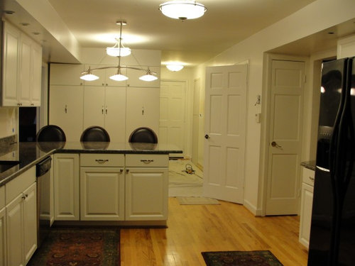
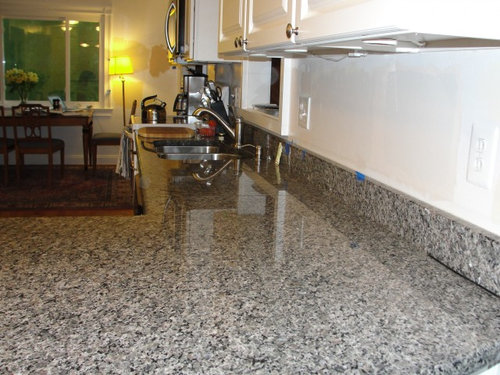
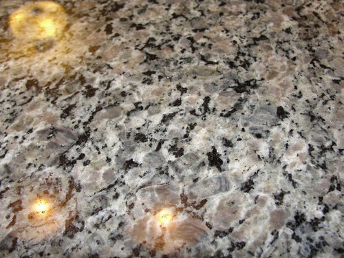
We just purchased a home that has granite counters in the kitchen. The granite is grey, black, mica flecks, and a touch of rose brown. Not a warm looking color combination. Cabinets are white. The house is in the woods so we need to avoid dark colors in this hallway, kitchen and dining area. A blue grey would be perfect but family members hate the coldness of that color. Can anyone suggest a good wall color for the kitchen that fits this description ? We need to bring light in to the area but want some color. Is there such a thing as a warm greige? Thanks in advance for any help. Carol Patrie

Comments (4)

  • 15 years ago
    This looks like New Caledonia granite. See if you can get a sample from a stone supplier by you and bring it to your paint store. Have them match that 'greige' color in it to warm up the place.
  • 14 years ago
    Thank you so much. I checked and you are correct, it is New Caledonia. I will see if I can get a sample to take to the paint store. Thanks again.
  • PRO
    14 years ago
    How about bring in some reds or oranges to pick up your area rugs. Maybe if it can fit in the budget a nice backsplash or simply painting a wall?
  • 14 years ago
    I would recommend Restoration Hardwares Silver Sage. It's a beautiful color....very warm and I think it would add a pop of color to your space.
  • 14 years ago
    I agree that Silver Sage would be pretty. Then you could accent with yellows, reds, or any color you like!
  • PRO
    14 years ago
    I know exactly what granite that is - try General Paint - Womb CL-3243W or Turbo CL-3244M. Bring in the reds/oranges with your accessories - then if you tire of the rugs you won't have an expensive renovation on your hands to get rid of the coloured backsplash.
  • 14 years ago
    Love your style! Try Sherwin Williams "Relaxed Khaki" - it's a taupy-greige: light, bright w/ a touch of warmth. Then add more vibrant color your w/ accessories. Good luck!
  • 14 years ago
    Your wood floors have a warm honey tone. By bringing in more of the same warm tones your kitchen will appear warm and sunny even on the coldest darkest days.

    Try Celtic Folklore 411 by Benjamin Moore. Though I like 'Silver Sage' by Restoration Hardware the underlying tones are cool and would make your kitchen appear even colder.

    If Celtic Folklore is to intense a color you might try Pale Vista 2029-60 also by Ben Moore. It has both warm and cool undertones which means it will work with the warmth of the floor and the coolness of the counter. It would be very subtle because of the pale shade.

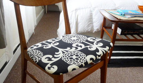
    Accent with a terra cotta and warm orange to bring out the rug colors. Try a terra cotta pot with a green plant and a bowl full of oranges. Recover your chair cushions with one of the patterns below and have a Roman Shade made for the window with one of the coordinating fabrics. or use a wood tone Roman Shade with drapes made from one of the fabrics.


    This link is to a short article about the psychology of color in the kitchen. http://pebblez.com/information/decor/kitchens/psychology-of-color-kitchens.htm

    I would love to see 'after' pictures!
  • 14 years ago
    I could see Sherwin Williams "Kilim Beige" warming that up. It's similar to the tan color above the red tile in jhudson's third photo.
  • 14 years ago
    Thank you to each of you who has responded. It has been so helpful to have others thinking about this with me. The painters come on Monday. I chose Valspar's Cottage Stone. This shade seems to bring some light in, warm up the place and go reasonably well with the counter. I love the idea of bright accents in the room to add some pop. I will post pictures after the painting is complete. Thanks again to everyone who helped me think. Carol
  • 14 years ago
    I'd go with a warm dove gray overall, but choose one wall (maybe the wall behind your table and chairs, or a backsplash area) to do in a Tuscan red...something with a hint of terracotta to pick up that warm ruddy fleck in the counters and the golden tones of the floor. We did that in our kitchen (dark slate countertops, white cabinets, stainless appliances, white tile backsplash) and the effect is warm but still clean and crisp. Looks great (and stil current) 5 years later.
  • PRO
    14 years ago
    Benjamin Moore Revere Pewter. Its a beautiful warm taupe/grey.
  • 14 years ago
    Not so convinced about Valspar's Cottage Stone. But you can always repaint later. That's what's so much fun about color.
  • 14 years ago
    One thing I would consider - what other colors are in adjoining rooms?
  • 14 years ago
    I think that a buttery yellow/gold would warm up the space.
  • 14 years ago
    Personally, I think that going taupe/ greige is a mistake - you'll end up with one dull looking room.

    I'd perk it up and bring some of the freshness of the forest indoors by selecting a Brilliant green - such as Benjamin Moore's Fresh Scent Green:
    http://www.benjaminmoore.com/en-us/for-your-home/color-gallery?cd=2033-30&col=CP
  • 14 years ago
    I love the idea of Celtic Folklore 411. I immediately pictured a colour like that when I saw your room. Oranges, terracottas and even peaches are wonderful with the green tones – ever seen Cougar Town? One of the characters in that (Ellie?) has a whole house decorated in those colours and I am fascinated by the endless array of things that can be done within that range. Do am image search for "Cougar Town Ellie's house' and you will see what I mean. The kitchen is gorgeous, warm and inviting. Have fun!
  • 14 years ago
    You should check out colormehappyblog.blogspot.com Maira Killam has a great blog on picking out the best backsplash to choosing the best paint colors.
  • 14 years ago
    I'd avoid the Celtic Folklore. I see nothing in this room or the adjoining room w/this color, thus far.
  • 14 years ago
    If you stick to the colours and tones you already have, you'll never try anything new. That said, it's up to the individual whether to branch out from existing tones or to bring in a new one. All academic anyway, as Carol is trying out the stone colour. Can't wait to see the finished room!
  • 14 years ago
    You must be pulling your hair out listening to so much conflicting advice!!!! Have you considered buying sample cans which you can try on different walls?
  • 14 years ago
    P.S. Rose brown and orange sometimes look hideous together.With your warm wood floor I dont see this as a cold space.A cool colour on the walls would look great with the floor and accessories could give you the warm pops.
  • PRO
    14 years ago
    I would suggest something in the way of furniture. I would add a warm rattan stool to your bar. That would give you a different color than the black and warm it up and give texture. We got our bar stools at Target online. They are about $130 each. Also I would then add a rattan shade to your window which would warm it up again. You could go with a neutral beige gray such as Pismo Dunes from Benjamin Moore. If you have an area where you could add fabric something with a geometric graphice design in browns and creams would go nicely with that. Otherwise you could go with charcoals and whites if you went with the cooler tones of paint. I really think adding the rattan/banana leaf bar stools is an important step toward warming up your room.
  • 14 years ago
    I would go with a taupe/light to medium tan color that pulls from both the hue in the floor and the spots in the counter.
  • 14 years ago
    @ray_lu: i agree. this color will create a more cohesive design, and it will create some contrast between the cabinets, counters, etc. then to add some interest and color, pick up the color(s) in the rug and perhaps more pattern in fabric or other accessories. this will also add future accessorizing flexibility.
  • 14 years ago
    Hope to see 'after' pictures soon!
  • 14 years ago
    Thanks everyone for your posts and suggestions. The painters are at the house all this week. The entire house is being painted. New floors everywhere except the kitchen next week. I will post some photos as soon as I can get things in order. Window treatments will come a bit later.
  • 12 years ago
    I am in the exact same boat. Didn't realize how difficult picking out a paint color would be. What color did you go with? Thanks.
  • 12 years ago
    In the end I had the room painted twice. First was a pale beige -Cottage Stone. It looked awful. I had it redone in a warm peachy color and it looks great. We are in the woods and the color is perfect for this setting. I am attaching photos taken from the center of the room so you can see how it looks facing each direction. The shades for the window match the wall color and have a nice warm effect in the evenings when closed. When pulled up they are not apparent at all and do not obstruct the view of the woods. A tray with warm orange tones gives a nice connection between the counter and the wall color
  • 12 years ago
    I would paint it in the blue gray color scheme. Sherwin Williams make a beautiful color called "Sea Salt". It would go with the cabinets, floors, granite. It is light enough not to look "cold" and modern enough to look updated. My kitchen is dark cherry cabinets with Madura Gold Granite. It has kinda a peachy color in it. My walls are a light sage green. I will try to attach a pic of my kitchen when it was first remodeled a year ago. Now the table has changed to a darker look. Here is also a pic of the Sea Salt paint color. Here is one kitchen that is dark and one with white cabinets. Both have the Sea Salt paint color.

    Good luck!
  • 12 years ago
    Sunlightishire, what a beautiful color choice. Sea salt is a lovely color. I am going to write that one down.