Software
Houzz Logo Print
hiccup4

Front entrance tile pattern

8 years ago
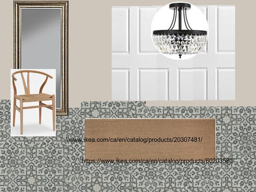
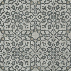
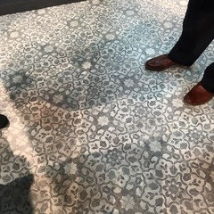
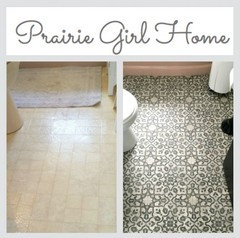
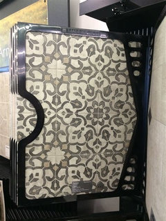
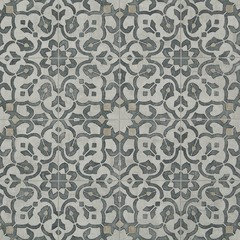
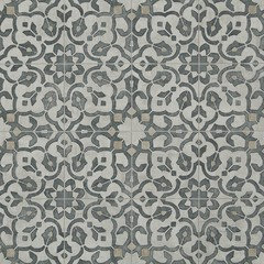
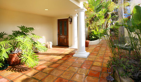
Which front entrance pattern/colour do you prefer? We live in an urban environment but we are not modern in terms of styling but we like contemporary classic. The front area will be used heavily by children/dogs if that makes a difference in terms of choice. Materials don't matter in this situation...just colour/pattern. The floor area will be 6' x10' south facing with 3/4 window door and full side lite. Thoughts?

Front entry · More Info

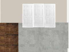
I have no idea why the closet doors came out like this! lol

Comments (35)

  • 8 years ago

    Is that your wall color? If so, choices 1 and 2 are too gray and cool. 3 looks like it has some warm tones but it is hard to tell. The best way to pick is to bring the samples to your space and see how they look with your light and paint.

    If you want pattern, you can always add an indoor outdoor rug to the space instead of choosing a more permanent pattered floor.

    hiccup4 thanked deegw
  • PRO
    8 years ago

    I LOVE #1 but not sure if you will get sick of that down the road? #3 isn't as exciting but seems to be the 'safest' option.


  • 8 years ago
    last modified: 8 years ago


    Worldly Gray SW 7043 - Neutral Paint Color - Sherwin-Williams · More Info

    Paint colour is SW Worldy Grey...d_gw Do you see some tan/beige in the print?

    Barnes Custom Builders -The floor is vinyl sheet flooring...if we do get sick of it..well...easy enough to change without breaking the bank. :)

    I have to admit..i like it..but find it a tad daunting.

    It's new build so I can't 'see' it in the space.

  • 8 years ago

    Photos I found...


    I normally would pick #3...but...I'm thinking this pattern may hide dog hair, dirt etc better between cleanings?

  • 8 years ago
    last modified: 8 years ago

    hiccup, I did see it when I magnified but the overall the tone is still gray and cool which made me think the third choice is best with the paint.

    Greys and beiges are tough because they have different undertones and it is best to make the decision based on the light in your space. What is the flooring next to the entry? Carpet, wood? Gray or beige? Is the rest of the house gray or beige tones?

    That being said, if the patterned floor will make you smile every time you walk in the door, go for it!

    hiccup4 thanked deegw
  • PRO
    8 years ago

    I think it's so pretty and I do see the beige tones in it. I almost wish it was a little bit larger scale, now that I see it in the photos you posted.

    hiccup4 thanked Barnes Custom Builders
  • 8 years ago


    Worldly Gray SW 7043 - Neutral Paint Color - Sherwin-Williams · More Info
    Stairs hall leading up to the main floor...which is the same.

  • 8 years ago
    last modified: 8 years ago

    I'm not crazy about it next to your wood floors. It's so hard to tell with small samples.

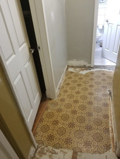
    I have to add that my mom and dad put that vinyl pattern in their kitchen in 1978! It was avocado and gold but the exact same pattern :)

    hiccup4 thanked deegw
  • 8 years ago

    Me too Barnes Custom Builders!

  • 8 years ago

    d_gw That's hilarious!

  • 8 years ago

    I dunno...I changed it to the pattern above. I'll probably chicken out and just go for plain gray.

  • 8 years ago

    There are lots of pretty, inexpensive indoor outdoor rugs with patterns similar to the geometric encaustic tile pattern. I would consider using the "boring" floor and getting a great rug in colors that work better with your wood floor.

    hiccup4 thanked deegw
  • 8 years ago


    Front Entry 2 · More Info
    Better?

  • PRO
    8 years ago

    I like it with the wood! And if you're going to add a rug instead, just continue the wood floors through that area.

    hiccup4 thanked Barnes Custom Builders
  • 8 years ago

    Barnes Custom Builders...which do you prefer with the wood?


  • PRO
    8 years ago

    The patterned one.

    hiccup4 thanked Barnes Custom Builders
  • 8 years ago

    ^^One more for the road.

  • 8 years ago
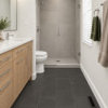
    Hi -- I have the Mannington sheet vinyl (the patterned one) in our cottage bathroom. I absolutely adore it! It is a lot warmer in person, so your wall color will look great with it. Add a jute rug to the entrance and it will look charming! I'll see if I can find some photos.
    hiccup4 thanked annied75
  • 8 years ago

    annied75 Did you use the filigree iron or the pewter ? I'm SO VERY EXCITED that I have a real in life person that has used it!! Please send photos.

  • 8 years ago
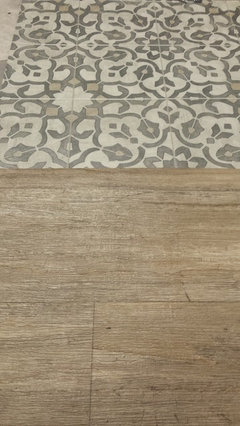
    I used the Iron color, since the Pewter had a faded appearance that I didn't like. Here's a quick photo showing the flooring matched up with another Mannington vinyl sheet flooring that we used in our kitchen and dining areas of our cottage. I know that sheet vinyl doesn't get a lot of credit, but it's come a long way! Plus, it's practical for the ease of clean-ups. As I mentioned, we love it at our cottage, since you don't have to worry about people with wet feet and dripping swimsuits damaging the floors.
  • 8 years ago
    last modified: 8 years ago

    I agree...I hate hate hate grout. I have marble with white grout all over my current house and I loved it for about 3 months. Then it just looked dirty. I'm all about less fuss and more living now. It looks fabulous with your floors. Do you think it would work with my darker floors? I did a mock up in the original post above.

  • 8 years ago
    I think it will look great with your floors! I also think your paint color will look nice. We used BM Grant Beige throughout our cottage. By using the iron color of the Mannington sheet vinyl, it has the bluish-gray and beige colors that can go either way for decorating.
  • 8 years ago

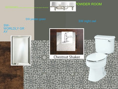
    I'm happily being swayed. I may just continue it in the powder room then. Does this work or is it a miss?

    Powder Room · More Info

  • 8 years ago
    I like the look, however, you could switch it up and paint the walls BM Intrigue or BM Duxbury Gray. I think that would look good with your vanity.
  • 8 years ago

    Below are darker versions of SW Sea Salt (on the same colour strip):


    Ripe Olive · More Info

    Pewter Green · More Info

    Retreat · More Info

    Acacia Haze · More Info

  • 8 years ago

    And these are on the same strip as SW Silver Strand:


    Night Owl · More Info

    Attitude Gray · More Info

    Illusive Green · More Info

  • 8 years ago
    last modified: 8 years ago

    Okay...but circling back to the front foyer...may I ask what colour I should paint the inside of the front door? This is SW Urban Bronze...but I question if it will 'go' with the floor. Should I just stick with white?

    Urbane Bronze · More Info


  • 8 years ago
    I would keep the door white or the same color as your trim.
    hiccup4 thanked annied75
  • PRO
    8 years ago

    I like the tile, it's fresh and current looking. Have fun with it!

    hiccup4 thanked Gray & Walter, Ltd.
  • 8 years ago

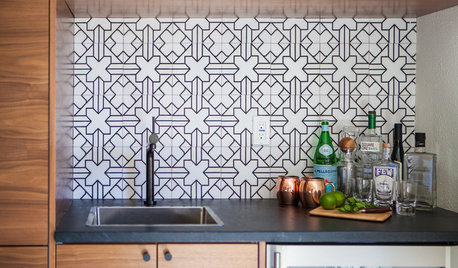
    I'm not sure where everyone seems to be coming up with these 'numbered choices' '#1, #2, #3' . I must be missing something. I have no idea which one is #1, which is #2, and which is #3. However from what I saw in the first photo posted I like the patterned sheet vinyl. Reminds me of cement tile. I just used a patterned porcelain floor tile made to resemble cement tile in my kitchen. I love the pattern and don't have even a speck of regret about using it, I love it more every day I see it.

    hiccup4 thanked artsyphartsy_home_maker
  • 8 years ago
    last modified: 8 years ago

    hiccup - I thought you'd get a kick out of this photo from another post. You are making a timeless decorating choice! It is so interesting to me that color changes and small pattern tweaks can make something look fresh.

  • 8 years ago

    Looks amazing!

  • 6 years ago

    does anybody have more pictures of the filigree iron? any pictures would be greatly appreciated with their cabinets. thank you!