

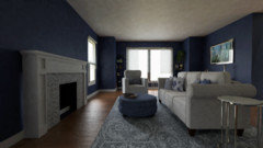
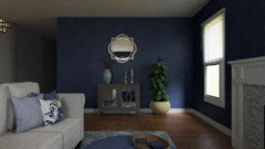
Feedback on design project(updated)
8 years ago
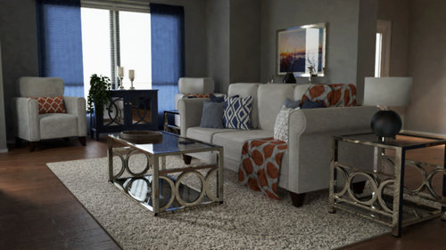
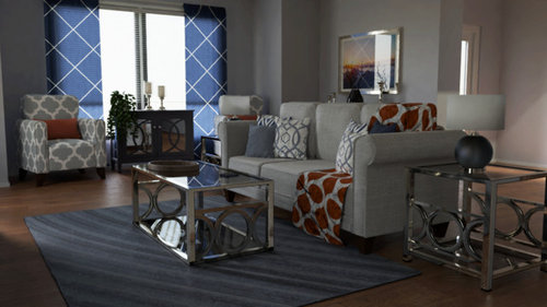
Featured Answer
Sort by:Oldest
Comments (10)
 PRO8 years ago
Related Professionals
McComb Interior Designers & Decorators · Chattanooga Interior Designers & Decorators · Petersburg Interior Designers & Decorators · Lewiston Interior Designers & Decorators · Amarillo Interior Designers & Decorators · Bend Interior Designers & Decorators · Phoenix Architects & Building Designers · Sedalia Kitchen & Bathroom Designers · Charleston Kitchen & Bathroom Designers · Chula Vista Kitchen & Bathroom Designers · Sarasota Interior Designers & Decorators · Mount Vernon Interior Designers & Decorators · Logan Interior Designers & Decorators · Monroe Flooring Contractors · Yuma Flooring Contractors 8 years agolast modified: 8 years ago
- 8 years agolast modified: 8 years ago
 8 years ago
 8 years ago
- 8 years ago
- 8 years ago
- 8 years ago
- 8 years ago
Related Stories
LANDSCAPE DESIGN5 Essential Considerations for a Landscape Design Project
Get your winter garden fix by planning an entirely new landscape or just an update for a single garden stretch
Full Story
BUDGETING YOUR PROJECTDesign Workshop: Is a Phased Construction Project Right for You?
Breaking up your remodel or custom home project has benefits and disadvantages. See if it’s right for you
Full Story
LANDSCAPE DESIGN5 Reasons to Consider a Landscape Design-Build Firm for Your Project
Hiring one company to do both design and construction can simplify the process. Here are pros and cons for deciding if it's right for you
Full Story
POWDER ROOMSDesigner’s Own Powder Room Packs in History, Color and Charm
A special wallpaper print and curated antiques help update this powder room in a 1790 Boston home
Full Story
BATHROOM MAKEOVERSBathroom of the Week: Designer’s Attic Master Bath
A Georgia designer matches the classic style of her 1930s bungalow with a few subtly modern updates
Full Story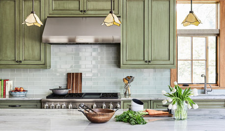
KITCHEN DESIGN11 Must-Haves in a Designer’s Dream Kitchen
Custom cabinets, a slab backsplash, drawer dishwashers — what’s on your wish list?
Full Story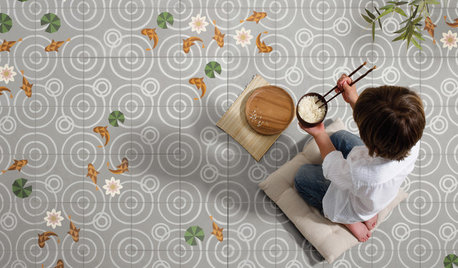
TILEWorld of Design: How Modern Geometric Designs Are Reinventing Cement
Intricate and eye-catching, the patterns of today’s cement tiles mark a break with their past while preserving an age-old technique
Full Story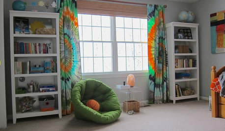
KIDS’ SPACESThis Designer’s Client Was Her 10-Year-Old Son
What do you give a boy with a too-babyish bedroom when he’s approaching double digits? See for yourself
Full Story
HOUZZ TV LIVEPeek Inside a Designer’s Cozy and Stylish Cabin Retreat
In this video, Noz Nozawa shares her newly renovated kitchen, great room and lounge space near Lake Tahoe in California
Full Story


Sina Sadeddin Architectural Design