Software
Houzz Logo Print
thejastongan

Sub-question: white marble, or simple white?

8 years ago
last modified: 8 years ago
To see the comprehensive discussion about the whole kitchen/dining project, please click [here[(https://www.houzz.com/discussions/backsplash-room-delineation-aesthetics-counter-options-galore-dsvw-vd~5205505).

___________________

We moved into our new house less than 6 months ago. We've been slowly chipping away at small projects, but now we're ready to dive into the big one: the kitchen/dining room.

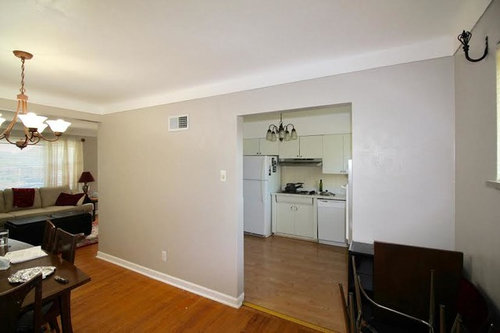
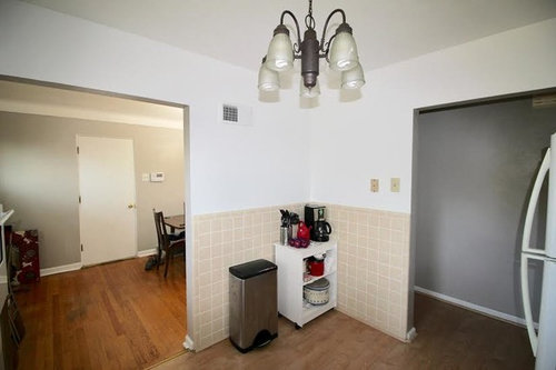
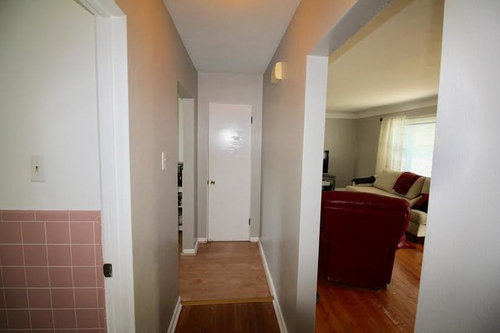
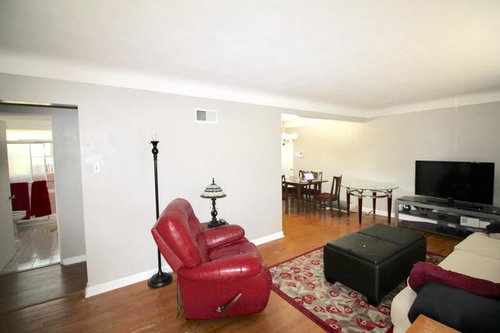
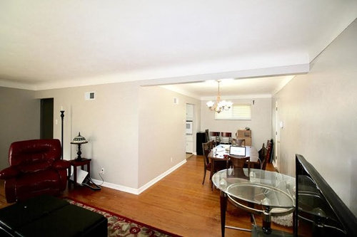
Below I've attached pictures (wide angle, so the size is somewhat distorted) of the current setup. We have already had a certified engineer come out to assess the wall removal and obtain the relevant permits.

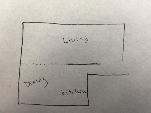
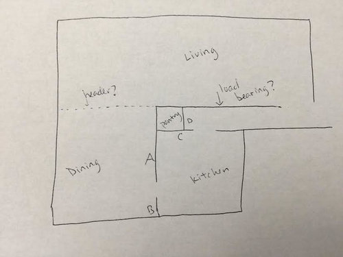
This rudimentary drawing shows the floor plan. It's an old drawing, so actually we have already determined that said wall is indeed the load bearing one.


Note: not drawn to scale, but relative room sizes are about right (very small kitchen, long living room etc).

The current plan has lots of walls. You zigzag from room to room. Here's a photo walkthrough going from living room --> dining room --> kitchen --> living room.


Once the wall is removed, the floor plan will still have the load bearing wall, but the others will be removed


___________________

Ok, finally on to the new designs. The kitchen we're hoping to build is simple, bright, and as "timeless" as possible. It's very unlikely that it'll be renovated again--even after 30 years--so we're trying to stay away from super trendy designs.

Thus far, that has meant:

  1. simple white cabinets
  2. a dark granite/quartz countertop
  3. a simple, light backsplash

___________________

We currently have 2 competing ideas

Option 1:

  1. white cabinets
  2. black countertop
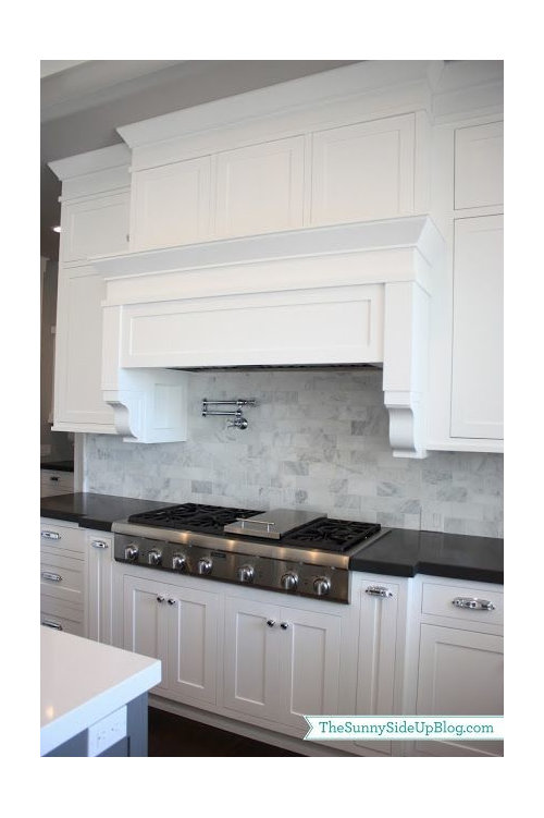
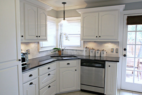
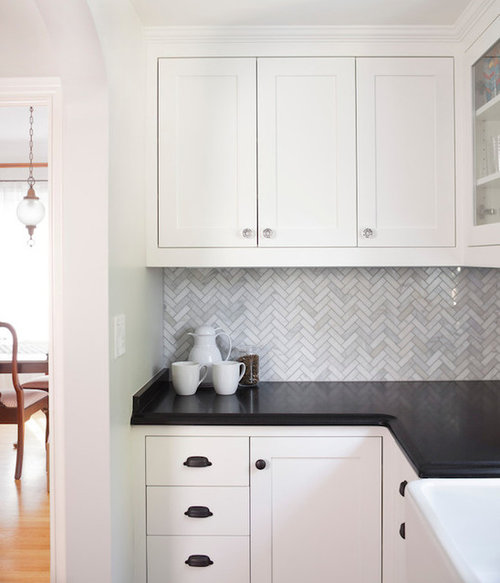
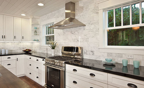
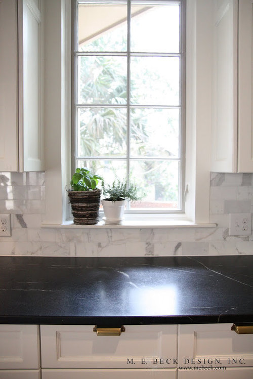
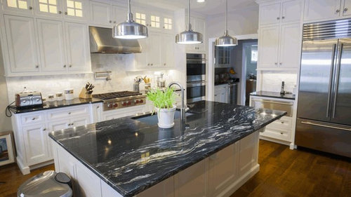
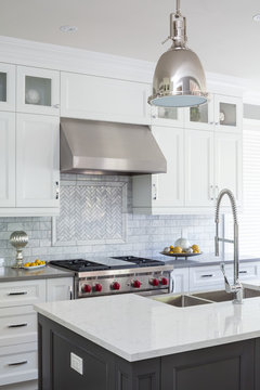
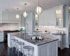
  3. *marble tile backsplash*

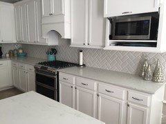
Similar to these photos:


Option 2:

  1. white cabinets
  2. black countertop
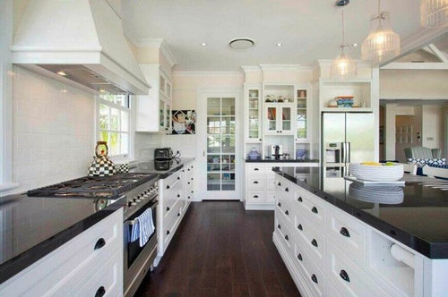
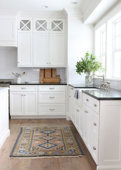
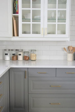
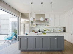
  3. *simple white backsplash*

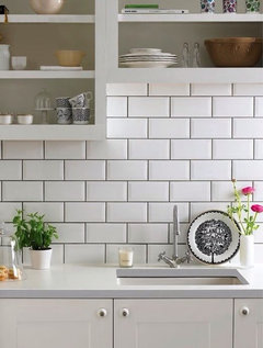
Similar to these photos:


Option 3: something else

marble tile
simple white
something else

Comments (9)

  • 8 years ago

    We thought about that, but weren't really sure if it was a problem or not. I guess we should've looked into what other people said about such a dark color.

    Actually, I've only just learned what soapstone is today! It seems like it could have some potential as a dark option

    Well, we were thinking dark counters because...well...everything else is white. Not off-white, but white. And lots of the granite/quartz we found had more of a cream color mixed in (rather than 1 - white, or 2 - neither (only containing other colors)).

    Any thoughts on colors?

  • 8 years ago
    last modified: 8 years ago
    I've read many posts on here about Quartz products and it seems the consensus is that the favourite one with a white kitchen is Zodiaq London Sky - I think its made by Dupont. Search in the advice section and you'll see many, many postings about it. I have seen it in person with white perimeter cabinets and a medium grey island and I think it looks spectacular.

    I guess you need to do a bit of research and see what you like. Many people like the grey quartzes as well. Some looks like concrete (not my favourite, but many people like that style which I consider modern). Some look like darker grey marbles with veining. Many people like one called Callacutta or Callacatta which apparently has grey and gold veining although it is hard to see in the pictures I've seen posted.

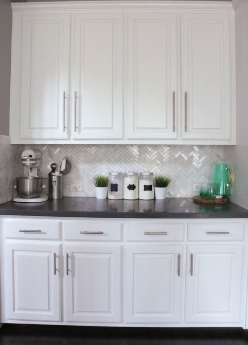
    I LOVE that herringbone tile backsplash you've shown in one of your pictures above. Look for pictures in the kitchen photos to see what people are pairing that choice with. I think the London Sky Quartz would look great with it, or a more grey background would be nice too.

    I used to think granite was the only way to go for kitchens and there are some really beautiful stones out there to choose from but in the last few years I have to say that the quartz products I've seen are really spectacular and very low maintenance.

    I'll bet there is a quartz made to look like soapstone as well. I have no idea how true soapstone is priced in comparison to granite or quartz products, but oh my it sure is lovely.

    Seeley Master Bath B · More Info
    I know this picture is from a washroom, but look at the gorgeous marble herringbone and counter with taupe tones. That would look amazing with white cabinets IMO.

    Ramshaw · More Info
    Zoom in on this photo to see the perimeter counters. They appear to be a grey/taupe quartz with marble tile backsplash. Looks great too.

    So many choices. Go find a good stone shop/fabricator and start looking. So many choices but I think the right one jumps out at you eventually so stick with it and read in the forums for opinions on different products for cleaning and durability etc.

  • 8 years ago

    Thanks for the detailed post mvcanada! The Zodiaq London Sky looks gorgeous. I wish I could deck my house out in it! I have only one concern with that for the countertop...and if it all about my finicky design sensibility when it comes to white. I find it hard to mix white with something off-white.

    For example: the cabinets are white, but the "white" part of the Zodiaq seems more subtle (perhaps a washed out light grey?).

    Something about the combo hits my eyes the wrong way, like a dark brown belt with black pants...they're close, but "not a match." That's why I've been tending towards the darker countertops...that way I can avoid the countertop's "mismatched" white. I know, insane haha

    Other - 1 · More Info

    Likewise, that's why I liked this grey one. There is nothing "competing" to be white on the countertop...it's different shades of grey, and of all the colors swirling around, none of them are white.

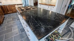
    I've read that soapstone has a fairly narrow price range, which is the same as higher-end granite/quartz ($85/sqft). But I've seen a few good looking ones today, including this dark one:

    I'm trying to break free from the dark side, but it's proving a bit hard!

    I also love the look of different countertops for the perimeter. I even like it when there are different colors for the cabinets, whether it's perimeter vs. island or top vs. bottom


    White kitchen · More Info

    White kitchen · More Info


  • 8 years ago

    Here is a link to another discussion in this forum about [London sky countertops by zodiaq[(https://www.houzz.com/discussions/london-sky-countertops-by-zodiaq-dsvw-vd~3897529?n=432). There are MANY comments about it, but it is worth reading through it. Most of the people posting really liked the London Sky with their white cabinets and there are several suggestions for which white was chosen. It may or may not sway your opinion, but it is always helpful to hear what people have found that works and see their pictures.

    That soapstone picture you posted with the veining is really lovely. I remember seeing soapstone in person when I was in an open house and it was more a honed finish and a greyish/black colour. It was spectacular and looked more like this picture. Soapstone counters. I don't know if that suits your tastes, but I still think you could use your marble or white backsplash with this and have it look spectacular. What I do remember about it was that I couldn't take my eyes off it and I couldn't stop touching it. Read up about it as there is maintenance involved. I hope someday to be able to use soapstone in a kitchen myself, but I think my next kitchen will almost certainly be a quartz counter.


  • 8 years ago

    Whites need to go together, they don't need to match per se.

    That said, London sky has a definite warm/creamy white cast to it. LG Muse is a marble-ish pattern that is a purer white background. I'm sure others exist as well but that's the one I'm familiar with (because its in my kitchen).

    https://www.houzz.com/discussions/lg-viatera-muse-and-karis-quartz-dsvw-vd~4766904?n=110

    You can also use a plain white quartz or plain white corian paired with a marble backsplash.

  • 8 years ago

    Your kitchen is gorgeous DrB477! I love how the white cabinets and countertop are contrasted with the strong color of the brick and...grey island? Am I seeing that right? If it is, I like that too

  • 8 years ago
    last modified: 8 years ago
    The perimeter cabinets are actually a very light grey, they were originally intended to be SW Repose Grey but the conversion varnish matching turned out lighter so they almost have an off white sort of appearance. I'm sure a regular white would have worked fine too, I don't really like the all white kitchen myself... but yet I sort of do. So I wanted the basic concept of light/bright/clean looking but yet a little different. Same thing with subway tile, I sort of like it, but yet not really. The stained fridge and island are also grey, sort of a brown grey that has a hint of pink from the underlying maple that warms it up. I originally looked at grey stains to try and save money (and improve durability) over paint, but in the end it didn't actually end up saving anything substantial, we just liked it.

    I'm hoping that our choices will hold up over time, we used some "trendy" things that we liked before realizing they were labeled as "trends" without signing up for the whole package. So we liked grey colors, wood tile, and an arabesque patterned backsplash but tried to use them in a more subtle (unique?) way that fit with the rest of the house. Personally I think that's the key to having something that holds up well, pick things you like that fit with the house and be a little unique without being over the top in the process.

  • 8 years ago


    DrB477, I totally understand about being on the fence with white. I rejected the idea for the longest time. Eventually I warmed up to it for a few simple reasons:

    1 - it's bright

    2 - if it gets dirty, breaks, etc, color matching is easy

    3 - simple (easy to match countertops to it etc)

    I still have a misplaced negativity towards it...although it looks very clean, there's just something not as sexy about the simplisticity of a white cabinet's design.

    _________

    As for subway tile, I'm generally not a fan. There are two exceptions:

    1 - I like certain herringbone styles

    2 - like the one above, I like when you cannot see the grout in between (grout that's the same color as the tile). This is in contrast to subway tile like the picture below


    Overall, I think you did a good job with balance...to me, it looks like a strong core of timeless kitchen design with a splash of modernity and interest!