Software
Houzz Logo Print
kph101

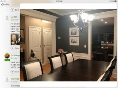
Charcoal Gray Dining Decor

8 years ago
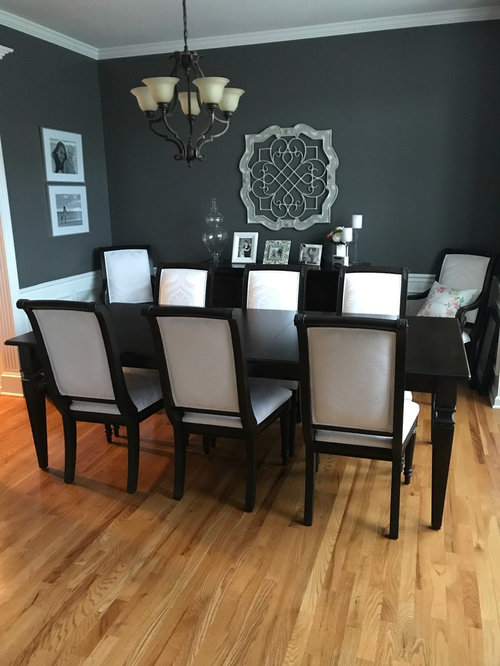
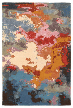
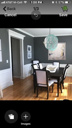
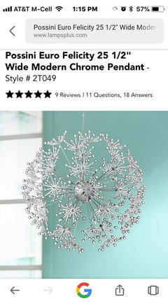
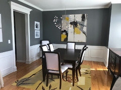
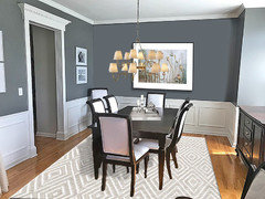
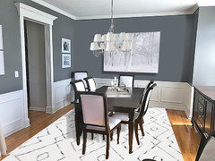
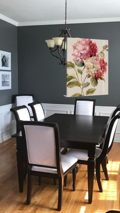
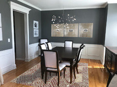
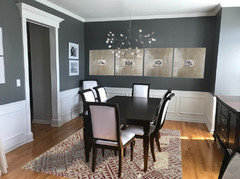
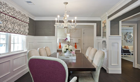
Hi everyone! I’m trying to figure out what type of rug and light fixture to get. Any help is appreciated!

Comments (90)

  • 8 years ago
    I like the server there but the feel of the
    room is a bit more cramped. Maybe it’s because I’m not used to it yet.
  • 8 years ago
    I think this new orientation looks very nice! You can take the semi sheets you had and sew a pocket on the bottom and sheer them on a rod top and bottom for the time being until you decide on a more permanent window treatment.
  • 8 years ago
    Shears! Not sheets;)!
  • 8 years ago
    How much drama do you want?

    What does entry and rest of house look like - colors?

    If this blends with wall, maybe - much of warm could be in the back:

    Oriental Weavers Sphinx Division-Galaxy 21908-8ft0inx10ft0in Tangerine · More Info

    [https://www.houzz.com/products/oriental-weavers-sphinx-division-galaxy-21908-8x10-tangerine-prvw-vr~93730402[(https://www.houzz.com/products/oriental-weavers-sphinx-division-galaxy-21908-8x10-tangerine-prvw-vr~93730402)

  • PRO
    8 years ago
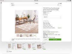
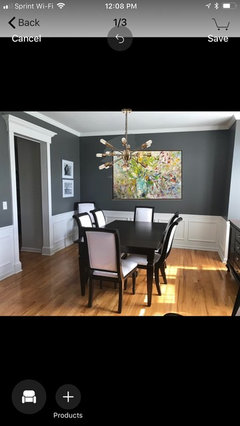
    To help you visualize i added light art, open chrome sputnik chandelier and interesting single shell piece for dining table centerpiece.
  • 8 years ago


  • 8 years ago
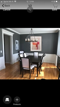
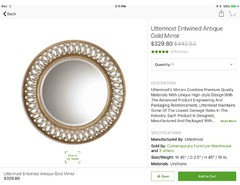
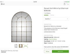
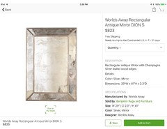
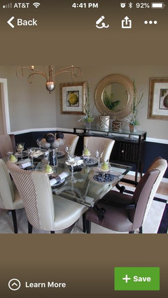
    Here are some mirrors that would be good with either the “Salento” white or the Sputnik style chandeliers -
  • 8 years ago
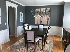
    kph101, Meant to mention - only you know your personal style and the existing decor in your adjoining spaces . It appears you have a transitional style going . With your flooring color and hallway closet door style ( which is more traditional/ country) you should keep those in mind when choosing the art or mirror, lighting and rug choices . I like the Sputnik fixture because it allows the back wall to show through , BUT it’s a little iffy with some of your other elements UNLESS you have contemporary decor mixed in throughout your home . Is there a punch color in the other rooms that could give a better idea of potential art or rug colors ?
  • PRO
    8 years ago
    Those are nice mirrors nicci, but I prefer art in dining rooms. The round one might be ok but when people are eating they generally don’t want to see themselves eating. Plus, aside from reflecting the lighting there is only hallway across from where mirror would hang. I am wondering what china looks like? Might take hint from china for art?
  • 8 years ago
    Most any mirror would be hung on the wall high enough( at LEAST a foot above chair rail ) that people don’t really see themselves eating . The reflection would be of the chandelier and the light from the front window. It would give a somewhat smaller room some depth . That said, it’s really hard to see what the dining room arch opens to . I had assumed it was the foyer and the living room beyond . I do like art as well ,though . I just think strictly abstract art works best when there is a lighting fixture hanging so close in front of the art . Otherwise, IMO it begins to look “jumbled up “. Just a personal preference . Abstract art does allow for that much better though . To the OP - can we see a bit more of what the dining room arch is opening to ?
  • 8 years ago
    For the record, BTW, I do like abstract art, too . I think that would be a perfectly fine option . Just think one has to be really careful when mixing art and lighting in the same plane ,in close proximity- one might detract from the other and look too busy.
  • PRO
    8 years ago
    That is why the latest lighting choices are open. Plus, you don’t always look straight on so art gets viewed with lighting aside. Just depends on the overall look you are going for.
  • 8 years ago

    Following

  • PRO
    8 years ago
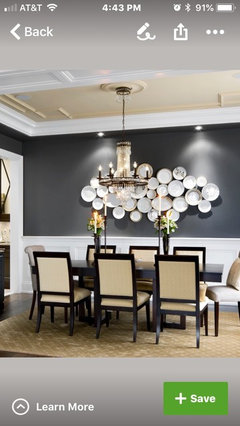
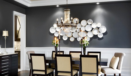
    Another approach for the wall would be to groups white plates something like this. Also here is round mirror with sconces for mirror approach. And one with art and open chandelier.
  • PRO
    8 years ago
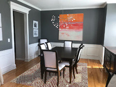
    To my eye, your furniture is more “transitional” so i would lean toward abstract art. That would help define your style. So many great pieces out there. I am really liking using pink with your dark grays. Really great combo.
  • 8 years ago
    last modified: 8 years ago

    As said, everyone is different. I happen to Not be a grey person, and so want to add warm, any warm almost, but mostly what's already there: golden of the flooring...

  • PRO
    8 years ago
    last modified: 8 years ago

    You have so lovely room. I would go with light colors.

  • 8 years ago

    To help I hope - I see your current beige-y shades, and others - imo, that doesn't go so great with grey in the background.

  • 8 years ago
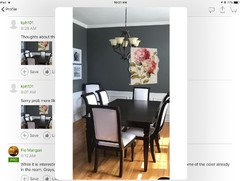
    Thoughts about this print?
  • 8 years ago
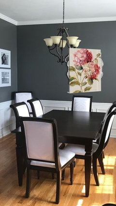
    Sorry prob more like this
  • PRO
    8 years ago
    While it is interesting it doesn’t work with anything in the room. Sorry. The art should have some of the color already in the room. Grays, whites, silvers. It could have some pinks but not that much.
  • 8 years ago
    Following
  • 8 years ago
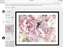
    Still too much pink?
  • 8 years ago
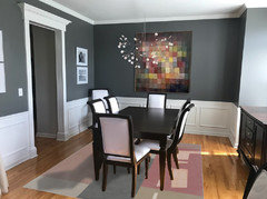
    kph101, I see you had a little vase of pink roses with a beige cloth on the little round table — sooo you must like pink florals . I agree with Flo that there should be more white in the art. You could easily frame that print in a large white matte with a thin metal frame that would match your new chandelier ( I still like the white one :). ) Or you could use a large bright white painted frame .( JoAnn Fabrics does a nice job on framing .) BUT - then you would need to pair it with a rug with more pink .
  • 8 years ago
    Was texting while you sent the second print - I like that one very much . Could use a softer pink rug with that one though.
  • 8 years ago
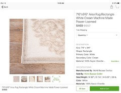
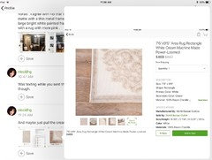
    And maybe just pull the cream color from that second print -
  • 8 years ago

    The pink floral pillow on the chair in the first pic is what inspired me to suggest pink and lavender rugs in my first comment :)

  • 8 years ago
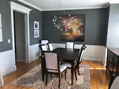
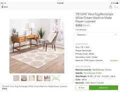
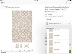
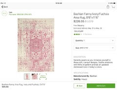
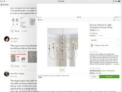
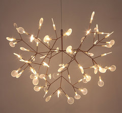
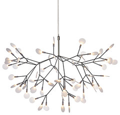
    Do you like this chandelier ? I can’t photoshop things into the room , but just to put them all together - I think this fixture with the peony print and cream and white rug would be so nice together - very soft and Parisian ,balanced by the crisp white and charcoal backdrop.
  • 8 years ago

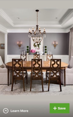
    Remember, your dining room is part of the whole home. If you want a harmonious feel throughout the home you need to add color from adjoining spaces into the next space. You have tan walls in the entry, gray walls in the dining room. Select a color that looks great in both rooms and add accessories to connect the spaces.

  • 8 years ago

    I like the pink with the gray, but how does it work with the wall color in the entry?

  • 8 years ago
    Just because pink looks nice with gray doesn’t mean you need to use it in here. There are other considerations to take into account such as your very gold flooring. If you love florals that’s fine but the needn’t be so literal either.
  • 8 years ago
    If you do go pink you may want to keep it to a minimum and less girlie with a touch of warmth to it though!
  • 8 years ago
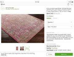
    Jennifer makes a good point . Maybe you should restrict the DR rug color ( and repeat it in the foyer ) to just the cream ,beige , charcoal colorway and reserve the pink just for the wall art . Keep in mind the peony print has a lot of the cream in it .
  • 8 years ago
    last modified: 8 years ago


    Modern Leaves Firefly Plant Pendant Light LED Chandelier Lighting Ceiling Lamp | · More Info
    Heracleum II Pendant - Design Within Reach · More Info

  • PRO
    8 years ago


    Hinsdale · More Info
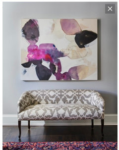
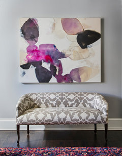
    An abstract with your greys, whites and pops of fushia like this piece would be ideal in your room. Flowers don't work in a "transitional" room like yours unless they are black and white or modern in styling.
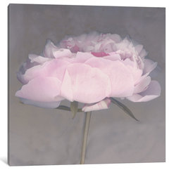
    "Jolie" Wrapped Canvas Art Print, 12x12x1.5 · More Info
    Big modern flower like this could work if you want flower.

  • 8 years ago

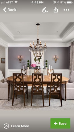
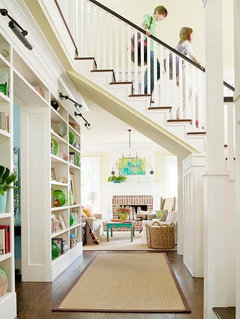
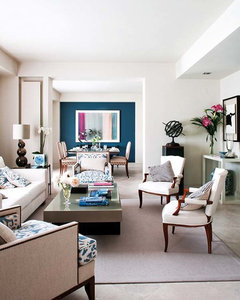
    here are some photos where one room is tied to others using color in art and accent pieces or accent walls.


  • PRO
    8 years ago

    You would need at least 36x36 I believe. There are other options too.

  • PRO
    8 years ago


    Artwork · More Info
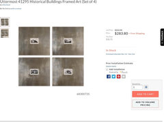
    I have used these in several homes and they are sooooo much prettier in person. The framing is like brushed silver and then the small pictures are of important architectural buildings all over the world. I would run a line of these rather than the grouping shown. But this would emphasize silver in your room. This is a very good value right now as well. They are "transitional" in look yet would combine with any other aspects of your home in nearby spaces.

  • PRO
    8 years ago


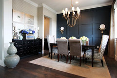
    Dining Room · More Info
    Here are the large silver art pieces in this dining room with dark blue/gray wall. Gives you a better idea of how they look in real life.

  • 8 years ago

    Those are cool, Flo. I think they might be too big to run all four in a line. Three maybe.


  • 8 years ago
    Love what Celerygirl did. Beautiful!
  • PRO
    8 years ago
    Agree, 3 is perfect for that wall. The 4th one might work in entry area.
  • 8 years ago
    I love the suggestions! The silver frames are beautiful. I agree with the 3 across. I also like this image that Flo posted (below)... It has a bit of everything that I love. Celerygirl’s imagage are clean too...love the fixtures. Nicci gets my style too! In a house of 4 girls (my poor husband...lol), he’ll just have to deal with the room being “pretty”. Hahaha. I think I’ll be ordering the frames, and I found some Pierre Joesph Redoute prints that resemble the image in the pic below.
  • PRO
    8 years ago
    Great! Keep us posted. Btw, if you order from Houzz let me know. You can use my Trade Program for additional 5% off. I just need to get you a personal code. Houzz puts a small amount in my account too so win/win. Can’t wait to see what you choose!
  • 8 years ago

    kph, before you order those silver frames, check the size. I had to guess at them when I Photoshopped them in your room, so I'm not positive on the proportions. It would even be a good idea to make templates and tape them to the wall to be sure.

  • 8 years ago
    kph101, can’t wait to see how your room turns out. Have fun and best of luck.
  • PRO
    8 years ago

    Always a good idea to make paper templates for art work to test size. The Uttermost silver historical prints are 23.13" wide x 21.13" high. So 3 is probably the right number.

  • 8 years ago

    Would you consider the large canvas suggested above by Flo on the back wall for color and the silver art pieces stacked on either side of the door?

  • PRO
    8 years ago


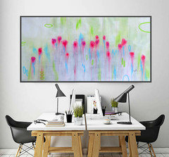
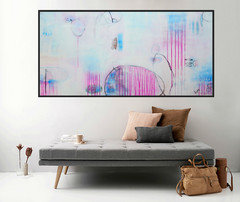
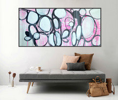
    Here's some suggestion for your wall you might like......to know more about my Art work and collections please visit my shop -


    http://www.pooviartgallery.com


    If you can make your purchases by June 15th, you will get a 30% discount on your order. USE COUPON CODE - BIGSAVING


    ****CUSTOM SIZE AVAILABLE ****


  • 8 years ago
    Flo,

    Please provide specific details for the first painting you suggested. I see it is sourced from Etsy, but would appreciate specific details as it would be perfect for my home. Thank you.

    Jean