

Need help with gallery wall layout
8 years ago
last modified: 8 years ago


Featured Answer
Sort by:Oldest
Comments (11)
 8 years ago
Related Professionals
DeRidder Interior Designers & Decorators · Champaign Interior Designers & Decorators · Richmond Architects & Building Designers · Danville Architects & Building Designers · Greenfield Architects & Building Designers · Superior Architects & Building Designers · Carbondale Kitchen & Bathroom Designers · Detroit Kitchen & Bathroom Designers · Kenosha Kitchen & Bathroom Designers · Kankakee Interior Designers & Decorators · Coldwater Interior Designers & Decorators · Vicksburg Kitchen & Bathroom Designers · College Station Kitchen & Bathroom Designers · Minneapolis Kitchen & Bathroom Designers · Waterbury Furniture & Accessories 8 years ago
- 8 years ago
- 8 years ago
 8 years agolast modified: 8 years ago
- 8 years ago
- 8 years ago


Related Stories
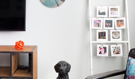
ARTHow to Display Lots of Photos Without a Perfect Gallery Wall
You can skip the matching frames and careful arrangement and hang your photos using one or more of these fun ideas
Full Story
COLOR9 Great Colors for Your Gallery Wall
Boost the power of your art collection with paint that brings out its color and detail
Full Story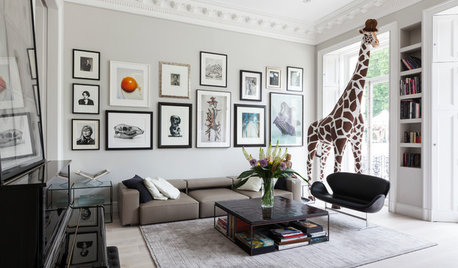
ARTAn Insider’s Guide to Creating the Perfect Gallery Wall
Bring your room to life with these expert tips for grouping artwork and photographs
Full Story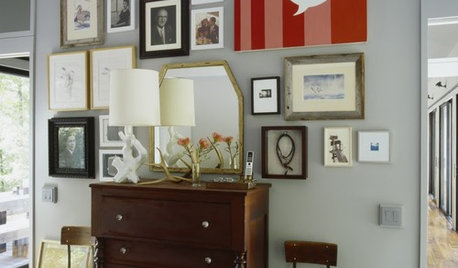
ARTA Gallery Wall for Every Personality
Eclectic, ambitious, inspired, dreamer? Which art-wall type are you?
Full Story
BUDGET DECORATINGBudget Decorator: A Most Affordable Gallery Wall
Need to fill a wall on the cheap? See how to make use of something pretty cool you may already have
Full Story
LIVING ROOMSPhoto Gallery Wall Stars in a Stylish New Family Room
A collection of black-and-white wedding photos adds a personal touch to this chic and cozy room in New Jersey
Full Story
REMODELING GUIDES11 Reasons to Love Wall-to-Wall Carpeting Again
Is it time to kick the hard stuff? Your feet, wallet and downstairs neighbors may be nodding
Full Story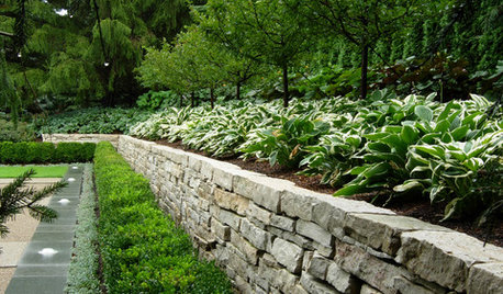
LANDSCAPE DESIGNGarden Walls: Dry-Stacked Stone Walls Keep Their Place in the Garden
See an ancient building technique that’s held stone walls together without mortar for centuries
Full Story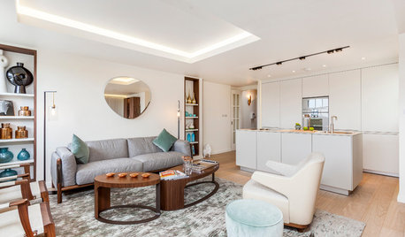
HOMES AROUND THE WORLDHouzz Tour: 2-Bedroom Apartment Gets a Clever Open-Plan Layout
Lighting, cabinetry and finishes help make this London home look roomier while adding function
Full Story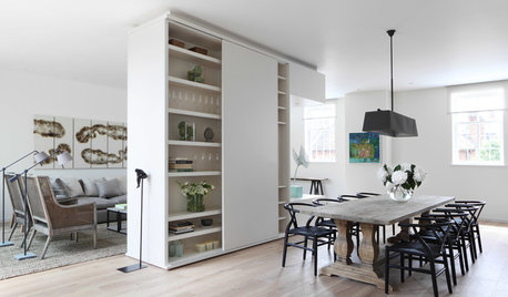
REMODELING GUIDESHow to Divide an Open-Plan Space With a Half Wall
Want to separate areas without losing the expansive feel? Pony walls can help make an open floor plan work
Full Story

Geneviève