Software
Houzz Logo Print
ncgirl317

Greige Paint Suggestions?

8 years ago

I'm looking for a griege that leans toward gray for my open concept family room/kitchen/breakfast area. I'm a fan of huge sample boards and have already tried the following...


Classic Gray looks too light and beige

Collingwood and Shoreline look too lavender

Repose Gray is a bit too dark in there

Edgecomb looks very beige

Gray Owl reads a little bit too blue/green


Can you please suggest any other samples I can try? Is it my northern exposure that is magnifying undertones? Frustrating.


Thanks for any colors you can suggest!

Lori


Northern exposure, medium wood floors, white shaker kitchen with Torquay countertops, white subway tile and furniture is mostly oatmeal linen.

Comments (32)

  • 8 years ago

    The colors you mentioned above are definitely more gray and less greige. If you want a true greige consider some of these...


  • 8 years ago

    You might also check BM's Winds Breath.

    Lori thanked chloebud
  • 8 years ago
    I’ll second the edgecomb suggestion. Used it in our living room and hall and I don’t think it reads beige.
    Lori thanked HKO HKO
  • 8 years ago

    In my last house Edgecomb looked beautiful, but not so much in this house. Our builder (and every other builder in my area) does Agreeable gray so I'd rather choose something different. The agreeable gray is also a bit dark in my neighbors homes, my house backs to woods which cuts down on the natural light so something lighter might look better.

  • 8 years ago
    If you're looking for a subtle (not saturated) greige, BM Balboa Mist is lovely in a north-facing room.
    Lori thanked tphilly
  • 8 years ago

    I have a sample board of Balboa Mist and I love the it when the sun is out, but once the sun goes down it is showing a bit of lavender, much like Collingwood and Shoreline do in this house.

  • 8 years ago

    BM Pale Oak?


    SW Passive?


  • 8 years ago

    SW Popular grey. Best greige ever.

  • 8 years ago

    Beth, I love the idea of Pale Oak. I have it in my fan deck but in looking it up it seems like some see pink/purple undertones once painted so I wasn't sure if I would be wasting my money on a sample. Light Pewter looks pretty too, but I can't find a lot written on it so I can't figure out the undertones for it.

  • 8 years ago
    last modified: 8 years ago

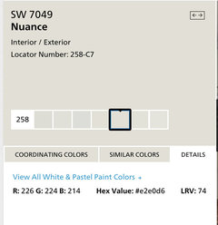
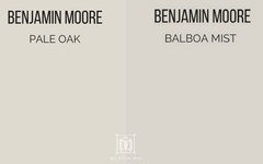
    since you tried balboa mist, let me show you how much more yellow it has in it

    see the diff? since your room is north, it gets blue light waves. i think go w/more of a yellow tone should help. (I could be so wrong! but the pinks/taupes just don't work)


    Lori thanked Beth H. :
  • 8 years ago

    I have Revere Pewter in my dining room, but it looks blah in there. I'll take a quick picture of it, maybe I just need a more exciting color for the dining room and it would work in the FR/kitchen/breakfast. I had Revere Pewter in my previous house and loved it, so I can't figure out why it looked great there but looks ho-hum in my current dining room.

  • 8 years ago
    last modified: 8 years ago

    i know BM samples are huge, and expensive. but try going to HD and getting the little Behr 2.50 samples. have them color match the BM color. it won't be exact, but it should be in the ballpark and give you a good idea.

    it all has to do w/ your lighting in this current house. what kind of bulbs are u using

    Lori thanked Beth H. :
  • 8 years ago

    You might prefer a super pale yellow like Light Pewter to the super pale brown that is Pale Oak. But you will only know in your space,with your natural and night-time light.

    Lori thanked hollybar
  • 8 years ago
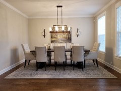
    Here is the Revere Pewter in the dining room, in person it falls flat in here --this room will need it's own post for help!
  • 8 years ago

    This builder puts recessed everywhere, originally had florescent bulbs but we switched them to the warm LED's

  • 8 years ago

    Light pewter is more of a pale yellow? I really can't find much about that color

  • 8 years ago
    last modified: 8 years ago

    Lori, don't let what the technical hue family a particular shade is,inhibit your choice. But yes,in colour jargonland it is a "yellow". http://encycolorpedia.com/dcd9cf  My strongly held belief is that you have to use your own eyes. Which is what you are obviously doing...and you will find the right shades because of that.

    ps-I've no idea why encycolorpedia links won't work :-( But just google BM Light Pewter encycolorpedia for more tech stuff than ya need.

    Lori thanked hollybar
  • 8 years ago
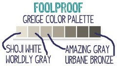
    This is my favorite greige color strip...
    Lori thanked kjoy1
  • 8 years ago

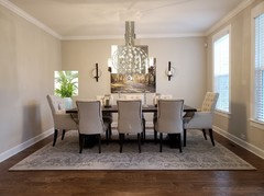
    lori, for that dining room, have you thought about doing some white wainscot?

    I don't think your wall color is that bad, you're just missing some elements.

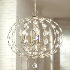
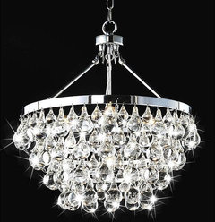
    That light fixture you have is too heavy and actual cuts the other wall in half, visually, blocking the art. I'd do something in the silver or light gold metal w/more glass.

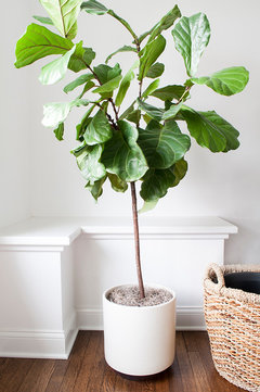
    maybe a slender buffet under the artwork, or a larger, more vertical size. I'd also do a tall plant in the corner


    hard to photo shop in the light, but hopefully you get the idea

  • 8 years ago

    Beth, Yes to all of your suggestions! I also have the Ballard larger Jill mirror that I could use in there if that would be better than the art.

  • 8 years ago

    SW Gracious greige

    Not to light, not to dark.

    Good luck,

    such a pain looking for paint colors. Lol. :)

    Lori thanked User
  • PRO
    8 years ago

    Lori, you need to hire a consultant, preferably one with training in color science. Don't be taking colors off the web, they don't even display accurately on a monitor.

    First of all, your kitchen materials are going to drive the paint color selection. Someone needs to look at those in person. (or at least see a photo). While color can be quantified scientifically, our perception of color is relative to what it's against. Many warm grays and greiges can be nice colors, but if they clash with your tile/trim/cabinets, etc, they aren't going to look right.

    Your light source will also influence the appearance of the color. You mention you changed from fluorescent to warm LED - good. Having a unified set of bulbs helps color not vary so wildly from one area to another. However, color will always look different at night, you can't control that. So what I tell my clients is, aim for a color that looks good on most walls, most of the time.

    A good consultant can help you narrow down your choices to no more than 1 or 2 colors. Test them in the same paint brand that you will ultimately purchase. If you are looking at super light colors, you may have to test them in a gallon of the real paint. Often, the formula for light colors doesn't break down evenly into the sample size and therefore it will not render accurately. If in doubt, check the sample paint against the chip before you leave the store. They'll dry it down on the chip for you. Hope that helps! Good luck.

    Lori thanked PaintColorHelp.com Dallas
  • PRO
    8 years ago
    last modified: 8 years ago

    Don't use the encycoloropedia dot com website.

    The data values are not correct because they use RGB values to do the transformations to the various value formats.

    And that's not the right way to do it.

    The chips have to be scanned according to color standards, using the right equipment and methods and you can only use XYZ or CIELAB values to do the transformation to other formats.

    Lori thanked Lori A. Sawaya
  • 8 years ago

    I would use a color that is close to what you’d like, then compensate by making it custom by adding additional dyes. Buy a piece of ultra light Sheetrock and paint the color on it, then add extra gray to the classic gray and paint on each color. Then take the piece home and see what you like best.

    Lori thanked Eric
  • PRO
    8 years ago

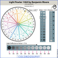
    Light Pewter looks pretty too, but I can't find a lot written on it so I can't figure out the undertones for it.

    Every color belongs to a hue family. Light Pewter belongs to the yellow hue family. Even if you did find someone talking about Light Pewter and undertones you should ignore it because undertones are just somebody else's opinion about what they think they see, what they think the color looks like where ever they are; that opinion has nothing to do with the color itself, you or your house.

    Light Pewter has a chroma of 0.57 which means it's a near neutral.

    In a reasonably balanced quality of light it's going to look "just gray". Some might describe it as a "warm gray".


    Lori thanked Lori A. Sawaya
  • 8 years ago

    You are right, Lori. So many colors that look great in pictures or are recommended by others take on their own unique look in my house. I'd love to have a color consultant, but I've tried one in the past and unfortunately she asked what colors I liked out of her sample boards and said go for it. I would rather have someone say what they would recommend with my furnishings, lighting, etc.

  • PRO
    8 years ago
    last modified: 8 years ago

    Hey Lori, if there is no one in your immediate area, many consultants will work long-distance from photos. You need to post (or send) photos of your space in natural daylight. Include closeups of counter, backsplash and cabinets. Also wide shots of your rooms with their respective furnishings. It's not always possible to interpret colors from photos 100%, but it's a lot better than nothing! Right now, we can't see the spaces you are talking about.

    Lori thanked PaintColorHelp.com Dallas
  • PRO
    8 years ago
    last modified: 8 years ago

    I'd love to have a color consultant, but I've tried one in the past and unfortunately she asked what colors I liked out of her sample boards and said go for it.

    You're right. Shuffling through a stack of paint chips hoping one of them works is not how color expertise is defined.

    Juli is right too. Virtual consultations work. I'm not taking any new clients at the moment but when I am, I have clients pick up a Color Muse and after a 3 minute coaching session to teach them how to use it, they send me screen shots of the color data values for all the important elements in the space. This is how I do virtual consultations so I know exactly the colors we have to work with.

    Lori thanked Lori A. Sawaya
  • 8 years ago

    Wow, just looked up the color muse you mentioned... That looks like a great tool!

  • 7 years ago

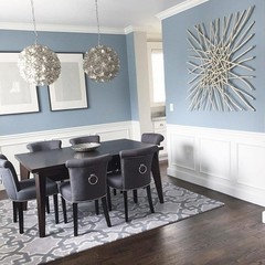
    I found a color called Modern Gray that works beautifully in a northern exposure room. Very balanced color RGB so no significant undertones and looks beautiful! LRV is in the high 60's.

  • PRO
    7 years ago
    last modified: 7 years ago
    Very balanced color RGB so no significant undertones and looks beautiful!

    RGB are red, green and blue channels of light that light up on some sort of device and mix together in different proportions to display a range of colors - and the device itself decides what that range of colors will be.

    Which is why we say the RGB color space, RGB values are device dependent and make no effort to model human visual perception.

    In other words, RGB values have no meaning or application outside of a device like your phone, tablet, laptop, computer, etc. It's why they don't correlate to paint colors or any other kind of color you see in real life.