

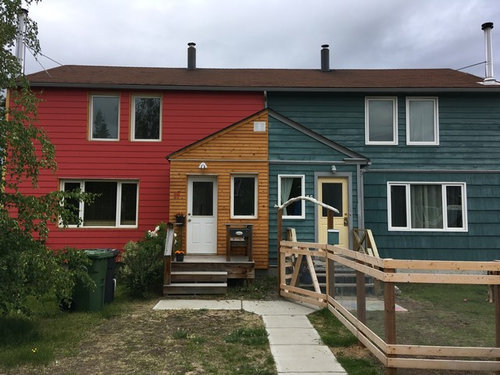
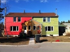
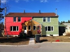
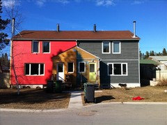
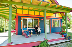
House color and door colour
8 years ago
Featured Answer
Sort by:Oldest
Comments (20)
Related Professionals
Middletown Architects & Building Designers · Montgomery Home Builders · Daytona Beach Home Builders · St. Louis Home Builders · Chicago Home Builders · Natchez Interior Designers & Decorators · Enfield Interior Designers & Decorators · Providence Interior Designers & Decorators · Bakersfield Interior Designers & Decorators · Ogden Interior Designers & Decorators · Modesto Architects & Building Designers · Palm Desert Architects & Building Designers · Reno Bathroom Remodelers · Queens Bathroom Remodelers · Winona Kitchen & Bathroom Designers 8 years ago
- 8 years ago
- 8 years agolast modified: 8 years ago
 8 years ago
- 8 years ago
- 8 years ago
- 8 years ago
 PRO8 years ago
 8 years agolast modified: 8 years ago
- 8 years ago
- 8 years ago
- 8 years ago
- 8 years ago
- PRO8 years ago
- 8 years ago


Related Stories
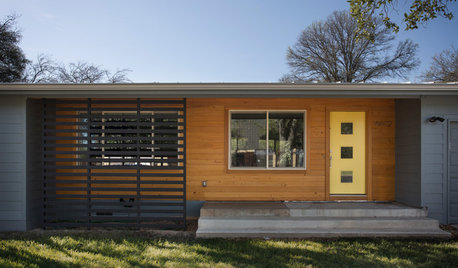
EXTERIOR COLORChoosing Color: 1 House, 5 Exterior Paint Palettes
See how color variations change the look of this midcentury ranch-style home
Full Story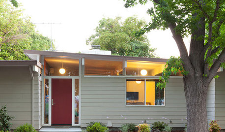
FRONT DOOR COLORSFront and Center Color: When to Paint Your Door Deep Red
Rich reds draw the eye and send an inviting message. See if one of these palettes speaks to you for your own front door
Full Story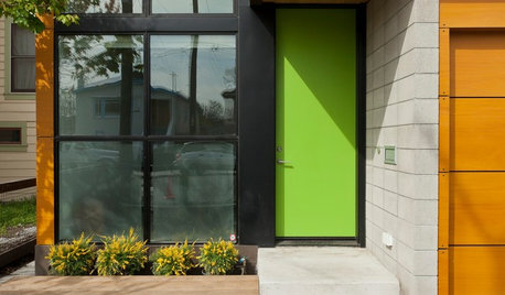
CURB APPEAL9 Daring Colors for Your Front Door
Stand out from the neighbors with a touch of neon green or a punch of hot pink
Full Story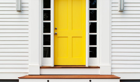
FUN HOUZZHouzz Quiz: What Color Should Your Front Door Be?
Think you’re hip enough for orange? Or optimistic enough for yellow? Take our front-door personality quiz and find out
Full Story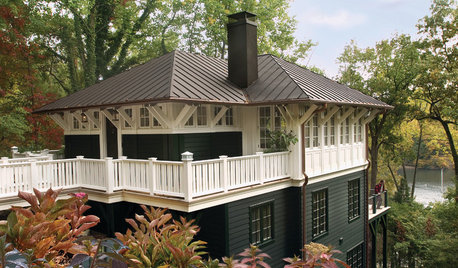
HOUZZ QUIZHouzz Quiz: What Color Should You Paint Your House?
Is white right? Maybe dark blue-gray? Take our quiz to find out which color is best for you and your home
Full Story
MOST POPULARHow to Choose a Front Door Color
If choosing a door paint isn't an open-and-shut case for you, here's help
Full Story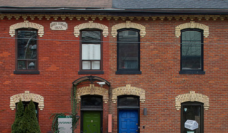
FRONT DOOR COLORSFront and Center Color: When to Paint Your Door Blue
Who knew having the blues could be so fun? These 8 exterior color palettes celebrate sunny-day skies to electric nights
Full Story
FRONT DOOR COLORSFront and Center Color: When to Paint Your Door Black
Love the idea of a black front door? Here are 8 exterior palettes to make it work
Full Story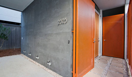
FRONT DOOR COLORSFront and Center Color: When to Paint Your Door Orange
Bring high energy and spirit to your home's entryway with a vibrant shade of orange on the front door
Full Story
ENTRYWAYSHelp! What Color Should I Paint My Front Door?
We come to the rescue of three Houzzers, offering color palette options for the front door, trim and siding
Full Story


decoenthusiaste