Software
Houzz Logo Print
webuser_467791033

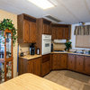
What would you do with this kitchen?

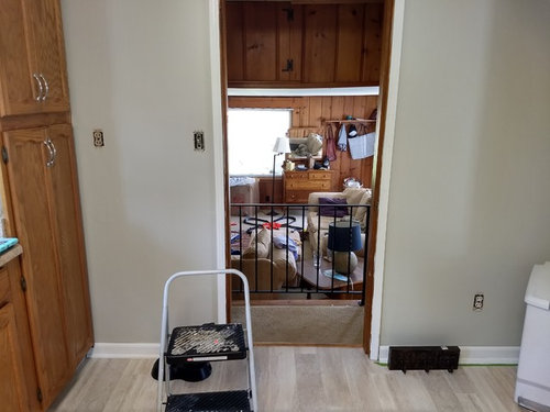
Down the road we are going to redesign the layout of the kitchen, but for now I need to work with what we got. I can paint though! I am not feeling the color I picked out. There is laminate type faux travertine on the floor. The view towards the knotty pine (not changing) is throwing the oak off. Probably should paint the cabs white/ off white. The adjacent room is bm Manchester Tan. The trim is a bright warm white - Valspar Du Jour. that's the trim throughout the house. Any ideas? Thank you!

Paint color help · More Info


Paint color help · More Info


Paint color help · More Info


Comments (34)

  • 8 years ago

    First of all, we have knotty pine paneling in our family room and I love it! In that room, my sofa is a soft beige (almost an ivory color) and my 2 chairs are charcoal. I have colorful accents in the art on the walls, books, and so forth. I also have a couple of red photos that look awesome as well. With the knotty pine paneling, and the colors I see in your kitchen, you could go with several color options. Blues, greens, and certain reds look great with wood and neutrals. What colors are your accessories? That would be a great starting point when thinking about color for the kitchen.

  • 8 years ago

    Thanks for the direction. I guess I'm wondering more about paint color for the cabinets and wall. Would you paint the wood, change the wall color?

  • 8 years ago
    last modified: 8 years ago

    I would leave the cabinets alone due to the expense and work in painting them. I love natural wood cabinets and I understand that they are becoming popular again. I would concentrate on painting the walls. You could go to BM, SW, or Behr paint websites and virtually paint a kitchen with colors you have in mind. It's how I chose my paint colors for my interior rooms and the exterior of my house. I then purchase samples of what I would like, paint a good sized section with the samples, look at it for a few days in both sunny and cloudy days and even at night with your current kitchen lighting to see if the color you chose will work. This will save you time and money.

  • 8 years ago

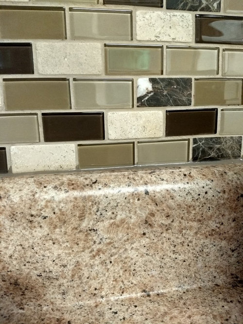
    Thank you. I like the idea of less work for now. That is always the way I find colors. I am looking for specific colors. Perhaps that might go with the counter/ backsplash combo which is very busy. I dont want to add another random color in there. That is the problem I already have on the wall. It doesn't give with everything. I was thinking perhaps bm Bleeker beige. I had originally painted the kitchen Manchester Tan. That felt blah. Then this grayish green because I thought it would be a good neutral. But that feels too minty. I also feel like there is so much going on between the wood grain, the knotty pine the busy floor, the busy back splash and counter....it needs to be more neutral.

  • 8 years ago

    A soft color looks so pretty and perks up a neutral space! I like neutral, to a certain extent, but I feel spaces need some color to perk them up. Here are some photos from Houzz so you can see what I'm talking about:

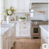
    Look how pretty this green looks against the neutral palette!

    Bailie Scott House Kitchen · More Info
    The color of this island looks great amongst this very neutral kitchen!
    Kitchen - Kitchener Area · More Info

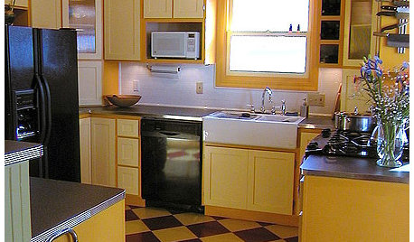
    This is close to the shade of yellow I will be painting my kitchen. My kitchen cabinets are close to the same color as in the photo. I have black appliances and a very bland linoleum floor. My husband and I are still debating what to do about the flooring! I also have some red accents to liven up my kitchen.

    Craftsman Inspired Kitchen · More Info

  • 8 years ago


    Paint color help · More Info

    I'm going to rephrase my original question. Can anyone point me to some specific * colors that won't clash with what I have going on? Thank you!

  • 8 years ago


  • 8 years ago

    What is the name of the color currently have up? I think it looks good over by the door way where the floor looks more of want cream. The separate color of the flooring above looks gray on my screen.

    If creaming colored flooring, I would recommend you look at SW Ramie and Believable Buff.

  • 8 years ago
    last modified: 8 years ago

    where do you have that backsplash?

    I'd paint the cabinets. White dove or even Simply white. replace the hardware.

    the backsplash isn't the best w/that countertop, and especially not w/the 4" piece up the back. one seems to be sage/green-gray,,and the other warmer tans/browns. The floor appears to be gray w/tans? You want colors that 'won't clash w/what you have', but the materials are already doing that.

    can we see a pic that shows the floor/cabinets/counter and splash? with some good daylight to get a true color reflection?

    Do you have a florescent light? if so, I'd start w/that first. they are easy enough to remove and replace w/regular lighting. better if you could do some recessed lights, like 6-8 cans.

    what is that light over the sink?

  • 8 years ago

    If you haven't installed the backsplash, switch to a solid. Maybe a cream found in the countertop. The counters and floor have enough pattern.

  • 8 years ago

    following...

  • 8 years ago


    yes, everything's ng clashes. The room in the distance is painted Manchester Tan. I was thinkingaybe painting the next color up on the swatch Bleeker beige. And painting the cabs a white. Not sure what white.

  • 8 years ago
    last modified: 8 years ago

    I think painting them Simply White would be fine. it's a good neutral white. if you want to do it yourself, let me know, I have the best how-to link on the internet.

    so is your lighting florescent? if so, it's going to change whatever color you put in there.

    this is cloud White on the cabs

    Pale Oak is a great neutral

    BM Lacey Pearl is a nice one too.

  • 8 years ago

    @beth H. I Love Simply white. Would those colors clash with the Manchester tan in the other room?

  • 8 years ago

    Pale oak looks really similar to Manchester tan to me.

  • 8 years ago

    I painted my living room BM Muslin and Behr Ultra Pure White. I love the combination. However, your tile looks like it may have a grey/green tone. I picked muslin because it has a pink undertone. That may not be the look you want. Here's a pic of my living room. And yes, that is a cat tree behind my chair, lol. Cats rule at my house.

    Paint Color crazy thanked shwshw
  • 8 years ago

    shwshw,,,that's nice combo. only one tree? lol. i have 3 or 4. yeah, they rule at mine too

  • 8 years ago

    That is nice shwshw! I think a pink undertone wouldn't be too bad with the travertine. But I'm kind of clueless about undertones. I have a sample card of muslin. I will have to take a look. It looks a bit too much like my Manchester tan from the picture. I tried Man tan in the kitchen at first and it was not looking or feeling right..

  • 8 years ago

    And yes Beth H there are flourescent lights. We will be replacing them with cans for sure. There is a bulb fixture above the sink that I may replace also.

  • 8 years ago
    last modified: 8 years ago

    man tan has more yellow undertones. Pale oak tends to lean over to the gray end, with slight taupe undertones. might look better w/your travertine.

    here's pale oak w/white wainscot

  • 8 years ago

    Ok thanks. It's a pretty color! I'll have to see how it looks with the greenish color in the backsplash and the rust color in the countertop. Oye!

  • 8 years ago

    Beth H I'll post a pic of the swatch with it tomorrow if I could find one!

  • 8 years ago
    last modified: 8 years ago

    since it's a bm color, and their samples are big and expensive, go to HD and get a $2.50 sample pot with a color match of Pale Oak. they'll have the formula in their machine. keep in mind it won't be identical, but it will be close enough to give you an idea. heck if you like it, just use the Behr paint.

  • 8 years ago
    Lol Beth, there' another tree in the opposite corner and one in the bedroom.
  • 8 years ago

    Not sure about pale oak.

  • 8 years ago

    Pale Oak ought to work. Does it look bluish in real life?

  • 8 years ago

    Tqtqtbw It looks purpleish to me.

  • 8 years ago


    painted a poster board with a sample of BM Revere pewter. How is that?

  • 8 years ago

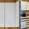
    This is Valspar wicker. It was part of the Eddie Bauer collection a time ago. I think I like it

  • 8 years ago

    Same wicker color in different lighting

  • 8 years ago

    are you looking at those colors w/your overhead lighting or in plain daylight?

    you see how Wicker changes. don't go off a paint chip.

  • 8 years ago

    I am not sure I think the first one was with lights off, and the second lights on. Does the wicker look ok?

  • 8 years ago

    they look like two diff colors in diff lighting. I like the soft gray look of wicker in the first picture.