Software
Houzz Logo Print
astor818

15 years ago
last modified: 15 years ago
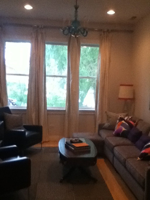
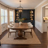
Please help me select FLOR tile for this space. Currently have Ripple in black and white. I think it needs color from one the following styles: Line Please, Good Vibrations, or Cambium. Light fixture is turquoise murano and this color plus red repeat through rest of the open space. The couch is grey, the leather chairs are brown, the drapes are white silk.

Comments (11)

  • 15 years ago
  • 15 years ago
    Astor818, you have a turquoise light fixture but I see little else in the room to attract attention to it. (Maybe I'm missing something?) I think strong teals in the tiles would enhance it best.

    I looked at the Flor styles, and of those you mentioned I liked the Cambium best because it has more visual interest. They were all pretty stripey but Cambium was more random, less repetitive. You have a lot of straight lines here already and the Good Vibrations and Line Please don't offer relief from that. Of the Cambium colors, there is none with teals; probably the Marigold color is best but it will just bring out the reds and none of the teals.

    A nice combination would be Velvet Twist and Short Shag, both in the color fathom, which would give you texture with the strong teal color. (Note that since I can barely see the light fixture I'm not positive of the color match with these tiles, and for max benefit the color should be close.) Another graphic style that I liked was Reorient in teal. A bit more teal in chair pillows would tie it all together, and red would accent it.

    Those are my thoughts. If nothing else, my answer should bump it back to the top of the list and you might get other ideas.
  • 15 years ago
    I forgot to mention that the tiles used as an area rug should go back underneath the front of the sofa. I would go back to about the same distance from the wall as is seen under the windows.

    Good luck with your decorating project!
  • 15 years ago
    Thanks. I ran out of ripple, I didn't originally order it for the space that's why it's not big enough. Point taken about the stripes but I'm surprised you don't like the good vibrations - it's curvy more than stripey and has turquoise as the dominant color. In the next seating area out of the photo there are two 1940's springer chairs upholstered in a turqoise and green striped silk with a reddish leather trim. In the entryway there is another turquoise murano fixture that was bought with the chandelier. Thanks again for your suggestions. If you feel like talking about the windows, feel free, they're making me crazy...
  • 15 years ago
    http://www.flor.com/good-vibrations-turquoise.html
    I looked again at this Good Vibrations photo, and I'm not seeing anything curvy about it. Which colorway were you looking at? And can you post a link?

    I think the murano fixture is an outstanding feature and and just beautiful. Since I could only see this vignette, there didn't seem to be enough turquoise to pull the eye to it and respect it properly. Maybe you could post other photos from different perspectives?

    Do you ever close the drapes, or have need to block the window light or view? Right off hand, I would be inclined to treat all the windows together, as one. So while I really like the height of the rod, I'd tend to pull all the panels to the outsides. To tie them all together, I'd mount a textured shade, maybe bamboo, as high as the rod and let it drop down maybe a foot from the tops of the windows. They might be good for a spot of color, but just making these changes would help in my opinion.

    Is there a painting or something over the sofa?
  • 15 years ago
    I was looking at the same thing you were, the lines within the pattern are wavy. I see that as curvy. Your comments about the windows are great. I was thinking a valance in Hermes orange silk. I understand where you recommend mounting the shades but I'm not clear if you would consider them as functional or as decor. Thank you for your interest.
  • 15 years ago
    That is a very pretty room!

    I think the shades should be both functional and decorative; they would be able to go down but you would normally leave them up. In the long run, whether or nor you get functional shades depends on whether you think you would ever have them down. I was mostly looking for texture and interest from them, as well as a bridge for the three windows.

    I see what you mean about the lines in Good Vibrations being less structured, but they are still quite a geometric statement. I can see that you like that, but I do think something more random would soften up the look of the area. In the end, you must love it, so choose the one that makes you feel peaceful and happy. If you were thinking of the turquoise colorway in Good Vibrations, it looks like there is a lot of purple so make sure that's what you want. I like the idea of orange as an add-in to the turquoise and red. Very happy colors!

    That is an interesting and attractive mirror, but the area behind the couch seems to be begging for more color. It would be nice to have a large painting there and a smaller one on the wall to the left of the fireplace, behind the chairs.
    http://www.morningmoonphotography.com/704_Orange_Turquoise_Paint.html
    http://www.brighthouseart.com/other/Resources/Amori_Metropolitan_Jewel_Box_Quartet.jpg
    http://fineartamerica.com/featured/autumn-tapestry-gina-signore.html

    And maybe a little more color on the chairs, table, maybe mantle...
    http://ecx.images-amazon.com/images/I/51eR--CgV1L._SL160_.jpg
    http://www.merrimentdesign.com/images/friday-inspiration-turquoise-and-orange.jpg
    http://morewaystowastetime.blogspot.com/2007/06/color-obsession-tantalizing-turquoise.html

  • 15 years ago
    Thank you, thank you, thank you! By the way, I was considering the good vibrations in the red :)
  • 15 years ago
    Oh, we have the eames rocker in turquoise too. it's in the back of the house so you can't see it. the wall behind my red stove is also, yes, turquoise and I inherited an amazing piece of art glass - kind of an urn with a lid in turquoise. The mirror is a place holder, an antique and valuable. I have a painting approximately the same size as the mirror, but it is more subdued colors and is an urban landscape of a town in Cuba by a Cuban artist. The room is in progress and I will be replacing the lampshades. I'm considering two purple stool/tables from Chiasso to go next to the brown leather chairs, and I will be changing the pillows and making a planting arrangement for the coffee table. Have you ever checked out Sprout Home? They are in Chicago and Brooklyn but also have an online store.
    http://www.chiasso.com/store/item.aspx?DepartmentId=136&ItemId=56306
  • 15 years ago
    The red (flame) is the one I like the best in that pattern. If you like it, go for it; it will bring a lot of color to this corner.
  • 15 years ago
    I'd love to see how the room comes out when you're done!