

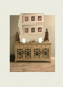
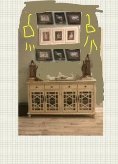
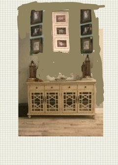
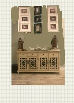
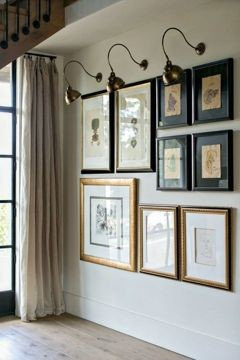
Moved to a coastal town- trying to use some of my old deco/ pictures-
8 years ago
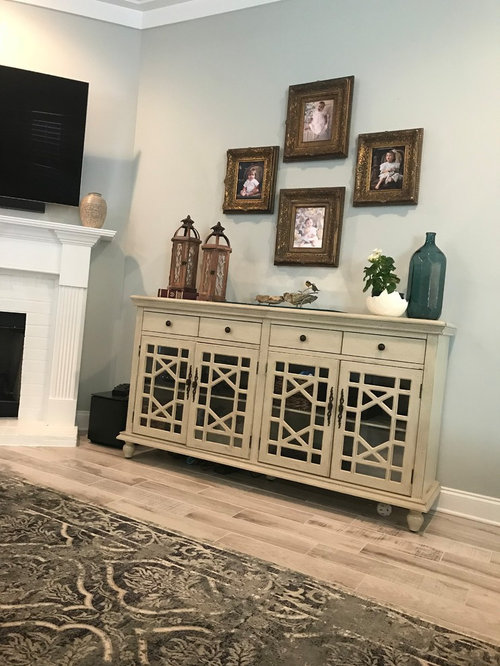
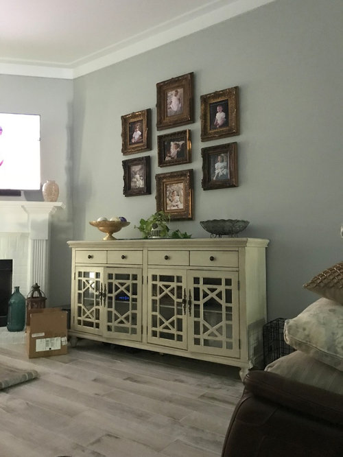
Featured Answer
Sort by:Oldest
Comments (24)
 8 years ago
 8 years ago
Related Professionals
Tallahassee Interior Designers & Decorators · Quincy Interior Designers & Decorators · Salina Interior Designers & Decorators · Florence Interior Designers & Decorators · Chattanooga Interior Designers & Decorators · North Platte Interior Designers & Decorators · Pittsburg Architects & Building Designers · Zanesville Architects & Building Designers · New Braunfels Architects & Building Designers · Rochester Architects & Building Designers · Janesville Architects & Building Designers · Flagstaff Architects & Building Designers · Medford Architects & Building Designers · Charleston Kitchen & Bathroom Designers · San Jose Kitchen & Bathroom Designers 8 years ago
- 8 years ago
- 8 years ago
 8 years ago
 PRO8 years ago
 8 years ago
 8 years ago
- 8 years ago
 PRO8 years ago
- 8 years ago
 8 years ago
- PRO8 years agolast modified: 8 years ago
 8 years ago
- 8 years ago
- 8 years ago
- 8 years ago
- 8 years ago
- 8 years ago
- PRO8 years agolast modified: 8 years ago
 8 years ago
- 8 years ago





Related Stories

EARTH DAYHow to Help Your Town’s Beneficial Birds and Bugs
Make a habitat using local materials to provide a home to the creatures that help our gardens
Full Story
HOUSEKEEPING10 Problems Your House May Be Trying to Show You
Ignore some of these signs and you may end up with major issues. We tell you which are normal and which are cause for concern
Full Story
LIFEHow to Decide on a New Town
These considerations will help you evaluate a region and a neighborhood, so you can make the right move
Full Story
REMODELING GUIDESHouzz Tour: An Old Oregon Library Starts a New Chapter
With an addition and some renovation love, a neglected Craftsman building becomes a comfortable home and studio
Full Story
GARDENING AND LANDSCAPINGPotted Plants Perk Up the Streets of Coastal France
Dotting a stairway or perched on a café table, plants in colorful pots and vibrant flowers make a picturesque scene in a town on the coast
Full Story
EXTERIORSWhere Front Yards Collide: Property Lines in Pictures
Some could be twins; others channel the Odd Couple. You may never look at property boundaries the same way again
Full Story
LIFEEmpty Nesters: Some Upsides to Downsizing
Moving to a smaller home can come with unexpected challenges along with a bounty of benefits
Full Story
UNIVERSAL DESIGNMy Houzz: Universal Design Helps an 8-Year-Old Feel at Home
An innovative sensory room, wide doors and hallways, and other thoughtful design moves make this Canadian home work for the whole family
Full Story
UPHOLSTERYSeeking a Quiet, Relaxed Spot? Try Upholstering Your Walls
Upholstery can envelop an entire room, a framed panel or a single wall. See some design options and learn what to expect
Full Story
FURNITURE6 Decades-Old Designs That Look Better Than Ever
After getting a few nips and tucks, some favorites from the ’60s and ’70s have made a stylish comeback
Full Story




Kitty PartinOriginal Author