Software
Houzz Logo Print
cgrimes75

Looking for panels to pair with my rug

7 years ago
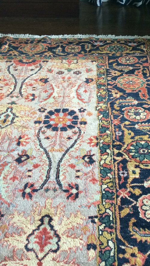
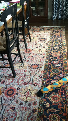
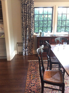
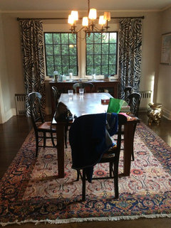
I recently pulled an old rug out of storage. It's one of my favorites and I'm putting it back in my dining room. I love mixing bold patterns and would love some advice about fabric for panels. I have 2 windows in my dining room side by side and they look a little too bare with nothing, and roman shades don't fill the space enough. Right now I have Diane Furstenburg's funky zebra in navy. They looked great with my old rug but are a little bit of an eye sore with the new. Any advice would be greatly appreciated! I don't love geometric patterns.

dining · More Info


Comments (23)

  • 7 years ago

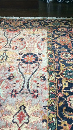
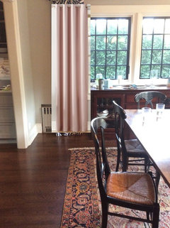
    Here's another photo

    dining · More Info


  • 7 years ago

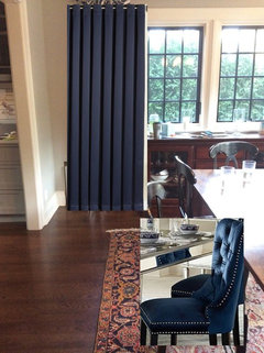
    I know you are thinking of pattern on pattern, and that's great, too few people have the courage to do that. But I just don't think you are going to do better to show that fabulous rug off that a plain, rich navy curtain.


  • 7 years ago
    Beautiful rug! I agree ^ I would also look for something one-coloured in a shade that appears in the rug.
  • 7 years ago


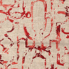
    Tab Top Curtain Panels Miramar Garnet Geometric Linen, 96", Unlined, Set of 2 · More Info


  • 7 years ago
    Thanks everyone. Someone told me that the key is to find the right size and repetition of pattern. I agree a solid is very nice and likely my best shot. It just makes the room feel heavy and dark.
  • 7 years ago
    Funny, I was going to suggest zebra until I read your comment about it being to-to-very-very! Try for one of the lesser dominant colors in your rug with just a hint of the navy and a smallish overall print. LOVE the rug btw.....good for you using it again!
  • 7 years ago
    Pottery Barn Cameron Pole Top or Grommet in Marshmallow is throughout our home and they’re gorgeous in a very understated way. They take the edge off of the window edge without filling the space. I can picture them with your rug.

    https://www.potterybarn.com/m/products/cameron-cotton-drape/?pkey=ccurtains-drapes&isx=0.2.9901
  • 7 years ago
    That’s so funny that the print came to mind! Pardon the morning mess, but wanted to give you a visual. I love both the panels and the rug but I think they are too much together.
  • 7 years ago

    I don't mind the look you have now but hgal's garnet fabric might be perfect. You'd have to order and try.


  • 7 years ago
    My walls are a taupe/grey custom color...closer to the solid taupe background of the rug but a little too grey to experiment with a beige/taupe neutral.
  • 7 years ago


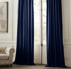
    Navy velvet from Restoration Hardware.


  • 7 years ago

    Sorry, but I also don't think the beautiful curtains and beautiful rug work well together. I agree that the solid navy looks too heavy and dark. I'm wondering about a lighter color with a tone on tone design if you don't want a solid color.

  • 7 years ago

    Wow what a stunning rug. I think the navy solid looks great, not too heavy . But if you feel it's too dark I could see a lighter tone on tone design as redoredone suggested.

  • 7 years ago
    Thanks redoredone and lulu Bella. I like the idea of tone on tone. Trick will be finding the right one!
  • 7 years ago

  • 7 years ago

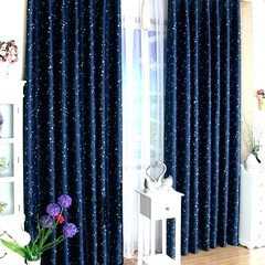
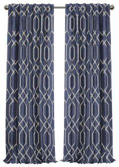
    How about something like this?

    Devin Room Darkening Geometric Single Window Panel, Navy, 52"x84" · More Info

    https://www.houzz.com/products/devin-blackout-single-window-panel-navy-52x84-prvw-vr~121834410

  • 7 years ago
    last modified: 7 years ago

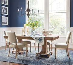
    The walls would look better in the blue rather than the curtains. van deusen blue walls, white wainscot,


    then you could do a soft print w/blue/white on the drapes.

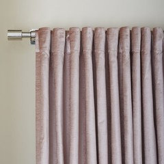
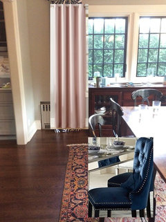
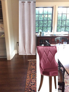
    if you don't want to repaint, then pull one of the softer colors from the rug or maybe the pink/red tones.


    this tone looks better next to your wall color and picks up on the reddish tones in the wood.


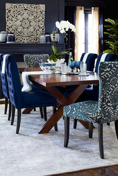
    You could bring in the blue in some artwork or trade in those chairs for something with navy


    i just think doing a solid blue panel would look too heavy with everything else in the room. I rather you do blinds or something if you want a dark blue.


  • 7 years ago
    Thanks Beth I appreciate the input. I love the idea of blue walls but my budget is probably restricted to new panels for now. The dining room is open floor plan with the kitchen. The kitchen has cabico cabinets in oyster— also a grey/taupe color.
  • 7 years ago
    Wow! I never would have thought to pull in that pale pink. It gives the rug a whole new look and keeps the room from looking heavy. Thank you!
  • 7 years ago
    last modified: 7 years ago

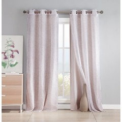
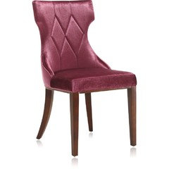
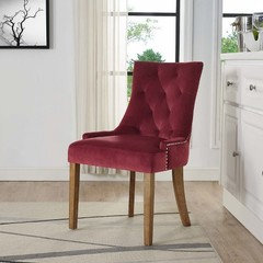
    pink, or dusty rose, look beautiful next to an oyster gray. and looks nice w/your flooring. do a semi sheer type of drape to keep things light. I'd look for some chairs on craigslist if you're on a budget. some that you could reupholster yourself in some velvet seat material. if going w/a pale rose or pink drape, you could do a darker pink or even a maroon velvet for your chairs.


    obviously these colors aren't a perfect match,,you'd have to figure out what goes best,,,,but as you can see, the lighter and darker pink, and reddish/pinks work great.

  • 7 years ago
    Ok great I’m going to search for some panels in those colors. Thank for your help!
  • 7 years ago

    Love the rug, it is obviously old, hang on to it! Please be sure to put the appropriate pad underneath it.


    Lighter color curtains would work best, and you have a lot of choices.


    To promote unity and a sense of harmony in the house, you might want to use the same color curtains in the dining room as you use in the living room, just as you probably are using the same color paint in both rooms.


    If that seems too boring to you, just use whatever light color you like.


    Do pick a color that will go with all your sets of dishes, and that will look good with food, and that is flattering to you. That still leaves you with a lot of choices that you can pull from the rug that will still go with your wall color.


    If you plan to add some seat cushions to your chairs, think about what color or what type of print you would do those in (even if you are not ready to do that right away) and then you can base your decision on the curtains on that.


    You can never go wrong with light off-white curtain, and then whatever you do with a seat cushion print will be fine.


    And again, you might want to try to unify the colors of the cushion with your living room in some way so the house decor seems unified.