Software
Houzz Logo Print
dotziegler

Accessories, too much, too little?

13 years ago
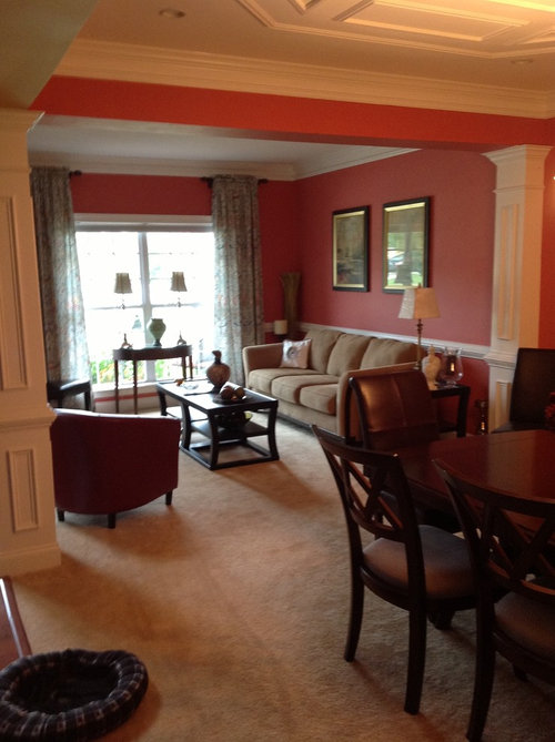
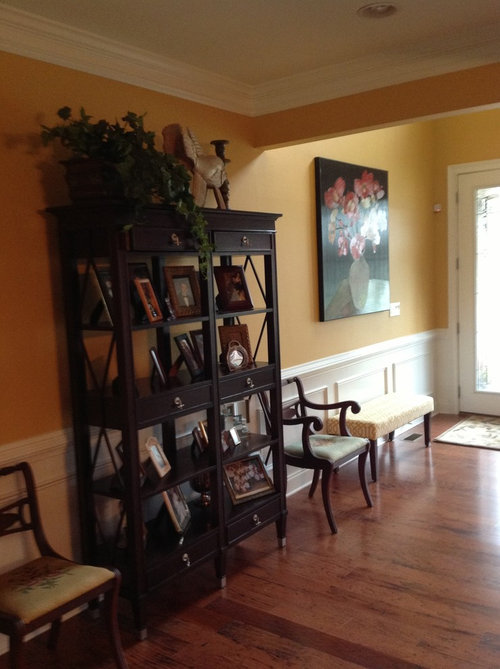
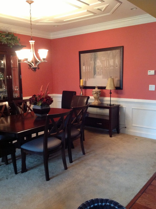
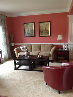
We recently finished painting our living room but now I just can't seem to get the accessories right. We have been moving small tables around but still not sure. The hall walls are actually a little darker than they appear, Behr High Plateau, LR is Behr Lovable. We do like to have a table with a light in front of the window.

Comments (21)

  • PRO
    13 years ago
    dotziegler - all the rooms look lovely. Could you upload a pic of the living room from behind the chairs looking toward the couch wall?

    Is there anything in the rooms that can go or you just looking to add?

    Lyvonne
  • 13 years ago
    Beautiful! I love your moldings and paint color!
  • 13 years ago
    This is from hall looking into LR. The sofa has to stay but think these tables might be too big
  • 13 years ago
    I would also remove everything from the top of the entryway shelf. Also, I think that there are too many framed pictures on the shelves. I would remove about 1/2 of them ... replace with other small, decorative items (small vase, bowl, etc.) Don't load up the shelves with too many things.
  • PRO
    13 years ago
    Rule of thumb for pretty shelves is 33% books( horizontal as well as verticle), 33% objects(including frames) and 33% open space unless a library in which case the books take the vast majority of space. Of course you alter this to your taste and your possessions. Your wall colors are truely lovely.
  • 13 years ago
    Too many pictures inside the shelf .
  • 13 years ago
    I agree w/ the others, too many framed pics on the shelves. Also the pictures behind the sofa may be a touch to high The tables in the living room are fine. The lamp should be more substanial. In the dining room the sidetable seems too low. You might consider removing the lamps and adding wall sconces on each side of the artwork. T You could also add an area rug in the dining room to add some patterm to the room.
  • 13 years ago
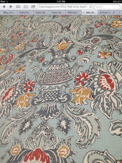
    Not a great pic but I saw this rug,maybe it would add color to the DR, the second pic is the fabric in my drapes and is my inspiration piece. I have a more substantial lamp I can try in the LR. I will post more pics later.
  • PRO
    11 years ago
    The lamps on the table against the window are out of proportion they are too tall for the length of the table.
  • 11 years ago
    I will agree with the tall lamps in the living room. The pictures above the sofa ---not sure but just doesnt seem to fit in the room right. The entry way and dining room looks great.
  • 11 years ago
    Some of this has already been said. I like the dining room as is. I think the art above the sofa is too high and too far apart. I agree about a more substantial table lamp in the living room next to the sofa. The lamps in the living room window look terribly awkward. I would remove that table altogether and get a nice floor lamp for the corner where the twigs are (removing the twigs). I would agree about moving the chairs out of the hallway and removing half the things from those shelves (and removing everything from the top of that piece). You have as beautiful home and beautiful pieces but I do think a bit of simplifying and decluttering would be very useful. Nothing new is needed other than possibly a couple lamps.
  • 11 years ago
    What is to the left of the living room window, a second red chair?
  • PRO
    11 years ago
    last modified: 11 years ago
    put the shelving unit where the flower painting is now and de clutter it. add some white decor to it for a pop off the dark walls and shelf. try the floral over the buffet, large painting over the sofa and the two paintings on the wall the shelf is on now. put the taller buffet lamps from the window into the dining room. and put only one lamp on the console in front of the window.
  • 11 years ago
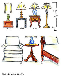
    This chart can hep with table and lamp heights.The leggy demi-lune looks awkward in front of the window. you need something lower and with more volume below. If you have art narrow enough to hang above the demi-lune, I'd try it at the entry and put the bench at the window. Try a floor lamp in the corner between window and sofa, rather than a lone lamp in the window. Art needs tweaking. 5-5-75 is a good rule of thumb. If hung alone, center point 5' above the floor. If over furniture then bottom frame 5" above the furniture. Art should be no wider than 75% of the width of the furniture it hangs above. With chair rails, the art should be closer to the rail than to the ceiling, and keep it below door and window frames. Your etagere display has too many photos on it. I'd rather see it styled more like a bookcase with 1/3 books, 1/3 large decor items and 1/3 open space. You can add one trio of layered photos on each of the two sides, preferably at different shelf heights. Place a large photo behind a pair of smaller ones to create interest, rather than lining them up like soldiers. It is more interesting even if people have to approach the shelves to see the details. You can also layer photos on side tables, etc.
  • PRO
    11 years ago
    It is hard to tell as these photos are small even when I enlarge them. The one thing I can say is you have too many things on each surface. You need to edit a bit, particularly on the etagere. The table at window would be better with one large lamp centered, the two lamps are too skinny/tall and it looks very cramped. Less is always more.
  • 11 years ago
    I agree, it is a lovely home!
    Yes, lower the art over the couch.
    Yes to one lamp on table in front if window.
    Yes to fewer pictures in cabinet.

    Love the paint colors and love the red chairs!
  • 11 years ago
    Looks lovely, may need brightening up a little with some cushions and a throw and a nice runner on table with light accessories also on the cabinet
  • 11 years ago
    Thanks everyone for your comments. I have moved some things around and will post new pictures after my tree and Christmas decorations come down. I think I need to look for a new picture for over the couch. The shelving unit is the only place I put family pictures and with 4 kids and 12 grands I have a few. What are your suggestions for showing them. They are all out of state so I like seeing them.
  • 11 years ago
    I understand why you have so many photos of your family. Some times I just remove a few of ours especially as the little ones get older. Maybe you can move some to other areas instead of all together on just those two shelf units. But it is your home, so be happy to have the photos all out.
  • 11 years ago
    The more I've heard from Houzzers to put family pics in more personal places like offices and bedrooms, I've moved my pics and now have the whole top of my dresser covered with pics. Also, I've done a picture wall in my casual family room in the basement, but I have finally moved most pics out of my entry and living room. It takes some rearranging but it can be done - but I only have two kids and 4 grands so it's a bit easier than your situation:)
Sponsored
Haus Studio
Average rating: 4.8 out of 5 stars28 Reviews
Franklin County's Preferred Custom Cabinetry & Design Studio