Software
Houzz Logo Print
noah_eisner

Small master bathroom - Before & After

7 years ago
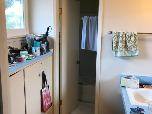
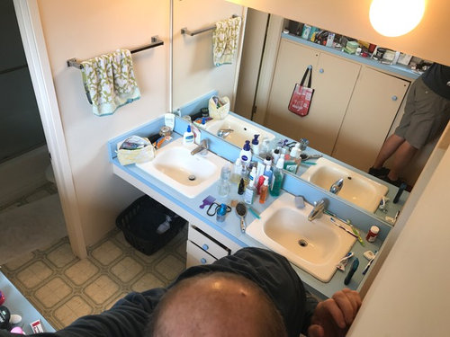
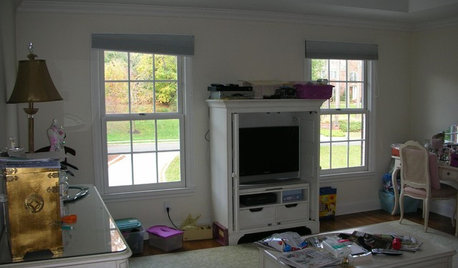
We have a small master bathroom - rectangular shape that is 6.3ft x 11.4ft. As you can see in the pictures, it was split into 2 sections...sinks/cabinets and then toilet/bath. I hated everything about it.


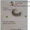
We couldn't change dimensions and we actually found out during demo the sink area is about 4" wider than the bathtub area due to some pipes in the wall.


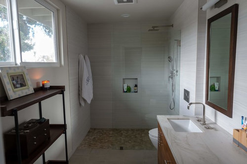
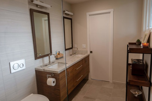
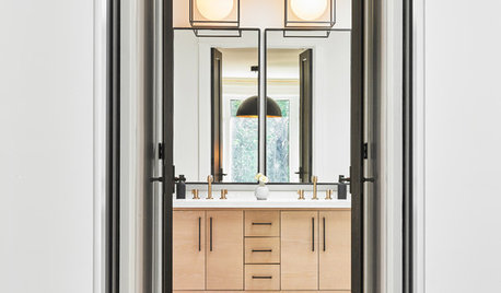
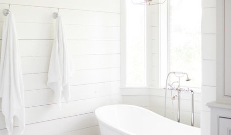
Here's the after...


Great advice from Houzzians (?) to help us design it. What I love/learned:

- Walk in shower with no door and no curb. LOVE, LOVE, LOVE!

- Wall-hanging toilet saves space

- Was able to re-use quartzite from kitchen counter remodel

- Better to have less cabinet space in bathroom. Less room for clutter.

- Taking out water restrictor from rain shower pretty much negates the need for handheld.


Few things I would do differently:

- Didn't add another electrical outlet by other sink while walls were open

- Height is adjustable on toilet before wall is covered up. Should have sat on it because it is about 1-1.5" too high.

- While the high faucets are pretty, they add to splashing of water on the countertop.


Be glad to share any/all items we used. And comments/criticisms are welcome!

Comments (22)

  • 7 years ago

    Yes, we lost a bathtub which concerned my wife. When necessary, we have the tub in the kids bathroom. Tradeoffs!

  • 7 years ago

    Beautiful transformation!

    Noah Eisner thanked User
  • PRO
    7 years ago

    Lovely update! I like the idea of no shower doors. Less to clean, sometimes they can be a pain.

    Noah Eisner thanked Stecki Construction
  • 7 years ago

    What a great transformation! It looks a million times bigger than the original. Your quartzite is beautiful.

    Noah Eisner thanked my_four_sons
  • 7 years ago

    It looks beautiful! Please tell me about the tiles used and brand, wood, color of the cabinets. Thank you!

    Noah Eisner thanked kitchen3920
  • 7 years ago

    Beautiful transformation. What are your floor tiles?

    Noah Eisner thanked lightlystarched
  • PRO
    7 years ago

    Gorgeous! Nice work


    - Woodruff Floors, LLC

    Noah Eisner thanked User
  • 7 years ago

    The vanity is custom walnut. Mirrors are custom too and walnut, but I knew I couldn't make an exact match so those are stained a bit darker.


    Quartzite is Mont Blanc Leathered.


    Tiles combination...

    - Floor: Happy Floors - X Rock Series - B Field Tile 12x24

    - Walls: Linea Porcelain Collection - Matrix Bright Honed 12x24

    - Shower Floor: It is from Island Stone cobbles or level pebbles. I can't seem to find the exact one we went with.


    And yes, to me the biggest difference is that it feels so much bigger now using more open plan and colors despite it being only 70+ sq ft.


  • 7 years ago

    It is so calm, clean, and uncluttered! I noticed all the products on the cupboard to in the "before" picture. Did you fit it all into those two drawers? Toss a lot? Send it to someone's bedroom?

    Noah Eisner thanked Nancy in Mich
  • 7 years ago

    Nice to hear the 'woulda-coulda's' cuz it helps us all, I think. Great transformation!

    Noah Eisner thanked tuckerdc
  • 7 years ago

    Awesome transformation! May I ask the make and model of your wall hung toilet and how do you like it so far? I am considering it but I read some people have issue with the “small water spot” result it cleaning it often after #2. Thanks!

  • PRO
    7 years ago

    Wow! Looks amazing!

  • 7 years ago
    @yeh it is Toto CT418FG with a Geberit system in the wall. I really like it if you want to save space. It looks a little cleaner aesthetically but the big difference is the distance from wall (8” fewer) and a little on the width. As far as the #2 on the sides, it does happen more than a normal toilet but I wouldn’t say it is problematic. Maybe requires an extra wand brush every other week?
  • 7 years ago

    Nice job! It looks so much bigger.

  • 7 years ago

    One thing I would do different - put blinds up on the window. I’m modest like that.

    lol - but seriously, it looks great. a job well done. :)

  • 7 years ago
    Looks great! So much more spacious seeming and functional than the previous layout.
  • 7 years ago
    Looks great, isn't it so much more functional?! We did something similar by taking a wall down too. Our space isn't square so we did a built in. I also regret not adding an outlet in hindsight.
    Check out this discussion on Houzz - http://houzz.com/sr/m=7/u=aHR0cHM6Ly93d3cuaG91enouY29tL2Rpc2N1c3Npb25zLzUzMzkwNzIvbWFzdGVyLWJhdGhyb29tLXJlbW9kZWw=
  • 7 years ago

    Wow! Looks really great! So much bigger

  • PRO
    7 years ago

    nice! you did a great job!

  • PRO
    7 years ago

    Hi Noah,

    I am so glad that you are pleased with our work. I am very thankful that you decided to go with the renderings that Marblus created for you. I know we all worked very hard on that. I am also very excited that you implemented my of our suggestions like going with a natural walnut vanity cabinet for your Master Bathroom . I truly believe that our ability to provide you, our customer, with an excellent 3D renderings for the Kitchen and Master was an exceptional touch. It was such a pleasure to work with you and watching our ideas unfold into a beautiful remodel. Thank you – Leo Palacios

  • 7 years ago

    @nancyinmich - yes we have more than enough room now. some things were tossed and i think a more open space (shelves instead of cabinets) forces you to prioritize and keep things cleaner. or at least that's what I'm doing!


    @leo and the marblus team - you guys rocked it! would highly recommend them if you are in the san jose area.