Software
Houzz Logo Print
paynete

Why not Yellow

13 years ago
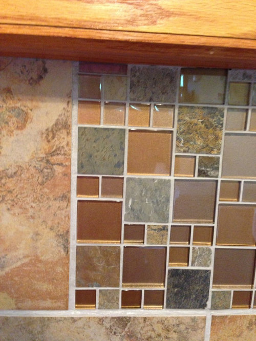
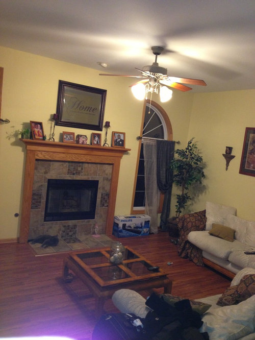
I keep hearing suggestions to tone down the yellow in spaces. Are yellows bad? I like warmth and think that beiges are too cool. Also I have a lot of honey oak wood in my home, and I am not sure that I want to paint all the wood trim. So what are my options if not yellows? I was looking at Sherwood Williams white raisin or outerbanks for our living room, what do u think? Her is a picture of our room and the fireplace tile. What colors should I be pulling from the tile to paint the walls?

Comments (22)

  • 13 years ago
    A pale blue would highlight the oak and make the floors, fireplace, and molding the focal point. Not to mention blue is considered a rather neutral color so you shouldn't have to make many changes over wise.
  • 13 years ago
    My family room is also Philadelphia cream, and I love it!but I also have colorful furniture to contrast, whereas yours is quite neutral. Consider a green too to pull from the tiles. Look at soft fern by BM.
  • 13 years ago
    If you want to go yellow, I think SW Creams or Buffs would be better. The brighter shades don't contrast well with the stone, IMO. Given that your furniture is quite neutral, I would go with a bluish or greenish gray shade. I could see a deeper spicy color going well, but it may be too dark, specially with a bare wood floor.
  • 13 years ago
    Benjamin Moore has a great website to help with color choices. Sarah
  • 13 years ago
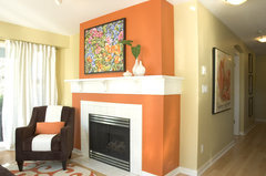
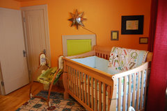
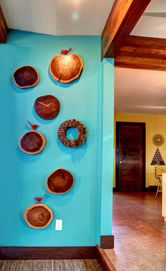
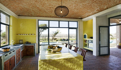
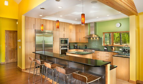
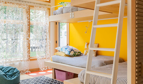
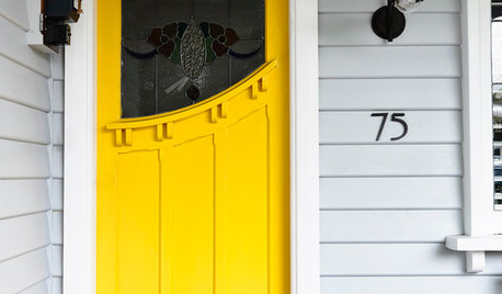
    Love yellows, but you have to choose just the right shade for your room. The yellow in your room is one I love, but it is wrong with the timber. Just to confuse the issue, I would go with an orange shade, you have some good examples on the colour chart you have done that pick up the shades of the timber. The only issue is whether your room is warm or cold, if it is a warm room orange could make it hot. If it needs cooling, blues would look just as good - you could even go to a turquoise.

    [houzz=
    Vancouver Residence · More Info
    ]

    [houzz=
    Nursery · More Info
    ]

    [houzz=
    Woodsy Holiday · More Info
    ]

    [houzz=
    JAKÉA! · More Info
    ]
  • 13 years ago
    last modified: 13 years ago
    I love yellow its cherry and warm and also refreshing ,looking at your tiles and fireplace you could use other colours as well if you like you could paint the wall where the fireplace is a brown and the rest a blue ,blue still works well with yellow , I will show you what I had in mind in a minute.

    here is one
    Kensington Blue 840 by Benjamin Moore · More Info


    and....

    Sherwin Williams Sable · More Info
    ]

    and for the window
    Finishing Touches · More Info

    Living room · More Info
  • 13 years ago
    I think the problem with the yellow you have now is that it's on the greenish tone. A great color would be on the orangish side of the spectrum. And maybe a little darker than you have now--maybe an almost gold.
  • 13 years ago
    Going a bit off topic ....I just had a need to express myself with... this is rather annoying ! when I find a fabric that I like and perhaps even have an interest on it ,I find out that its sold to designers only .

    Living room · More Info
  • PRO
    13 years ago
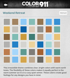
    Yellow can be a difficult color. It seems so bright and cheerful but if the lighting is not perfect it seems to react the most and can look like any color from yellowy green to tan.. yuk.I created an app called Color911. ( find out more about it at Color911.com) You can create your own palette of colors OR take/find a photo of something that inspires you and pull the colors from it.. or what I think would be a big help to you is to look at the pre-made color themes. Within the app are many pre-made color themes that are colors that all look beautifully together. You can choose any number of colors within a theme and use the colors for everything from wall color to accent color I attached a screen shot of one of the themes in the app. There are many of them and everyone is very different. This is just a sample. I think you can see how the creams and other colors might be a better solution than the yellow. They are more accommodating to the elements already in your home. I hope this inspires you!
  • 13 years ago
    I think a grayish green would look nice ... SW Svelte Sage:
  • 13 years ago
    Genevieve, I look at fabrics on here and when I go looking can't even buy anything that remotely looks like them. Sometimes certain colours or shades of a colour are "out" and cannot be bought anywhere. I wanted plain sunshine yellow curtains for my dining room, even some black or grey in it would have been fine - there was absolutely nothing with any shade of yellow.
  • 13 years ago
    @olldroo I noticed that too I wish that these sellers would make things available and easier for the ones that are not professionals on here . perhaps I understood Houzz wrongly ,but my thoughts were that we could purchase from these places since they are reputable companies. I don't mind to help out searching but I mind wasting time when I find something that could work for a person quest to than finding out that its either sold out or not available to the public. I think that if this goes on I will look on line directly instead of clicking on what is offered on here . In regard of your curtains I will try to help you find them .
  • 13 years ago
    Thank you for that Genevieve, that is lovely of you. Unfortunately shipping costs make things prohibitive for me. I do sew, have made all the curtains for the house in my latest renovation, it does open my options more. I did find a few wholesalers I could go to their warehouses and choose fabrics and they were very generous in sending me samples but I then had to purchase them through a store. I was lucky I found a discount store quite near me who kept their overheads down to be able to heavily discount and they also carried a lot of discontinued lines at amazing prices. Discontinued lines help a lot as that way you often get colours you want. I was able to get my lounge room curtains there, I wanted a nice rich cream, but everything now is more bone/beige. There are laws here for wholesalers and retailers that doesn't help. I just wonder though who decides what colours are "IN" and what are "OUT". I always seem to want the "out" colours. Even sales people at the warehouses were amazed there was nothing on the market. Two weeks ago I wandered a very large shopping complex looking for a simple blue scarf surely not a big ask, but there was not one scarf to be had that was even remotely blue. I ended up with a cream one with shades of pale apricots and a smidge of blue through it - not the right blue but it is so pale you don't notice it.

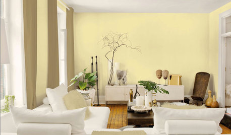
    The lounge here is the yellow I wanted

    [houzz=
    Bold dramatic statements · More Info
    ]
  • 13 years ago
    last modified: 13 years ago
    My suggestion would be BM November Rain to work with the natural stained wood.

    If you want to work with the tile, I suggest BM Healing aloe.
  • 13 years ago
    BM Saybrook Sage goes well with honey oak trim.
  • 13 years ago
    If you paint a whole wall that color yellow, it will make your eyes water.
  • 13 years ago
    You can't pick wall colors based on fabric colors. It's not the same.
  • PRO
    13 years ago
    I agree with the blue and pale green suggestions.
  • 13 years ago
    Like Sasha - I have Philadelphia Cream in the majority of our living space. The LR, DR, and kitchen all open to each other. The color is fabulous and doesn't scream yellow....it whispers it. We must have tried 10 different yellows before finding this. The trim is White Chocolate. Our accent colors are sage green and a deep sort of cranberry color and everything blends great. It's a very versatile color and works great with wood.
  • 13 years ago
    Love the green suggestions. Will have to get some samples on the wall.